1-20 of 3816
Keywords: Books at JSTOR
Close
Follow your search
Access your saved searches in your account
Would you like to receive an alert when new items match your search?
Journal

Focuses on digital libraries and library services applying digital technologies to support the data information and knowledge life cycle.
Journal Articles
in Combating misinformation using social media practices to enhance digital literacy: a bibliometric review (2015–2024)
> Digital Library Perspectives
Published: 21 August 2026
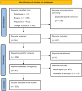
Figure 1. PRISMA flow diagram of the study selection process (2015–2024) Source: Authors’ own work A Flow diagram details study identification, screening, eligibility, exclusions, retrieval, and final inclusion of 200 studies. The flow diagram is titled Identification of studies via datab... More about this image found in PRISMA flow diagram of the study selection process (2015–2024) Source: ...
in Combating misinformation using social media practices to enhance digital literacy: a bibliometric review (2015–2024)
> Digital Library Perspectives
Published: 21 August 2026
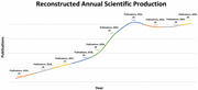
Figure 2. Reconstructed annual scientific production trend (2015–2024) Source: Authors’ own work A Line graph of annual scientific production from 2015 to 2024, rising from 13 to 26 publications with a slight dip after 2021. The graph is titled Reconstructed Annual Scientific Production. Th... More about this image found in Reconstructed annual scientific production trend (2015–2024) Source: Aut...
in Big data life cycle management practices, experiences and challenges in computer vision: implications for research data services
> Digital Library Perspectives
Published: 13 August 2026
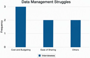
Figure 1. Types of struggles with data management of interviewees Source: Authors’ own work A bar chart compares 3 data management struggles, with cost and budgeting reported most often. The vertical axis represents frequency from 0 to 3 in increments of 1. Cost and Budgeting has a frequenc... More about this image found in Types of struggles with data management of interviewees Source: Authors’...
in Big data life cycle management practices, experiences and challenges in computer vision: implications for research data services
> Digital Library Perspectives
Published: 13 August 2026
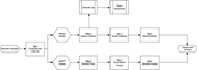
Figure 2. GenAI-assisted qualitative analysis workflow Source: Authors’ own work A flowchart compares manual and ChatGPT analysis of cleaned interview transcripts before results are compared and contrasted. The interview transcript proceeds to Step 1, de-identify and clean data. The manual ... More about this image found in GenAI-assisted qualitative analysis workflow Source: Authors’ own work ...
Journal Articles
in Participatory practices in AI design for cultural heritage: a scoping review on methods, inclusion, and epistemic justice
> Digital Library Perspectives
Published: 04 August 2026
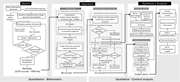
Figure 1. Scoping review workflow ( SALSA ): bibliometric mapping in SciMAT (Search–Appraisal) and four-dimension content analysis (Synthesis–Analysis). Record flow after deduplication: 3,270 → 479 (bibliometric filter) → 80 (≥8 / 16 canonical keywords) → 40 (title/abstract screen) → 22 analyzable... More about this image found in Scoping review workflow ( SALSA ): bibliometric mapping in SciMAT (Search–A...
Journal Articles
in AI-enabled accessibility in digital libraries: a review of policy frameworks and efficacy evidence for blind and visually impaired ( BVI ) users
> Digital Library Perspectives
Published: 21 July 2026
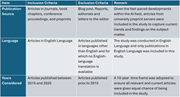
Figure 1. Eligibility criteria for literature used in the study Source: Author’s own work A table summarises publication source, language, and year criteria for including or excluding studies from a review. he 4 columns contain item, inclusion criteria, exclusion criteria, and remark. Publi... More about this image found in Eligibility criteria for literature used in the study Source: Author’s o...
in AI-enabled accessibility in digital libraries: a review of policy frameworks and efficacy evidence for blind and visually impaired ( BVI ) users
> Digital Library Perspectives
Published: 21 July 2026
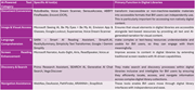
Figure 2. AI-powered accessibility tools for BVI users in digital libraries A table groups A I tools into 6 accessibility categories and explains their primary functions in digital libraries. The 3 columns contain A I powered tool category, specific A I tools, and primary function in digital... More about this image found in AI-powered accessibility tools for BVI users in digital libraries A ta...
in AI-enabled accessibility in digital libraries: a review of policy frameworks and efficacy evidence for blind and visually impaired ( BVI ) users
> Digital Library Perspectives
Published: 21 July 2026
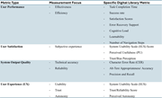
Figure 3. Metrics for measuring the effectiveness of AI accessibility tools within digital libraries environment Source: Author’s own work A table links 4 digital library metric types with their measurement focuses and specific evaluation measures. The 3 columns contain metric type, measu... More about this image found in Metrics for measuring the effectiveness of AI accessibility tools within ...
Journal Articles
Journal Articles
in Assessing the impact of cultural misinformation deepfakes through AI-based user engagement analysis
> Digital Library Perspectives
Published: 14 July 2026
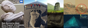
Figure 1. Deepfake images accompanying disinformation sources A collage combines a mummy-like head, a large footprint, a stone head, terrain markings, and an underwater pyramid-like form. The collage includes a mummy-like head and upper body, a large footprint impression on volcanic ground wit... More about this image found in Deepfake images accompanying disinformation sources A collage combines a...
in Assessing the impact of cultural misinformation deepfakes through AI-based user engagement analysis
> Digital Library Perspectives
Published: 14 July 2026
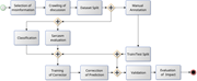
Figure 2. Methodology from the detection of misinformation to the evaluation of impact A workflow moves from misinformation selection and discussion crawling to annotation, classification, sarcasm evaluation, correction, validation, and impact evaluation. The workflow begins with selection of ... More about this image found in Methodology from the detection of misinformation to the evaluation of impac...
in Assessing the impact of cultural misinformation deepfakes through AI-based user engagement analysis
> Digital Library Perspectives
Published: 14 July 2026
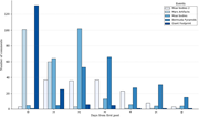
Figure 3. Amount of daily publications of users’ comments from the first post A grouped bar chart compares comment counts for 5 events across days 0 to 6 from the first post. The chart plots number of comments against days from first post, from 0 to 6. For Moai bodies 2, the values are 3 comme... More about this image found in Amount of daily publications of users’ comments from the first post A gr...
in Assessing the impact of cultural misinformation deepfakes through AI-based user engagement analysis
> Digital Library Perspectives
Published: 14 July 2026
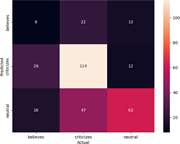
Figure 4. Confusion matrix of classification results by the pretrained BART-MNLI model A confusion matrix compares predicted and actual labels for believes, criticizes, and neutral classes. The confusion matrix has predicted labels on the vertical axis and actual labels on the horizontal axis.... More about this image found in Confusion matrix of classification results by the pretrained BART-MNLI mode...
in Assessing the impact of cultural misinformation deepfakes through AI-based user engagement analysis
> Digital Library Perspectives
Published: 14 July 2026
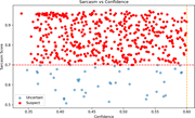
Figure 5. Blue points represent uncertain classifications, with a confidence lower than 0.6. Red points represent suspected misclassifications because of sarcasm A scatter plot compares sarcasm score and confidence, with suspect points above 0.70 sarcasm and uncertain points below it. The scat... More about this image found in Blue points represent uncertain classifications, with a confidence lower th...
in Assessing the impact of cultural misinformation deepfakes through AI-based user engagement analysis
> Digital Library Perspectives
Published: 14 July 2026
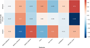
Figure 6. Relevance of features with respect to each class A heat map compares 7 feature values for ground truth labels believes, criticizes, and neutral. The heat map has ground truth labels on the vertical axis and features on the horizontal axis. The scale ranges from about negative 1.0 to ... More about this image found in Relevance of features with respect to each class A heat map compares 7 f...