

1-20 of 73747
Keywords: SOR
Close
Follow your search
Access your saved searches in your account
Would you like to receive an alert when new items match your search?
Journal

Provides a platform for research and discussion across the range of disciplines involved in computer-aided engineering and software.
Journal Articles
in Development of a least-squares-based polynomial partition of unity method for solving the 2D Allen–Cahn equation
> Engineering Computations
Published: 22 September 2026
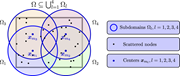
Figure 1 A covering set for a sample domain Ω A diagram illustrating a global domain covered by overlapping circular subdomains. A diagram of a global domain covered by four overlapping circular subdomains. The global domain is highlighted with an extra-bold border. Each subdomain, labeled as ... More about this image found in A covering set for a sample domain Ω A diagram illustrating a global dom...
in Development of a least-squares-based polynomial partition of unity method for solving the 2D Allen–Cahn equation
> Engineering Computations
Published: 22 September 2026
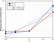
Figure 2 The L∞-norm error as a function of h at T = 1 with ϵ = 0.3, dt = 0.0004, for m = 7 and m = 8 in Example 5.1 A line graph showing the L-norm error as a function of h at T equals 1 with sigma equals 0.3, dt equals 0.0004, for m equals 7 and m equals 8 in Example 5.1. A line graph showing the L-norm error as a function of h at T equals 1 with sigma equals 0.3, dt equals 0.0004, for m equals 7 and m equals 8 in Example 5.1. The x-axis represents the variable h ranging from 0.05 to 0.2. The y-axis represents the maximum error at final time ranging from 10 to the power of negative 3 to 10 to the power of negative 2. The graph includes two data series: one for m equals 7 represented by blue circles and a solid blue line, and another for m equals 8 represented by red squares and a solid red line. Additionally, there are two dashed lines indicating the rates: a blue dashed line for a rate of 1.58 for m equals 7 and a red dashed line for a rate of 1.11 for m equals 8. The graph shows that as h increases, the maximum error at final time also increases for both m equals 7 and m equals 8. The rate lines provide a reference for the rate of increase in error. All values are approximated. More about this image found in The L∞-norm error as a functio...
in Development of a least-squares-based polynomial partition of unity method for solving the 2D Allen–Cahn equation
> Engineering Computations
Published: 22 September 2026
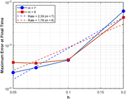
Figure 3 The L∞-norm error as a function of h at T = 1 with ϵ = 0.5, dt = 0.0004, for m = 7 and m = 8 in Example 5.1 A line graph showing the maximum error at final time as a function of h for different values of m. A line graph showing the maximum error at final time as a function of h. The horizontal axis represents h, ranging from 0.05 to 0.2. The vertical axis represents the maximum error at final time, ranging from 10ˆ-4 to 10ˆ-2. The graph includes two data series: one for m = 7, represented by blue circles and a solid blue line, and another for m = 8, represented by red squares and a solid red line. Additionally, there are two dashed lines indicating the rates: a blue dashed line for Rate = 2.39 (m = 7) and a red dashed line for Rate = 1.78 (m = 8). The blue line shows an upward trend, indicating that the maximum error increases as h increases. The red line also shows an upward trend, but with a slightly different slope compared to the blue line. More about this image found in The L∞-norm error as a functio...
in Development of a least-squares-based polynomial partition of unity method for solving the 2D Allen–Cahn equation
> Engineering Computations
Published: 22 September 2026
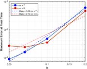
Figure 4 The L∞-norm error as a function of h at T = 1 with ϵ = 0.7, dt = 0.0004, for m = 7 and m = 8 in Example 5.1 A line graph showing the L-norm error as a function of h at T equals 1 with lambda equals 0.7, dt equals 0.0004, for m equals 7 and m equals 8 in Example 5.1. A line graph showing the L-norm error as a function of h at T equals 1 with lambda equals 0.7, dt equals 0.0004, for m equals 7 and m equals 8 in Example 5.1. The x-axis represents the variable h ranging from 0.05 to 0.2. The y-axis represents the maximum error at final time on a logarithmic scale ranging from 10 to the power of negative 4 to 10 to the power of negative 2. The graph includes two data series: one for m equals 7 represented by blue circles and a solid blue line, and another for m equals 8 represented by red squares and a solid red line. Additionally, there are two dashed lines indicating the rates: a blue dashed line for a rate of 3.09 for m equals 7 and a red dashed line for a rate of 2.14 for m equals 8. The data points show that as h increases, the maximum error at final time also increases for both m equals 7 and m equals 8. The rate lines provide a reference for the expected error reduction rates. All values are approximated. More about this image found in The L∞-norm error as a functio...
in Development of a least-squares-based polynomial partition of unity method for solving the 2D Allen–Cahn equation
> Engineering Computations
Published: 22 September 2026
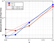
Figure 5 The L∞-norm error as a function of h at T = 1 with ϵ = 0.9, dt = 0.0004, for m = 7 and m = 8 in Example 5.1 A line graph showing the maximum error at final time as a function of h for different values of m. A line graph displays the maximum error at final time on the vertical axis with a logarithmic scale ranging from 10ˆ-4 to 10ˆ-2. The horizontal axis represents h, ranging from 0.05 to 0.2. Two data series are plotted: one for m = 7, represented by blue circles and a solid blue line, and another for m = 8, represented by red squares and a solid red line. Additionally, two dashed lines indicate the rates: a blue dashed line for a rate of 3.22 (m = 7) and a red dashed line for a rate of 2.37 (m = 8). The blue series shows an upward trend with increasing h, while the red series also shows an upward trend but with a slightly different slope. More about this image found in The L∞-norm error as a functio...
in Development of a least-squares-based polynomial partition of unity method for solving the 2D Allen–Cahn equation
> Engineering Computations
Published: 22 September 2026
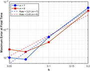
Figure 6 The L∞-norm error as a function of h at T = 1 with ϵ = 1, dt = 0.0004, for m = 7 and m = 8 in Example 5.1 A line graph showing the L-norm error as a function of h at T equals 1 with lambda equals 1 and dt equals 0.0004 for m equals 7 and m equals 8 in Example 5.1. A line graph showing the L-norm error as a function of h at T equals 1 with lambda equals 1 and dt equals 0.0004 for m equals 7 and m equals 8 in Example 5.1. The x-axis represents the variable h ranging from 0.05 to 0.2. The y-axis represents the maximum error at final time on a logarithmic scale ranging from 10 to the power of negative 4 to 10 to the power of negative 2. The graph includes two data series: one for m equals 7 represented by blue circles and a blue solid line, and another for m equals 8 represented by red squares and a red solid line. Additionally, there are two dashed lines indicating the rates: a blue dashed line for a rate of 3.21 for m equals 7 and a red dashed line for a rate of 2.45 for m equals 8. The data points show that as h increases, the maximum error at final time also increases for both m equals 7 and m equals 8. The rate lines provide a reference for the expected error rates. All values are approximated. More about this image found in The L∞-norm error as a functio...
in Development of a least-squares-based polynomial partition of unity method for solving the 2D Allen–Cahn equation
> Engineering Computations
Published: 22 September 2026
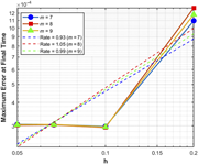
Figure 7 The L∞-norm error as a function of h at T = 1 with ϵ = 0.3, dt = 0.0003, for m = 7, m = 8, and m = 9 in Example 5.2 A line graph showing the maximum error at final time as a function of h for different values of m. A line graph displays the maximum error at final time on the vertical axis, measured in units of 10 to the power of -4, against the variable h on the horizontal axis, ranging from 0.05 to 0.2. The graph includes three data series represented by different symbols and colors: blue circles for m = 7, red squares for m = 8, and green triangles for m = 9. Each series shows an increasing trend in maximum error as h increases. Additionally, dashed lines indicate the rates of error for each m value: blue dashed line for Rate = 0.93 (m = 7), red dashed line for Rate = 1.05 (m = 8), and green dashed line for Rate = 0.99 (m = 9). The legend in the top left corner explains the symbols and colors used for different m values and their corresponding rates. More about this image found in The L∞-norm error as a functio...
in Development of a least-squares-based polynomial partition of unity method for solving the 2D Allen–Cahn equation
> Engineering Computations
Published: 22 September 2026
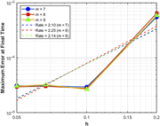
Figure 8 The L∞-norm error as a function of h at T = 1 with ϵ = 0.5, dt = 0.0003, for m = 7, m = 8, and m = 9 in Example 5.2 A line graph showing the maximum error at final time as a function of h for different values of m. A line graph displays the maximum error at final time on the vertical axis with a logarithmic scale ranging from 10ˆ-5 to 10ˆ-3. The horizontal axis represents h, ranging from 0.05 to 0.2. The graph includes three data series: m = 7 represented by blue circles, m = 8 represented by red squares, and m = 9 represented by green triangles. Each series shows an increasing trend in maximum error as h increases. Additionally, three dashed lines indicate the rates: Rate = 2.10 for m = 7, Rate = 2.25 for m = 8, and Rate = 2.14 for m = 9. The legend in the top left corner identifies the symbols and rates corresponding to each m value. More about this image found in The L∞-norm error as a functio...
in Development of a least-squares-based polynomial partition of unity method for solving the 2D Allen–Cahn equation
> Engineering Computations
Published: 22 September 2026
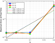
Figure 9 The L∞-norm error as a function of h at T = 1 with ϵ = 0.6, dt = 0.0003, for m = 7, m = 8, and m = 9 in Example 5.2 A line graph showing the L-norm error as a function of h at T equals 1 with different values of m. The line graph presents the L-norm error at the final time T equals 1 with a time step dt equals 0.0003, plotted as a function of h. The graph includes three data lines representing different values of m: m equals 7, m equals 8, and m equals 9. Each data line is marked with distinct symbols: circles for m equals 7, squares for m equals 8, and triangles for m equals 9. Additionally, the graph includes dashed lines indicating the rates of error decrease: Rate equals 2.45 for m equals 7, Rate equals 2.62 for m equals 8, and Rate equals 2.49 for m equals 9. The x-axis represents the variable h, ranging from 0.05 to 0.2, while the y-axis represents the maximum error at the final time, ranging from 10 to the power of negative 5 to 10 to the power of negative 3. The graph demonstrates that as h decreases, the error also decreases, confirming the effectiveness and accuracy of the proposed method. All values are approximated. More about this image found in The L∞-norm error as a functio...
in Development of a least-squares-based polynomial partition of unity method for solving the 2D Allen–Cahn equation
> Engineering Computations
Published: 22 September 2026
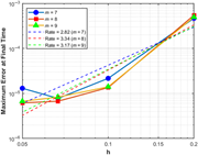
Figure 10 The L∞-norm error as a function of h at T = 1 with ϵ = 0.9, dt = 0.0003, for m = 7, m = 8, and m = 9 in Example 5.2 A line graph showing the maximum error at final time as a function of h for different values of m. A line graph displays the maximum error at final time on the vertical axis with a logarithmic scale ranging from 10ˆ-6 to 10ˆ-3. The horizontal axis represents h, ranging from 0.05 to 0.2. Three data series are plotted: blue circles for m = 7, orange squares for m = 8, and green triangles for m = 9. Each series shows an increasing trend in maximum error as h increases. Additionally, dashed lines indicate the rates of error for each m value: blue dashed line for rate 2.82 (m = 7), red dashed line for rate 3.34 (m = 8), and green dashed line for rate 3.17 (m = 9). The legend in the upper left corner identifies the symbols and rates corresponding to each m value. More about this image found in The L∞-norm error as a functio...
in Development of a least-squares-based polynomial partition of unity method for solving the 2D Allen–Cahn equation
> Engineering Computations
Published: 22 September 2026
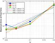
Figure 11 The L∞-norm error as a function of h at T = 1 with ϵ = 1, dt = 0.0003, for m = 7, m = 8, and m = 9 in Example 5.2 A line graph showing the L-norm error as a function of h at T equals 1 with different values of m. The line graph presents the L-norm error at the final time T equals 1 with a time step dt equals 0.0003, plotted as a function of h. The graph includes three data lines representing different values of m: m equals 7, m equals 8, and m equals 9. Each data line is marked with distinct symbols: circles for m equals 7, squares for m equals 8, and triangles for m equals 9. The x-axis represents the variable h, ranging from 0.05 to 0.2. The y-axis represents the maximum error at the final time, ranging from 10 to the power of negative 6 to 10 to the power of negative 3. The graph also includes dashed lines indicating the rates of error reduction for each value of m: a blue dashed line for m equals 7 with a rate of 2.88, a red dashed line for m equals 8 with a rate of 3.48, and a green dashed line for m equals 9 with a rate of 3.30. The data points show that as h decreases, the error also decreases, demonstrating the effectiveness and accuracy of the proposed method. More about this image found in The L∞-norm error as a functio...
in Development of a least-squares-based polynomial partition of unity method for solving the 2D Allen–Cahn equation
> Engineering Computations
Published: 22 September 2026
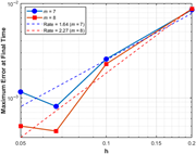
Figure 12 The L∞-norm error as a function of h at T = 1 with ϵ = 0.6, dt = 0.0004, for m = 7, and m = 8 in Example 5.3 A line graph showing the maximum error at final time as a function of h for different values of m. A line graph displays the maximum error at final time on the vertical axis and h on the horizontal axis. The graph includes two data series: one for m equals 7, represented by blue circles and a solid blue line, and another for m equals 8, represented by red squares and a solid orange line. Additionally, there are two dashed lines indicating the rates: a blue dashed line for a rate of 1.64 (m equals 7) and a red dashed line for a rate of 2.27 (m equals 8). The data points for m equals 7 show a trend where the error increases as h increases, with a noticeable rise between h equals 0.05 and h equals 0.1. Similarly, the data points for m equals 8 also show an increasing trend in error with increasing h, but with a slightly different slope compared to m equals 7. The dashed lines provide a visual reference for the rates of increase in error for each value of m. More about this image found in The L∞-norm error as a function of h...
in Development of a least-squares-based polynomial partition of unity method for solving the 2D Allen–Cahn equation
> Engineering Computations
Published: 22 September 2026
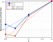
Figure 13 The L∞-norm error as a function of h at T = 1 with ϵ = 0.7, dt = 0.0004, for m = 7, and m = 8 in Example 5.3 A line graph showing the L-norm error as a function of h at T equals 1 with alpha equals 0.7, dt equals 0.0004, for m equals 7, and m equals 8. A line graph showing the L-norm error as a function of h at T equals 1 with alpha equals 0.7, dt equals 0.0004, for m equals 7, and m equals 8. The x-axis represents the variable h ranging from 0.05 to 0.2. The y-axis represents the maximum error at final time ranging from 10 to the power of negative 3 to 10 to the power of negative 2. The graph includes two data lines: one for m equals 7 represented by blue circles and another for m equals 8 represented by red squares. Additionally, there are two dashed lines indicating the rates: a blue dashed line for a rate of 1.60 for m equals 7 and a red dashed line for a rate of 2.21 for m equals 8. The data points show that as h decreases, the maximum error at final time also decreases, demonstrating the effectiveness and accuracy of the proposed method. All values are approximated. More about this image found in The L∞-norm error as a function of h...
in Development of a least-squares-based polynomial partition of unity method for solving the 2D Allen–Cahn equation
> Engineering Computations
Published: 22 September 2026
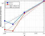
Figure 14 The L∞-norm error as a function of h at T = 1 with ϵ = 0.8, dt = 0.0004, for m = 7, and m = 8 in Example 5.3 A line graph showing the maximum error at final time as a function of h for different values of m. A line graph displays the maximum error at final time on the vertical axis with a logarithmic scale ranging from 10ˆ-3 to 10ˆ-2. The horizontal axis represents h, ranging from 0.05 to 0.2. Two data series are plotted: one for m equals 7, represented by blue circles and a solid blue line, and another for m equals 8, represented by red squares and a solid red line. Additionally, two dashed lines indicate the rates: a blue dashed line for a rate of 1.58 (m equals 7) and a red dashed line for a rate of 2.17 (m equals 8). The blue line shows an increasing trend with some fluctuations, while the red line shows a more consistent increase. The dashed lines serve as references for the rates of increase. More about this image found in The L∞-norm error as a function of h at
in Development of a least-squares-based polynomial partition of unity method for solving the 2D Allen–Cahn equation
> Engineering Computations
Published: 22 September 2026
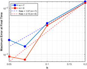
Figure 15 The L∞-norm error as a function of h at T = 1 with ϵ = 0.9, dt = 0.0004, for m = 7, and m = 8 in Example 5.3 A line graph showing the maximum error at final time as a function of h for different values of m. A line graph displays the maximum error at final time on the vertical axis with a logarithmic scale ranging from 10ˆ-3 to 10ˆ-2. The horizontal axis represents h, ranging from 0.05 to 0.2. Two data series are plotted: one for m = 7, represented by blue circles and a solid blue line, and another for m = 8, represented by red squares and a solid orange line. Additionally, two dashed lines indicate the rates: a blue dashed line for a rate of 1.57 (m = 7) and a red dashed line for a rate of 2.15 (m = 8). The blue line shows an increasing trend with some fluctuations, while the orange line shows a more consistent increase. The dashed lines provide a reference for the expected rates of error decrease as h becomes smaller. More about this image found in The L∞-norm error as a function of h at
in Development of a least-squares-based polynomial partition of unity method for solving the 2D Allen–Cahn equation
> Engineering Computations
Published: 22 September 2026
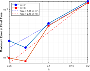
Figure 16 The L∞-norm error as a function of h at T = 1 with ϵ = 1, dt = 0.0004, for m = 7, and m = 8 in Example 5.3 A line graph showing the L-norm error as a function of h at T equals 1 with lambda equals 1, dt equals 0.0004, for m equals 7 and m equals 8. A line graph showing the L-norm error as a function of h at T equals 1 with lambda equals 1, dt equals 0.0004, for m equals 7 and m equals 8. The x-axis represents the variable h ranging from 0.05 to 0.2. The y-axis represents the maximum error at final time ranging from 10 to the power of negative 3 to 10 to the power of negative 2. The graph includes two data series: one for m equals 7 represented by blue circles and a solid blue line, and another for m equals 8 represented by red squares and a solid orange line. Additionally, there are two dashed lines indicating the rates: a blue dashed line for rate equals 1.56 with m equals 7 and a red dashed line for rate equals 2.13 with m equals 8. The data points show that as h decreases, the maximum error at final time also decreases, demonstrating the effectiveness and accuracy of the proposed method. All values are approximated. More about this image found in The L∞-norm error as a function of h...
in Development of a least-squares-based polynomial partition of unity method for solving the 2D Allen–Cahn equation
> Engineering Computations
Published: 22 September 2026
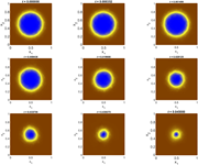
Figure 17 Snapshots at different time instances for ϵ = 0.04 with m = 7, h = 1/20 and dt = 0.0002 in Example 5.4 Nine heatmap plots showing the evolution of a solution over time. The image contains nine heatmap plots arranged in a 3x3 grid, each representing the evolution of a solution at different time instances. Each plot has two axes labeled x1 and x2, both ranging from 0 to 1. The time instances (t) for each plot are as follows: top row (left to right) t = 0.000000, t = 0.000352, t = 0.001406; middle row (left to right) t = 0.008438, t = 0.019688, t = 0.028125; bottom row (left to right) t = 0.033750, t = 0.039375, t = 0.045000. The color gradient in each plot ranges from blue in the center to yellow and then to brown towards the edges, indicating the intensity of the solution at different points in the x1-x2 plane. As time progresses, the blue region in the center of each plot appears to shrink, suggesting a change in the solution's distribution over time. More about this image found in Snapshots at different time instances for ϵ = 0.04 with ...
in Development of a least-squares-based polynomial partition of unity method for solving the 2D Allen–Cahn equation
> Engineering Computations
Published: 22 September 2026
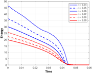
Figure 18 Energy as a function of time for ϵ = 0.04, 0.05, 0.06, 0.07, 0.08, 0.09 with m = 7, h = 1/20 and dt = 0.0002 in Example 5.4 A line graph showing energy as a function of time for different values of epsilon ranging from 0.04 to 0.09. A line graph showing energy as a function of time for different values of epsilon ranging from 0.04 to 0.09. The x-axis represents time, ranging from 0 to 0.06, and the y-axis represents energy, ranging from 0 to 50. The graph includes six lines, each representing a different value of epsilon: 0.04, 0.05, 0.06, 0.07, 0.08, and 0.09. The lines show a steady decrease in energy over time, with higher values of epsilon corresponding to lower initial energy levels and faster rates of energy dissipation. All values are approximated. More about this image found in Energy as a function of time for ϵ = 0.04, 0.05, 0.06, 0.0...

