
1-20 of 6347
Keywords: VIKOR
Close
Follow your search
Access your saved searches in your account
Would you like to receive an alert when new items match your search?
Journal

Addresses all aspects of innovation management.
Journal Articles
European Journal of Innovation Management 1–27.
Published: 10 September 2026
... strategies, namely those representing efficient trade-offs between customer satisfaction and return-cost reduction. Finally, the VIKOR method is applied to assess the robustness of the resulting strategy rankings under different decision-making preferences. Findings The results reveal the relative...
in An innovation-oriented multi-criteria framework for prioritizing return management strategies in e-commerce: an AHP-TOPSIS approach with VIKOR-based robustness analysis
> European Journal of Innovation Management
Published: 10 September 2026
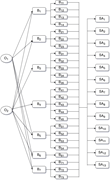
Figure 1 Hierarchical structure of the decision-making problem A hierarchical structure diagram representing a decision-making model with objectives, barriers, sub-barriers, and strategic actions. A hierarchical structure diagram illustrating a decision-making model. The diagram consists of fo... More about this image found in Hierarchical structure of the decision-making problem A hierarchical str...
in An innovation-oriented multi-criteria framework for prioritizing return management strategies in e-commerce: an AHP-TOPSIS approach with VIKOR-based robustness analysis
> European Journal of Innovation Management
Published: 10 September 2026
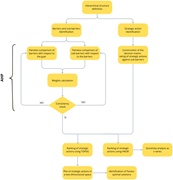
Figure 2 Flow chart of the procedure A flowchart illustrating a decision-making process using AHP, TOPSIS, Pareto analysis, and VIKOR. The flowchart begins with the hierarchical structure definition, which branches into two main paths: barriers and sub-barriers identification, and strategic More about this image found in Flow chart of the procedure A flowchart illustrating a decision-making p...
in An innovation-oriented multi-criteria framework for prioritizing return management strategies in e-commerce: an AHP-TOPSIS approach with VIKOR-based robustness analysis
> European Journal of Innovation Management
Published: 10 September 2026
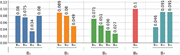
Figure 3 Weights of sub-barriers with respect to O1 A bar graph comparing values of different sub-barriers. A bar graph compares the values of different sub-barriers. The horizontal axis lists the sub-barriers labeled as B 1, B 2, B 5, B 6, and B 7, each with multiple subcategories (e.g., B 11, B 12, etc.). The vertical axis represents the values ranging from 0.00 to 0.12. The bars are grouped by sub-barrier categories and are colored differently: blue for B 1, orange for B 2, green for B 5, red for B 6, and teal for B 7. Each bar's value is labeled at the top. Notable values include B 61 at 0.10, B 11 and B 14 at 0.08, B 21 at 0.089, B 51 at 0.071, and B 72 and B 73 at 0.091. The graph shows variations in the weights of sub-barriers with respect to O 1. More about this image found in Weights of sub-barriers with respect to O1 A bar graph compar...
in An innovation-oriented multi-criteria framework for prioritizing return management strategies in e-commerce: an AHP-TOPSIS approach with VIKOR-based robustness analysis
> European Journal of Innovation Management
Published: 10 September 2026
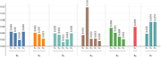
Figure 4 Weights of sub-barriers with respect to O2 A bar graph showing weights of sub-barriers with respect to O 2. The bar graph compares the weights of sub-barriers with respect to O 2. The x-axis is labeled with B 1, B 2, B 3, B 4, B 5, B 6, and B 7, each containing multiple sub-barriers. The y-axis represents the weight values ranging from 0.00 to 0.12. The bars are vertical and grouped by their respective main barriers. Each group contains multiple sub-barriers with varying heights indicating their respective weights. The color scheme includes blue, orange, green, brown, and red bars. Notable values include B 4 2 at 0.118, B 6 1 at 0.059, and B 7 2 and B 7 3 both at 0.074. All values are approximated. More about this image found in Weights of sub-barriers with respect to O2 A bar graph showin...
in An innovation-oriented multi-criteria framework for prioritizing return management strategies in e-commerce: an AHP-TOPSIS approach with VIKOR-based robustness analysis
> European Journal of Innovation Management
Published: 10 September 2026
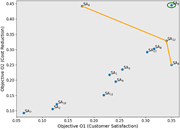
Figure 5 Pareto frontiers analysis A scatter plot showing the relationship between customer satisfaction and cost reduction. A scatter plot with a few data points representing the relationship between customer satisfaction and cost reduction. The horizontal axis represents Objective O1 (Custom... More about this image found in Pareto frontiers analysis A scatter plot showing the relationship betwee...
in An innovation-oriented multi-criteria framework for prioritizing return management strategies in e-commerce: an AHP-TOPSIS approach with VIKOR-based robustness analysis
> European Journal of Innovation Management
Published: 10 September 2026
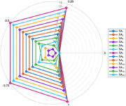
Figure 6 Ranking of strategic actions for the customer satisfaction objective O1 as a function of ν A line graph showing the ranking of strategic actions for customer satisfaction objective O1 using the VIKOR method. A line graph showing the ranking of strategic actions More about this image found in Ranking of strategic actions for the customer satisfaction objective O...
in An innovation-oriented multi-criteria framework for prioritizing return management strategies in e-commerce: an AHP-TOPSIS approach with VIKOR-based robustness analysis
> European Journal of Innovation Management
Published: 10 September 2026
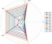
Figure 7 Ranking of strategic actions for the return cost reduction objective O2 as a function of ν A radar chart displaying multiple data series with varying values. A radar chart with 13 data series labeled SA 1 to SA 13. The chart has a circular grid with concentric rings marked from 0 to 13. The horizontal axis represents different attributes, and the vertical axis represents the values from 0 to 1. Each data series is represented by a different colored line connecting points on the grid. The lines vary in shape and size, indicating different performance levels across the attributes. The legend on the right side of the chart identifies each data series by color and label. More about this image found in Ranking of strategic actions for the return cost reduction objective O...
in The effect of board capital diversity on innovation performance: evidence from new product announcements
> European Journal of Innovation Management
Published: 08 September 2026
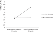
Figure 1 The moderating effect of the degree of new product newness on the relationship between board knowledge diversity and abnormal returns around NPI announcements: The positive association between board knowledge diversity and abnormal returns becomes stronger when product newness is high. So... More about this image found in The moderating effect of the degree of new product newness on the relations...
in The effect of board capital diversity on innovation performance: evidence from new product announcements
> European Journal of Innovation Management
Published: 08 September 2026
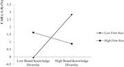
Figure 2 The Moderating effect of firm size on the relationship between board knowledge diversity and abnormal returns of NPI announcements: The positive association between board knowledge diversity and abnormal returns weakens as firm size increases. Source: Authors’ own work A line graph sho... More about this image found in The Moderating effect of firm size on the relationship between board knowle...
Journal Articles
European Journal of Innovation Management 1–18.
Published: 08 September 2026
Journal Articles
European Journal of Innovation Management 1–26.
Published: 08 September 2026
Journal Articles
European Journal of Innovation Management 1–24.
Published: 08 September 2026
Includes: Supplementary data
in When humans collaborate with AI: critical reflection as a pathway to learning from innovation failures
> European Journal of Innovation Management
Published: 08 September 2026
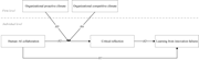
Figure 1 Theoretical model A diagram of a theoretical model showing relationships between organizational climates and individual behaviors. The diagram illustrates a theoretical model with two levels: firm level and individual level. At the firm level, there are two boxes labeled 'Organization... More about this image found in Theoretical model A diagram of a theoretical model showing relationships...
in When humans collaborate with AI: critical reflection as a pathway to learning from innovation failures
> European Journal of Innovation Management
Published: 08 September 2026
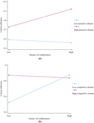
Figure 2 Interaction plots of human–AI collaboration with (a) organizational proactive climate and (b) organizational competitive climate on critical reflection Two line graphs showing the interaction of human-AI collaboration with organizational proactive and competitive climates on critical r... More about this image found in Interaction plots of human–AI collaboration with (a) organizational proacti...
Journal Articles
European Journal of Innovation Management 1–29.
Published: 08 September 2026
in From “data silos” to “data sharing”: public data openness and enterprise ambidextrous innovation
> European Journal of Innovation Management
Published: 08 September 2026
Figure 1 Parallel trend test. Source: Authors’ own work Two line graphs depict the average causal effect of periods since an event on innovation levels. Two line graphs labeled Innov1 and Innov2 depict the average causal effect of periods since an event on innovation levels. Each graph has a v... More about this image found in Parallel trend test. Source: Authors’ own work Two line graphs depict th...
in From “data silos” to “data sharing”: public data openness and enterprise ambidextrous innovation
> European Journal of Innovation Management
Published: 08 September 2026
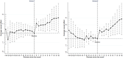
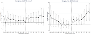
Figure 2 Cengiz et al. (2019) estimates. Source: Authors’ own work Two line graphs compare average causal effects over time periods before and after an event. The image contains two line graphs side by side. The left graph is labeled 'Cengiz et al. (2019)-Innov1' and the right graph is labeled 'Cengiz et al. (2019)-Innov2'. Both graphs plot 'Average causal effect' on the y-axis against 'Periods since the event' on the x-axis, ranging from -14 to 10. Each graph features a line with data points connected by lines, and error bars extending vertically from each data point. The x-axis is marked with periods ranging from -14 to 10, with a vertical dashed line at period 0 indicating the event. The y-axis ranges from -1 to 3 in the left graph and from -1 to 4 in the right graph. In the left graph, the average causal effect fluctuates around zero before the event and shows a slight upward trend after the event. In the right graph, the average causal effect decreases before the event and shows a significant upward trend after the event. More about this image found in Cengiz et al. (2019) estimates. Source: Authors’ own work...
in From “data silos” to “data sharing”: public data openness and enterprise ambidextrous innovation
> European Journal of Innovation Management
Published: 08 September 2026
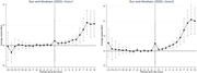
Figure 3 Sun and Abraham (2021) estimates. Source: Authors’ own work Two line graphs depict the average causal effect over periods since an event. The image contains two line graphs side by side. The left graph is titled 'Sun and Abraham (2020)-Innov1' and the right graph is titled 'Sun and ... More about this image found in Sun and Abraham (2021) estimates. Source: Authors’ own work Two line gr...

