

1-20 of 8486
Keywords: ORGANIZATIONAL CHANGE
Close
Follow your search
Access your saved searches in your account
Would you like to receive an alert when new items match your search?
Journal

Publishing work that contributes to the continuous improvement of health care organisations providing a forum for current thinking on the theoretical and practical aspects of quality and management in health care.
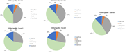
in Evaluating administrative service quality in public hospitals: a SERVPERF-based study in Portugal
> International Journal of Health Care Quality Assurance
Published: 21 September 2026
Figure 1 Overall service quality by location and by total sample. Source (s) : Authors’ own work Four pie charts showing service quality ratings across different locations and one pie chart showing global quality ratings across all locations. A pie chart titled ‘Global quality - Local 1' wit... More about this image found in Overall service quality by location and by total sample. Source (s) : Aut...
Journal Articles
Int J Health Care Qual Assur 1–15.
Published: 21 September 2026
Includes: Supplementary data
Journal Articles
Int J Health Care Qual Assur 1–15.
Published: 21 September 2026
Journal Articles
Int J Health Care Qual Assur 1–13.
Published: 14 September 2026
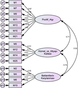
in Understanding international university students' perceptions of healthcare service quality: development and validation of a new scale
> International Journal of Health Care Quality Assurance
Published: 14 September 2026
Figure 1 Confirmatory factor analysis results. Source: Authors' own work A diagram representing a confirmatory factor analysis model with labeled components and their relationships. A diagram of a confirmatory factor analysis model. The model includes three main factors: Pozitif_Algı, Hizmet... More about this image found in Confirmatory factor analysis results. Source: Authors' own work A diag...
Journal Articles
Int J Health Care Qual Assur 1.
Published: 11 September 2026
Journal Articles
Int J Health Care Qual Assur 1–16.
Published: 11 September 2026
Journal Articles
Int J Health Care Qual Assur 1–22.
Published: 10 September 2026
Includes: Supplementary data
Journal Articles
Int J Health Care Qual Assur 1–10.
Published: 09 September 2026
Journal Articles
Int J Health Care Qual Assur 1–17.
Published: 08 September 2026
.... , Chênevert , D. and Jobin , M. (2021), “ The antecedents of physicians' behavioral support for lean in healthcare: the mediating role of commitment to organizational change ”, International Journal of Production Economics , Vol. 232 , pp. 1 - 15 , doi: 10.1016/j.ijpe.2020.107961 . Glisson...
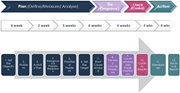
in A practical model for improving first-case on-time starts performance
> International Journal of Health Care Quality Assurance
Published: 08 September 2026
Figure 1 Improvement process overview – PDCA steps. Source (s) : Author’s own work A flowchart illustrating a 12-step continuous quality improvement process using the Lean Plan, Do, Check, Act (PDCA) cycle. A flowchart illustrating a 12-step continuous quality improvement process using the L... More about this image found in Improvement process overview – PDCA steps. Source (s) : Author’s own work...
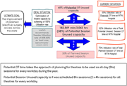
in A practical model for improving first-case on-time starts performance
> International Journal of Health Care Quality Assurance
Published: 08 September 2026
Figure 2 OT utilisation rate at Williamstown Hospital (based on 1 May 2022 to 30 April 2023 data). Source (s) : Author’s own work A diagram illustrating the utilization rate of operating theatres at Williamstown Hospital. The diagram presents an analysis of the utilization rate of operating ... More about this image found in OT utilisation rate at Williamstown Hospital (based on 1 May 2022 to 30 Apr...
in A practical model for improving first-case on-time starts performance
> International Journal of Health Care Quality Assurance
Published: 08 September 2026
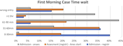
Figure 3 Admission-to-anaesthesia wait time analysis. Source (s) : Author’s own work A bar graph showing the distribution of waiting times for first morning cases from admission to the start of anaesthesia. A horizontal bar graph compares the waiting times for first morning cases from admiss... More about this image found in Admission-to-anaesthesia wait time analysis. Source (s) : Author’s own wo...
in A practical model for improving first-case on-time starts performance
> International Journal of Health Care Quality Assurance
Published: 08 September 2026
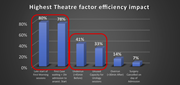
Figure 4 Summary of the overall problem identification. Source (s) : Author’s own work A bar graph showing the highest theatre factor efficiency impact. The bar graph compares various factors affecting theatre efficiency, with vertical bars representing the percentage impact of each factor. ... More about this image found in Summary of the overall problem identification. Source (s) : Author’s own ...
in A practical model for improving first-case on-time starts performance
> International Journal of Health Care Quality Assurance
Published: 08 September 2026
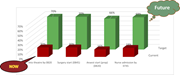
Figure 5 Key performance indicators (KPIs) identified to measure this study objective. Source (s) : Author’s own work A bar graph comparing current and target percentages for various identified surgical Key Performance Indicators (KPIs). A bar graph compares current and target percentages fo... More about this image found in Key performance indicators (KPIs) identified to measure this study objectiv...
in A practical model for improving first-case on-time starts performance
> International Journal of Health Care Quality Assurance
Published: 08 September 2026
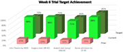
Figure 6 Week six trial outcome report. Source (s) : Author’s own work A bar graph showing week six trial target achievement for various surgical metrics (idetified KPIs). The bar graph compares the target, current, and prior achievement percentages for four surgical metrics: Into Theatre by... More about this image found in Week six trial outcome report. Source (s) : Author’s own work A bar gr...
in A practical model for improving first-case on-time starts performance
> International Journal of Health Care Quality Assurance
Published: 08 September 2026
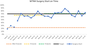
Figure 7 AM surgery start reporting after 20 months of change implementation. Source (s) : Author’s own work A line graph showing the percentage of on-time surgery starts over a period from August 2023 to June 2025. A line graph titled WTN Surgery Start on Time. The horizontal axis represent... More about this image found in AM surgery start reporting after 20 months of change implementation. Sourc...
Journal Articles
Int J Health Care Qual Assur 1–13.
Published: 07 September 2026
Includes: Supplementary data
in Pet-related barriers to healthcare and pet attachment in patients presenting to the emergency department
> International Journal of Health Care Quality Assurance
Published: 07 September 2026
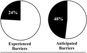
Figure 1 Two pie charts showing experienced and anticipated barriers. A pie chart titled 'Experienced Barriers' with two segments. One segment is labeled '24 percent' and occupies approximately one-quarter of the chart. The other segment is unlabeled and occupies the remaining three-quarters o... More about this image found in Two pie charts showing experienced and anticipated barriers. A pie chart t...

