
1-20 of 3922
Keywords: VIKOR
Close
Follow your search
Access your saved searches in your account
Would you like to receive an alert when new items match your search?
Journal

Publishes research to contribute to the improvement of management practices within societies and businesses worldwide.
Journal Articles
Journal of Advances in Management Research 1–27.
Published: 05 October 2026

in Analysing the influence of dynamic capabilities on sustainable performance of women-led micro-enterprises: insights from entrepreneurial, technological and sustainability orientation
> Journal of Advances in Management Research
Published: 05 October 2026
Figure 1 Key aspects of sustainable business performance. Source: Author's own creation A Venn diagram illustrating key aspects of sustainable business performance. A Venn diagram illustrating key aspects of sustainable business performance. The diagram consists of three overlapping circles, e... More about this image found in Key aspects of sustainable business performance. Source: Author's own creat...

in Analysing the influence of dynamic capabilities on sustainable performance of women-led micro-enterprises: insights from entrepreneurial, technological and sustainability orientation
> Journal of Advances in Management Research
Published: 05 October 2026
Figure 2 Proposed conceptual framework. Source: Author's own creation A diagram of a conceptual framework showing relationships between entrepreneurial orientation, technology orientation, sustainability orientation, dynamic capabilities, and sustainable business performance. The diagram illus... More about this image found in Proposed conceptual framework. Source: Author's own creation A diagram o...

in Analysing the influence of dynamic capabilities on sustainable performance of women-led micro-enterprises: insights from entrepreneurial, technological and sustainability orientation
> Journal of Advances in Management Research
Published: 05 October 2026
Figure 3 Methodological flow chart. Source: Author's own creation A flowchart illustrating the stages of a research study. A flowchart illustrating the stages of a research study. The process begins with an introduction, which includes the background of the study and research gaps and objectiv... More about this image found in Methodological flow chart. Source: Author's own creation A flowchart ill...

in Analysing the influence of dynamic capabilities on sustainable performance of women-led micro-enterprises: insights from entrepreneurial, technological and sustainability orientation
> Journal of Advances in Management Research
Published: 05 October 2026
Figure 4 Measurement model. Source: Author’s own creation A diagram of a measurement model showing relationships between unobservable variables and observed indicators. The diagram illustrates a measurement model used in structural equation modeling (SEM). It shows the relationships between un... More about this image found in Measurement model. Source: Author’s own creation A diagram of a measurem...

in Analysing the influence of dynamic capabilities on sustainable performance of women-led micro-enterprises: insights from entrepreneurial, technological and sustainability orientation
> Journal of Advances in Management Research
Published: 05 October 2026
Figure 5 Structural model. Source: Author’s own creation A structural model diagram showing relationships between different variables. A structural model diagram illustrating the relationships between various variables. The diagram includes four main variables: EO, TO, SO, and DC, which are co... More about this image found in Structural model. Source: Author’s own creation A structural model diagr...
Journal Articles
Journal of Advances in Management Research 1–28.
Published: 15 September 2026

in The issue of organizational agility: mapping past, present and future landscape
> Journal of Advances in Management Research
Published: 15 September 2026
Figure 1 Three-pronged approach to address objectives of research. Source: Authors' own work A diagram illustrating a three-pronged approach to address research objectives on open access. A diagram illustrating a three-pronged approach to address research objectives on open access. The diagram... More about this image found in Three-pronged approach to address objectives of research. Source: Authors' ...

in The issue of organizational agility: mapping past, present and future landscape
> Journal of Advances in Management Research
Published: 15 September 2026
Figure 2 Systematic search strategy flow diagram. Source: Authors' own work A flowchart illustrating the systematic search strategy for a study on organizational agility. The flowchart begins with a search for studies on Scopus using specific keywords related to organizational agility, excludi... More about this image found in Systematic search strategy flow diagram. Source: Authors' own work A flo...

in The issue of organizational agility: mapping past, present and future landscape
> Journal of Advances in Management Research
Published: 15 September 2026
Figure 3 Evolutionary Mapping of the concept of Agility. Source: Authors' own work A timeline of the evolution of the concept of agility from the 1980s to 2023. A timeline of the evolution of the concept of agility from the 1980s to 2023. The timeline begins in the 1980s with Jack Welch puttin... More about this image found in Evolutionary Mapping of the concept of Agility. Source: Authors' own work ...

in The issue of organizational agility: mapping past, present and future landscape
> Journal of Advances in Management Research
Published: 15 September 2026
Figure 4 Number of articles published year-wise. Source: Authors' own work A line graph showing the number of articles published year-wise from 1995 to 2025. A line graph titled ‘Year-wise analysis’ displays the number of articles published each year from 1995 to 2022. The horizontal axis repr... More about this image found in Number of articles published year-wise. Source: Authors' own work A line...

in The issue of organizational agility: mapping past, present and future landscape
> Journal of Advances in Management Research
Published: 15 September 2026
Figure 5 Most cited and productive journals. Source: Authors' own work A bar and line graph showing the top 30 influential journals based on citations and the number of documents. A bar and line graph compares the top 30 influential journals based on the total number of citations and the numbe... More about this image found in Most cited and productive journals. Source: Authors' own work A bar and ...

in The issue of organizational agility: mapping past, present and future landscape
> Journal of Advances in Management Research
Published: 15 September 2026
Figure 6 Cluster map from co-citation analysis. Source: Authors' own work A network map showing four clusters of co-citation analysis. The image presents a network map generated using VOSviewer for co-citation analysis. The map is divided into four major clusters, each represented by a differe... More about this image found in Cluster map from co-citation analysis. Source: Authors' own work A netwo...

in The issue of organizational agility: mapping past, present and future landscape
> Journal of Advances in Management Research
Published: 15 September 2026
Figure 7 Keyword co-occurrence network of OA literature. Source: Authors' own work A network diagram showing the co-occurrence of keywords in organizational agility research. A network diagram visualizing the co-occurrence of keywords in organizational agility research. Each node represents a ... More about this image found in Keyword co-occurrence network of OA literature. Source: Authors' own work ...

in The issue of organizational agility: mapping past, present and future landscape
> Journal of Advances in Management Research
Published: 15 September 2026
Figure 8 Co-authorship network analysis. Source: Authors' own work A co-authorship network map with authors as nodes and collaboration links. A co-authorship network map generated using VOSviewer displays authors as nodes and collaboration links between them. The strength of the links indicate... More about this image found in Co-authorship network analysis. Source: Authors' own work A co-authorshi...

in The issue of organizational agility: mapping past, present and future landscape
> Journal of Advances in Management Research
Published: 15 September 2026
Figure 9 OA framework for crisis management. Source: Authors' own work A diagram of the organizational agility framework for crisis management. The diagram illustrates the organizational agility framework for crisis management. It starts with value creating business practices resulting in orga... More about this image found in OA framework for crisis management. Source: Authors' own work A diagram ...
Journal Articles
Journal of Advances in Management Research 1–39.
Published: 25 June 2026
... , G. (2015), “ Evaluating suppliers to include green supplier development programs via fuzzy C-Means and VIKOR methods ”, Computers and Industrial Engineering , Vol. 86 , pp. 69 - 82 , doi: 10.1016/j.cie.2014.10.013 . Albanese , A. , Nardello , M. and Brunelli , D. (2021...
in A human-centric generative AI framework using fuzzy multi-criteria analysis and machine learning for sustainable agroecology supply chain under Industry 5.0
> Journal of Advances in Management Research
Published: 25 June 2026
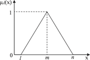
Figure 1 A triangular fuzzy number A triangular fuzzy number graph. A line graph representing a triangular fuzzy number. The x-axis is labeled with the variable x and the y-axis is labeled with the function mu I of x. The graph forms a triangle with vertices at points l, m, and n on the x-axis... More about this image found in A triangular fuzzy number A triangular fuzzy number graph. A line graph...
in A human-centric generative AI framework using fuzzy multi-criteria analysis and machine learning for sustainable agroecology supply chain under Industry 5.0
> Journal of Advances in Management Research
Published: 25 June 2026
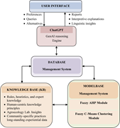
Figure 2 Integrated conceptual DSS model for organic farming alternatives incorporating ChatGPT for human-centric decision support A diagram of an integrated conceptual decision support system model for organic farming alternatives. The diagram illustrates an integrated conceptual decision sup... More about this image found in Integrated conceptual DSS model for organic farming alternatives incorporat...

