
1-20 of 3532
Follow your search
Access your saved searches in your account
Would you like to receive an alert when new items match your search?
Journal

Covers the fields of finance and economics with focus on financial institutions financial policy control issues for firms central bank policy risk and uncertainty.
Journal Articles
Journal:
Journal of Financial Economic Policy
Journal of Financial Economic Policy 1–15.
Published: 11 September 2026
Includes: Supplementary data
in Empowering MENA’s future: how financial inclusion bridges the aging population and economic growth from public good theory
> Journal of Financial Economic Policy
Published: 19 August 2026
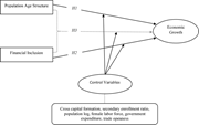
Figure 1. Theoretical framework Source: Authors’ own creation A conceptual model links population age structure and financial inclusion to economic growth through H 1, H 2 and H 3, with control variables. Population age structure connects directly to economic growth through H 1. Financial i... More about this image found in Theoretical framework Source: Authors’ own creation A conceptual mode...
Journal Articles
Journal:
Journal of Financial Economic Policy
Journal of Financial Economic Policy 1–23.
Published: 19 August 2026
Journal Articles
Journal:
Journal of Financial Economic Policy
Journal of Financial Economic Policy 1–35.
Published: 17 August 2026
Journal Articles
Journal:
Journal of Financial Economic Policy
Journal of Financial Economic Policy 1–21.
Published: 17 August 2026
in The long road ahead: sovereign wealth funds and the challenge of economic diversification in the GCC countries
> Journal of Financial Economic Policy
Published: 17 August 2026
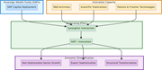
Figure 1. Transmission mechanism: the moderating role of innovation in SWF-driven economic diversification Source: Authors’ own work A flow diagram shows sovereign wealth fund capital and innovation capacity combining to support economic diversification. The flow begins with sovereign wealt... More about this image found in Transmission mechanism: the moderating role of innovation in SWF-driven eco...
in Who holds, who harms? The effect of creditor composition on Tanzania’s financial stability
> Journal of Financial Economic Policy
Published: 17 August 2026
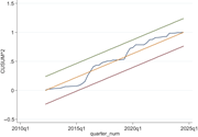
Figure 1. Plot of the CUSUM test A line graph shows CUSUM squared increasing from about 0 to 1 across quarters from 2012 to 2024. The horizontal axis covers quarters from about 2012 to 2024, and the vertical axis ranges from negative 0.5 to 1.5. The irregular line rises from 0 to about 0.08 ... More about this image found in Plot of the CUSUM test A line graph shows CUSUM squared increasing fro...
in Does innovation credit reduce informal finance? Evidence from China
> Journal of Financial Economic Policy
Published: 14 August 2026
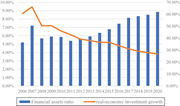
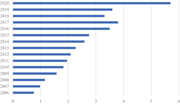
Figure 1. Trend of financialization in China (%) Note: According to Shi & Fang (2023) , financial assets ratio = (trading financial assets + held-to-maturity investments + available-for-sale financial assets + investment properties + long-term equity investments)/total assets; Real-economy... More about this image found in Trend of financialization in China (%) Note: According to Shi & Fan...
in Does innovation credit reduce informal finance? Evidence from China
> Journal of Financial Economic Policy
Published: 14 August 2026
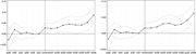
Figure 2. The average scale of firm’s trade credit reallocation (1 billion RMB ) Note: Total amount of enterprise trade credit reallocation = accounts receivable + notes receivable + advances – accounts payable – notes payable – advances received; average value = enterprise trade credit reallo... More about this image found in The average scale of firm’s trade credit reallocation (1 billion RMB ) N...

in Does innovation credit reduce informal finance? Evidence from China
> Journal of Financial Economic Policy
Published: 14 August 2026
Figure 3. Conceptual framework Source: Author’s own work A conceptual model links directed credit eligibility to research and development adjustments and liquidity reallocation, moderated by competition and political connections. The model begins with directed credit eligibility based on ob... More about this image found in Conceptual framework Source: Author’s own work A conceptual model lin...
in Does innovation credit reduce informal finance? Evidence from China
> Journal of Financial Economic Policy
Published: 14 August 2026
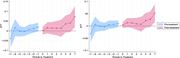
Figure 4. Estimated event-time effects Source: Author’s own work A two-panel event-study chart tracks estimates from 6 periods before to 8 periods after the current period, with generally increasing post-event values. The horizontal axis in Panel A and Panel B runs from pre 6 through pre 1,... More about this image found in Estimated event-time effects Source: Author’s own work A two-panel ev...
in Does innovation credit reduce informal finance? Evidence from China
> Journal of Financial Economic Policy
Published: 14 August 2026
Figure 5. Event-study estimates from c s d i d : N T C _ C O S T vs N T C _ I N C O M E Source: Author’s own work A two-panel event-study chart compares average treatment effects before and after treatment across periods negative 7 to 7. The horizontal a... More about this image found in Event-study estimates from c s d i d : N T C _ C O S T ...
in Does innovation credit reduce informal finance? Evidence from China
> Journal of Financial Economic Policy
Published: 14 August 2026
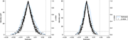
Figure 6. Simulations results Source: Author’s own work A two-panel density plot compares estimator distributions and p values, with both estimator curves peaking near 0. The horizontal axis in both panels represents the estimator from negative 0.03 to 0.03. The left vertical axis represent... More about this image found in Simulations results Source: Author’s own work A two-panel density plo...
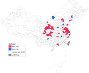
in Does innovation credit reduce informal finance? Evidence from China
> Journal of Financial Economic Policy
Published: 14 August 2026
Figure A1. Pilot cities of “Promote Sci-Tech and Finance Integration” policy Source: Author’s own work A map of China marks pilot cities by start year, with 41 cities in 2011 and 9 cities in 2016. The map outlines provincial and city boundaries across China. Pilot cities starting in 2011 cl... More about this image found in Pilot cities of “Promote Sci-Tech and Finance Integration” policy Source:...
Journal Articles
Journal:
Journal of Financial Economic Policy
Journal of Financial Economic Policy 1–24.
Published: 14 August 2026
Journal Articles
Journal:
Journal of Financial Economic Policy
Journal of Financial Economic Policy 1–20.
Published: 13 August 2026
Journal Articles
Journal:
Journal of Financial Economic Policy
Journal of Financial Economic Policy (2026) 18 (5): 880.
Published: 21 July 2026
Journal Articles
Journal:
Journal of Financial Economic Policy
Journal of Financial Economic Policy 1–25.
Published: 16 July 2026

in Determinants of financial inclusion in Afghanistan: a micro-level probit analysis
> Journal of Financial Economic Policy
Published: 29 June 2026
Figure 1. Conceptual framework A flow diagram showing the relationship between determinants and financial inclusion indicators. The flow diagram contains determinants linked to financial inclusion indicators. Determinants include gender, age, education, income, employment, and location, urban ... More about this image found in Conceptual framework A flow diagram showing the relationship between det...

