
1-20 of 2337
Keywords: LIBOR
Close
Follow your search
Access your saved searches in your account
Would you like to receive an alert when new items match your search?
Journal

Provides an international platform for theoretical and practical developments relating to financial management of property and construction.
in Impact of transportation on the property market at the national level: case of the USA
> Journal of Financial Management of Property and Construction
Published: 25 August 2026
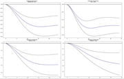
Figure 1. The normalized long-term response of HVI toward past escalation of AIRRPMTSI (upper left), VMT (upper right), RAILPM (lower left) and TRANSIT (lower right) Source: Authors’ own work A collection of four impulse response graphs arranged in a two-by-two grid, each showing diffe... More about this image found in The normalized long-term response of HVI toward past escalation of AIRRPM...
in Impact of transportation on the property market at the national level: case of the USA
> Journal of Financial Management of Property and Construction
Published: 25 August 2026
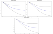
Figure 2. The normalized long-term response of HVI toward past escalation of PRTRANSCON (upper left), PBTRANSCON (upper right) and total transportation construction spending (lower) Source: Authors’ own work Three impulse response graphs showing relationships between variables, with each g... More about this image found in The normalized long-term response of HVI toward past escalation of PRTRAN...
in Impact of transportation on the property market at the national level: case of the USA
> Journal of Financial Management of Property and Construction
Published: 25 August 2026
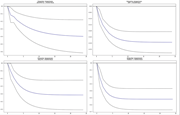
Figure 3. The normalized long-term response of PERMITNSA toward past escalation of AIRRPMTSI (upper left), VMT (upper right), RAILPM (lower left) and TRANSIT (lower right) Source: Authors’ own work Four impulse response plots showing relationships between different variables. Each plot e... More about this image found in The normalized long-term response of PERMITNSA toward past escalation of AI...
in Impact of transportation on the property market at the national level: case of the USA
> Journal of Financial Management of Property and Construction
Published: 25 August 2026
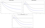
Figure 4. The normalized long-term response of PERMITNSA toward past escalation of PRTRANSCON (upper left), PBTRANSCON (upper right) and total transportation construction spending (lower) Source: Authors’ own work Three impulse response graphs displaying the relationship between various fina... More about this image found in The normalized long-term response of PERMITNSA toward past escalation of PR...
in Impact of transportation on the property market at the national level: case of the USA
> Journal of Financial Management of Property and Construction
Published: 25 August 2026
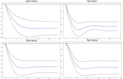
Figure 5. The normalized long-term response of PRRESCON toward past escalation of AIRRPMTSI (upper left), VMT (upper right), RAILPM (lower left) and TRANSIT (lower right) Source: Authors’ own work Four graphs illustrate impulse responses (AIRPMTSI, RALPM, WTI, and TRANSIT) to prescon ove... More about this image found in The normalized long-term response of PRRESCON toward past escalation of AIR...
in Impact of transportation on the property market at the national level: case of the USA
> Journal of Financial Management of Property and Construction
Published: 25 August 2026
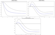
Figure 6. The normalized long-term response of PRRESCON toward past escalation of PRTRANSCON (upper left), PBTRANSCON (upper right) and total transportation construction spending (lower) Source: Authors’ own work Three plots illustrate impulse responses related to construction spending and a... More about this image found in The normalized long-term response of PRRESCON toward past escalation of PRT...
in Impact of transportation on the property market at the national level: case of the USA
> Journal of Financial Management of Property and Construction
Published: 25 August 2026
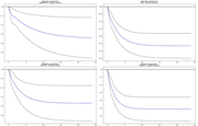
Figure 7. The normalized long-term response of market hotness toward past escalation of AIRRPMTSI (upper left), VMT (upper right), RAILPM (lower left) and TRANSIT (lower right) Source: Authors’ own work Four graphs illustrate impulse responses labeled by market hotness for AIRPMTSI, RAIL... More about this image found in The normalized long-term response of market hotness toward past escalation ...
in Impact of transportation on the property market at the national level: case of the USA
> Journal of Financial Management of Property and Construction
Published: 25 August 2026
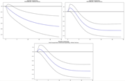
Figure 8. The normalized long-term response of market hotness toward past escalation of PRTRANSCON (upper left), PBTRANSCON (upper right) and total transportation construction spending (lower) Source: Authors’ own work Three impulse response graphs illustrating market hotness related to diff... More about this image found in The normalized long-term response of market hotness toward past escalation ...
in Impact of transportation on the property market at the national level: case of the USA
> Journal of Financial Management of Property and Construction
Published: 25 August 2026
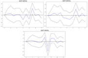
Figure 9. The normalized response of PERMIT1NSA (upper left), PERMIT24NSA (upper right) and PERMIT5NSA (lower) toward impulse of TRANSIT Source: Authors’ own work Three graphs illustrating impulse responses titled "TRANSIT - PERMITSNSA". The top two graphs show varied responses, while the bo... More about this image found in The normalized response of PERMIT1NSA (upper left), PERMIT24NSA (upper righ...
Journal Articles
Journal of Financial Management of Property and Construction 1–24.
Published: 25 August 2026
in Financing model for prefabricated building supply chain under the blockchain environment
> Journal of Financial Management of Property and Construction
Published: 23 February 2026
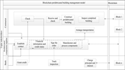
Figure 1. Structure of the blockchain financing model for the prefabricated building supply chain Note(s): The dashed arrows in the diagram indicate that the operation or transaction has been validated by all participants in the supply chain and marked by a timestamp; the contractor will check ... More about this image found in Structure of the blockchain financing model for the prefabricated building ...
in Financing model for prefabricated building supply chain under the blockchain environment
> Journal of Financial Management of Property and Construction
Published: 23 February 2026
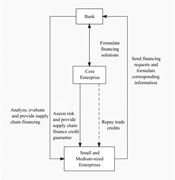
Figure 2. The blockchain financing processes linking the triple stakeholders of the prefabricated building supply chain Note(s): The solid line denotes actual work and the dotted line is cooperative work Source : Authors’ own work A process flow diagram presents interactions among a bank, ... More about this image found in The blockchain financing processes linking the triple stakeholders of the p...
in Financing model for prefabricated building supply chain under the blockchain environment
> Journal of Financial Management of Property and Construction
Published: 23 February 2026
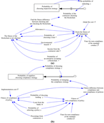
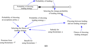
Figure 3. System dynamics ( SD ) simulation model of the evolutionary gaming system of the prefabricated building supply chain in blockchain mode: (a) contractor; (b) prefabricated components suppliers; and (c) bank Source : Authors’ own work A multi-part causal loop diagram presents probabil... More about this image found in System dynamics ( SD ) simulation model of the evolutionary gaming system o...
in Financing model for prefabricated building supply chain under the blockchain environment
> Journal of Financial Management of Property and Construction
Published: 23 February 2026
Figure 3. Continued A multi-part causal loop diagram presents probabilities, fitness values, costs, benefits, and penalties related to inspection, compliance, and lending strategies involving blockchain. The diagram presents three labelled sections, a, b, and c, composed of interconnected text... More about this image found in Continued A multi-part causal loop diagram presents probabilities, fitne...
in Financing model for prefabricated building supply chain under the blockchain environment
> Journal of Financial Management of Property and Construction
Published: 23 February 2026
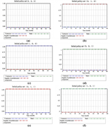
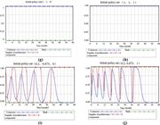
Figure 4. The three-way evolutionary game path with different initial policy sets (I): (a) at (0, 0, 0); (b) at (0, 1, 0); (c) at (1, 0, 0); (d) at (0, 0, 1); (e) at (0, 1, 1); (f) at (1, 0, 1); (g) at (1, 1, 0); (h) at (1, 1, 1); (i) at (0.2, 0.875, 0) and (j) at (0.2, 0.875, 1) Source : Author... More about this image found in The three-way evolutionary game path with different initial policy sets (I)...
in Financing model for prefabricated building supply chain under the blockchain environment
> Journal of Financial Management of Property and Construction
Published: 23 February 2026
Figure 4. Continued Four time series charts present strategy selection probabilities for a contractor, a prefabricated components supplier, and a bank under different initial policy sets over time. The charts labelled e, f, g, and h present strategy selection probabilities over time, measured ... More about this image found in Continued Four time series charts present strategy selection probabiliti...
in Financing model for prefabricated building supply chain under the blockchain environment
> Journal of Financial Management of Property and Construction
Published: 23 February 2026
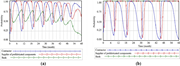
Figure 5. The three-way evolutionary game path ( II ): (a) lowering the probability of the bank choosing the lending strategy from 1 to 0.8 and (b) lowering the probability of the suppliers choosing the compliance strategy from 0.875 to 0.775 Source : Authors’ own work Two time series charts ... More about this image found in The three-way evolutionary game path ( II ): (a) lowering the probability o...
in Financing model for prefabricated building supply chain under the blockchain environment
> Journal of Financial Management of Property and Construction
Published: 23 February 2026
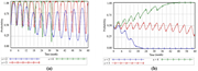
Figure 6. Impact of changing the contractor’s revenue (n) on the system game under the conventional scenario: (a) prefabricated components suppliers and (b) bank Source : Authors’ own work Two time series charts present probability values for three cases labelled n equals two, n equals three, and n equals four across time in months. The charts labelled a and b present probability on the vertical axis from zero point zero zero to one point zero zero and time on the horizontal axis from zero to sixty months. In chart a, three continuous curves labelled n equals two, n equals three, and n equals four fluctuate repeatedly across the probability range over the full-time span, with numeric markers placed along each curve at regular intervals. In chart b, three curves labelled n equals two, n equals three, and n equals four follow different trajectories, where one curve declines towards zero, one oscillates around mid-range values, and one increases towards one, with numeric markers placed along each curve. Legends below each chart identify the three cases using the labels n equals two, n equals three, and n equals four. More about this image found in Impact of changing the contractor’s revenue (n) on the sys...
in Financing model for prefabricated building supply chain under the blockchain environment
> Journal of Financial Management of Property and Construction
Published: 23 February 2026
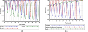
Figure 7. Impact of changing the subsidy (k) on the system game under the conventional scenario: (a) prefabricated components suppliers and (b) bank Source : Authors’ own work Two time series charts present probability changes over time for different parameter values and stakeholder roles measured across sixty months. The charts labelled a and b present probability on the vertical axis from zero point zero zero to one point zero zero and time on the horizontal axis from zero to sixty months. In chart a, three continuous curves correspond to parameter values k equals zero point two five, k equals zero point three five, and k equals zero point one five, with repeated oscillations across the probability range and numeric markers placed along each curve at regular intervals. In chart b, three curves represent the contractor, supplier of prefabricated components, and bank, each varying over time with repeated rises and declines and numeric markers along the curves. Legends beneath the charts identify the parameter values in chart a and the three stakeholders in chart b. More about this image found in Impact of changing the subsidy (k) on the system game unde...

