1-20 of 20674
Keywords: ORGANISATIONS
Close
Follow your search
Access your saved searches in your account
Would you like to receive an alert when new items match your search?
Journal

Essential reading on the design and construction of civil engineering structures and its associated applied research.
Journal Articles
Proceedings of the Institution of Civil Engineers - Structures and Buildings 1–21.
Published: 26 August 2026
in Data-driven design of elevated subway station constrained by transient thermal comfort
> Proceedings of the Institution of Civil Engineers - Structures and Buildings
Published: 26 August 2026
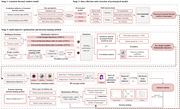
Figure 1. Flow chart of research methodology (SPSS, Statistical Package for the Social Sciences; BP, back-propagation; RMSE, root mean squared error; NSGA-II, non-dominated sorting genetic algorithm II ) A flowchart outlines a three stage framework for modelling, optimising, and validating tr... More about this image found in Flow chart of research methodology (SPSS, Statistical Package for the Socia...
in Data-driven design of elevated subway station constrained by transient thermal comfort
> Proceedings of the Institution of Civil Engineers - Structures and Buildings
Published: 26 August 2026
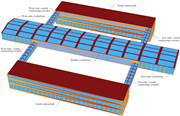
Figure 2. Geometric model of the typical elevated subway station building A three-dimensional station model identifies two station halls, a platform, and four connecting corridors. The model identifies the North station hall and South station hall, with the platform extending between them. The... More about this image found in Geometric model of the typical elevated subway station building A three-...
in Data-driven design of elevated subway station constrained by transient thermal comfort
> Proceedings of the Institution of Civil Engineers - Structures and Buildings
Published: 26 August 2026
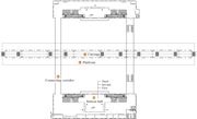
Figure 3. Distribution of measurement points in a typical elevated subway station building A station plan identifies measurement areas in the station hall, connecting corridor, platform, and carriage. The plan marks four measurement areas. Area 1 covers the station hall and indicates the first... More about this image found in Distribution of measurement points in a typical elevated subway station bui...
in Data-driven design of elevated subway station constrained by transient thermal comfort
> Proceedings of the Institution of Civil Engineers - Structures and Buildings
Published: 26 August 2026
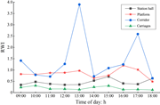
Figure 4. Hourly variation in the relative warmth index ( RWI ) for the various spaces of the elevated subway station building A line graph compares R W I in the station hall, platform, corridor, and carriages from 09:00 to 18:00 hours. The graph plots Relative Warmth Index, R W I, against tim... More about this image found in Hourly variation in the relative warmth index ( RWI ) for the various space...
in Data-driven design of elevated subway station constrained by transient thermal comfort
> Proceedings of the Institution of Civil Engineers - Structures and Buildings
Published: 26 August 2026
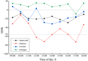
Figure 5. Hourly variation in the heat dissipation rate ( HDR ) for the various spaces of the elevated subway station building A line graph compares H D R in the station hall, platform, corridor, and carriages from 09:00 to 18:00 hours. The graph plots Heat Dissipation Rate, H D R, against tim... More about this image found in Hourly variation in the heat dissipation rate ( HDR ) for the various space...
in Data-driven design of elevated subway station constrained by transient thermal comfort
> Proceedings of the Institution of Civil Engineers - Structures and Buildings
Published: 26 August 2026
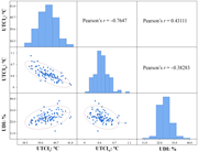
Figure 6. Correlation matrix diagram of the optimisation objective ( UTCI s, universal thermal climate index in summer; UTCI w, universal thermal climate index in winter; UDI, useful daylight illuminance) A correlation matrix compares U T C I s, U T C I w, and U D I using histograms, scatter plots, and Pearson correlation coefficients. The correlation matrix compares U T C I s, U T C I w, and U D I. Histograms on the diagonal show the distributions of each variable. The lower-left panels contain scatter plots with fitted ellipses. The scatter plot between U T C I s and U T C I w shows a negative relationship, while the corresponding upper panel reports Pearson's r equals negative 0.7647. The scatter plot between U T C I s and U D I shows a positive relationship, with Pearson's r equals 0.43111. The scatter plot between U T C I w and U D I shows a weaker negative relationship, with Pearson's r equals negative 0.38283. Axis ranges include approximately 38.5 to 41.8 degrees Celsius for U T C I s, 0 to 1.1 degrees Celsius for U T C I w, and 11 to 44 per cent for U D I. More about this image found in Correlation matrix diagram of the optimisation objective ( UTCI s...
in Data-driven design of elevated subway station constrained by transient thermal comfort
> Proceedings of the Institution of Civil Engineers - Structures and Buildings
Published: 26 August 2026
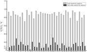
Figure 7. Total and first-order sensitivity analysis of universal thermal climate index in summer ( UTCI s) A grouped bar chart compares total and first-order sensitivity analysis values for 34 design variables. The grouped bar chart compares total sensitivity analysis and first-order sensitivity analysis for design variables n 1 through n 34. The vertical axis represents U T C I s in degrees Celsius and ranges from 0 to 1.2. Each design variable contains a light bar for total sensitivity analysis and a dark bar for first-order sensitivity analysis. Total sensitivity values remain consistently high, generally between about 0.7 and 1.0 across all variables. First-order sensitivity values are much lower and vary between about 0 and 0.3. Dashed horizontal reference lines mark sensitivity thresholds at 0.05 and 0.1. Variables including n 4, n 9, n 11, n 20, n 21, n 24, n 29, n 30, and n 33 have first-order sensitivity values above 0.1, while the remaining variables are at or below the threshold. More about this image found in Total and first-order sensitivity analysis of universal thermal climate ind...
in Data-driven design of elevated subway station constrained by transient thermal comfort
> Proceedings of the Institution of Civil Engineers - Structures and Buildings
Published: 26 August 2026
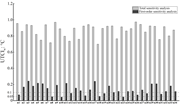
Figure 8. Total and first-order sensitivity analysis of universal thermal climate index in winter ( UTCI w) A grouped bar chart compares total and first-order sensitivity analysis of U T C I w for 34 design variables. The grouped bar chart compares total sensitivity analysis and first-order sensitivity analysis for design variables n 1 through n 34. The vertical axis represents U T C I w in degrees Celsius and ranges from 0 to 1.2. Each design variable contains a light bar for total sensitivity analysis and a dark bar for first-order sensitivity analysis. Total sensitivity values remain consistently high, generally between about 0.7 and 1.0 across all variables. First-order sensitivity values are considerably lower and vary between about 0 and 0.25. Dashed horizontal reference lines mark sensitivity thresholds at 0.05 and 0.1. Several variables, including n 2, n 3, n 4, n 5, n 6, n 7, n 9, n 11, n 13, n 14, n 16, n 17, n 20, n 24, n 25, n 29, n 30, n 32, n 33, and n 34, exceed the 0.1 threshold in first-order sensitivity, while the remaining variables are at or below the threshold. More about this image found in Total and first-order sensitivity analysis of universal thermal climate ind...
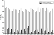
in Data-driven design of elevated subway station constrained by transient thermal comfort
> Proceedings of the Institution of Civil Engineers - Structures and Buildings
Published: 26 August 2026
Figure 9. Total and first-order sensitivity analysis of useful daylight illuminance ( UDI ) A grouped bar chart compares total and first-order sensitivity analysis of U D I for 34 design variables. The grouped bar chart compares total sensitivity analysis and first-order sensitivity analysis f... More about this image found in Total and first-order sensitivity analysis of useful daylight illuminance (...
in Data-driven design of elevated subway station constrained by transient thermal comfort
> Proceedings of the Institution of Civil Engineers - Structures and Buildings
Published: 26 August 2026
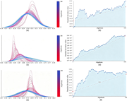
Figure 10. Standard deviation and standard deviation trendline. (a) Standard deviation of universal thermal climate index in summer ( UTCI s); (b) standard deviation trendline of UTCI s; (c) standard deviation of universal thermal climate index in winter ( UTCI w); (d) standard deviation trendline of UTCI w; (e) standard deviation of useful daylight illuminance ( UDI ); (f) standard deviation trendline of UDI Six plots compare algebraic distribution curves and standard deviation trends for three measured parameters. Panels a, c, and e plot multiple algebraic distribution curves with a vertical colour scale ranging from 0 to 100, while panels b, d, and f plot standard deviation value against Algebraic from 0 to 100 using blue markers and lines, a dashed linear reference line, and a shaded area beneath the curve. Panel a contains overlapping bell shaped distributions spanning approximately 42.26 to 42.34. Most curves peak near 42.30 to 42.31, while higher algebraic values produce broader curves and lower algebraic values produce narrower and taller peaks. Panel b begins near 0, rises rapidly to about 50, fluctuates between approximately 45 and 65 through the middle range, then gradually increases to about 70 before reaching approximately 100 at Algebraic 100. The dashed reference line rises steadily, and an angle of 11.58 degrees is marked. Panel c plots right skewed distributions spanning approximately 0.261 to 0.278. Lower algebraic values produce tall narrow peaks near 0.265, whereas higher algebraic values broaden and shift the curves towards approximately 0.270 to 0.274 with lower peak heights. The colour scale ranges from 4.37 times 10 to the negative 4 to 2.86 times 10 to the negative 3. Panel d starts near 0, increases gradually, reaches approximately 40 to 50 by the middle range, and then continues rising to nearly 100 at the highest algebraic value. The dashed reference line shows a steady increase, and an angle of 25.48 degrees is indicated. Panel e presents bell shaped distributions over approximately 6.39 to 68.45. Curves with lower algebraic values have tall narrow peaks centred near 42.6, whereas higher algebraic values become broader with lower peaks extending from about 30 to 55. Panel f begins near 0.39, decreases rapidly to approximately 0.18, then gradually approaches about 0.10 and fluctuates slightly before ending near 0.11. The dashed reference line increases across the plot, and an angle of 17.62 degrees is labelled. More about this image found in Standard deviation and standard deviation trendline. (a) Standard deviation...
in Data-driven design of elevated subway station constrained by transient thermal comfort
> Proceedings of the Institution of Civil Engineers - Structures and Buildings
Published: 26 August 2026
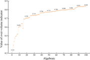
Figure 11. Hypervolume index A line graph shows the over-volume indicator increasing with Algebraic from 0.323 to 0.844. The graph plots the value of the over-volume indicator from 0.3 to 0.9 against Algebraic from 0 to 100. The value increases rapidly from 0.323 at Algebraic 1 to 0.605 near A... More about this image found in Hypervolume index A line graph shows the over-volume indicator increasin...

in Data-driven design of elevated subway station constrained by transient thermal comfort
> Proceedings of the Institution of Civil Engineers - Structures and Buildings
Published: 26 August 2026
Figure 12. Distribution diagram of non-dominated solution set ( UTCL s, UTCI in summer; UTCI w, universal thermal climate index in winter; UDI, useful daylight illuminance) A three-dimensional scatter plot compares U T C I s, U T C I w, and U D I values across multiple solutions. The three-dimensional scatter plot places U T C I s in degrees Celsius on one axis, U T C I w in degrees Celsius on another axis, and U D I in per cent on the vertical axis. U T C I s ranges from about negative 42.31 to negative 42.27 degrees Celsius. U T C I w ranges from about negative 0.274 to negative 0.266 degrees Celsius. U D I ranges from about negative 50 to negative 15 per cent. The points form a descending curved distribution. Values near U T C I s negative 42.31 degrees Celsius and U T C I w negative 0.266 to negative 0.269 degrees Celsius correspond to U D I values of about negative 15 to negative 30 per cent. As U T C I s increases towards negative 42.27 degrees Celsius and U T C I w decreases towards negative 0.274 degrees Celsius, U D I generally decreases towards about negative 50 per cent. More about this image found in Distribution diagram of non-dominated solution set ( UTCL s, UTC...
in Data-driven design of elevated subway station constrained by transient thermal comfort
> Proceedings of the Institution of Civil Engineers - Structures and Buildings
Published: 26 August 2026
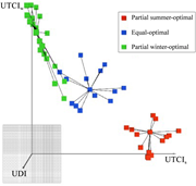
Figure 13. Distribution of the non-dominated solutions in the clustering space ( UTCL s, UTCI in summer; UTCL w, UTCI in winter; UDI, useful daylight illuminance) A three-dimensional clustering plot groups optimisation solutions into three decision categories. The plot presents three-dimensional clustering using U D I, U T C I w, and U T C I s as the three axes. Three groups of square markers are identified in the legend: Partial summer-optimal, Equal-optimal, and Partial winter-optimal. The Partial summer-optimal group forms a compact cluster near higher U T C I s values. The Equal-optimal group occupies the central region with several connected points radiating from a central node. The Partial winter-optimal group extends vertically near higher U T C I w values with connected branches. Black connecting lines link neighbouring points within each cluster to illustrate the clustering structure. More about this image found in Distribution of the non-dominated solutions in the clustering space ( UTCL ...
in Data-driven design of elevated subway station constrained by transient thermal comfort
> Proceedings of the Institution of Civil Engineers - Structures and Buildings
Published: 26 August 2026
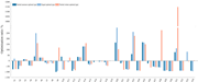
Figure 14. Optimisation ratio of design parameters corresponding to three types of clustering centres A grouped bar chart compares optimisation ratios of 34 design variables for three optimisation types. The grouped bar chart plots optimisation ratio in per cent on the vertical axis and design... More about this image found in Optimisation ratio of design parameters corresponding to three types of clu...
in Data-driven design of elevated subway station constrained by transient thermal comfort
> Proceedings of the Institution of Civil Engineers - Structures and Buildings
Published: 26 August 2026
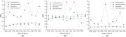
Figure 15. Comparison of the optimisation of passenger’s transient thermal comfort for each space in summer: (a) station halls, (b) platforms, (c) corridors (RWI, relative warmth index) Three line graphs compare measured and optimised R W I values throughout the day at three locations. The gra... More about this image found in Comparison of the optimisation of passenger’s transient thermal comfort for...
in Data-driven design of elevated subway station constrained by transient thermal comfort
> Proceedings of the Institution of Civil Engineers - Structures and Buildings
Published: 26 August 2026
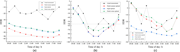
Figure 16. Comparison of the optimisation of passenger’s transient thermal comfort for each space in winter: (a) station halls, (b) platforms, (c) corridors (HDR, heat dissipation rate) Three line graphs compare measured and optimised H D R values from 09:00 to 18:00 hours. The graphs plot Hea... More about this image found in Comparison of the optimisation of passenger’s transient thermal comfort for...
Journal Articles
Proceedings of the Institution of Civil Engineers - Structures and Buildings 1–12.
Published: 25 August 2026
in Pseudo-static bearing capacity of skirted footings on sandy slopes using artificial neural network and random forest regression models
> Proceedings of the Institution of Civil Engineers - Structures and Buildings
Published: 25 August 2026
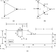
Figure 1. (a) The element and stress variables for the lower bound finite-element limit analysis ( FELA ); (b) the element and velocity variables for the upper bound FELA; (c) schematic representation of a model geometry for a footing resting on sloping ground (not to scale, all dimensions are in ... More about this image found in (a) The element and stress variables for the lower bound finite-element lim...