1-20 of 3625
Keywords: CO2-EOR
Close
Follow your search
Access your saved searches in your account
Would you like to receive an alert when new items match your search?
Journal

Covers the role of science and technology in the knowledge-based economy exploring how different economic agents can foster these activities.
Journal Articles
Journal of Science and Technology Policy Management 1–27.
Published: 17 August 2026
in Digital transformation in India’s payment system: analysing the evolution of unified payments interface ( UPI )
> Journal of Science and Technology Policy Management
Published: 17 August 2026
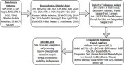
Figure 1. Overview of the research methodology Source: Created by authors A flowchart shows data selection, monthly data collection, statistical analysis, econometric modelling, and software used. The flow begins with data source selection from N P C I for U P I and U P I apps, R B I for A ... More about this image found in Overview of the research methodology Source: Created by authors A flo...
in Digital transformation in India’s payment system: analysing the evolution of unified payments interface ( UPI )
> Journal of Science and Technology Policy Management
Published: 17 August 2026
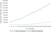
Figure 2. UPI transaction pre-COVID period vs post-COVID period Source: Created by authors A line graph compares pre-Covid and post-Covid transaction values across 45 months. The horizontal axis presents 45 months, while the vertical axis presents transaction value in rupees in crores fro... More about this image found in UPI transaction pre-COVID period vs post-COVID period Source: Created b...
in Digital transformation in India’s payment system: analysing the evolution of unified payments interface ( UPI )
> Journal of Science and Technology Policy Management
Published: 17 August 2026
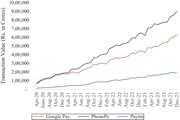
Figure 3. Performance of major UPI apps in India Source: Created by authors A line graph compares Google Pay, PhonePe, and Paytm transaction values from April 2020 to December 2023. The horizontal axis presents dates from April 2020 to December 2023, while the vertical axis presents trans... More about this image found in Performance of major UPI apps in India Source: Created by authors A...
in Digital transformation in India’s payment system: analysing the evolution of unified payments interface ( UPI )
> Journal of Science and Technology Policy Management
Published: 17 August 2026
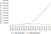
Figure 4. UPI transactions versus POS transaction in India Source: Created by authors A line graph compares U P I and P O S transaction values from July 2016 to November 2023. The horizontal axis presents dates from July 2016 to November 2023, while the vertical axis presents transactio... More about this image found in UPI transactions versus POS transaction in India Source: Created by a...
in Digital transformation in India’s payment system: analysing the evolution of unified payments interface ( UPI )
> Journal of Science and Technology Policy Management
Published: 17 August 2026
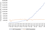
Figure 5. UPI transaction versus ATM transaction in India Source: Created by authors A line graph compares U P I and A T M transaction values from July 2016 to November 2023. The horizontal axis presents dates from July 2016 to November 2023, while the vertical axis presents transaction... More about this image found in UPI transaction versus ATM transaction in India Source: Created by au...
Journal Articles
Journal of Science and Technology Policy Management 1–36.
Published: 13 August 2026
in Construction 4.0 adoption: barriers, mitigation strategies and pathways to sustainable digital transformation
> Journal of Science and Technology Policy Management
Published: 13 August 2026
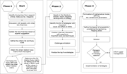
Figure 1. Framework of methodology Source: Authors’ own research Flowchart illustrating a three-phase strategy development process with specific tasks for each phase, concluding with a decision point for managers regarding strategy selection. The flowchart presents a three-phase process for... More about this image found in Framework of methodology Source: Authors’ own research Flowchart illu...
in Construction 4.0 adoption: barriers, mitigation strategies and pathways to sustainable digital transformation
> Journal of Science and Technology Policy Management
Published: 13 August 2026
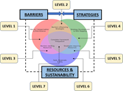
Figure 2. Barrier management framework Source: Authors’ own research A diagram showing interconnections between barriers, strategies, and resources for sustainability with labeled levels, influencing factors, and direction of flows. The image depicts a conceptual diagram illustrating the re... More about this image found in Barrier management framework Source: Authors’ own research A diagram ...
Journal Articles
Journal of Science and Technology Policy Management 1–13.
Published: 05 August 2026
Journal Articles
Journal of Science and Technology Policy Management 1–30.
Published: 30 July 2026
Journal Articles
Journal of Science and Technology Policy Management (2026) 17 (8): 1677–1680.
Published: 30 July 2026
in The impact of IT adoption during a pandemic on multinational enterprise performance: evidence from Indonesia
> Journal of Science and Technology Policy Management
Published: 30 July 2026
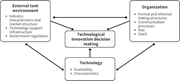
Figure 1. Technology Organisation Environment Framework ( Tornatzky and Fleischer, 1990 ) A conceptual diagram links external task environment, organisation, and technology with technological innovation decision making. The external task environment includes industry characteristics and market... More about this image found in Technology Organisation Environment Framework ( Tornatzky and Fleischer, 19...
in The impact of IT adoption during a pandemic on multinational enterprise performance: evidence from Indonesia
> Journal of Science and Technology Policy Management
Published: 30 July 2026
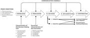
Figure 2. Diffusion of Innovation Theory – IDPM ( Rogers, 1995 ) A flowchart traces innovation adoption through knowledge, persuasion, decision, implementation, and confirmation. The process begins with prior conditions, including previous practice, felt needs or problems, innovativeness, an... More about this image found in Diffusion of Innovation Theory – IDPM ( Rogers, 1995 ) A flowchart tra...
in The impact of IT adoption during a pandemic on multinational enterprise performance: evidence from Indonesia
> Journal of Science and Technology Policy Management
Published: 30 July 2026
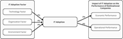
Figure 3. Conceptual Model A conceptual diagram links I T adoption factors with I T adoption and multinational company performance. Technology factor, organisation factor, and environment factor form the I T adoption factors and connect to I T adoption through relationships P 1, P 2, and P 3. ... More about this image found in Conceptual Model A conceptual diagram links I T adoption factors with I ...
in The impact of IT adoption during a pandemic on multinational enterprise performance: evidence from Indonesia
> Journal of Science and Technology Policy Management
Published: 30 July 2026
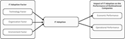
Figure 4. Research Model A conceptual diagram links I T adoption factors with I T adoption and multinational company performance. Technology factor, organisation factor, and environment factor form the I T adoption factors and connect directly to I T adoption. I T adoption then connects to the... More about this image found in Research Model A conceptual diagram links I T adoption factors with I T ...
in The impact of IT adoption during a pandemic on multinational enterprise performance: evidence from Indonesia
> Journal of Science and Technology Policy Management
Published: 30 July 2026
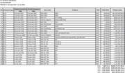
Figure A1. Dongjin Indonesia Income Report (translated from Indonesia) Table Summary:** This table is titled “INCOME REPORT” and presents data between the dates of 1 January 2019 and 31 July 2021. The columns include “No,” “Document Type,” “Customs Document Date,” “Receipt Document Date,” “Item... More about this image found in Dongjin Indonesia Income Report (translated from Indonesia) Table Summar...
in The impact of IT adoption during a pandemic on multinational enterprise performance: evidence from Indonesia
> Journal of Science and Technology Policy Management
Published: 30 July 2026
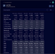
Figure A2. Uni-Charm Indonesia Finance Report Financial table displaying data for UniCharm Indonesia Tbk, including quarterly figures for last price, market cap, equity, revenue, net profit, and various ratios. The image presents a financial table for UniCharm Indonesia Tbk titled “UCID.” The ... More about this image found in Uni-Charm Indonesia Finance Report Financial table displaying data for U...

in The impact of IT adoption during a pandemic on multinational enterprise performance: evidence from Indonesia
> Journal of Science and Technology Policy Management
Published: 30 July 2026
Figure A3. DamoGO Indonesia’s productivity (translated from Indonesia) Two social media posts report food savings of 2,300 kilograms in July 2020 and 8,348 kilograms in June 2021. The DamoGO account post for July 2020 states that DamoGOers saved 2,300 kilograms of food. The June 2021 post stat... More about this image found in DamoGO Indonesia’s productivity (translated from Indonesia) Two social m...