1-20 of 8152
Keywords: ORGANISATION
Close
Follow your search
Access your saved searches in your account
Would you like to receive an alert when new items match your search?
Journal

Essential reading on civil engineering developments across all areas of transport.
Journal Articles
Proceedings of the Institution of Civil Engineers - Transport 1–13.
Published: 23 July 2026
in How does the high-speed rail network reinforce the dominance of core cities in regional China?
> Proceedings of the Institution of Civil Engineers - Transport
Published: 23 July 2026
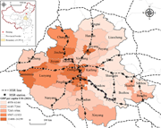
Figure 1. Spatial distribution of the high-speed rail ( HSR ) network and per capita gross domestic product ( GDP ) in the Central Plains urban agglomeration ( CPUA ) in 2021 A thematic map shows high-speed rail stations, lines, and per capita G D P across C P U A cities. The inset map identif... More about this image found in Spatial distribution of the high-speed rail ( HSR ) network and per capita ...
in How does the high-speed rail network reinforce the dominance of core cities in regional China?
> Proceedings of the Institution of Civil Engineers - Transport
Published: 23 July 2026
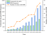
Figure 2. High-speed rail ( HSR ) network development and service supply in the CPUA, 2010–2021 A combined bar chart and line graph show high-speed rail growth from 2010 to 2021. The horizontal axis covers years 2010 to 2021. The left vertical axis measures connected city pairs and high-speed ... More about this image found in High-speed rail ( HSR ) network development and service supply in the CPUA,...
in How does the high-speed rail network reinforce the dominance of core cities in regional China?
> Proceedings of the Institution of Civil Engineers - Transport
Published: 23 July 2026
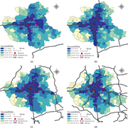
Figure 3. Patterns of HSR accessibility in the CPUA, 2010–2021 Four maps show accessibility changes with expanding high-speed rail networks around Zhengzhou. The maps present accessibility classes, metropolitan area boundaries, Zhengzhou, and high-speed rail lines. Panel a shows a single eas... More about this image found in Patterns of HSR accessibility in the CPUA, 2010–2021 Four maps show ac...
in How does the high-speed rail network reinforce the dominance of core cities in regional China?
> Proceedings of the Institution of Civil Engineers - Transport
Published: 23 July 2026
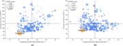
Figure 4. Changes in travel time improvement rate and absolute travel time in 2010 and 2021 Two bubble charts compare travel time improvement rate, travel time, and P G D P. The x-axis gives average travel time improvement rate in per cent. Panel a gives average travel time in 2010 in hours, f... More about this image found in Changes in travel time improvement rate and absolute travel time in 2010 an...
in How does the high-speed rail network reinforce the dominance of core cities in regional China?
> Proceedings of the Institution of Civil Engineers - Transport
Published: 23 July 2026
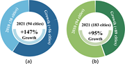
Figure 5. Spatiotemporal compression effect of HSR: expansion of Zhengzhou’s travel circle, 2010–2021 Two donut charts compare city count growth between 2010 and 2021. The first chart gives 38 cities in 2010 and 94 cities in 2021, with growth of 147 per cent and an increase of 56 cities. The s... More about this image found in Spatiotemporal compression effect of HSR: expansion of Zhengzhou’s travel c...
in How does the high-speed rail network reinforce the dominance of core cities in regional China?
> Proceedings of the Institution of Civil Engineers - Transport
Published: 23 July 2026
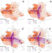
Figure 6. Patterns of HSR connectivity in the CPUA, 2010–2021 Four maps show H S R frequency changes across C P U A cities. The maps mark Zhengzhou, H S R cities, H S R lines, and city-level H S R frequency. Panel a shows connections from Zhengzhou towards Yuncheng, Jiyuan, Luoyang, and Zhum... More about this image found in Patterns of HSR connectivity in the CPUA, 2010–2021 Four maps show H S...
in How does the high-speed rail network reinforce the dominance of core cities in regional China?
> Proceedings of the Institution of Civil Engineers - Transport
Published: 23 July 2026
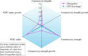
Figure 7. Comparison of HSR connectivity indicators between Zhengzhou and the CPUA average A radar chart compares Zhengzhou and C P U A averages across connectivity and W D C metrics. The 6 axes give connectivity breadth, connectivity breadth growth, connectivity strength, connectivity str... More about this image found in Comparison of HSR connectivity indicators between Zhengzhou and the CPUA...
Journal Articles
Proceedings of the Institution of Civil Engineers - Transport 1.
Published: 17 July 2026
Journal Articles
Proceedings of the Institution of Civil Engineers - Transport 1.
Published: 17 July 2026
Journal Articles
Proceedings of the Institution of Civil Engineers - Transport 1–11.
Published: 10 July 2026
... . Grigoratos T and Martini G (2014) Non-Exhaust Traffic Related Emissions. Brake and Tyre Wear PM . Publications Office of the European Union , Luxembourg . ISO (International Organization for Standardization) (2017) ISO 9096: Stationary source emissions – manual determination of mass...
in Particulate emissions from motorcycle brakes: non-combustion sources of urban pollution
> Proceedings of the Institution of Civil Engineers - Transport
Published: 10 July 2026
Figure 1. Experimental set-up of motorcycle custom mounting for brake emission testing: (a) support overview, (b) air intake and chamber, (c) outlet system Three panels showing motorcycle test setup with chamber, air intake, outlet duct, filter holder, and sampling pump. More about this image found in Experimental set-up of motorcycle custom mounting for brake emission testin...
in Particulate emissions from motorcycle brakes: non-combustion sources of urban pollution
> Proceedings of the Institution of Civil Engineers - Transport
Published: 10 July 2026
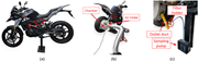
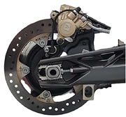
Figure 2. Rear brake system with self-cleaning disc and sliding calliper A motorcycle rear wheel brake assembly showing brake disc, caliper, mounting components, and surrounding mechanical structure. More about this image found in Rear brake system with self-cleaning disc and sliding calliper A motorcy...
in Particulate emissions from motorcycle brakes: non-combustion sources of urban pollution
> Proceedings of the Institution of Civil Engineers - Transport
Published: 10 July 2026
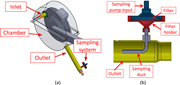
Figure 3. Particle collecting chamber: (a) chamber overview, (b) outlet and sampling duct Part a shows inlet, chamber, outlet, and sampling system around the brake disc. Part b shows the outlet sampling duct connected to filter holder and sampling pump input. More about this image found in Particle collecting chamber: (a) chamber overview, (b) outlet and sampling ...
in Particulate emissions from motorcycle brakes: non-combustion sources of urban pollution
> Proceedings of the Institution of Civil Engineers - Transport
Published: 10 July 2026
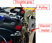
Figure 4. Speed-control apparatus A motorcycle throttle control setup showing throttle grip connected to pulley driven by an electric motor. More about this image found in Speed-control apparatus A motorcycle throttle control setup showing thro...
in Particulate emissions from motorcycle brakes: non-combustion sources of urban pollution
> Proceedings of the Institution of Civil Engineers - Transport
Published: 10 July 2026
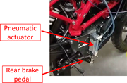
Figure 5. Braking actuation and control apparatus A motorcycle rear brake control setup showing pneumatic actuator connected to rear brake pedal. More about this image found in Braking actuation and control apparatus A motorcycle rear brake control ...
in Particulate emissions from motorcycle brakes: non-combustion sources of urban pollution
> Proceedings of the Institution of Civil Engineers - Transport
Published: 10 July 2026
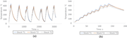
Figure 6. Disc temperature using the stock pad set-up: (a) overview, (b) during the first cycle Two-line graph showing brake temperature over time for Stock T 1, T 2, and T 3 during repeated cycles and short interval test. Part a horizontal axis shows time in seconds from 0 to about 3200. Vert... More about this image found in Disc temperature using the stock pad set-up: (a) overview, (b) during the f...
in Particulate emissions from motorcycle brakes: non-combustion sources of urban pollution
> Proceedings of the Institution of Civil Engineers - Transport
Published: 10 July 2026
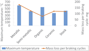
Figure 7. Temperature and mass loss for different pad materials A bar chart with a line plot showing maximum brake temperature and mass loss per braking cycle for metallic, semi metallic, organic, ceramic, and stock pads. The horizontal axis lists pad materials metallic, semi metallic More about this image found in Temperature and mass loss for different pad materials A bar chart with a...
in Particulate emissions from motorcycle brakes: non-combustion sources of urban pollution
> Proceedings of the Institution of Civil Engineers - Transport
Published: 10 July 2026
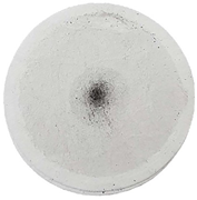
Figure 8. Example of a sampling filter, test 1 A circular filter sample showing concentrated particle deposit at the center and lighter distribution toward the edges. More about this image found in Example of a sampling filter, test 1 A circular filter sample showing co...
