

1-20 of 13053
Keywords: VIKOR
Close
Follow your search
Access your saved searches in your account
Would you like to receive an alert when new items match your search?
Journal

Examining factors that impact the environment their consequences and how to manage them
Journal Articles
Management of Environmental Quality: An International Journal 1–29.
Published: 09 September 2026
in Artificial intelligence, technological research and development and economic globalisation as drivers of clean energy transition: a mission-oriented innovation policy system perspective
> Management of Environmental Quality: An International Journal
Published: 09 September 2026
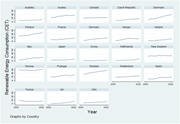
Figure 1 Renewable energy consumption of 23 OECD countries from 2002 to 2021. Source(s): Authors’ calculation Multiple line graphs depict renewable energy consumption trends for 23 OECD countries from 2002 to 2021. The image contains 23 line graphs, each representing the renewable energy con... More about this image found in Renewable energy consumption of 23 OECD countries from 2002 to 2021. Sourc...
in Artificial intelligence, technological research and development and economic globalisation as drivers of clean energy transition: a mission-oriented innovation policy system perspective
> Management of Environmental Quality: An International Journal
Published: 09 September 2026
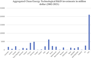
Figure 2 Aggregated sustainable energy technological R&D spending in million dollars (2002–2021). Source(s): Authors’ calculations A bar graph showing aggregated clean energy technological R&D investments in million dollars from 2002 to 2021. The bar graph compares clean energy techn... More about this image found in Aggregated sustainable energy technological R&D spending in million dol...
in Artificial intelligence, technological research and development and economic globalisation as drivers of clean energy transition: a mission-oriented innovation policy system perspective
> Management of Environmental Quality: An International Journal
Published: 09 September 2026
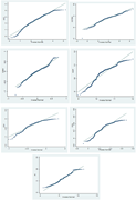
Figure 3 Q–Q plots of each variable. Source(s): Authors’ calculation Multiple QQ plots showing the distribution of various data series compared to a normal distribution. The image contains seven QQ plots, each depicting the distribution of a different data series compared to a normal distrib... More about this image found in Q–Q plots of each variable. Source(s): Authors’ calculation Multiple Q...
Journal Articles
Management of Environmental Quality: An International Journal 1–24.
Published: 07 September 2026
in The EKC hypothesis revisited: industrialization, trade, globalization and FDI effects on natural resource depletion in South Korea
> Management of Environmental Quality: An International Journal
Published: 07 September 2026
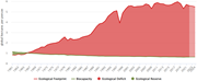
Figure 1 Trends in South Korea's ecological balance (1961–2024) (gha per person). Source: GFN (2025) A line graph showing South Korea's ecological balance from 1961 to 2024. The line graph illustrates the trends in South Korea's ecological balance from 1961 to 2024, measured in global hectar... More about this image found in Trends in South Korea's ecological balance (1961–2024) (gha per person). So...
in Geopolitical risk and renewable energy consumption: distributional patterns, innovation, and energy-exporter heterogeneity
> Management of Environmental Quality: An International Journal
Published: 03 September 2026
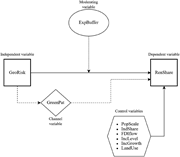
Figure 1 Conceptual framework of the empirical analysis A conceptual framework showing the associations among geopolitical risk, renewable-energy innovation, energy-exporter status, control variables, and renewable energy consumption. A conceptual framework in which GeoRisk is the main explana... More about this image found in Conceptual framework of the empirical analysis A conceptual framework sh...
in Geopolitical risk and renewable energy consumption: distributional patterns, innovation, and energy-exporter heterogeneity
> Management of Environmental Quality: An International Journal
Published: 03 September 2026
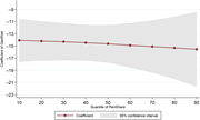
Figure 2 Geopolitical-risk coefficients across the conditional renewable energy distribution. Note: Points represent the estimated GeoRisk coefficients; the shaded area shows 95% confidence intervals A line graph showing the estimated GeoRisk coefficient across conditional quantiles of renewabl... More about this image found in Geopolitical-risk coefficients across the conditional renewable energy dist...
Journal Articles
Management of Environmental Quality: An International Journal (2026) 37 (8): 2474–2495.
Published: 03 September 2026
Includes: Supplementary data
in Novel fuzzy game two-stage DEA model: application in sustainable road transport system
> Management of Environmental Quality: An International Journal
Published: 01 September 2026
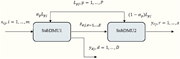
Figure 1 Two-stage structure A diagram of a two-stage structure with two sub-DMUs. A diagram of a two-stage structure with two sub-DMUs. The diagram shows the flow of inputs and outputs between two sub-DMUs. SubDMU1 takes inputs xij and Lpj and produces outputs zej and ydj. SubDMU2 takes input... More about this image found in Two-stage structure A diagram of a two-stage structure with two sub-DMUs...
in Novel fuzzy game two-stage DEA model: application in sustainable road transport system
> Management of Environmental Quality: An International Journal
Published: 01 September 2026
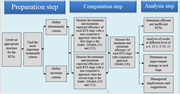
Figure 2 Major steps of our suggested approach A flowchart illustrating the major steps of a suggested approach for evaluating the sustainability of road transport systems. The flowchart outlines the major steps of a suggested approach for evaluating the sustainability of road transport system... More about this image found in Major steps of our suggested approach A flowchart illustrating the major...
in Novel fuzzy game two-stage DEA model: application in sustainable road transport system
> Management of Environmental Quality: An International Journal
Published: 01 September 2026
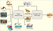
Figure 3 The two-stage configuration of RTSs A flowchart depicting the two-stage configuration of road transport systems, highlighting key indicators and their relationships. A flowchart illustrating the two-stage configuration of road transport systems. The first stage includes inputs such as... More about this image found in The two-stage configuration of RTSs A flowchart depicting the two-stage ...
in Novel fuzzy game two-stage DEA model: application in sustainable road transport system
> Management of Environmental Quality: An International Journal
Published: 01 September 2026
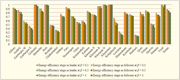
Figure 4 Comparison of energy efficiency stage performance under different strategies A bar graph comparing energy efficiency stages across various regions under different strategies. The bar graph compares energy efficiency stages across various regions under different strategies. The x-axis ... More about this image found in Comparison of energy efficiency stage performance under different strategie...
in Novel fuzzy game two-stage DEA model: application in sustainable road transport system
> Management of Environmental Quality: An International Journal
Published: 01 September 2026
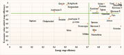
Figure 5 Energy-EVA matrix A scatter plot showing the relationship between energy stage efficiency and economic value-added stage efficiency for various regions. A scatter plot representing the relationship between energy stage efficiency and economic value-added stage efficiency for 30 region... More about this image found in Energy-EVA matrix A scatter plot showing the relationship between energy...
Journal Articles
Management of Environmental Quality: An International Journal (2026) 37 (8): 2437–2473.
Published: 01 September 2026
Includes: Supplementary data
in Aligning firms with SDGs and COP30: the comparative power of voluntary and regulatory climate commitments
> Management of Environmental Quality: An International Journal
Published: 26 August 2026
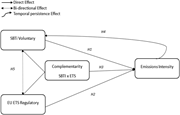
Figure 1 Conceptual framework. Source: Authors’ own work A conceptual framework diagram linking voluntary and regulatory climate governance to firm-level emission intensity. A conceptual framework diagram illustrating the relationships between voluntary and regulatory climate governance and fi... More about this image found in Conceptual framework. Source: Authors’ own work A conceptual framework d...
in Aligning firms with SDGs and COP30: the comparative power of voluntary and regulatory climate commitments
> Management of Environmental Quality: An International Journal
Published: 26 August 2026
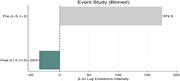
Figure 2 Binned event-study estimates of SBTi adoption. Source: Authors’ own work A bar graph showing binned event-study estimates of SBTi adoption. The bar graph presents binned event-study estimates of SBTi adoption. The x-axis represents the beta on log emissions intensity, ranging from neg... More about this image found in Binned event-study estimates of SBTi adoption. Source: Authors’ own work ...
in Aligning firms with SDGs and COP30: the comparative power of voluntary and regulatory climate commitments
> Management of Environmental Quality: An International Journal
Published: 26 August 2026
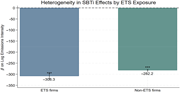
Figure 3 Heterogeneity in SBTi Effects by EU ETS Exposure. Note: In Figure 3 , asterisks indicate statistical significance levels: ***p < 0.01, **p < 0.05, and * p < 0.10. Source: Authors’ own work A bar graph compares the effects of SBTi on emissions intensity between ETS firms and non-ETS firms. The bar graph compares the effects of SBTi on emissions intensity between ETS firms and non-ETS firms. The x-axis represents two categories: ETS firms and non-ETS firms. The y-axis represents the beta on log emissions intensity, ranging from 0 to -350. There are two vertical bars, one for ETS firms and one for non-ETS firms. The bar for ETS firms is colored blue and shows a value of -308.3, while the bar for non-ETS firms is colored green and shows a value of -282.2. Both bars have asterisks indicating statistical significance levels, with three asterisks for ETS firms and three asterisks for non-ETS firms, suggesting a significance level of p < 0.01. The graph indicates that the estimated SBTi coefficient is more negative among ETS-covered firms compared to non-ETS firms, suggesting that regulatory exposure strengthens the association between voluntary climate commitments and lower emission intensity. All values are approximated. More about this image found in Heterogeneity in SBTi Effects by EU ETS Exposure. Note: In Figure 3 , aste...
Journal Articles
Management of Environmental Quality: An International Journal (2026) 37 (8): 2416–2436.
Published: 26 August 2026

