Introduction
Affordance is a word coined by Gibson (1977), and its meaning has been expanded by various researchers (Norman, 1988; Ware, 2003). In the past 20 years, e-learning has become a staple in educational institutions. In 2012, 32% of higher education students were enrolled in at least one online course (Sloan Consortium, 2013b). The 32% was equivalent to 6.7 million students. Also, in 2012, the number of students that enrolled in online learning increased by 6%.
In a 2006 survey of U.S. school administrators of K–12 schools, 63.1% of the schools surveyed had students that were enrolled in blended or fully online courses and 57.9% of the schools surveyed had students that were fully enrolled in online courses. The figures for K–12 schools were reported after surveying 366 school districts out of 16,000 school districts in the United States (Sloan Consortium, 2013a). With so many educational institutions depending on online learning, it is important for designers to make use of affordances in designing for instruction.
Affordances Then and Now
Affordance is a physical feature that allows the user to use what the product is intended for (Gibson, 1977, 1979; Norman, 1988; Ware, 2003). Gibson coined the word affordance: “The affordances of the environment are what it offers the animal, what it provides or furnishes, either for good or ill. The verb to afford is found in the dictionary, but the noun affordance is not. I have made it up” (Gibson, 1979, p. 127).
Gibson, a perceptual psychologist was the first to describe affordance as a relational capacity of the product to the user and to the environment (Gibson, 1977, 1979; Kaptelinin & Nardi, 2012). According to Gibson’s definition, the affordance can be present on the product without the user being aware of its presence. Norman (1998, 2011), on the other hand, defined affordance as the perceived use of the design of the product by the user. He called this the perceived affordance. A perceived affordance is useful because the user is able to identify the clues needed to use the product, unlike the Gibsonian definition where the affordance can be present but the user does not know the usefulness. Nielsen (1993) describes affordance as the usability of the product.
Kaptelinin and Nardi (2012) argued that the Gibsonian definition of affordance as an interaction between animals and their environment was no longer adequate in the way affordances were used in human computer interactions today. They proposed a mediated action perspective on defining affordance. Kaptelinin and Nardi (2012) suggested that affordances should be looked upon from three angles; the user, the mediator, or means and the environment. They asserted that the Gibsonian definition of affordances did not include core concepts such as culture, motivation, development, communication, functionality, and context. They suggested different definitions of affordance based on the action and proposed definitions for maintenance affordances, aggregation affordances, learning affordances, auxiliary affordances, and other mediated actions to the affordances.
In designing the product, the designer must consider the product and the user because the designer will not be there when the user uses the product (Dillon, McKnight, & Richardson, 1988). Mayes and de Freitas (2004) assert that models of e-learning are not models but are affordances of e-learning because the models aim to make the learner use the technology to learn electronically.
Kirschner (2002) defined educational affordance as the capacity of the learner to learn within a certain construct. If a computer is donated to nomadic children and the computer is powered only by electricity, the learners would not have the educational affordances to learn if they do not have electricity. When an e-learner can perceive the use of a design and it allows the learner to communicate, the device has afforded a social affordance (Kreijns, Kirschner, & Jochems, 2002). Social affordance and technological affordances are present in e-learning environments.
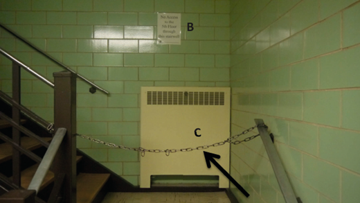
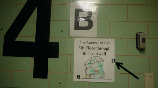
In technological affordances, a perceived affordance is preferable to the Gibsonian affordance (Bower, 2008; Kirschner, Strijbos, Kreijns, & Beers, 2004). Technological affordances should allow the educational and social affordances to interact (Kirschner et al., 2004). The technological affordance should not have to make users exert their thinking faculties before they can figure out the use of the affordance (Krug, 2014). If the affordance is present and the learner does not know the use of the affordance or has difficulty in using the affordance, then the affordance is there merely as a utility. The affordance must present clues to the user (see Figure 1).
The same affordance can be perceived by users in different ways. As an example, a 5-year-old child may see a wobbly table as a see-saw. An adult may see the wobbly table as an accident waiting to happen. Signifiers are used by designers to let the users see the affordance. Not all affordances require signifiers (see Figures 2 and 3).
Some affordances are forcing functions that prevent a function from being done like a chain preventing access to a floor of a library or web pages that cannot be accessed without a password.
Definitions of E-Learning
Simonson, Smaldino, Albright, and Zvacek, (2009) defined distance education as “institution-based, formal education where the learning group is separated, and where interactive telecommunications systems are used to connect learners, resources, and instructors” (p. 28).
Sangra, Vlachopoulos, and Cabrera (2012) divided the various definitions of e-learning into four categories; technology-driven, educational-paradigm-oriented, communication-oriented, and delivery-system-oriented. Education and electronic communication between the instructor and the learner is a common thread in the four categories.
Comprehension, Recall, and Retention of Text
Several studies have shown that reading text from a computer screen is not as comprehensible as reading text from a hard copy book (Dillon et al., 1988; Mangen, Walgermo, & Bronnick, 2013; Pölönen, Järvenpää, & Häkkinen, 2012). The text should be organized and sequenced. Ausubel’s theory of meaningful learning has shown that organizers aid in learning and in understanding (Ausubel, 1960). Text should be organized with cues and relationships should be visualized. Visual mnemonics should be related to the facts in the lesson. While colorful displays may be appealing, research has not supported color (Braden, 1996; Simonson, et al., 2009). Dark colors should be used against a bright background (Simonson et al., 2009).
Kerr and Symons (2006) compared the reading comprehension of 60 fifth-grade students who had been divided into groups. One group read a paper copy of the text while the second group read the text from a computer screen. Both groups were tested and the group that read from paper outperformed the group that read from the computer screen.
Similarly, when 72 tenth-grade students were divided into two groups and given comprehension passages to read, and later tested on the passages, the group that read from paper copies outperformed the group that read from a liquid-crystal display monitor (Mangen et al., 2013).
In an ethnographic study, Sellen and Harper (2003) argued that the affordances that paper provides allows the user to grasp, to fold and to carry the book in a way the user cannot manipulate electronic devices. The e-ink readers that are being manufactured now do not have a backlit screen, making them look like paper (Siegel, 2013). The first generation e-readers were not made with a multitechnology system. They could not connect to the Internet and could not use a mouse.
Studies conducted on popular electronic reading devices and hard copy paper showed that for reading comprehension, there is no difference (Baker, 2012). However, readers who had a preconceived notion that reading from paper was better still believed that reading from paper was better even when they performed equally well on the other formats (Baker, 2012).
In contrast, eighth-grade students who read from an online source were unable to recall the details in an article as well as the group that read from the paper source (Fisher, Lapp, & Wood 2011). However, when the online group and the printed paper group were tested for the major gist in the article, they fared equally.
When students in a different study were asked to suggest methods that they used to aid comprehension, students who read using the electronic readers said they bookmarked the pages, while students who read traditional books folded the pages. Further, the study revealed that there was no difference in comprehending the passages read when the two groups were compared (Schugar, Schugar, & Penny, 2011).
Empirical articles published between 1990 and 2004 showed that students who were novices to the lessons performed poorly on hypertext (DeStefano & LeFevre, 2006). However, when the hypertext was organized in a hierarchical format, students who were novices improved their performance. The review also showed that learning comprehension by hypertext increased cognitive load and increased comprehension and navigation tasks.
While hypertext on the computer has shown its advantage in terms of being able to search a particular topic, when it comes to comprehension exercises, reading from a book or paper has proven to be superior. It has been suggested that the superiority is due to the linearity of the paper texts (DeStefano & LeFevre, 2006). Hypertext has a nonlinear organization and paper text has a linear organization (Kerr & Symons, 2006). It has also been suggested that the human brain views the text as a terrain that can be physically manipulated; there is a mental representation of the word or text (Jabr, 2013). The hanzi of the Chinese and the kanji of the Japanese are thought to stimulate mental representations. The kanji is made up of 1,000 to 5,000 characters (Omniglot, 2013). The Chinese hanzi depends on motor memory for writing (Nakamura et al., 2012). The alphabet literacy depends on phonetics. Nakamura et al. (2012) conducted experiments with native speakers of French and native speakers of Chinese. They were able to conclude that mental representation played a role in alphabetic literacy.
Display Rate
The pace at which text is displayed on the screen may be too fast for some users and this might make them read too fast and thereby lose comprehension (Seow, 2008). Shneiderman and Plaisant (2010) suggested that users should be allowed to control the display rate of the text. They further suggested that if the aim of the user was to scan for relevant material, then the screen may display the texts at a faster pace. If the task involves entering of data, then the display rate should not be fast.
Text Design
A sans serif font should be used instead of a serif font because it is easier to read. If the text is displayed on a regular monitor, a font size of 24 point to 32 or 36 point should be used (Hartley, 1996; Simonson et al., 2009). Sans serif fonts do not have finishing strokes at the end, while serif fonts have finishing strokes at the end. Capital letters take up more space than lower case letters. While television uses a centering text display, a left justified text is preferable for web pages (Simonson et al., 2009).
Pointers or arrows should be used to identify key points in pictures. A contrasting color can emphasize the area of interest. A border or a line can be used to unify the objects of interest. Word pictures can be arranged as pyramids, maps, hierarchies, outlines, and cognitive maps to present the ideas and points being presented (Simonson et al., 2009). Designers should use vertical and horizontal white space.

Research in eye movement has shown that readers rely on special cues given by the white space as in paragraphs, headings, and punctuations (Hartley, 1996). Segmentation of texts and picture labeling improves comprehension (Florax & Ploetzner, 2010). Graff (2003) contends that segmentation is only of advantage to verbalizer-imagers. Verbalizer-imagers are good at verbalizing, but are not good at keeping track of their spatial locations while holistic-analytic persons are able to see things as a whole and have difficulty analyzing them in segments. Graff (2003) goes on to suggest that web designers should look at the cognitive style of the learners before designing web pages. Verbaliser-imagers would benefit from segmentations and less segmentation would be of benefit to analytic persons.
Designers should avoid long sentences because they contain too many subordinate clauses and can overload the memory (Hartley, 1996). Text can be organized using signal phrases such as therefore, secondly, because, and as a result of.
According to the Royal National Institute for the Blind (2012), when designing websites for the visually impaired the designer should make the font size readable even when the browser setting is changed to reduce the text size because some users have low tunnel vision. The institute recommends Ariel or Verdana font for text. Also, the base font chosen should be 100% so that when the visually impaired person resizes the text, the text will still be displayed at 100% (Royal National Institute for the Blind, 2012).
Kintsch, Kozimsky, Streby, McKoon, and Keenan (1975) showed that participants were better able to recall from text that was uncluttered than from texts that were cluttered. Studies have also shown that when participants are given cues like topics related are put together, or text is put in bold print or in uppercase letters, the participants are more apt to recall the content in the text (Glynn & DiVesta, 1979). Dillon et al. (1996) suggested that web designers should not design web pages the way printed books are designed. They pointed out that web users already have a model of how printed books are organized and web designers should design web pages that support hypertext.
Conclusion
This article has given an overview of affordance from the Gibsonian definition to how it is being used today. It highlighted ways that designers can make use of affordances from organizing, sequencing, and segmentation of text, to use of cues and visualizations for different types of learners. It also emphasized the use of sans serif font instead of a serif font and attention to the use of special fonts for those who are visually impaired. Designers should take cognizance of the points highlighted in this paper when designing for instruction.
About the author