
1-20 of 6866
Keywords: ORL dataset
Close
Follow your search
Access your saved searches in your account
Would you like to receive an alert when new items match your search?
Journal

Explores information discovery and access for digital information researchers.
Journal Articles
Journal:
Information and Learning Sciences
Information and Learning Sciences 1–17.
Published: 12 October 2026
Includes: Supplementary data
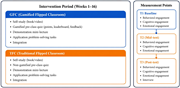
in Temporal dynamics of multidimensional engagement in gamified and traditional flipped classrooms: behavioral, cognitive, and emotional trajectories
> Information and Learning Sciences
Published: 12 October 2026
Figure 1. Overview of the quasi-experimental research procedure and intervention design, illustrating the three measurement points (T1-T3) and the 16-week instructional interventions implemented in the gamified flipped classroom ( GFC ) and traditional flipped classroom ( TFC ) groups Two secti... More about this image found in Overview of the quasi-experimental research procedure and intervention desi...
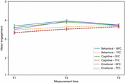
in Temporal dynamics of multidimensional engagement in gamified and traditional flipped classrooms: behavioral, cognitive, and emotional trajectories
> Information and Learning Sciences
Published: 12 October 2026
Figure 2. Mean trajectories of behavioral, cognitive and emotional engagement for the gamified flipped classroom ( GFC ) and traditional flipped classroom ( TFC ) across three time points (T1–T3). Solid lines denote GFC; dashed lines denote TFC A line graph compares behavioural, cognitive, an... More about this image found in Mean trajectories of behavioral, cognitive and emotional engagement for the...
Journal Articles
Journal:
Information and Learning Sciences
Information and Learning Sciences 1–23.
Published: 08 October 2026
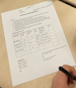
in Applying a humanistic data science framework to curricular development and implementation: a forensic analysis of synergies and tensions across layers in middle school social studies
> Information and Learning Sciences
Published: 08 October 2026
Figure 1. Filled in food access map worksheet for the Blackfeet Indian Reservation Source: Property of the Authors A Food Access Table Worksheet contains handwritten grocery and convenience store counts and distances for four cluster areas. The Food Access Table Worksheet contains direction... More about this image found in Filled in food access map worksheet for the Blackfeet Indian Reservation ...
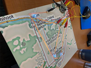
in Applying a humanistic data science framework to curricular development and implementation: a forensic analysis of synergies and tensions across layers in middle school social studies
> Information and Learning Sciences
Published: 08 October 2026
Figure 2. Paper circuit map symbolizing food access data on Fort Belknap Reservation Source: Property of the Authors A map of the Fort Belknap Reservation carries a copper tape circuit with L E D lights and connected alligator clips and a microcontroller. The copper tape circuit and LEDs sym... More about this image found in Paper circuit map symbolizing food access data on Fort Belknap Reservation ...
in Applying a humanistic data science framework to curricular development and implementation: a forensic analysis of synergies and tensions across layers in middle school social studies
> Information and Learning Sciences
Published: 08 October 2026
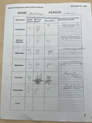
Figure 3. One student’s worksheet categorizing reservations as food access or food desert Source: Property of the Authors A worksheet table records food access, food sovereignty, and food security ideas for several reservations. The worksheet titled Westward Expansion Notes 2020.notebook co... More about this image found in One student’s worksheet categorizing reservations as food access or food de...
in Applying a humanistic data science framework to curricular development and implementation: a forensic analysis of synergies and tensions across layers in middle school social studies
> Information and Learning Sciences
Published: 08 October 2026
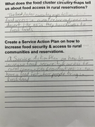
Figure 4. One student’s community action plan Source: Property of the Authors A worksheet records responses about food access in rural reservations and a service action plan for improving food security. The worksheet asks what food cluster circuitry maps tell about food access in rural rese... More about this image found in One student’s community action plan Source: Property of the Authors A...
in Applying a humanistic data science framework to curricular development and implementation: a forensic analysis of synergies and tensions across layers in middle school social studies
> Information and Learning Sciences
Published: 08 October 2026
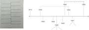
Figure 5. Whiteboard display of timeline worksheet Source: Property of the Authors Two worksheet pages contain treaty questions and a handwritten timeline of dates from 1795 to 1856. The worksheet page titled Why the Treaty Matters asks students to define a treaty, explain why treaties matt... More about this image found in Whiteboard display of timeline worksheet Source: Property of the Authors...
in Applying a humanistic data science framework to curricular development and implementation: a forensic analysis of synergies and tensions across layers in middle school social studies
> Information and Learning Sciences
Published: 08 October 2026
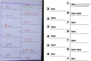
Figure 6. Comparing the original timeline worksheet with a revised design to support student understanding across events Source: Property of the Authors Two timeline templates show treaty related dates from 1815 to 1856, with grouped spans for 1836 to 1850 and 1849 to 1856. The first timeli... More about this image found in Comparing the original timeline worksheet with a revised design to support ...
Journal Articles
Journal:
Information and Learning Sciences
Information and Learning Sciences 1–23.
Published: 05 October 2026
Journal Articles
Journal:
Information and Learning Sciences
Information and Learning Sciences 1–16.
Published: 01 October 2026
Journal Articles
Journal:
Information and Learning Sciences
Information and Learning Sciences 1–26.
Published: 29 September 2026
Includes: Supplementary data
Published: 29 September 2026
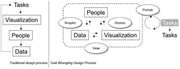
Figure 1. Traditional design process compared with task wrangling design process Note(s): In the traditional design process, the task is ill-defined, and it is only after the tool is built that the dashboard designers source feedback to iterate on the visualization. In the Crisan and Munzner (... More about this image found in Traditional design process compared with task wrangling design process No...
Published: 29 September 2026
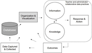
Figure 2. A theory of action for data use in schools Note(s): Our theory of action for data use in schools situates the domain expert, in this case school principals, within a collaborative space alongside data scientists. As information and knowledge are exchanged, school principals acquire, e... More about this image found in A theory of action for data use in schools Note(s): Our theory of action...
Published: 29 September 2026
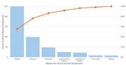
Figure 3. Pareto chart of African American student’s reasons for out-of-school suspension ( OSS ) Note(s): Pareto charts superimpose a bar chart of the frequency of incidents with a line graph of the cumulative percentage of incidents; adapted from Hinnant-Crawford (2020) A Pareto chart ra... More about this image found in Pareto chart of African American student’s reasons for out-of-school suspen...
Published: 29 September 2026
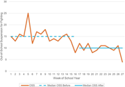
Figure 4. Run chart of out-of-school suspension for fighting before and after intervention Note(s): Run charts show variation in outcomes by plotting the median as a reference line, allowing the user to identify trends, runs and shifts; adapted from Hinnant-Crawford (2020) A line graph tra... More about this image found in Run chart of out-of-school suspension for fighting before and after interve...
Published: 29 September 2026
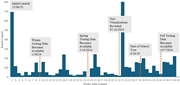
Figure 5. Logins by week of school year Note(s): The dashboards were first launched on December 5, 2023 A bar chart tracks report logons across 49 weeks after launch, with major peaks near launch and week 33 and several annotated events. The bar chart plots report logons across 49 weeks aft... More about this image found in Logins by week of school year Note(s): The dashboards were first launche...
Published: 29 September 2026
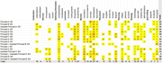
Figure 6. Code presence chart from principal interviews Note(s): The most common uses for data dashboards were comparing assessments, monitoring attendance, assessing needs and setting team goals A table summarises coded terms used by school principals and assistant principals across celebra... More about this image found in Code presence chart from principal interviews Note(s): The most common u...

