1-20 of 21681
Keywords: Supply chain analytics in SCOR
Close
Follow your search
Access your saved searches in your account
Would you like to receive an alert when new items match your search?
Journal

Focusing on the impact of new technology within businesses it covers; green information systems sustainable supply chains big data and social media.
Journal Articles
Journal:
Industrial Management & Data Systems
Industrial Management & Data Systems 1–23.
Published: 23 July 2026
Includes: Supplementary data
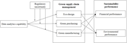
in How does data analytics capability affect sustainability performance?
> Industrial Management & Data Systems
Published: 23 July 2026
Figure 1 Research model. Source: Authors’ own work A diagram of a research model. The diagram illustrates a research model with three main components: Regulatory uncertainty, Data analytics capability, and Green supply chain management. Data analytics capability influences Regulatory uncertain... More about this image found in Research model. Source: Authors’ own work A diagram of a research model....
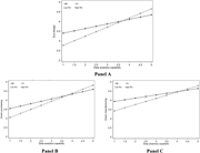
in How does data analytics capability affect sustainability performance?
> Industrial Management & Data Systems
Published: 23 July 2026
Figure 2 The moderating effects of regulatory uncertainty. Source: Authors’ own work Three line graphs showing the moderating effects of regulatory uncertainty on the relationships between data analytics capability and eco-design, green purchasing, and green manufacturing. The image contains t... More about this image found in The moderating effects of regulatory uncertainty. Source: Authors’ own work...
Journal Articles
Journal:
Industrial Management & Data Systems
Industrial Management & Data Systems 1–29.
Published: 21 July 2026
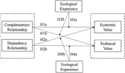
in How does the relationship with the platform owner affect the value creation of platform-dependent enterprises?
> Industrial Management & Data Systems
Published: 21 July 2026
Figure1 Conceptual model. Source: Authors’ own work A conceptual model diagram illustrating relationships between complementary relationship, dependency relationship, ecological experience, economic value, and technical value. A conceptual model diagram illustrating relationships between compl... More about this image found in Conceptual model. Source: Authors’ own work A conceptual model diagram i...
Journal Articles
Journal:
Industrial Management & Data Systems
Industrial Management & Data Systems 1–23.
Published: 14 July 2026
Includes: Supplementary data
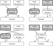
in The strategic matching between manufacturers and streamers in live-streaming e-commerce
> Industrial Management & Data Systems
Published: 14 July 2026
Figure 1 Four cooperation scenarios A diagram illustrating four cooperation scenarios involving manufacturers, streamers, and consumers. A diagram illustrating four cooperation scenarios involving manufacturers, streamers, and consumers. Panel A: A flowchart showing a high influence streamer c... More about this image found in Four cooperation scenarios A diagram illustrating four cooperation scena...
in The strategic matching between manufacturers and streamers in live-streaming e-commerce
> Industrial Management & Data Systems
Published: 14 July 2026
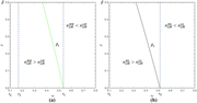
Figure 2 Profit comparisons for the large manufacturer under parameter sets of a = 0.5, m = 0.4, γ = 0.4 and rL = 0.1 Two line graphs compare profit scenarios for a large manufacturer. The image contains two line graphs side by side, labeled (a) and (b), comparing profit scenarios for a large manufacturer. Each graph plots beta (β) on the y-axis against rL on the x-axis. In graph (a), a green line labeled β1 separates regions where πHH LM is greater than πLH LM from regions where πHH LM is less than πLH LM. In graph (b), a gray line labeled β2 separates regions where πHL LM is greater than πLL LM from regions where πHL LM is less than πLL LM. Both graphs feature vertical dashed lines marking specific points on the x-axis. More about this image found in Profit comparisons for the large manufacturer under parameter sets of
in The strategic matching between manufacturers and streamers in live-streaming e-commerce
> Industrial Management & Data Systems
Published: 14 July 2026
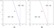
Figure 3 Profit comparisons for the small manufacturer under parameter sets of a = 0.5, m = 0.4, γ = 0.4 and rL = 0.1 Two line graphs compare profit scenarios for a small manufacturer. The image contains two separate line graphs side by side. Each graph plots beta on the y-axis against rH on the x-axis. The left graph, labeled (a), shows a blue line indicating the threshold beta3 where profit comparisons change. The right graph, labeled (b), shows a red line indicating the threshold beta4 where profit comparisons change. Both graphs have vertical dashed lines marking specific rH values. The left graph compares profits for high-high and high-low scenarios, while the right graph compares profits for low-high and low-low scenarios. The lines in both graphs indicate the points at which the profit comparisons switch from one scenario being more profitable to the other. More about this image found in Profit comparisons for the small manufacturer under parameter sets of
in The strategic matching between manufacturers and streamers in live-streaming e-commerce
> Industrial Management & Data Systems
Published: 14 July 2026
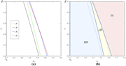
Figure 4 Equilibrium cooperation scenarios under parameter sets of a = 0.5, m = 0.4, γ = 0.4 and rL = 0.1 Two line graphs depict equilibrium cooperation scenarios under specific parameter sets. Two line graphs depict equilibrium cooperation scenarios under specific parameter sets. Panel A shows a line graph with the horizontal axis labeled rH and the vertical axis labeled beta. The graph includes four lines labeled beta1, beta2, beta3, and beta4, each representing different parameter sets. Panel B shows another line graph with the horizontal axis labeled rH and the vertical axis labeled beta. This graph includes regions labeled HH, LH, and LL, with dashed lines indicating boundaries between these regions. More about this image found in Equilibrium cooperation scenarios under parameter sets of a...
in The strategic matching between manufacturers and streamers in live-streaming e-commerce
> Industrial Management & Data Systems
Published: 14 July 2026
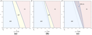
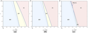
Figure 5 The impact of γ on equilibrium cooperation scenarios Three graphs showing equilibrium cooperation scenarios with different gamma values. The image contains three separate graphs labeled (a), (b), and (c), each depicting equilibrium cooperation scenarios for different values of gamma. Each graph has the x-axis labeled as rL and the y-axis labeled as beta. The graphs are divided into regions marked HH, LH, and LL. In graph (a), gamma is set to 0.15, in graph (b), gamma is set to 0.4, and in graph (c), gamma is set to 0.65. The regions are color-coded: blue for HH, yellow for LH, and pink for LL. Graph (c) includes a hatched region labeled HH/LL. All values are approximated. More about this image found in The impact of γ on equilibrium cooperation scenarios Th...
in The strategic matching between manufacturers and streamers in live-streaming e-commerce
> Industrial Management & Data Systems
Published: 14 July 2026
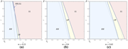
Figure 6 The impact of a on equilibrium cooperation scenarios Three line graphs depict the impact of a on equilibrium cooperation scenarios. Three line graphs depict the impact of a on equilibrium cooperation scenarios. Each graph shows the relationship between beta sub L on the vertical axis and r sub L on the horizontal axis. The graphs are labeled (a), (b), and (c) corresponding to different values of a, which are 0.3, 0.5, and 0.7 respectively. Panel A: The graph shows four regions labeled HH, LH, LL, and another LH. The regions are color-coded: blue for HH, yellow for LH, pink for LL, and a small yellow region for LH. The lines separating these regions are dashed and solid, indicating different boundaries. Panel B: Similar to Panel A, this graph also shows four regions labeled HH, LH, LL, and another LH. The color-coding and line styles are consistent with Panel A. Panel C: This graph also shows four regions labeled HH, LH, LL, and another LH. The color-coding and line styles are consistent with the previous panels. The regions shift slightly as the value of a increases from 0.3 to 0.7. More about this image found in The impact of a on equilibrium cooperation scenarios Th...
in The strategic matching between manufacturers and streamers in live-streaming e-commerce
> Industrial Management & Data Systems
Published: 14 July 2026
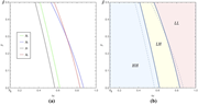
Figure 7 The impact of m on equilibrium cooperation scenarios Three graphs showing equilibrium cooperation scenarios for different values of m. The image contains three separate graphs labeled (a), (b), and (c), each depicting equilibrium cooperation scenarios for different values of m. Each graph has a horizontal axis labeled rL and a vertical axis labeled beta. The graphs are divided into regions marked HH, LH, and LL. In graph (a), with m equal to 0.15, the regions are clearly separated by lines. In graph (b), with m equal to 0.4, the regions overlap slightly. In graph (c), with m equal to 0.65, the regions overlap more significantly. The lines separating the regions shift as the value of m changes, indicating different equilibrium cooperation scenarios. More about this image found in The impact of m on equilibrium cooperation scenarios Th...
in The strategic matching between manufacturers and streamers in live-streaming e-commerce
> Industrial Management & Data Systems
Published: 14 July 2026
Figure 8 Equilibrium cooperation scenarios under parameter sets of a = 0.5, m = 0.4, γ = 0.4 and rL = 0.1 Two line graphs depict equilibrium cooperation scenarios with different parameter sets. Two line graphs depict equilibrium cooperation scenarios with different parameter sets. Panel A shows a line graph with the horizontal axis labeled rH and the vertical axis labeled beta. The graph includes four lines representing different parameter sets: beta 5 in green, beta 6 in blue, beta 7 in black, and beta 8 in red. These lines show a downward trend as rH increases. Panel B shows another line graph with the horizontal axis labeled rH and the vertical axis labeled beta. This graph is divided into three regions: HH in blue, LH in yellow, and LL in pink. The lines from Panel A are overlaid on this graph, showing how the different parameter sets interact with the regions. More about this image found in Equilibrium cooperation scenarios under parameter sets of a...
Journal Articles
Journal:
Industrial Management & Data Systems
Industrial Management & Data Systems 1–24.
Published: 07 July 2026
Includes: Supplementary data
in Strategic data sales on online platforms with consumer privacy concerns and protection
> Industrial Management & Data Systems
Published: 07 July 2026
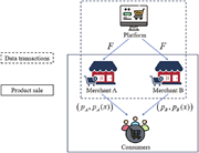
Figure 1 The supply chain structure. Source: Authors’ own creation A diagram of a supply chain structure involving a platform, merchants, and consumers. A diagram of a supply chain structure. The diagram shows a platform at the top, connected to two merchants labeled Merchant A and Merchant ... More about this image found in The supply chain structure. Source: Authors’ own creation A diagram of...
in Strategic data sales on online platforms with consumer privacy concerns and protection
> Industrial Management & Data Systems
Published: 07 July 2026
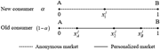
Figure 2 Consumer market structure. Source: Authors’ own creation A line graph showing consumer market structure. A line graph showing consumer market structure. The x-axis ranges from 0 to 1, representing different market segments. The y-axis represents the proportion of consumers, divided ... More about this image found in Consumer market structure. Source: Authors’ own creation A line graph ...
in Strategic data sales on online platforms with consumer privacy concerns and protection
> Industrial Management & Data Systems
Published: 07 July 2026
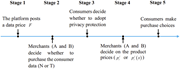
Figure 3 The timing of the game. Source: Authors’ own creation A timeline of a five-stage process involving a platform, merchants, and consumers. The timeline illustrates a five-stage process. In stage 1, the platform posts a data price. In stage 2, merchants A and B decide whether to purcha... More about this image found in The timing of the game. Source: Authors’ own creation A timeline of a ...
in Strategic data sales on online platforms with consumer privacy concerns and protection
> Industrial Management & Data Systems
Published: 07 July 2026
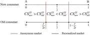
Figure 4 The mechanism of personalized pricing. Source: Authors’ own creation A line graph comparing consumer surplus in anonymous and personalized markets for new and old consumers. A line graph compares consumer surplus in anonymous and personalized markets for new and old consumers. The x... More about this image found in The mechanism of personalized pricing. Source: Authors’ own creation A...