The purpose of this paper is to promote social network analysis (SNA) methodology within the humanitarian research community, surveying its current state of the art and demonstrating its utility in analyzing humanitarian operations.
A comprehensive survey of the related literature motivates a proposed agenda for interested researchers. Analysis of two humanitarian networks in Afghanistan demonstrates the use and utility of SNA, based on secondary data. In the second case study, the use of random graphs to detect network motifs is demonstrated using Monte Carlo simulation to create the benchmark null sets.
SNA is an adaptable and highly useful methodology in humanitarian research, quantifying patterns of community structure and collaboration among humanitarian organizations. Network motifs suggesting distinct affinity between particular agencies within humanitarian clusters are observed.
The authors summarize common challenges of using SNA in humanitarian research and discuss ways to alleviate them.
Practitioners can use SNA as readily as researchers, to visualize existing networks, identify areas of concern and better communicate observations.
By making SNA more accessible to a humanitarian research audience, the authors hope its ability to capture complex, dynamic relationships will advance understanding of effective humanitarian relief systems.
To the best of knowledge, it is the first study to conduct a systematic analysis of the application of SNA in empirical humanitarian research and outline a concrete SNA-based research agenda. This is also a currently rare instance of a humanitarian study using random graphs to assess observed SNA measures.
1. Introduction
Social network analysis (SNA) is a methodology well adapted to hyper-dynamic environments, with a capacity to assess, model and predict the behavior of complex adaptive systems (Choi et al., 2001). Humanitarian logistics is a domain challenged with the provision of urgent services in the face of dynamic demand, dependent on complex collaborations between multiple entities. While the potential of SNA to assist in research under such conditions is undeniable, such research is relatively scarce at the time of this writing. Related fields such as supply chain management (SCM) already recognize the value of SNA, evidenced by the growing number of studies using a network lens while advancing theory on supply chain complexity and archetypes (Bellamy and Basole, 2013). The purpose of this paper is to promote interest in the SNA methodology within the humanitarian research community, by demonstrating its ability to illuminate intangible connections in large-scale humanitarian endeavors. We begin with a briefing on SNA and its extension into the supply chain literature, followed by detailed review and synthesis of SNA-related humanitarian research to date. We follow with two case studies set in Afghanistan, using data from the United Nations Office for the Coordination of Humanitarian Affairs (OCHA). Throughout decades of conflict impacting all aspects of life, one of the driving forces behind Afghanistan’s painstaking reconstruction has been the diverse body of non-state humanitarian actors among which OCHA is one of the most influential (West, 2017). The first and briefer case study demonstrates popular SNA metrics, while the second explores new ways to measure relationships between humanitarian agencies. These cases, combined with our literature survey, motivate a proposed SNA-based humanitarian research agenda, to benefit anyone interested in applying this methodology to the study of humanitarian operations.
The remainder of this paper is as follows: in the next section, we outline the development of SNA research and its growth in SCM. This provides the theoretical foundation for Section 3, in which we discuss the state of extant SNA applications in humanitarian operations, including limitations encountered. To demonstrate both SNA’s current state-of-the-art and its promising opportunities for future research, the two case studies follow in Sections 4 and 5. In conclusion, we provide a summary of research gaps and potential directions to aid interested researchers and practitioners in their work with this exciting methodology.
2. Related literature
2.1 A brief history of social network analysis (SNA)
SNA emerged as an offshoot of graph theory, a branch of mathematics initiated by Swiss Scientist Leonhard Euler in the eighteenth century. This mathematical foundation was blended with a strong sociological element, originating in the work of Georg Simmel (Simmel, 1950), who first theorized social dynamics between individuals. The methodology was soon extended to the study of larger groups, organizational structures (Moreno, 1934) and entire societies (Travers and Milgram, 1967; Merton, 1957). The initial interest in patterns of affiliation led to what could be called the “second wave of SNA,” as configuration of social connections became formally defined as network embeddedness (Granovetter, 1985). At this juncture, sociologist Granovetter proposed the influential theory of weak ties: strong bonds of high frequency contact and/or close proximity tend to connect similar individuals, while weaker ties often denote bridges between otherwise disconnected communities, useful in diverse contexts (Granovetter, 1973). Another influential theory from this period is that of social capital (Coleman, 1987), the advantage of affiliation with a high density social network. Sociologist and Strategist Burt followed with an argument that the greatest benefit accrues to those who connect otherwise disconnected social entities, i.e. those who span structural holes, as opposed to those embedded in closed, highly connected networks (Burt, 1992).
One could argue that current SNA research has reached a third phase, an evolution into the broader domain of network science. Here focus shifts to whole networks, with increasing interest in areas such as network evolution, complexity, synchronicity and diffusion. While the theoretical foundations of these ideas date back many years, novelty arises from the statistical rigor now used to analyze them, made possible by recent advances in technology. As an example of SNA’s broadening applicability to real-life contexts, Barabási and Albert (1999) discuss the scale-free network, characterized by a few nodes whose connections greatly exceed the network’s average, observed in entities as diverse as the World Wide Web and biological networks. This new view of network structure has given rise to one of the central problems in SNA today, the identification of key influencers or smaller set of actors instrumental in propagating useful or harmful effects throughout a much larger network (Delre et al., 2010). Recent research suggests that weakly connected entities, traditionally thought insignificant, can in fact emerge as influencers of great consequence, superseding the best-connected actors by serving as more efficient conduits (Morone and Makse, 2015). With the rise of network science, several SNA software platforms have aided growth in related research (Otte and Rousseau, 2002). Among the most widely used in social science is UCINET (Borgatti et al., 2002), which combines an extensive variety of network concepts with empirical tests. Alternatives include Igraph for complex networks (Csardi and Nepusz, 2006), Cytoscape for biomolecular interactions (Shannon et al., 2003), Gephi for network visualization and dynamics (Bastian et al., 2009), and SNAP for very large networks (Leskovec and Sosič, 2016). Further fueling growth in the third phase of SNA research is the emergence of social media platforms such as Twitter, Facebook and Instagram, which both exemplify many of the original theories of SNA, and provide massive data sets for empirical study (Lewis et al., 2008).
2.2 Social network analysis and supply chain management
A significant feature of the rise of network science was SNA’s assimilation into numerous academic fields outside of sociology, some employing a macro-organizational perspective (Brass et al., 2004), and others repurposing social measures to study natural phenomena. Of those investigations still focused on human society, SNA research can now be categorized as interpersonal, intra-organizational or inter-organizational (Wittek, 2014). Perhaps no other application reflects the complex dynamics of inter-organizational networks better than SCM, a domain that emerged concurrent with the second phase of SNA research (Simchi-Levi and Kaminsky, 2008). Bellamy and Basole (2013) consider De Toni and Nassimbeni (1995) among the earliest SCM studies to adopt SNA’s network analytic view, in a comparison of two manufacturing sectors. The clear distinction in SCM between actors and flows creates a context prime for SNA along several dimensions, including network structure, diffusion and evolution. Supply chain structure studies focus primarily on node-level metrics, to characterize the dynamics between organizations inside networks. Kim et al. (2011) emphasize the importance of social capital within organizations, while Gulati (1998) extends that concept to broader organizational alliances. Further SNA applications include investigations of technology adoption patterns (Greve, 2009), variations in productive efficiency (Kao et al., 2017), volume of innovation (Bellamy et al., 2014), innovation diffusion (Johnsen et al., 2006) and disruption and resilience in complex supply networks (Zhao et al., 2011; Kim et al., 2015). Despite this activity, there exists a distinct paucity of empirical studies that robustly demonstrate causal relationships between SNA metrics and SCM outcomes, which may be explained by the difficulty of studying these complex multi-echelon connections in their otherwise uncontrolled environments (Pérez Mesa and Galdeano-Gómez, 2015). Others argue that extrapolation of micro-theories of human behavior to the macro-organizational level is problematic, due to the idiosyncratic qualities of organizations (Galaskiewicz, 2011). While SCM is not exempt from these considerations, one particular branch of SCM is poised between human and supply networks, perhaps capable of leading the way in a reconciliation of their theoretical and practical differences. This branch is the emerging domain of humanitarian logistics.
3. Social network analysis in humanitarian logistics: the state of the art
The potential of humanitarian logistics with respect to SNA (and vice versa) lies in its powerful blend of community well-being with the constructs of commercial SCM, connecting two network-based worlds. SNA can provide valuable insight in both cases, and thus it is not surprising to find an extant body of recent humanitarian research employing this methodology (Table I). Most of this emerging research focuses on how network features relate to communication and coordination during an incident. In general, higher node-level centrality metrics are shown advantageous for both the procurement and diffusion of resources following a crisis, and the embeddedness of humanitarian organizations in the core of a network shown beneficial over its periphery. The metrics commonly cited in the second column of Table I are likewise popular in the study of non-humanitarian supply chains, and we will demonstrate several in our first case study.
On aggregate, Table I represents the vanguard in SNA applications to humanitarian contexts. As such, their combined observations on the methodology’s limitations provide insight for further work. Most challenges cited fall into one of three categories: obtaining an adequate sample, establishing the right amount and intensity of connections and finding accurate outcome data. Collectively, Table I research uses two primary means of gathering data – directly, through surveys and face-to-face interviews (Moore et al., 2003; Lai et al., 2017; Ssengooba et al., 2017) and indirectly, by analyzing secondary sources such as public media outlets, social media announcements, government documents and agency reports (Curtis, 2016; Kim et al., 2018; Kim and Hastak, 2018). Even when an exhaustive list of actors is available, reconstructing network ties among actors presents challenges. For direct data collection, cognitive biases, unreliable memories, subjective opinions or biases endogenous to survey research threaten the data’s validity (Fowler, 2013). Indirect collection methods can harbor pitfalls such as incomplete or inconsistent data and variations in the visibility of different humanitarian activities.
Even when an accurate network is constructed, data for operationalization of non-network variables may prove hard to get. In Table I, most studies use network measures such as centrality or density as independent variables, and one or more non-network factors such as cost efficiency (Urrea et al., 2016), beneficiary outcome (Moore et al., 2003), foreign aid allocation (Swiss, 2017) or relief communication (Álvarez and Serrato, 2013) as dependent variables. Such data are prone to missing values and often restrict statistical analyses to non-parametric methods, which do not allow for establishing causal relationships (Moore et al., 2003). Humanitarian researchers interested in SNA causal analysis with non-normally distributed data are advised to consider non-parametric causality testing techniques such as the non-parametric Granger causality test (Diks and Panchenko, 2006). Authentic network data also violate the assumption of random sampling;, hence, ordinary statistical tests arguably produce biased results (Borgatti et al., 2002). Bootstrapping and permutation tests are strongly recommended, and are available through many SNA software platforms, including the quadratic assignment procedure as an option for both correlation and regression analysis in UCINET (Borgatti et al., 2002).
Reviewing the most popular SNA concepts evident in Table I confirms that extant SNA-related research in humanitarian settings is consistent with “second wave” SNA’s focus on node-level social capital (Borgatti and Foster, 2003), as opposed to the study of whole networks. This focus is also consistent with most SCM network-related research, where emphasis on actor-level measures persists, despite pointed calls for better understanding of whole supply networks (Singhal and Singhal, 2012). Limiting focus to this level has arguably stunted the development of supply network typology, and hindered better understanding of risk propagation, resilience, subgraph formation and network life cycles (Bellamy and Basole, 2013). This concern is also voiced elsewhere in network science, as recognition of self-organized networks should not preclude researchers from seeking underlying principles of controllability that could make self-organizing architecture better serve the network’s purpose (Barabasi, 2019). In other words, just because many real-world networks emerge spontaneously and follow unique trajectories, does not mean they exclude common principles that could assist in maintaining the normal functioning of those networks. Ironically, these concepts are even more critical in humanitarian settings, where uncovering patterns such as the governing principles of humanitarian collaboration are critical to the success of these activities (Waugh Jr and Streib, 2006). This will be the particular focus of our second case study, exploring the measurement of affinity between organizations within an instance of the UN’s Cluster Approach model to humanitarian operations.
4. Case study 1: examining population displacement in Afghanistan
We continue with a short case study to demonstrate network visualization and the application of those metrics most popular in the current literature. In that sense, this tutorial continues the discussion in the previous section, since it demonstrates the actor-level social capital orientation of the “second wave” of SNA research, the current lens of much of the extant humanitarian SNA-related research to date. The subject of analysis is conflict-induced population displacement between provinces in Afghanistan, from January 1 to August 20 of 2018. This provides the reader with an example of a directed network, one that embodies tangible movement. Throughout this briefing, we emphasize key terms from the parlance of network analysis in italics.
4.1 Data and methodology
For the tutorial, we collect network data directly from spreadsheets downloaded from the Humanitarian Data Exchange (HDX), an open data repository site at humdata.org (OCHA, 2018).
These reports provide all instances of conflict displaced persons in Afghanistan between January 1 and August 20 of 2018. The raw data are consolidated by province and converted to VNA format, a common input configuration for network software. UCINET and Netdraw are then used to analyze those files. As one of the most widely used SNA packages, UCINET is credited with facilitating and standardizing network analysis across many different research domains (Kok and Labadin, 2019; Freeman, 2004).
4.2 Results
4.2.1 Network visualization
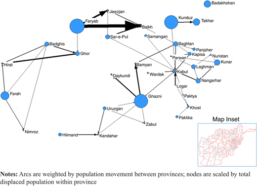
Figure 1 provides a visualization of population displacement in Afghanistan during the first eight months of 2018. It embodies the SNA framework of systems as graphs (better known as networks), consisting of vertices and arcs (Johnson et al., 2001) and their meanings change with the application (Galaskiewicz, 2011). In Figure 1, the vertices (sometimes known as actors but better known as nodes) represent Afghan provinces, arranged according to their physical proximity on a map. The arcs (also known as links, edges or ties) represent the movement of displaced persons between those provinces. Links are visually weighted by the relative volume of migration, ranging from 50 people in the case of some links to over 9,000 people forced from the province of Faryab into neighboring Balkh. Node size reflects internal displacement within the province, known more generally as reflexive ties, those whose origin and target nodes coincide (Wasserman and Faust, 1994). Figure 1 demonstrates how network visualization can render complex interactions in an easy-to-understand way, particularly the representation of multiple characteristics at once. Studies in domains as diverse as sociology, biology and information science have pointed to the potential of network visualization, provided it conforms to the principle of graphical excellence and contains meaningful information (Brandes et al., 2006; Royer et al., 2008; Moody et al., 2005).
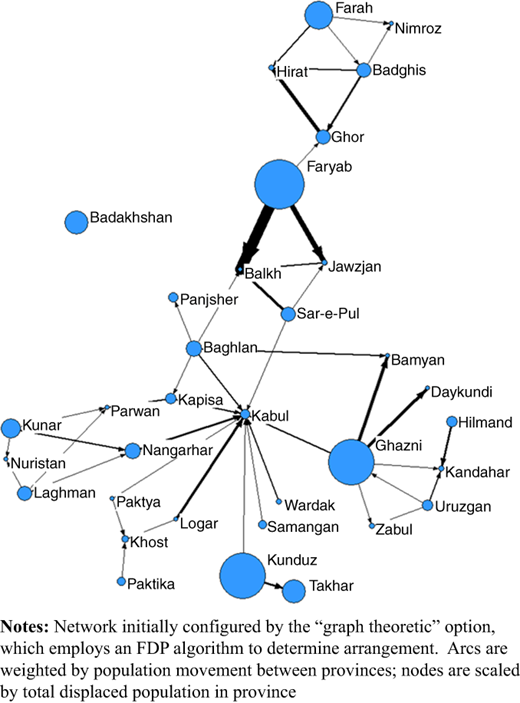
Although accurate, Figure 1 does not take advantage of abstraction, in that geography dictates the placement of its nodes. In contrast, Figure 2 shows the same network, where the nodes have been “unpinned” from their map locations and rearranged by a force directed placement (FDP) algorithm, which treats nodes as analogous to physical bodies attached by spring-like bonds (Di Battista et al., 1994). This process is usually applied to an otherwise random arrangement, disentangling arcs to create a more intuitive network. In Figure 1, geographic location naturally provides some network esthetic, as provinces locate nearest those provinces with which they share links, because the links themselves represent the crossing of provincial borders. Both Figures 1 and 2 visually emphasize the provinces of Faryab, Kunduz and Ghazni through node size and multiple outgoing links, an emphasis that triangulates with media reports of ongoing Taliban attacks on the local population in these provinces during this period (Usmani, 2018a, b). However, the FDP algorithm provides further insight into this pattern of population displacement, relative to the map in Figure 1. Its simulated physics moves Kabul into the center of the graphic, clarifying its role in the convergence of multiple evacuations, while suggesting branching subsystems of evacuation in those areas farthest from the Kabul-based center. While nodes Hilmand and Nimroz are visually associated with Figure 1, they are widely separated in Figure 2, as FDP highlights the stark logistical separation created by the Hindu Kush mountain range, which effectively divides Afghanistan along most of its southwest/northeast diagonal axis. Readily generated and intuitive, visualizations such as these can aid the processes of assessment and allocation, as well as assist in communication of humanitarian issues.
4.2.2 SNA metrics
SNA provides well-known metrics to express the nature of each node’s connectedness, such as the high in-degree centrality of the Kabul province in Figure 2. Table II provides a sample of node-level metrics for a selection of provinces. These “second wave” measures are typical of those featured in SNA-related SCM and humanitarian research to date.
Node-level metrics quantify various aspects of network structure around a node, such as the foundational concept of degree, the number of direct connections between the node and any other part of the network. Kabul’s centrality in the Figure 2 is due in large part to the fact that it has the highest degree of all the nodes, ten connections. As noted previously, all these connections represent inward flow, so Kabul’s in-degree centrality is also 10, while its out-degree centrality is 0. The value of any SNA metric to a researcher is driven by its ability to detect some useful “ground truth” specific to its application. Kabul’s combination of non-zero in-degree with zero out-degree is an earmark property of a region that serves exclusively as shelter from adversity in other provinces, and Table II indicates that provinces such as Balkh, Hirat and Parwan serve in that same role, although to a lesser magnitude. Having positive in-degree and out-degree centrality (movement of refugees both in and out of a province) is a relatively rare condition in this example, occurring in only 6 of the 34 provinces. In Table II, Badghis and Ghazni are two examples, and here we see that this condition is reflected in positive directed betweenness, meaning the nodes are intermediaries on a number of directed paths between other pairs of nodes, in a purely graphical sense. While Kabul has no such score, serving strictly as a destination, it possesses the highest scores on the popular undirected measures of eigenvector and symmetric betweenness centralities, as well as the greatest 2-step reach. Each expresses some dimension of a node’s embeddedness within the overall network structure, from the dramatic centrality of Kabul to the peripheral nature of a network pendant such as Takhar. Of the span of measures demonstrated in Table II, degree centrality and 2-step reach will play an important role in our exploratory study of affinity discussed next.
5. Case study 2: exploring affinity within two clusters of the humanitarian response in Afghanistan
In this section, we explore affinity between humanitarian agencies operating in Afghanistan, and demonstrate a new metric for its assessment. Originally framed as a tendency of people to affiliate with certain others, affinity has outgrown its sociological origins, boasting numerous applications to complex networks including biological and language processing (Ivarsson and Jemth, 2019; Pomeroy et al., 2018). Seeking its ability to uncover sub-community structures not readily apparent otherwise, we examine affinity by first analyzing the proximity of agencies operating on behalf of two UN-coordinated humanitarian clusters in Afghanistan. We then assess affinity through contrast of observed proximities with random “null models,” an important step in validation rarely witnessed in extant humanitarian research. This case study represents the third and most recent phase of SNA research, as it demonstrates network dynamics over time and evaluates whole networks as opposed to individual actors. Affinity is also an undirected relationship, illustrating a fundamental distinction in network theory (Wasserman and Faust, 1994) when compared with the first case study. Before we begin our analysis of proximity and affinity, it is helpful to review certain details concerning its context here.
5.1 The UN cluster approach model and the clusters under study
Coordinating separate organizations is central to successful humanitarian aid. In 2005, the UN undertook a major reform of this process, establishing the Cluster Approach model. The Cluster Approach divides a large-scale humanitarian effort into smaller communities of agencies, each focused on a particular sector such as health, food security or shelter. A lead agency provides coordination within each cluster, and any number of the 11 pre-defined clusters may be active, according to the needs of the humanitarian crisis. The main function of the Cluster Approach is to provide a platform for communication between agencies for data collection, needs assessment and distribution of information (Stumpenhorst et al., 2011). Some reservations about its effectiveness have been expressed, such as the challenge faced by some practitioners to reconcile the multi-sectoral nature of their organizations with a single cluster (Clarke and Campbell, 2018). Overall assessment of the Cluster Approach has been positive, however, recognizing better coverage of humanitarian needs, reduced duplication of effort and stronger partnerships among local actors (Steets et al., 2010). Arguably, the model can operate in two different modes, a command-and-control-like structure or a more organic approach, the distinction being the difference between cluster members “being coordinated” vs “coordinating” in the provision of services (Clarke and Campbell, 2018; Saavedra and Knox-Clarke, 2015). Surveys indicate that in practice, cluster members are more likely to follow the latter strategy, an approach largely consistent with adaptive practices common to emergency management (Clarke and Campbell, 2018). In the context of system dynamics, such emergent processes entail dynamic complexity, a characteristic of humanitarian logistics which requires rigorous study to improve understanding of how to design and manage such operations in the future (Gonçalves, 2008).
Of the six clusters currently operating in Afghanistan, we select two for detailed analysis: the Health cluster and the Water, Sanitation and Hygiene (WASH) cluster. We collect data on all agencies within each cluster with some degree of operating presence across the 399 districts of Afghanistan, as reported quarterly from the start of 2015 through the third-quarter of 2018. We first calculate geographic proximity between cluster agencies, and use this data to demonstrate dynamic network analysis. We then propose a new metric for detecting affinity between agencies from proximity data, which we use to contrast the Health and WASH clusters.
5.2 Data and methodology
Raw data are provided by quarterly reports of Who-Does-What-Where (3W), downloaded from HDX at humdata.org. We collect 3W reports from the first quarter of 2015 through the third-quarter of 2018, to serve as input files for a program written in VBA. This program extracts information on a target cluster and calculates proximity, which we define as instances in which agencies are working on behalf of the same cluster in the same district. Such operations may not necessarily be located in the same community, but average district size in Afghanistan suggests most co-located operations are within 30 km of one another. As outputs, the program reports pairwise instances of co-location between all combinations of cluster members, writes VNA format files for generating proximity networks in Netdraw, and provides basic node-level metric reporting. Detecting affinity in proximity data requires random replications of authentic proximity networks, discussed in detail in Section 5.3.2. Monte Carlo simulations provide the random results, in spreadsheets that mimic the structure of the original 3W reports, to enable analysis in the same manner as the original data. A second VBA program reads proximity reports of both authentic and random instances and creates numerical matrices visible as heat maps in Section 5.3.2.
5.3 Results
5.3.1 Early results: proximity and network churn
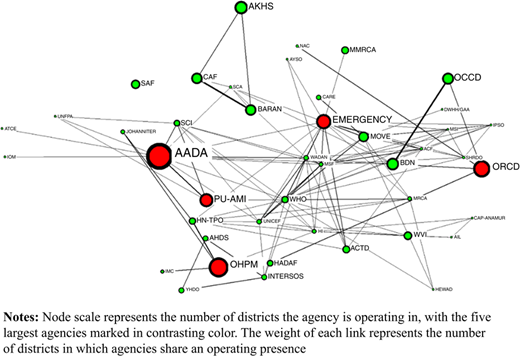
Figure 3 provides a visualization of proximity within the Health cluster in Afghanistan in the third-quarter of 2018. Each node represents an agency, scaled in size to reflect the number of districts in which that agency maintained an operating presence. The links between nodes represent proximity, the condition of agencies operating in the same districts. Interestingly, the data used in the generation of Figure 3 indicate that 38 per cent of all operations in the Health cluster were alone in their respective districts. In light of this, Figure 3 underscores the value of visualization, by revealing only one true isolate in this network, or agency that operated alone in all its districts. In other words, while members of the Health cluster operated alone in many instances, those that did operate alone almost invariably operated in close proximity to other cluster members in some other part of their service areas.
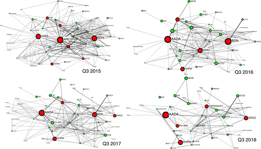
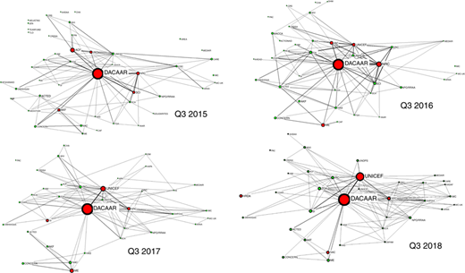
The value of network science does not stop at describing the present state of the network, but can assist in prediction of its future development, including the changing of participants commonly known as network churn (Sasovova et al., 2010). Predicting future changes begins with study of historical data, such as the four “snapshots” of the Health cluster proximity network in Figure 4, and the same networks as they relate to the WASH cluster in Figure 5.
Visual inspection of Figures 4 and 5 suggests some differences in the evolution of these two clusters over a three-year period. Figure 4 suggests that the Health cluster has declined somewhat in the number of actors, and dramatically in terms of these agencies’ proximity to one another, apparent from the lower density of connections in the most recent proximity graph. In contrast, WASH cluster networks in Figure 5 are somewhat smaller and more homogenous, with no drastic changes in size or density apparent in comparison of 2015–2018. Table III provides underlying data on network size and churn across this time line.
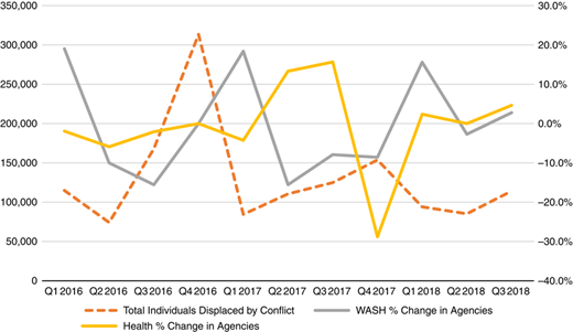
In Table III, the mean values across the full time series reveal another interesting feature: while both clusters experience surges in agency entrances and exits, these numbers nearly balance when averaged across the three-year interval. This indicates both clusters cycle in size, centered on a less dramatic trend toward contraction over three years. At this point, a natural next step in network analysis would be to search for potential drivers of this cyclic churn. Figure 6 begins that exploration, plotting the proportion of cluster size change against data introduced in our first case study, the number of people displaced by conflict in Afghanistan each quarter. Here the cycles in magnitude of operating presence are apparent, and they do appear to respond to surges in displacement in the last quarters of 2016 and 2017. This pattern evokes the ground truth of greater need for cluster services in the wake of such events, although it is likely that multiple factors drive cluster churn. For example, the precipitous drop in Health cluster size in the last quarter of 2017 was likely exacerbated by October 2017 attacks against humanitarian workers that closed Red Cross field offices in the Faryab and Kunduz provinces, and/or December 2017 clashes with the Taliban that also threatened the security of humanitarian staff in northern Afghanistan. While Figure 6 suggests resurgence of cluster size in early 2018 may be response to the needs of those displaced by the 2017 conflicts, the rapid expansion of the Health cluster in particular is likely at least partially related to a wave of poliovirus cases that emerged that previous December (USAID, 2017).
5.3.2 Evaluating affinity between agencies through random graphs
While visualization in the previous section offers interesting observations of network churn, it does not confirm that the proximity observed reflects genuine affinity between co-located agencies. If present, affinity between cluster members would be the driver of one or more network motifs within Figures 4 and 5, or significant patterns of interconnection specific to the networks under investigation (Milo et al., 2002). Apart from social networks, affinity-oriented motifs have been demonstrated in a variety of non-human networks ranging from protein interaction networks to webpages on the internet (Voevodski et al., 2009; Li and Horvath, 2009). In general, the process of motif discovery involves comparison of an existing network with a series of randomized graphs, where the motif is detected as a pattern occurring more frequently in reality than in the random instances (Milo et al., 2002). We now propose to apply this process of motif discovery to evaluate affinity among the Health and WASH cluster members.
Random graphs were first introduced in the 1950s as a mathematically tractable means of analyzing complex networks (Barabási and Albert, 1999), and have since become the preferred benchmark for in-silico validation of network topology and structure observed in existing systems (Schaffter et al., 2011). Their value depends on their ability to hold salient characteristics of the original network constant, creating a “null model” of the original system (Silva et al., 2017). In the case of the Health and WASH clusters, we create null models that preserve each node’s identity, the relative magnitude of its collective operations and the observed needs of each district in Afghanistan. When compared to actual data, a null model allows us to recognize what portion of proximity could be the natural result of the size of the agencies in question. In this study, each null model consists of ten random replications of a particular proximity network at a particular time. To generate a random replication, the following values are required for every agency j and every district i:
s(j) is the total number of operations provided by agency j across all districts.
d(i) is the total number of operations in district i across all agencies.
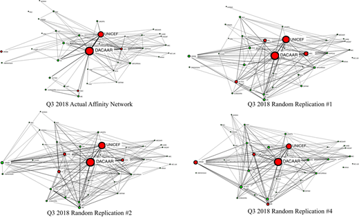
Each random replication is the result of a Monte Carlo simulation in which d(i) is fixed for each district, derived from original cluster data in that time period. To determine who is operating where, agencies are chosen randomly with a probability that reflects their overall contribution to the existing network, or for a given agency j. The simulation enforces the condition that an agency is not assigned to a district two or more times, by replacing any redundant random draw with another random draw that meets that condition. Figure 7 illustrates the most recent WASH cluster network in our data set, contrasted with three of its random replications.
Examination of Figure 7 suggests that the random replications possess greater density of connections, as mean degree centrality appears to be higher. This is an early suggestion of affinity in the actual cluster, in that distribution of the same operating instances across the same districts at random is creating greater diversity of co-located operations, a heterogeneity of proximity that highlights the presence of at least some habitual co-location partners in the upper-left network. Degree centrality is a well-known node-level metric introduced in our first case study, and it returns here to express the number of different agencies that a fellow cluster member would likely be familiar with, due to co-located operations in one or more districts. Table IV reports several whole network measures including mean degree centrality, for both clusters and their corresponding null models, in the earliest and the most recent quarters of this data set. In each of the four cases, the mean degree centrality of the actual proximity network is less than the mean value of the null model, confirming our visual impression of Figure 7. To explore one potential consequence of that distinction, Table IV also reports the mean 2-step reach within each of the eight cases. 2-step reach centrality is another node-level metric introduced in the first case study, stated here as the proportion of the network a target node can “reach” through paths of up to two links. Restated, this measure tallies direct connections and “friends of friends,” an expression of the weak ties first discussed to Section 2.1 as potential bridges between groups. Reach centrality can represent the potential for information diffusion, particularly in terms of referrals, as in “[…] I can’t assist you with that, but I know someone who probably can[…]” Indeed, SNA research has demonstrated that in certain contexts, “friends of friends” ties constitute an important relational resource which may prove more useful to focal nodes than their immediate connections (Bian, 1997). One compelling feature of the affinity suggested by restricted degree centrality in the actual networks is the distinct drop in 2-step reach in three of the four scenarios. As an example, if district assignments were determined at random within the Health cluster in 2018, any given agency would be, on average, within one referral of 54.9 per cent of the entire cluster membership, whereas the actual arrangement of operations provides that accessibility at a mean of 44.3 per cent. Only the Health cluster at the start of 2015 provides a scenario in which random mean 2-step reach is narrowly higher than the actual network.
Table IV supports the notion of some affinity present in at least three of the four scenarios. To gain further insight into its source, or to understand why Q1 2015 for the Health cluster may be an exception, we return to the node-level. Within a target cluster at a given period in time, let us define two further parameters:
αjk is the count of co-located operations between agency j and k.
is the count of co-located operations that occur naturally, given s( j ), s( k ), and d( i ) for all districts i.
Parameter reflects the degree to which we would expect agencies j and k to overlap given all locations of all existing operations were determined at random. In this study, we estimate using the mean αjk observed in the appropriate null model. Affinity between agencies j and k is expressed in the strict difference between the actual and random proximity instances, or:
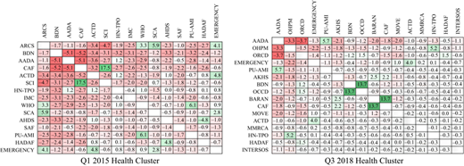
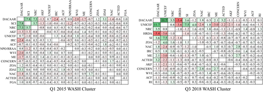
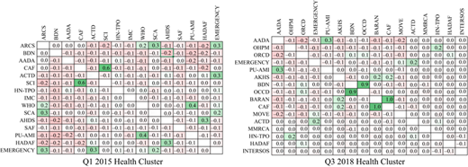
Figures 8 and 9 display these differences as heat maps, a useful format for surveying pairwise comparisons between nodes. For clarity, these maps include only the “major players,” or the 15 largest agencies in terms of number of operations.
At first glance, comparison of Figures 8 and 9 would suggest that the Health cluster is host to a significant network motif consisting of both positive affinity among some agencies and its opposite, a notable lack of affinity between some pairs. In contrast, the WASH cluster would appear to have fewer features. However, it is difficult to judge the significance of these particular values without further context, which motivates our proposed Affinity Index, norming expression (1) by the overall size of the smaller agency. Restated, for any agency j and k, let:
Figure 10 provides Affinity Index heat maps corresponding to the Health cluster scenarios in Figure 8. Here we see the dramatic departures from random originally visible in Figure 8 reduce when taking variation in agency size into account. Distinct affinities within the Health cluster persist, however, as indicated by the remaining heat map cells with darker backgrounds. Indeed, two pairs of agencies clearly visible in Figure 10 (OCCD and BDN and CAF and BARAN) are the likely cause of most of the observed paucity of overall 2-step reach in the Q3 2018 proximity network. Here each participant within a pair invests most instances of co-location with the other participant, to the exclusion of the remaining actors in the network. Although seemingly dramatic instances of non-affinity in Q1 2015 appear to fall away upon normalization, one motif that emerges is the widespread occurrence of a moderately negative affinity score between most of 15 largest agencies. This indicates that each of these larger agencies frequently has one or two less than expected instances of co-location with other large agencies, a collective deficit apparently invested in smaller agencies or in opportunities to operate alone. In this context, both investments enhance the internal connectedness of the network, at which point we return to the observation that this was the only scenario in Table IV in which the actual proximity network had a greater 2-step reach than its random counterparts.
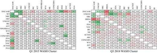
Figure 11 provides the equivalent Affinity Index values for the WASH cluster, corresponding to the absolute differences in Figure 9. The WASH cluster is somewhat smaller than the Health cluster and contains a greater concentration of operations in its two largest agencies, apparent earlier in the scaling of node size in Figures 5 and 7. When affinity is normed in this context, most of the significant features of Figure 9 persist, in contrast to the same comparison on behalf of the Health cluster. We note at this point that the ground truth of significant affinity could be genuinely “social,” as a pair of agencies may have a distinct preference for operating in each other’s vicinity. Factors that could motivate such a preference include previous experience, cooperative agreements and/or a propensity for collaboration. However, a significantly positive Affinity Index score does not necessarily mean two agencies prefer proximity to one another, but may also detect preference for a third factor. One example would be a shared preference for operating across adjacent districts, so co-location in one district implies higher likelihood of co-location in the neighboring districts. Another factor might be preference for a specific type of project, consistently drawing two agencies into the same districts where that particular need arises.
6. Conclusions and future research directions
Interactions among humanitarian actors are crucial to humanitarian response and research. However, their structure has received limited attention in quantitatively rigorous empirical research. Although SNA is not a new methodology, its use in humanitarian research is still sporadic. Extant empirical studies have treated humanitarian systems primarily as static snapshots, despite their distinctly dynamic nature. SNA can frame important humanitarian issues, by adapting existing SNA concepts to humanitarian contexts, as demonstrated in our first case study; or by introducing humanitarian-specific metrics, such as the Affinity Index proposed in our second case study. Among its many benefits, this methodology can detect salient network motifs in humanitarian data, which may then be used to quantify collaboration and assess its outcomes.
However, challenges remain for SNA research in humanitarian research. Following a framework adapted from Jones and Faas (2016), we organize observations from our literature review along four dimensions in Table V, to present both research gaps and potential future directions.
The highly dynamic character of humanitarian operations is driven by its myriads of different actors, the temporality of its supply structures, and the immense scope of potential disaster (Jahre et al., 2009; Kovács and Spens, 2009). As such, both humanitarian operations and supporting research should be open to influence, but cannot be scripted. SNA is a methodology that welcomes complexity and offers easy-to-implement ways to analyze and quantify it. This paper provides a subset of the possible paths humanitarian researchers might explore with SNA; the rest remains ready for discovery.