1-20 of 5212
Keywords: INTERCEPTOR
Close
Follow your search
Access your saved searches in your account
Would you like to receive an alert when new items match your search?
Journal

Covers the effect of civil engineering on local communities.
Journal Articles
Proceedings of the Institution of Civil Engineers - Municipal Engineer 1–14.
Published: 28 July 2026
Includes: Supplementary data
in Transportation simulation and stakeholder exercises for urban seismic resilience
> Proceedings of the Institution of Civil Engineers - Municipal Engineer
Published: 28 July 2026
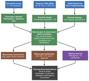
Figure 1. Integrated methodological framework for urban seismic resilience planning (case study: St. Louis) A flowchart shows the workflow for earthquake evacuation traffic simulation and planning recommendations. The flowchart begins with three input sources. Household survey with n of 149 re... More about this image found in Integrated methodological framework for urban seismic resilience planning (...
in Transportation simulation and stakeholder exercises for urban seismic resilience
> Proceedings of the Institution of Civil Engineers - Municipal Engineer
Published: 28 July 2026
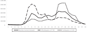
Figure 2. Evacuation demand profiles used to represent baseline conditions and earthquake-triggered demand surges for 07:00 and 16:00 events A line graph compares hourly evacuation demand for baseline conditions and earthquakes occurring at 07.00 and 16.00. The horizontal axis represents time ... More about this image found in Evacuation demand profiles used to represent baseline conditions and earthq...
in Transportation simulation and stakeholder exercises for urban seismic resilience
> Proceedings of the Institution of Civil Engineers - Municipal Engineer
Published: 28 July 2026
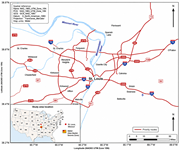
Figure 3. St. Louis metropolitan region: priority evacuation and response corridors used in the case study A map identifies the study area, priority routes, and reference information for the St. Louis metropolitan region. The map covers the St. Louis metropolitan region with latitude from 38.2... More about this image found in St. Louis metropolitan region: priority evacuation and response corridors u...
in Transportation simulation and stakeholder exercises for urban seismic resilience
> Proceedings of the Institution of Civil Engineers - Municipal Engineer
Published: 28 July 2026
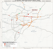
Figure 4. Bridge seismic screening results for the St. Louis region (Mw 6.7 scenario). The map highlights bridges within 500 m of priority corridors A map shows bridge seismic risk for priority routes in the St. Louis metropolitan region after a magnitude 6.7 earthquake. The map presents the S... More about this image found in Bridge seismic screening results for the St. Louis region (Mw 6.7 scenario)...
in Transportation simulation and stakeholder exercises for urban seismic resilience
> Proceedings of the Institution of Civil Engineers - Municipal Engineer
Published: 28 July 2026
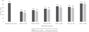
Figure 5. 24-h average network speed by scenario group (Baseline vs. Damaged network) A grouped bar chart compares baseline and damaged network speeds across 7 earthquake scenario groups. The horizontal axis lists baseline with no earthquake, 100 per cent at 07.00, 100 per cent at 16.00, 50 pe... More about this image found in 24-h average network speed by scenario group (Baseline vs. Damaged network)...
in Transportation simulation and stakeholder exercises for urban seismic resilience
> Proceedings of the Institution of Civil Engineers - Municipal Engineer
Published: 28 July 2026
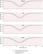
Figure 6. Hourly speed-to-speed-limit ratio on priority corridors: Scenarios 1 and 2 (7:00 a.m. event), Baseline vs. Damaged network Four line graphs compare hourly speed to speed limit ratios for baseline and damaged networks after a 07.00 earthquake. The horizontal axis in all panels represe... More about this image found in Hourly speed-to-speed-limit ratio on priority corridors: Scenarios 1 and 2 ...
Journal Articles
Proceedings of the Institution of Civil Engineers - Municipal Engineer 1–15.
Published: 20 July 2026
Includes: Supplementary data
in Cloud model-based public spaces safety risk assessment in Xi’an old residential areas
> Proceedings of the Institution of Civil Engineers - Municipal Engineer
Published: 20 July 2026
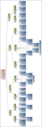
Figure 1. AHP hierarchy model for safety risk assessment of public spaces in old residential areas A flowchart shows a security risk evaluation index system for public spaces in old residential areas. The system branches into 4 categories, external environment, external space, public safety ... More about this image found in AHP hierarchy model for safety risk assessment of public spaces in old res...
in Cloud model-based public spaces safety risk assessment in Xi’an old residential areas
> Proceedings of the Institution of Civil Engineers - Municipal Engineer
Published: 20 July 2026
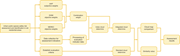
Figure 2. Cloud model-based urban public spaces safety risk assessment and identification in old residential areas A flowchart outlines the safety risk assessment and identification process for urban public spaces in old residential areas. The process starts with an urban public spaces safety ... More about this image found in Cloud model-based urban public spaces safety risk assessment and identifica...

in Cloud model-based public spaces safety risk assessment in Xi’an old residential areas
> Proceedings of the Institution of Civil Engineers - Municipal Engineer
Published: 20 July 2026
Figure 3. Cloud generator: (a) normal cloud generator and (b) backward cloud generator Two panels show the processes of normal cloud generation and backward cloud generation. The panel a shows Ex, He, and En entering a normal cloud generator. Then drop, x i, mu i, emerges as the output. The pa... More about this image found in Cloud generator: (a) normal cloud generator and (b) backward cloud generato...
in Cloud model-based public spaces safety risk assessment in Xi’an old residential areas
> Proceedings of the Institution of Civil Engineers - Municipal Engineer
Published: 20 July 2026
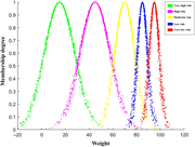
Figure 4. Standard cloud image A scatter graph compares membership degree against weight for 5 risk levels. The vertical axis represents membership degree from 0 to 1. The horizontal axis represents weight from negative 20 to 120. Five distributions represent very high risk, high risk, moderat... More about this image found in Standard cloud image A scatter graph compares membership degree against ...
in Cloud model-based public spaces safety risk assessment in Xi’an old residential areas
> Proceedings of the Institution of Civil Engineers - Municipal Engineer
Published: 20 July 2026
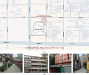
Figure 5. Location and current status of the residential area of Xi’an Fourth People’s Hospital: (a) location and (b) current status Two panels show a study area map and street views of the residential area near Xian number 4 Hospital. The panel a presents a street map of Xincheng District, Xi... More about this image found in Location and current status of the residential area of Xi’an Fourth People’...
in Cloud model-based public spaces safety risk assessment in Xi’an old residential areas
> Proceedings of the Institution of Civil Engineers - Municipal Engineer
Published: 20 July 2026
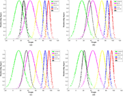
Figure 6. Integrated cloud image for safety risk assessment at the primary indicators: (a) external environment cloud image; (b) external space cloud image; (c) public safety facilities cloud image; and (d) safety management systems cloud image Four scatter graphs show membership degree against... More about this image found in Integrated cloud image for safety risk assessment at the primary indicators...
Journal Articles
Proceedings of the Institution of Civil Engineers - Municipal Engineer 1–15.
Published: 14 July 2026
Includes: Supplementary data
in The financial cost of non-revenue water in Mutare, Zimbabwe
> Proceedings of the Institution of Civil Engineers - Municipal Engineer
Published: 14 July 2026
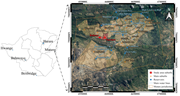
Figure 1. Location of the study area, Natview and Raheen Subzones (adopted from Mapenzauswa et al., 2026 ) A satellite view identifies study area suburbs in Mutare, Zimbabwe, with surrounding suburbs, reservoirs, water lines, and jurisdiction. Thenb map identifies Zimbabwe and marks Harare, Mutare, Bulawayo, Hwange, and Beitbridge, with a connector indicating the enlarged study area. A satellite view of Mutare identifies the study suburbs, Raheen and Natview. Surrounding suburbs include Weirmouth, Hobhouse, Zimta Park, Chikanga, Sakubva Large and Sakubva Small, Yeovil, Florida, Allan Wilson, Christmas Pass, Mountain View, Hospital Hill, C B D, Murambi, Bordervale, Morningside, Greenside, Darlington, Muneni, Industrial area, Nyamakete, Dangamvura 1 and Dangamvura 2, Dangamvura, Dangamvura 3, Fern Valley, High Level 1 and High Level 2. Reservoirs and the main water line network extend across the mapped suburbs. A dashed boundary marks the Mutare jurisdiction. Coordinate values range from 455000 east to 470000 east and from 7890000 north to 7905000 north. A north arrow indicates map orientation, and a scale bar spans 0 to 5 kilometres. More about this image found in Location of the study area, Natview and Raheen Subzones (adopted from Mape...
in The financial cost of non-revenue water in Mutare, Zimbabwe
> Proceedings of the Institution of Civil Engineers - Municipal Engineer
Published: 14 July 2026
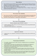
Figure 2. Schematic diagram showing the key steps in study design and approach A flowchart outlines data collection, non-revenue water calculation, loss partitioning, and financial impact quantification. The process begins with data collection, where water distribution network data, pipe lengt... More about this image found in Schematic diagram showing the key steps in study design and approach A f...
in The financial cost of non-revenue water in Mutare, Zimbabwe
> Proceedings of the Institution of Civil Engineers - Municipal Engineer
Published: 14 July 2026
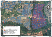
Figure 3. Schematic diagram of the Hobhouse water distribution network, showing the flow and pressure logging points A satellite view identifies pressure and flow logging points, the water distribution network, and Raheen and Natview subzones. The satellite view identifies the Raheen and Natvi... More about this image found in Schematic diagram of the Hobhouse water distribution network, showing the f...
in The financial cost of non-revenue water in Mutare, Zimbabwe
> Proceedings of the Institution of Civil Engineers - Municipal Engineer
Published: 14 July 2026
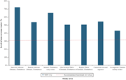
Figure 4. Comparative analysis of NRW in the study areas against similar studies and the African benchmark A bar chart compares non-revenue water levels across study areas with the recommended African benchmark. The vertical axis represents the level of non-revenue water from 0 to 80 per cen... More about this image found in Comparative analysis of NRW in the study areas against similar studies an...