1-20 of 5169
Keywords: MAGNET MOTOR
Close
Follow your search
Access your saved searches in your account
Would you like to receive an alert when new items match your search?
Journal

Covers the effect of civil engineering on local communities.
Journal Articles
Proceedings of the Institution of Civil Engineers - Municipal Engineer 1–20.
Published: 26 June 2026

in A comparative analysis of interconnectivity impact on ridership demand forecast in MMTS
> Proceedings of the Institution of Civil Engineers - Municipal Engineer
Published: 26 June 2026
Figure 1. Pooled actual vs predicted (transformed-basis linear model) A scatter plot comparing actual G values for B R T S boarding with predicted G values and a dashed reference line. The scatter plot shows predicted G values against actual G values for B R T S boarding. The horizontal axis i... More about this image found in Pooled actual vs predicted (transformed-basis linear model) A scatter pl...

in A comparative analysis of interconnectivity impact on ridership demand forecast in MMTS
> Proceedings of the Institution of Civil Engineers - Municipal Engineer
Published: 26 June 2026
Figure 2. Pooled predicted vs actual BRTS boarding (coloured by city) A scatter plot comparing actual G with predicted G, grouped by cities with a diagonal reference line. The scatter plot shows predicted G values against actual G values grouped by cities. The horizontal axis is labelled act... More about this image found in Pooled predicted vs actual BRTS boarding (coloured by city) A scatter ...

in A comparative analysis of interconnectivity impact on ridership demand forecast in MMTS
> Proceedings of the Institution of Civil Engineers - Municipal Engineer
Published: 26 June 2026
Figure 3. Actual vs predicted BRTS boarding and SHAP-based feature importance (pooled model) A two-panel chart showing actual versus predicted B R T S boarding and S H A P feature importance values. The left panel shows a scatter plot of predicted B R T S boarding, G, against actual B R T S ... More about this image found in Actual vs predicted BRTS boarding and SHAP-based feature importance (pool...

in A comparative analysis of interconnectivity impact on ridership demand forecast in MMTS
> Proceedings of the Institution of Civil Engineers - Municipal Engineer
Published: 26 June 2026
Figure 4. Actual vs predicted BRTS boarding and SHAP-based feature importance (pooled model) A horizontal bar chart showing mean absolute S H A P values for features ranked by impact. The horizontal bar chart shows mean absolute S H A P values representing average impact on model output magn... More about this image found in Actual vs predicted BRTS boarding and SHAP-based feature importance (pool...

in A comparative analysis of interconnectivity impact on ridership demand forecast in MMTS
> Proceedings of the Institution of Civil Engineers - Municipal Engineer
Published: 26 June 2026
Figure 5. LIME-based local explanation for Pune, single prediction (Instance 23), presenting the effect of various parameters on BRTS boarding prediction A horizontal bar chart showing L I M E explanation for instance 23 with feature contributions to prediction. The horizontal bar chart show... More about this image found in LIME-based local explanation for Pune, single prediction (Instance 23), pre...

in A comparative analysis of interconnectivity impact on ridership demand forecast in MMTS
> Proceedings of the Institution of Civil Engineers - Municipal Engineer
Published: 26 June 2026
Figure 6. LIME-based local explanation for Jaipur, single prediction (Instance 10), presenting the effect of various parameters on BRTS boarding prediction A horizontal bar chart showing L I M E explanation for Jaipur instance 10 with feature contributions. The horizontal bar chart shows L I... More about this image found in LIME-based local explanation for Jaipur, single prediction (Instance 10), p...

in A comparative analysis of interconnectivity impact on ridership demand forecast in MMTS
> Proceedings of the Institution of Civil Engineers - Municipal Engineer
Published: 26 June 2026
Figure 7. LIME-based local explanation for Ahmedabad, single prediction (Instance 14), presenting the effect of various parameters on BRTS boarding prediction A horizontal bar chart showing L I M E explanation for Ahmedabad instance 14 with feature contributions. The horizontal bar chart sho... More about this image found in LIME-based local explanation for Ahmedabad, single prediction (Instance 14)...
Journal Articles
Proceedings of the Institution of Civil Engineers - Municipal Engineer 1–10.
Published: 17 June 2026
in Local calibration of safety performance functions for multi-lane rural highways in Sonepat
> Proceedings of the Institution of Civil Engineers - Municipal Engineer
Published: 17 June 2026
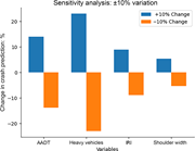
Figure 1. Sensitivity analysis plot with dual bars A bar chart showing sensitivity analysis with plus or minus 10 percent variation, where Heavy Vehicles have the largest effect on crash prediction change. The bar chart shows a sensitivity analysis with plus or minus 10 percent variation for f... More about this image found in Sensitivity analysis plot with dual bars A bar chart showing sensitivity...
Journal Articles
Proceedings of the Institution of Civil Engineers - Municipal Engineer 1–14.
Published: 04 June 2026
in Assessing bus stop accessibility for persons with reduced mobility in Durban, South Africa
> Proceedings of the Institution of Civil Engineers - Municipal Engineer
Published: 04 June 2026
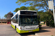
Figure 1. Low-floor bus in operation (Durban People Mover) A People Mover bus with 10537 displayed is parked beside a paved walkway surrounded by trees and buildings in an outdoor urban setting. More about this image found in Low-floor bus in operation (Durban People Mover) A People Mover bus with...
in Assessing bus stop accessibility for persons with reduced mobility in Durban, South Africa
> Proceedings of the Institution of Civil Engineers - Municipal Engineer
Published: 04 June 2026
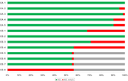
Figure 2. Results for critical requirements at bus stops A horizontal bar chart compares yes, no, and not applicable responses across categories labelled C A and C S. The horizontal stacked bar chart displays response distributions across categories labelled C A 1 to C A 5 and C S 1 to C S 8. ... More about this image found in Results for critical requirements at bus stops A horizontal bar chart co...
in Assessing bus stop accessibility for persons with reduced mobility in Durban, South Africa
> Proceedings of the Institution of Civil Engineers - Municipal Engineer
Published: 04 June 2026
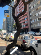
Figure 3. Boarding zone obstruction by parked vehicles A curved tree trunk stands beside parked vehicles and high-rise buildings along a city street with a bus stop sign 1 and 2. More about this image found in Boarding zone obstruction by parked vehicles A curved tree trunk stands ...
in Assessing bus stop accessibility for persons with reduced mobility in Durban, South Africa
> Proceedings of the Institution of Civil Engineers - Municipal Engineer
Published: 04 June 2026
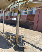
Figure 4. Absence of required perch or leaning supports A metal bus shelter includes accessible seating and support rails positioned along a paved pedestrian walkway. More about this image found in Absence of required perch or leaning supports A metal bus shelter includ...
in Assessing bus stop accessibility for persons with reduced mobility in Durban, South Africa
> Proceedings of the Institution of Civil Engineers - Municipal Engineer
Published: 04 June 2026
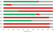
Figure 5. Results for non-critical requirements at bus stops A stacked horizontal bar chart compares Yes, No, and N slash A responses across N C A and N C S categories. The stacked horizontal bar chart compares response distributions across 7 categories labelled N C A 1, N C A 2, N C S 1, N C ... More about this image found in Results for non-critical requirements at bus stops A stacked horizontal ...
in Assessing bus stop accessibility for persons with reduced mobility in Durban, South Africa
> Proceedings of the Institution of Civil Engineers - Municipal Engineer
Published: 04 June 2026
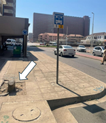
Figure 6. Non-compliant tree pit creating a tripping hazard A damaged pavement beside a bus stop sign includes a broken concrete section highlighted with an arrow. More about this image found in Non-compliant tree pit creating a tripping hazard A damaged pavement bes...
in Assessing bus stop accessibility for persons with reduced mobility in Durban, South Africa
> Proceedings of the Institution of Civil Engineers - Municipal Engineer
Published: 04 June 2026
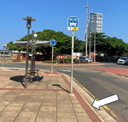
Figure 7. Absence of tactile ground surface indicators A bus stop shelter and roadside sign stand beside a curved roadway near a roundabout and trees with an arrow pointing to the pavement. More about this image found in Absence of tactile ground surface indicators A bus stop shelter and road...
in Assessing bus stop accessibility for persons with reduced mobility in Durban, South Africa
> Proceedings of the Institution of Civil Engineers - Municipal Engineer
Published: 04 June 2026
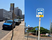
Figure 8. Different bus stop signpost models within the network Two roadside transit signs stand along urban pavements beside parked vehicles and city streets. The split-panel image shows two roadside transit signs installed along urban pavements. The left panel displays a tall signpost with a... More about this image found in Different bus stop signpost models within the network Two roadside trans...
