1-20 of 8175
Keywords: PUBLIC SECTOR
Close
Follow your search
Access your saved searches in your account
Would you like to receive an alert when new items match your search?
Journal

Essential reading on civil engineering developments across all areas of transport.
Journal Articles
Proceedings of the Institution of Civil Engineers - Transport 1–8.
Published: 31 July 2026
in Deep sleep on a light European train: modularity and lightweight, key to profitable night trains
> Proceedings of the Institution of Civil Engineers - Transport
Published: 31 July 2026
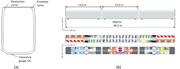
Figure 1. (a) Cross-section of the ‘AliSa’ car body; (b) train formation (top) and interior layout for the upper and lower levels (bottom) Two diagrams show a railway vehicle clearance gauge and a 3-car interior layout with principal dimensions. The diagram in panel a compares a clearance gaug... More about this image found in (a) Cross-section of the ‘AliSa’ car body; (b) train formation (top) and in...
in Deep sleep on a light European train: modularity and lightweight, key to profitable night trains
> Proceedings of the Institution of Civil Engineers - Transport
Published: 31 July 2026
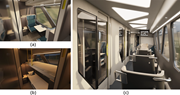
Figure 2. Design concept: (a) compartment during the day and (b) at night; (c) business reclining chair opposite the sleeping cabins Three renderings show railway passenger accommodation with seating, sleeping berths, and an interior corridor. More about this image found in Design concept: (a) compartment during the day and (b) at night; (c) busine...
in Deep sleep on a light European train: modularity and lightweight, key to profitable night trains
> Proceedings of the Institution of Civil Engineers - Transport
Published: 31 July 2026
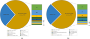
Figure 3. (a) Ten most significant drivers for the end coach; (b) ten most significant drivers for the middle coach Two pie charts show the contribution of the 10 largest weight drivers and other components for 2 railway vehicle configurations. The charts comprise panel a and panel b. Panel a ... More about this image found in (a) Ten most significant drivers for the end coach; (b) ten most significan...
in Deep sleep on a light European train: modularity and lightweight, key to profitable night trains
> Proceedings of the Institution of Civil Engineers - Transport
Published: 31 July 2026
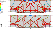
Figure 4. Topology optimisation (a) without and (b) with module frame of the middle coach Two contour plots compare element density distributions for 2 structural optimisation results. The contour plots comprise panel a and panel b. A contour scale indicates element densities from 0.01 to 1.00... More about this image found in Topology optimisation (a) without and (b) with module frame of the middle c...
in Deep sleep on a light European train: modularity and lightweight, key to profitable night trains
> Proceedings of the Institution of Civil Engineers - Transport
Published: 31 July 2026
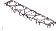
Figure 5. Automatically derived design of the topology optimisation for the roof A three-dimensional structural model shows an elongated framework formed by interconnected beams and joints. The X, Y, and Z axes indicate the model orientation. More about this image found in Automatically derived design of the topology optimisation for the roof A...
Journal Articles
Proceedings of the Institution of Civil Engineers - Transport 1–14.
Published: 28 July 2026
in Equity-oriented transit-oriented development in Taipei: accessibility, displacement and commerce
> Proceedings of the Institution of Civil Engineers - Transport
Published: 28 July 2026
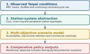
Figure 1. Research workflow linking observed Taipei conditions, station-system abstraction, a multi-objective scenario model and comparative policy outputs (MRT, mass rapid transit) A flowchart outlines a four-step framework from observed Taipei conditions to comparative policy outputs. The fl... More about this image found in Research workflow linking observed Taipei conditions, station-system abstra...
in Equity-oriented transit-oriented development in Taipei: accessibility, displacement and commerce
> Proceedings of the Institution of Civil Engineers - Transport
Published: 28 July 2026
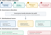
Figure 2. Conceptual sequence linking value creation, governance allocation and distributive outcomes in equity-oriented transit-oriented development A flowchart illustrates value creation, governance allocation, distributional levers, and distributional outcomes. The flowchart begins with the... More about this image found in Conceptual sequence linking value creation, governance allocation and distr...
in Equity-oriented transit-oriented development in Taipei: accessibility, displacement and commerce
> Proceedings of the Institution of Civil Engineers - Transport
Published: 28 July 2026
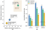
Figure 3. Typology-level planning tension and accessibility return in Taipei: (a) typology-level planning tension, (b) objective 1: scenario by typology Two graphs compare redevelopment capacity, displacement sensitivity, and accessibility under three policy scenarios. Panel a shows a scatter ... More about this image found in Typology-level planning tension and accessibility return in Taipei: (a) typ...
in Equity-oriented transit-oriented development in Taipei: accessibility, displacement and commerce
> Proceedings of the Institution of Civil Engineers - Transport
Published: 28 July 2026
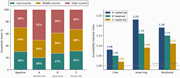
Figure 4. Scenario dashboard summarising compositional and typological outcomes: (a) post-development household composition, (b) objective 1 by station typology Two bar charts compare household income shares and accessibility across baseline and three policy scenarios The left chart is a stack... More about this image found in Scenario dashboard summarising compositional and typological outcomes: (a) ...
in Equity-oriented transit-oriented development in Taipei: accessibility, displacement and commerce
> Proceedings of the Institution of Civil Engineers - Transport
Published: 28 July 2026
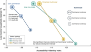
Figure 5. Trade-off frontier across station typologies and policy bundles A bubble line graph compares low-income household retention and accessibility across three station typologies and policy scenarios. The graph plots accessibility or ridership index on the horizontal axis from 1.00 to abo... More about this image found in Trade-off frontier across station typologies and policy bundles A bubble...
Journal Articles
Proceedings of the Institution of Civil Engineers - Transport 1–14.
Published: 28 July 2026
in Curbside EV charging infrastructure planning: fusing choice behavior and demand prediction
> Proceedings of the Institution of Civil Engineers - Transport
Published: 28 July 2026
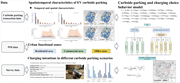
Figure 1. Research framework diagram A flow diagram shows data sources, analysis workflow, and an E V curbside parking and charging behaviour model. The flow starts with data sources, curbside parking transaction data, P O I data, and survey data. Curbside parking transaction data lead to spat... More about this image found in Research framework diagram A flow diagram shows data sources, analysis w...
in Curbside EV charging infrastructure planning: fusing choice behavior and demand prediction
> Proceedings of the Institution of Civil Engineers - Transport
Published: 28 July 2026
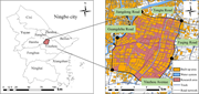
Figure 2. Research area Two maps show Ningbo city districts and a Yinzhou research area bounded by named roads, with land use, tracks, and road networks. The first map locates the research area in Yinzhou within Ningbo city, alongside Cixi, Yuyao, Jiangbei, Zhenhai, Beilun, Haishu, Fenghua, Ni... More about this image found in Research area Two maps show Ningbo city districts and a Yinzhou research...
in Curbside EV charging infrastructure planning: fusing choice behavior and demand prediction
> Proceedings of the Institution of Civil Engineers - Transport
Published: 28 July 2026
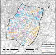
Figure 3. Identification of urban functional zones A map shows functional zone road segments for residential area, commercial area, and office area, with a north arrow and a 0 to 8 kilometre scale. More about this image found in Identification of urban functional zones A map shows functional zone roa...
in Curbside EV charging infrastructure planning: fusing choice behavior and demand prediction
> Proceedings of the Institution of Civil Engineers - Transport
Published: 28 July 2026
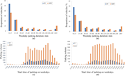
Figure 4. Analysis of temporal characteristics of EVs and ICEVs Four bar charts compare E V and I C E V weekday parking duration proportions and parking start time volumes. The panel a grouped bar chart plots weekday parking duration in minutes against proportion of vehicles in per cent. E V a... More about this image found in Analysis of temporal characteristics of EVs and ICEVs Four bar charts co...
in Curbside EV charging infrastructure planning: fusing choice behavior and demand prediction
> Proceedings of the Institution of Civil Engineers - Transport
Published: 28 July 2026
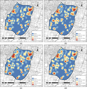
Figure 5. Heat maps of curbside parking: (a) EVs, weekdays; (b) EVs, weekends; (c) ICEVs, weekdays; (d) ICEVs, weekends Four heat maps show charging demand density across the study area. The four panels show the same study area with charging demand classified as Sparse, Relatively sparse, Mode... More about this image found in Heat maps of curbside parking: (a) EVs, weekdays; (b) EVs, weekends; (c) IC...

in Curbside EV charging infrastructure planning: fusing choice behavior and demand prediction
> Proceedings of the Institution of Civil Engineers - Transport
Published: 28 July 2026
Figure 6. Example of a typical scenario A car parked at a charging station in a commercial area, with details on parking and charging conditions provided in the adjacent table. The scenario heading states Commercial area, raining or snowing, 120 kilowatt fast charging. Would you choose to char... More about this image found in Example of a typical scenario A car parked at a charging station in a co...