


This paper presents a pilot study of a machine learning (ML) approach to predict occupants' satisfaction with the indoor environment in high-rise mixed-use buildings, aiming to validate a proof of concept for integrating ML models into early-stage design tools to support occupant-centred performance evaluation.
Using post-occupancy evaluation data from a case study building, Random Forest and Neural Network models were trained to classify satisfaction levels–Dissatisfied, Neutral or Satisfied–for both residents and workers based on indoor environmental factors. The methodology focuses on addressing class imbalance through data resampling and cost-sensitive learning, with model performance assessed using class-specific metrics.
Both models achieved high overall accuracy (cross-validation score >0.80), with notable improved performance in identifying minority classes after balancing methods were employed. While limited to a single case study, future data collection across diverse buildings and occupant profiles has the potential to improve performance and enable generalisability.
This research demonstrates the feasibility of a scalable framework for predicting indoor environmental satisfaction, enabling the integration of ML models into simulation-based workflows for data-driven, occupant-centric design evaluation. It advances the field by (1) classifying satisfaction into three actionable categories while explicitly addressing class imbalance, (2) operationalising POE data to move beyond retrospective reporting and (3) establishing a proof of concept for embedding ML models into early-stage design tools.
List of abbreviations:
- ADASYN
Adaptive Synthetic Sampling
- CWB
Class Weight Balanced
- CV
Cross-Validation
- FP
False Positives
- FN
False Negatives
- GRC
Glass fibre Reinforced Concrete
- IE
Indoor Environment
- IEQ
Indoor Environmental Quality
- IMB
Imbalanced
- IoT
Internet of Things
- ML
Machine Learning
- MLR
Multinomial Logistic Regression
- NN
Neural Network
- OS
Oversampled
- POE
Post-Occupancy Evaluation
- RH
Relative Humidity
- RF
Random Forest
- ROC AUC
Receiver Operating Characteristic Area Under the Curve
- SHAP
SHapley Additive exPlanations
- SHGC
Solar Heat Gain Coefficient
1. Introduction
The urgency of the climate crisis, coupled with the ongoing growth of urban populations and density, requires a swift and effective response in the form of innovative solutions to not only decrease carbon emissions but also improve and maintain the wellbeing of building occupants. Usually, efforts to enhance building performance through simulation-based strategies primarily aim at reducing energy consumption during operation; however, this approach often overlooks the wellbeing and satisfaction of building occupants (Afful et al., 2023).
Recent studies point to the importance of shifting the paradigm of IEQ and building performance evaluation toward a more human-centred perspective, incorporating indicators linked to positive stimuli for building occupants (Altomonte et al., 2020; Rohde et al., 2020). Therefore, there is a need for a fresh approach to assessing building performance, one that prioritises the satisfaction and wellbeing of occupants as central criteria in the evaluation process. Ideally, this evaluation should take place from the earliest stages, when design decisions significantly influence building performance (Ouldja et al., 2024). The rapid advancements in ML and artificial intelligence offer promising opportunities to develop more effective evaluation tools for this purpose, including ML models trained on POE data, which can be used to inform and improve the design of new buildings rather than merely assess the performance of existing ones (Roberts et al., 2019).
An increasing number of studies have employed ML to predict comfort related to individual factors, such as personal thermal comfort (Arakawa Martins et al., 2022) and indoor air quality (Karaiskos et al., 2024). Recent advances in integrating these models with IoT and Digital Twin technologies have enabled real-time IEQ monitoring, offering continuous data streams that capture the dynamic nature of indoor environments and occupant interactions (Broday and Gameiro Da Silva, 2023; Nikolić and Ewart, 2025; Tsang et al., 2024). While these technologies are primarily applied during building operation to enhance comfort and reduce carbon emissions, they also demonstrate potential for informing early design-stage decisions through predictive modelling.
The IEQ, which encompasses parameters such as thermal comfort, visual comfort, acoustic comfort and air quality, integrates an important part of occupants' satisfaction with the indoor environment and wellbeing. Numerous studies have extensively demonstrated the influence of IEQ parameters on occupants' health and productivity, and therefore, on their wellbeing (Al horr et al., 2016; Vladoiu et al., 2021). An extensive body of literature has established the importance of thermal comfort for health and wellbeing, besides linking extreme temperatures with increased morbidity (Frasch et al., 2025; Rony and Alamgir, 2023). Visual comfort and exposure to daylight also play a vital role in wellbeing. It impacts office workers by affecting their performance and stress, sleep patterns, and mood (Karaman Madan et al., 2024). Furthermore, numerous studies have shown that acoustic discomfort can impact the health and wellbeing of building occupants, influencing aspects such as mental health, mood and life satisfaction (Chen and Ma, 2019; Felipe Contin De Oliveira et al., 2023). Some research indicates a direct link between acoustic comfort and worker productivity in commercial buildings (Mikulski, 2018). Indoor air quality is another critical factor. Inadequate ventilation rates can lead to high CO2 levels, which contribute to sick building syndrome (Carrer et al., 2015; Hou et al., 2021) and increased exposure to microbial pollutants, often linked to respiratory diseases and immunological reactions (Vieceli et al., 2023).
A considerable amount of research has focused on POE to examine the connection between IEQ and the satisfaction of building occupants, emphasising the complex relationship between them. Kim and De Dear (2012), for example, conducted extensive POE evaluations across multiple countries, identifying this non-linear relationship between IEQ factors and IE satisfaction. Choi and Moon (2017) conducted a POE in 14 office buildings, collecting data on IEQ performance and occupant satisfaction at individual workstations, exploring the relationships between environmental satisfaction and human factors, and analysing the influence of building spatial attributes on occupant.
The well-established correlations between IEQ aspects and occupant satisfaction support their use as features in training ML models. These models can capture complex relationships between IEQ factors, enabling the prediction of occupant satisfaction to assess building performance during early design. Some authors proposed evaluation tools for assessing IEQ. Ncube and Riffat (2012) developed a multivariate regression model to predict perceived IEQ for assessing existing UK office buildings. Based on data from two case studies using a one-time questionnaire, the model does not account for seasonal changes, limiting its ability to capture IEQ dynamics. Larsen et al. (2020) introduced the IEQ Compass for evaluating multi-family residential buildings. It employs a pie chart to visualise IEQ aspects, with weights set through expert consultation and data collected with a single questionnaire. In a different approach, Fathi and O'Brien (2023) proposed a simulation-based method for assessing IEQ in the early design stages. Their model assigns scores to IEQ aspects based on acceptability levels from established standards. However, it assumes equal weighting for all factors when calculating the overall score, which may not fully reflect the nuanced influence of each factor on occupant satisfaction.
Several other studies have developed regression and ML models to predict IE satisfaction based on comfort parameters, using data collected from POEs or controlled experiments (Tang et al., 2020, 2022; Wong et al., 2008, 2018). These models often rely on Likert scales with 7 or even 10 points to represent satisfaction levels. While such detailed scales offer a more nuanced understanding of occupant satisfaction, they also reflect subjective perception variations, which can introduce noise into ML models.
This study argues that for early-stage design predictions, the key goal should be to clearly differentiate across satisfied, neutral, and dissatisfied responses. As such, it proposes reducing broad Likert scale responses from POE datasets to three distinct classes before training ML models. This approach also addresses the asymmetric distribution of responses in the datasets, where “very dissatisfied” was absent for apartments and rare for offices, which would otherwise exacerbate class imbalance. This simplification is expected to improve prediction reliability by focussing on critical satisfaction levels rather than granular but potentially noisy variations.
Moreover, a common feature of self-reported IE satisfaction data is class imbalance, with most responses indicating satisfaction (Graham et al., 2021). In classification tasks, imbalanced data can bias models toward the majority class, reducing their ability to detect minority classes such as dissatisfaction. This may result in high overall accuracy while masking poor performance in underrepresented categories (Johnson and Khoshgoftaar, 2019). Since dissatisfied responses are few, their misclassification has little effect on overall accuracy, concealing the model's limitations in identifying dissatisfied occupants. The reviewed studies do not explicitly address this issue, as they rely on regression methods that predict continuous satisfaction values rather than classifying responses.
To the best of the authors' knowledge, no previous studies have proposed predicting overall indoor satisfaction by distinguishing among the three classes: Satisfied, Neutral, and Dissatisfied. This study presents the training of ML classification models to predict IE satisfaction based on IEQ factors, grouped into these three satisfaction categories. The models are designed for integration into an early-stage design assessment tool.
1.1 Aims and objectives
This study is part of a broader ongoing research project aimed at incorporating occupants' IE satisfaction and wellbeing into an early design-stage assessment tool for building performance. The research first proposes a comprehensive framework encompassing three primary dimensions: (1) Comfort, which includes IEQ parameters; (2) Delight, addressing aspects such as views, access to nature, and living space size; and (3) Social, which considers communal spaces and community gardens (Croffi et al., 2023). This paper specifically focuses on the Comfort dimension (Figure 1), drawing on data collected through a POE of a case study building.
 The flowchart consists of two dashed rectangles labeled “Collected data” with an icon of four stacked horizontal lines and “Occupants’ feedback - surveys” with an icon of three human figures. “Collected data” and “Occupants’ feedback - surveys” are enclosed within the first and second text boxes. A downward arrow from “Collected data” leads to the first dashed rectangle consisting of the third, fourth, fifth, and sixth text boxes stacked vertically and labeled from top to bottom as follows: “Temperature and humidity values,” “Illuminance values,” “C O 2 levels values,” and “Noise level values.” Rightward arrows from the third through the sixth text boxes lead to the seventh, eighth, ninth, and tenth text boxes in “Occupants’ feedback - surveys.” These text boxes are stacked vertically and labeled from top to bottom as follows: “Thermal satisfaction,” “Daylight satisfaction,” “Air Quality satisfaction,” and “Noise level satisfaction.” Rightward arrows from “Thermal satisfaction,” “Daylight satisfaction,” “Air Quality satisfaction,” and “Noise level satisfaction” lead to an eleventh text box titled “Comfort” that is labeled “Satisfaction with the Indoor Environment.” A rightward arrow from “Comfort” leads to a twelfth text box outside the dashed rectangle on the far right labeled “Wellbeing.”
Proposed framework – comfort dimension. Source: Croffi et al. (2023)
The flowchart consists of two dashed rectangles labeled “Collected data” with an icon of four stacked horizontal lines and “Occupants’ feedback - surveys” with an icon of three human figures. “Collected data” and “Occupants’ feedback - surveys” are enclosed within the first and second text boxes. A downward arrow from “Collected data” leads to the first dashed rectangle consisting of the third, fourth, fifth, and sixth text boxes stacked vertically and labeled from top to bottom as follows: “Temperature and humidity values,” “Illuminance values,” “C O 2 levels values,” and “Noise level values.” Rightward arrows from the third through the sixth text boxes lead to the seventh, eighth, ninth, and tenth text boxes in “Occupants’ feedback - surveys.” These text boxes are stacked vertically and labeled from top to bottom as follows: “Thermal satisfaction,” “Daylight satisfaction,” “Air Quality satisfaction,” and “Noise level satisfaction.” Rightward arrows from “Thermal satisfaction,” “Daylight satisfaction,” “Air Quality satisfaction,” and “Noise level satisfaction” lead to an eleventh text box titled “Comfort” that is labeled “Satisfaction with the Indoor Environment.” A rightward arrow from “Comfort” leads to a twelfth text box outside the dashed rectangle on the far right labeled “Wellbeing.”Proposed framework – comfort dimension. Source: Croffi et al. (2023)
The framework assesses the impact of each IEQ factor on IE satisfaction, recognising wellbeing as a complex and multifaceted concept. Rather than quantifying wellbeing directly, the framework positions IE satisfaction as a key contributor, reflecting how indoor environments support comfort, health, and wellness. It focuses on parameters that can be quantified during early design stages, defined here as the initial phase of architectural design when building form and massing are explored, but detailed room layouts are not yet developed. Factors typically addressed later, such as electric lighting, sound privacy, and furnishings, were excluded from this phase and this study.
This study aims to validate the Comfort dimension of the framework by establishing a proof of concept for training and evaluating ML models to predict IE satisfaction using POE data. For that, it begins by analysing the data to identify correlations and statistical significance between IEQ factors and IE satisfaction. Subsequently, it presents the training of Random Forest and Neural Network models, comparing their performance on each class before and after addressing data imbalance.
The study also examines feature contribution to the models' predictions, analysing how each model interprets the influence of input variables on IE satisfaction. It then discusses the potential for future work to integrate the ML models into a simulation-based tool for early design evaluation to predict IE satisfaction, offering a comprehensive method for assessing a building's potential to support occupant wellbeing.
2. Methodology
2.1 Data collection
This study employed a POE methodology to gather data from the case study. The case study (Figure 2) is the U City building, a 19-story mixed-use urban development that combines apartments for seniors on upper floors, disability accommodations on middle levels, social services, and office spaces. The building operates as a carbon-neutral, 6-Star-rated building (according to the Green Star environmental rating assessment by the Australian Green Building Council) and was awarded the 2020 Good Design Australia Award for Social Impact.
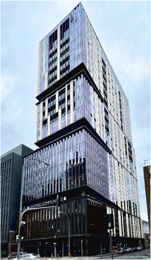
U city building in Adelaide, South Australia. Source: NSSF (2023), licensed under CC BY-SA 4.0. Image adjusted for clarity
U city building in Adelaide, South Australia. Source: NSSF (2023), licensed under CC BY-SA 4.0. Image adjusted for clarity
The building is located in Adelaide, South Australia, which has a warm-summer Mediterranean climate, characterised by hot, dry summers and mild, wet winters. It features a north-facing main façade and includes both offices and apartments oriented in all directions. Apartment windows are operable, with a U-value of 2.179 m2 K/W and SHGC of 0.189, while office windows are fixed, with a U-value of 2.786 m2 K/W and SHGC of 0.24. External walls consist of GRC panels with R3.7 insulation.
Data were collected between August 2022 and January 2024, during which occupants participated in surveys delivered via smart devices. A total of 39 participants agreed to regularly complete the surveys: 11 males and 10 females in the apartments, and 7 males, 10 females, and one non-binary in the offices. Apartment residents ranged from 65 to over 85 years old, while office occupants were aged 18 to 64.
The surveys gathered information related to IEQ factors, including thermal, visual, and acoustic comfort, indoor air quality, and overall self-reported wellbeing, as well as adaptive behaviours such as clothing choices, activities, window operations, and indoor lighting adjustments in response to environmental conditions.
Participants were instructed to complete surveys at least twice weekly throughout the data collection period to capture experiences across seasons. However, the number of responses varied among participants, with some contributing more frequently than others. Also, a decline in response rates was observed over time, likely due to survey fatigue (Ghafourifard, 2024), and participant turnover, particularly among office occupants who left the building during the study period.
Among the invited participants, 32 submitted at least one response. Of these, 28 responded five or more times, 20 responded at least twelve times, and 12 participants contributed over 30 responses (Figure 3). This uneven distribution may introduce bias toward the experiences and perceptions of the more active participants. However, as this is a pilot study, the primary objective is to test the feasibility of the data collection method and evaluate the potential of ML models for predicting IE satisfaction, rather than drawing generalisable conclusions.
 The heatmap titled “Weekly Response Concentration per Participant” is displayed at the top center. The horizontal axis at the bottom is labeled “Week” and shows date markings from 2022-08-01 at the far left to 2024-01-15 at the far right, with intervals such as 2022-08-15, 2022-08-29, 2022-09-12, 2022-09-26, 2022-10-10, 2022-10-24, 2022-11-07, 2022-11-21, 2022-12-05, 2022-12-19, 2023-01-02, 2023-01-16, 2023-01-30, 2023-02-13, 2023-02-27, 2023-03-13, 2023-03-27, 2023-04-10, 2023-04-24, 2023-05-08, 2023-05-22, 2023-06-05, 2023-06-19, 2023-07-03, 2023-07-17, 2023-07-31, 2023-08-14, 2023-08-28, 2023-09-11, 2023-09-25, 2023-10-09, 2023-10-23, 2023-11-06, 2023-11-20, 2023-12-04, 2023-12-18, and 2024-01-01. The vertical axis on the left is labeled “Participant” and lists participant I D s from top to bottom: 1126, 1233, 1376, 1437, 1513, 1533, 1540, 1615, 1704, 1760, 1822, 1846, 1890, 2007, 2011, 2014, 2092, 2227, 2260, 2271, 2370, 2392, 2411, 2462, 2485, 2499, 2674, 2814, 3109, 3117, 3133, and 3277. The heatmap consists of rectangular cells representing the number of responses each participant gave per week, shaded in varying intensities of blue. Most cells are very light, indicating few or no responses. Darker blue clusters appear notably for participants 2392, 2411, and 3109, with the darkest shades between late 2022 and mid-2023. A vertical color scale appears on the right, labeled “Number of Responses,” ranging from 0 in white to 9 in dark blue with an interval of 1.
Weekly participant response concentration throughout the study period. Source: Authors' own work
The heatmap titled “Weekly Response Concentration per Participant” is displayed at the top center. The horizontal axis at the bottom is labeled “Week” and shows date markings from 2022-08-01 at the far left to 2024-01-15 at the far right, with intervals such as 2022-08-15, 2022-08-29, 2022-09-12, 2022-09-26, 2022-10-10, 2022-10-24, 2022-11-07, 2022-11-21, 2022-12-05, 2022-12-19, 2023-01-02, 2023-01-16, 2023-01-30, 2023-02-13, 2023-02-27, 2023-03-13, 2023-03-27, 2023-04-10, 2023-04-24, 2023-05-08, 2023-05-22, 2023-06-05, 2023-06-19, 2023-07-03, 2023-07-17, 2023-07-31, 2023-08-14, 2023-08-28, 2023-09-11, 2023-09-25, 2023-10-09, 2023-10-23, 2023-11-06, 2023-11-20, 2023-12-04, 2023-12-18, and 2024-01-01. The vertical axis on the left is labeled “Participant” and lists participant I D s from top to bottom: 1126, 1233, 1376, 1437, 1513, 1533, 1540, 1615, 1704, 1760, 1822, 1846, 1890, 2007, 2011, 2014, 2092, 2227, 2260, 2271, 2370, 2392, 2411, 2462, 2485, 2499, 2674, 2814, 3109, 3117, 3133, and 3277. The heatmap consists of rectangular cells representing the number of responses each participant gave per week, shaded in varying intensities of blue. Most cells are very light, indicating few or no responses. Darker blue clusters appear notably for participants 2392, 2411, and 3109, with the darkest shades between late 2022 and mid-2023. A vertical color scale appears on the right, labeled “Number of Responses,” ranging from 0 in white to 9 in dark blue with an interval of 1.Weekly participant response concentration throughout the study period. Source: Authors' own work
The survey captures the participants' IEQ perceptions and their IE satisfaction. The significance and correlations between them informed the feature selection to train the ML models in this study (Table 2). The ML models have IE satisfaction as the target variable, and the IEQ perceptions as the independent variables encompassing thermal sensation, thermal satisfaction, daylight perception, daylight preference, sound perception, sound preference, and air quality. To improve model applicability in the early-stage design tools, the variables representing daylight and sound preferences were binarised. Neutral responses (“No change”, coded as 0) were reclassified as satisfied (1), while preferences for either more or less daylight or sound (coded as −1 or +1) were grouped as dissatisfied (0) (Table 1). This binarisation aligns with the intended use of the models, which rely on simplified satisfaction thresholds identified by the study.
Machine-learning models independent variables and target variables
| Variables | Values |
|---|---|
| Thermal Sensation | −3 Cold, −2: Cool, −1: Slightly cool, 0: Neutral, 1: Slightly warm, 2: Warm, 3: Hot |
| Thermal Satisfaction | 1: Very dissatisfied, 2: Dissatisfied, 3: Neutral, 4: Satisfied, 5: Very satisfied |
| Daylight Perception | 1: Dark, 2: A bit dark, 3: Neutral, 4: A bit bright, 5: Bright |
| Daylight Satisfaction | 0: Dissatisfied (prefer less or more light), 1: Satisfied (prefer no change) |
| Sound Perception | 1: Noisy, 2: A bit noisy, 3: Neutral, 4: A bit quiet, 5: Quiet |
| Sound Satisfaction | 0: Dissatisfied (prefer less or more sound), 1: Satisfied (prefer no change) |
| Air Quality Perception | 1: Very poor, 2: Poor, 3: Reasonable, 4: Good, 5: Very good |
| IE Satisfaction* | 1: Very Dissatisfied, 2: Dissatisfied, 3: Neutral, 4: Satisfied, 5: Very Satisfied |
To support the interpretation of survey responses and ensure alignment with established standards, environmental data were collected or simulated where feasible. Temperature and humidity were measured at 30-min intervals using data loggers, providing a continuous dataset used to validate occupants' thermal satisfaction responses and to compare observed values with previous study thermal comfort thresholds (Williamson and Daniel, 2020; Földváry Ličina et al., 2018; Soebarto and Bennetts, 2014). For instance, this study identified a neutral thermal sensation range between 22.4 and 26.6°C in apartments during summer, closely aligning with the 21.7°C–26.2°C range reported by Soebarto and Bennetts for the same location.
Daylight conditions were not directly measured but were simulated using the actual weather data to estimate indoor illuminance levels and Daylight Autonomy (DA, >300lux). These simulated values were compared with survey responses regarding daylight perception and preference and benchmarked with established standards (Standards Australia and Standards New Zealand, 2008; US Green Building Council, 2013). As an example, this study identified a daylight satisfaction threshold at 57% of the floor area achieving DA for at least 50% of occupied hours, which closely aligns with the LEED v4 recommendation of 55% of regularly occupied space receiving over 300 lux for the same duration. The consistency between the satisfaction levels and thresholds identified in this study and those reported in previous research or standard recommendations supports the reliability of the satisfaction predictions and the applicability of models developed from larger datasets used in the study.
Due to resource limitations, other variables such as CO2 concentration and sound pressure levels were not monitored continuously. For these, standard threshold values from standards were used to guide the interpretation of survey responses related to air quality, sound perception, and sound preference (ASHRAE, 2022; Standards Association of Australia, 2016). It is important to note that these measured and simulated environmental values were not used directly as input features for the ML model. Rather, they informed the development of regression models to determine satisfaction thresholds through comparison with established benchmarks. These validated thresholds will later be integrated into the analytical tool to estimate satisfaction levels for each environmental factor based on simulation outputs. The resulting satisfaction levels will serve as inputs to the ML models for predicting IE satisfaction.
2.2 Data analysis and feature selection
In the period to March 2024, apartment residents had responded to the survey a total of 822 times, while the office workers had responded 491 times. The initial findings indicated a high level of satisfaction with the IE among both residents and workers, with over 80% expressing satisfaction or strong satisfaction (Figure 4). Less than 20% felt neutral, and around 5% reported dissatisfaction. Among residents, the option “Very Dissatisfied” was never chosen, while among workers, this option was chosen in less than 2% of the answers. These outcomes aligned with expectations, given the building's 6 Green Star rating and its well-designed indoor environment, resulting in a high IEQ performance.
 In both graphs, the horizontal axis is labeled “I E Satisfaction” and has five markings labeled from left to right as follows: “Very dissatisfied,” “Dissatisfied,” “Neutral,” “Satisfied,” and “Very satisfied.” The vertical axis is labeled “Percent” and has markings ranging from 0 to 80 in increments of 20 units. Bar graph 1: The graph is titled “Apartment Residents.” The data from the bars on the graph are as follows: Very dissatisfied: 0 percent. Dissatisfied: 4.15 percent. Neutral: 11.2 percent. Satisfied: 67.5 percent. Very satisfied: 18.67 percent. Bar graph 2: The graph is titled “Office Workers.” The data from the bars on the graph are as follows: Very dissatisfied: 0.59 percent. Dissatisfied: 3.85 percent. Neutral: 16.89 percent. Satisfied: 56.89 percent. Very satisfied: 22.81 percent. Note: All numerical data values are approximated.
IE satisfaction answers histograms. Source: Authors' own work
In both graphs, the horizontal axis is labeled “I E Satisfaction” and has five markings labeled from left to right as follows: “Very dissatisfied,” “Dissatisfied,” “Neutral,” “Satisfied,” and “Very satisfied.” The vertical axis is labeled “Percent” and has markings ranging from 0 to 80 in increments of 20 units. Bar graph 1: The graph is titled “Apartment Residents.” The data from the bars on the graph are as follows: Very dissatisfied: 0 percent. Dissatisfied: 4.15 percent. Neutral: 11.2 percent. Satisfied: 67.5 percent. Very satisfied: 18.67 percent. Bar graph 2: The graph is titled “Office Workers.” The data from the bars on the graph are as follows: Very dissatisfied: 0.59 percent. Dissatisfied: 3.85 percent. Neutral: 16.89 percent. Satisfied: 56.89 percent. Very satisfied: 22.81 percent. Note: All numerical data values are approximated.IE satisfaction answers histograms. Source: Authors' own work
Preliminary statistical analysis showed a significant correlation between IE satisfaction and IEQ for both apartment residents and office workers (Table 2). In apartments, all IEQ factors were significant (p < 0.05), with thermal satisfaction showing the strongest correlation, followed by air quality and daylight perception. Among office workers, daylight perception was not significant. The highest correlation was with thermal satisfaction, followed by sound perception, air quality, and sound satisfaction.
Significance and correlation values between the variables and IE satisfaction
| Apartment residents | Office workers | |||
|---|---|---|---|---|
| p-value | Correlation | p-value | Correlation | |
| Thermal Sensation | 0.001 | 0.114 | 0.000 | 0.161 |
| Thermal Satisfaction | 0.000 | 0.639 | 0.000 | 0.748 |
| Daylight Perception | 0.000 | 0.210 | 0.493* | 0.031 |
| Daylight Satisfaction | 0.000 | 0.137 | 0.000 | 0.202 |
| Sound Perception | 0.001 | 0.120 | 0.000 | 0.311 |
| Sound Satisfaction | 0.000 | 0.186 | 0.000 | 0.222 |
| Air quality | 0.000 | 0.237 | 0.000 | 0.295 |
Note(s): *Insignificant
The IEQ variable data were plotted against the mean IE satisfaction for each group, showing the minimum and maximum satisfaction levels and the average value marked by a blue dot. As shown in the plots below, thermal sensation and thermal satisfaction clearly correlate with IE satisfaction. The plots indicate that both residents and office workers were satisfied when they felt slightly cool to slightly warm, and IE satisfaction increased when they were thermally comfortable (Figures 5 and 6). The IE satisfaction decreased as they started to feel cool or warm.
 In both graphs, the horizontal axis is labeled “Thermal Sensation” and has seven markings labeled from left to right as follows: “Cold,” “Cool,” “Slightly Cool,” “Neutral,” “Slightly Warm,” “Warm,” and “Hot.” The vertical axis is labeled “I E Satisfaction (average)” and has five markings labeled from bottom to top as follows: “Very Dissatisfied,” “Dissatisfied,” “Neutral,” “Satisfied,” and “Very Satisfied.” Dashed horizontal lines are present between “Dissatisfied” and “Neutral” and between “Neutral” and “Satisfied.” Graph 1: The graph is titled “Apartment Residents.” It shows 6 coordinates with error bars. The error bars for the coordinates are depicted as follows: (Cold and slightly below Neutral): Between Dissatisfied and between Neutral and Satisfied. (Cool and slightly below Satisfied): Between Dissatisfied and Very Satisfied. (Slightly Cool and Satisfied): Between Neutral and Very Satisfied. (Neutral and slightly above Satisfied): Between Neutral and Very Satisfied. (Slightly Warm and Satisfied): Between Neutral and Very Satisfied. (Warm and between Neutral and Satisfied): Between Dissatisfied and Very Satisfied. A best-fit curve moves closely along the coordinates. Graph 2: The graph is titled “Office Workers.” It shows 6 coordinates with error bars. The error bars for the coordinates are depicted as follows: (Cold and between Dissatisfied and Neutral): Between Very Dissatisfied and Satisfied. (Cool and above Neutral): Between Dissatisfied and Very Satisfied. (Slightly Cool and slightly above Satisfied): Between Neutral and Very Satisfied. (Neutral and slightly above Satisfied): Between Satisfied and Very Satisfied. (Slightly Warm and slightly below Satisfied): Between Neutral and Very Satisfied. (Warm and Neutral): Between Dissatisfied and Satisfied. A best-fit curve moves closely along the coordinates.
Thermal sensation and IE satisfaction of apartment residents and office workers. Source: Authors' own work
In both graphs, the horizontal axis is labeled “Thermal Sensation” and has seven markings labeled from left to right as follows: “Cold,” “Cool,” “Slightly Cool,” “Neutral,” “Slightly Warm,” “Warm,” and “Hot.” The vertical axis is labeled “I E Satisfaction (average)” and has five markings labeled from bottom to top as follows: “Very Dissatisfied,” “Dissatisfied,” “Neutral,” “Satisfied,” and “Very Satisfied.” Dashed horizontal lines are present between “Dissatisfied” and “Neutral” and between “Neutral” and “Satisfied.” Graph 1: The graph is titled “Apartment Residents.” It shows 6 coordinates with error bars. The error bars for the coordinates are depicted as follows: (Cold and slightly below Neutral): Between Dissatisfied and between Neutral and Satisfied. (Cool and slightly below Satisfied): Between Dissatisfied and Very Satisfied. (Slightly Cool and Satisfied): Between Neutral and Very Satisfied. (Neutral and slightly above Satisfied): Between Neutral and Very Satisfied. (Slightly Warm and Satisfied): Between Neutral and Very Satisfied. (Warm and between Neutral and Satisfied): Between Dissatisfied and Very Satisfied. A best-fit curve moves closely along the coordinates. Graph 2: The graph is titled “Office Workers.” It shows 6 coordinates with error bars. The error bars for the coordinates are depicted as follows: (Cold and between Dissatisfied and Neutral): Between Very Dissatisfied and Satisfied. (Cool and above Neutral): Between Dissatisfied and Very Satisfied. (Slightly Cool and slightly above Satisfied): Between Neutral and Very Satisfied. (Neutral and slightly above Satisfied): Between Satisfied and Very Satisfied. (Slightly Warm and slightly below Satisfied): Between Neutral and Very Satisfied. (Warm and Neutral): Between Dissatisfied and Satisfied. A best-fit curve moves closely along the coordinates.Thermal sensation and IE satisfaction of apartment residents and office workers. Source: Authors' own work
 In both graphs, the horizontal axis is labeled “Thermal Satisfaction” and has five markings labeled from left to right as follows: “Very Dissatisfied,” “Dissatisfied,” “Neutral,” “Satisfied,” and “Very Satisfied.” The vertical axis is labeled “I E Satisfaction (average)” and has five markings labeled from top to bottom as follows: “Very Dissatisfied,” “Dissatisfied,” “Neutral,” “Satisfied,” and “Very Satisfied.” Graph 1: The graph is titled “Apartment Residents.” It shows 4 coordinates with error bars. The error bars for the coordinates are depicted as follows: (Dissatisfied, slightly above Dissatisfied): Between Dissatisfied and Neutral. (Neutral, slightly above Neutral): Between Dissatisfied and Satisfied. (Satisfied, Satisfied): Between Neutral and Very Satisfied. (Very Satisfied and between Satisfied and Very Satisfied): Between Satisfied and Very Satisfied. A best-fit line moves closely along the coordinates. Graph 2: The graph is titled “Office Workers.” It shows 5 coordinates with error bars. The error bars for the coordinates are depicted as follows: (Very Dissatisfied, slightly below Dissatisfied): Between Very Dissatisfied and slightly below Neutral. (Dissatisfied, slightly below Neutral): Between Dissatisfied and Satisfied. (Neutral and between Neutral and Satisfied): Between Neutral and Satisfied. (Satisfied, Satisfied): Between Satisfied and Very Satisfied. (Very Satisfied and between Satisfied and Very Satisfied): Between Satisfied and Very Satisfied. A best-fit line moves closely along the coordinates.
Thermal Satisfaction and IE Satisfaction of apartment residents and office workers. Source: Authors' own work
In both graphs, the horizontal axis is labeled “Thermal Satisfaction” and has five markings labeled from left to right as follows: “Very Dissatisfied,” “Dissatisfied,” “Neutral,” “Satisfied,” and “Very Satisfied.” The vertical axis is labeled “I E Satisfaction (average)” and has five markings labeled from top to bottom as follows: “Very Dissatisfied,” “Dissatisfied,” “Neutral,” “Satisfied,” and “Very Satisfied.” Graph 1: The graph is titled “Apartment Residents.” It shows 4 coordinates with error bars. The error bars for the coordinates are depicted as follows: (Dissatisfied, slightly above Dissatisfied): Between Dissatisfied and Neutral. (Neutral, slightly above Neutral): Between Dissatisfied and Satisfied. (Satisfied, Satisfied): Between Neutral and Very Satisfied. (Very Satisfied and between Satisfied and Very Satisfied): Between Satisfied and Very Satisfied. A best-fit line moves closely along the coordinates. Graph 2: The graph is titled “Office Workers.” It shows 5 coordinates with error bars. The error bars for the coordinates are depicted as follows: (Very Dissatisfied, slightly below Dissatisfied): Between Very Dissatisfied and slightly below Neutral. (Dissatisfied, slightly below Neutral): Between Dissatisfied and Satisfied. (Neutral and between Neutral and Satisfied): Between Neutral and Satisfied. (Satisfied, Satisfied): Between Satisfied and Very Satisfied. (Very Satisfied and between Satisfied and Very Satisfied): Between Satisfied and Very Satisfied. A best-fit line moves closely along the coordinates.Thermal Satisfaction and IE Satisfaction of apartment residents and office workers. Source: Authors' own work
Regarding daylight perception, approximately 90% of residents and around 85% of office workers reported that both apartments and workspaces had adequate natural illumination. When analysing the data across different daylight perception categories, a clear pattern emerged among residents, showing higher levels of IE satisfaction with increased daylight perception. However, this correlation was not observed among office workers (Figure 7).One possible explanation is that office workers might not have consistent access to natural light, as in open-plan offices the light distribution can be uneven and many workstations were positioned away from windows, thus electric lighting was often the primary source of illumination in office environments, affecting their perception (Veitch and Newsham, 2000).
 In both graphs, the horizontal axis is labeled “Daylight Perception” and has five markings labeled from left to right as follows: “Dark, “A bit dark,” “OK,” “A bit bright,” and “Bright.” The vertical axis is labeled “I E Satisfaction (average)” and has five markings labeled from top to bottom as follows: “Very Dissatisfied,” “Dissatisfied,” “Neutral,” “Satisfied,” and “Very Satisfied.” Graph 1: The graph is titled “Apartment Residents.” It shows 5 coordinates with error bars. The error bars for the coordinates are depicted as follows: (Dark, slightly below Satisfied): Between Dissatisfied and Very Satisfied. (A bit dark, slightly below Satisfied): Between Neutral and Very Satisfied. (OK, Satisfied): Between Neutral and Very Satisfied. (A bit bright, Satisfied): Between Satisfied and Very Satisfied. (Bright, slightly above Satisfied): Between Satisfied and Very Satisfied. A best-fit line moves closely along the coordinates. Graph 2: The graph is titled “Office Workers.” It shows 4 coordinates with error bars. The error bars for the coordinates are depicted as follows: (A bit dark, slightly above Satisfied): Between Neutral and Very Satisfied. (OK, Satisfied): Between Very Satisfied and Very Satisfied. (A bit bright, slightly below Satisfied): Between Dissatisfied and Very Satisfied. (Bright, slightly above Satisfied): Between Dissatisfied and Very Satisfied. A best-fit line moves closely along the coordinates.
Daylight perception and IE satisfaction of apartment residents and office workers. Source: Authors’ own work
In both graphs, the horizontal axis is labeled “Daylight Perception” and has five markings labeled from left to right as follows: “Dark, “A bit dark,” “OK,” “A bit bright,” and “Bright.” The vertical axis is labeled “I E Satisfaction (average)” and has five markings labeled from top to bottom as follows: “Very Dissatisfied,” “Dissatisfied,” “Neutral,” “Satisfied,” and “Very Satisfied.” Graph 1: The graph is titled “Apartment Residents.” It shows 5 coordinates with error bars. The error bars for the coordinates are depicted as follows: (Dark, slightly below Satisfied): Between Dissatisfied and Very Satisfied. (A bit dark, slightly below Satisfied): Between Neutral and Very Satisfied. (OK, Satisfied): Between Neutral and Very Satisfied. (A bit bright, Satisfied): Between Satisfied and Very Satisfied. (Bright, slightly above Satisfied): Between Satisfied and Very Satisfied. A best-fit line moves closely along the coordinates. Graph 2: The graph is titled “Office Workers.” It shows 4 coordinates with error bars. The error bars for the coordinates are depicted as follows: (A bit dark, slightly above Satisfied): Between Neutral and Very Satisfied. (OK, Satisfied): Between Very Satisfied and Very Satisfied. (A bit bright, slightly below Satisfied): Between Dissatisfied and Very Satisfied. (Bright, slightly above Satisfied): Between Dissatisfied and Very Satisfied. A best-fit line moves closely along the coordinates.Daylight perception and IE satisfaction of apartment residents and office workers. Source: Authors’ own work
Approximately 75% of residents rated their apartments as ‘quiet’ or ‘OK,’ with only 15% preferring less noise. Most (85%) were content with sound levels. Among office workers, satisfaction was lower: 65% were satisfied, while 35% were dissatisfied. Analysis of sound perception categories showed that increased noise reduced IE satisfaction for both groups. However, the effect differed; residents reported highest satisfaction at neutral levels, while office workers preferred quieter environments (Figure 8).
 In both graphs, the horizontal axis is labeled “Sound Perception” and has five markings labeled from left to right as follows: “Noisy, “A Bit Noisy,” “Neutral,” “A Bit Quiet,” and “Quiet.” The vertical axis is labeled “I E Satisfaction (average)” and has five markings labeled from top to bottom as follows: “Very Dissatisfied,” “Dissatisfied,” “Neutral,” “Satisfied,” and “Very Satisfied.” Graph 1: The graph is titled “Apartment Residents.” It shows 5 coordinates with error bars. The error bars for the coordinates are depicted as follows: (Noisy, slightly above Neutral): Between Dissatisfied and Satisfied. (A Bit Noisy, slightly below Satisfied): Between Neutral and Very Satisfied. (Neutral, Satisfied): Between Satisfied and Very Satisfied. (A Bit Quiet, slightly above Satisfied): Between Satisfied and Very Satisfied. (Quiet, Satisfied): Between Dissatisfied and Very Satisfied. A best-fit curve moves closely along the coordinates. Graph 2: The graph is titled “Office Workers.” It shows 5 coordinates with error bars. The error bars for the coordinates are depicted as follows: (Noisy, slightly below Satisfied): Between Neutral and Satisfied. (A Bit Noisy, slightly below Satisfied): Between Dissatisfied and Satisfied. (Neutral, slightly below Satisfied): Slightly below Neutral and Very Satisfied. (A Bit Quiet, slightly above Satisfied): Between Neutral and Very Satisfied. (Quiet, slightly above Satisfied): Between Neutral and Very Satisfied. A best-fit line moves closely along the coordinates.
Sound Perception and IE Satisfaction of apartment residents and office workers. Source: Authors' own work
In both graphs, the horizontal axis is labeled “Sound Perception” and has five markings labeled from left to right as follows: “Noisy, “A Bit Noisy,” “Neutral,” “A Bit Quiet,” and “Quiet.” The vertical axis is labeled “I E Satisfaction (average)” and has five markings labeled from top to bottom as follows: “Very Dissatisfied,” “Dissatisfied,” “Neutral,” “Satisfied,” and “Very Satisfied.” Graph 1: The graph is titled “Apartment Residents.” It shows 5 coordinates with error bars. The error bars for the coordinates are depicted as follows: (Noisy, slightly above Neutral): Between Dissatisfied and Satisfied. (A Bit Noisy, slightly below Satisfied): Between Neutral and Very Satisfied. (Neutral, Satisfied): Between Satisfied and Very Satisfied. (A Bit Quiet, slightly above Satisfied): Between Satisfied and Very Satisfied. (Quiet, Satisfied): Between Dissatisfied and Very Satisfied. A best-fit curve moves closely along the coordinates. Graph 2: The graph is titled “Office Workers.” It shows 5 coordinates with error bars. The error bars for the coordinates are depicted as follows: (Noisy, slightly below Satisfied): Between Neutral and Satisfied. (A Bit Noisy, slightly below Satisfied): Between Dissatisfied and Satisfied. (Neutral, slightly below Satisfied): Slightly below Neutral and Very Satisfied. (A Bit Quiet, slightly above Satisfied): Between Neutral and Very Satisfied. (Quiet, slightly above Satisfied): Between Neutral and Very Satisfied. A best-fit line moves closely along the coordinates.Sound Perception and IE Satisfaction of apartment residents and office workers. Source: Authors' own work
This difference could stems from the distinct acoustic needs of residential and office environments. In homes, ambient sounds like distant traffic, nature, or household activity are often perceived as normal or even comforting. Residential noise tolerance can also vary with lifestyle and daily routines, with some individuals preferring mild background noise (Torresin et al., 2020). In contrast, office workers typically need quieter environments to maintain focus and productivity (Brocolini et al., 2016).
Air quality was perceived as either good or very good by nearly 75% of both residents and workers, with around 20% perceiving it as neutral and approximately 5% categorising it as poor. Air quality was predominantly favourable for both groups, having a similar influence on occupants' IE satisfaction when binning the air quality categories. Air quality perception (Figure 9) had a similar impact on IE satisfaction for residents and workers.
 In both graphs, the horizontal axis is labeled “Air Quality Perception” and has five markings labeled from left to right as follows: “Very Poor, “Poor,” “Ok,” “Good,” and “Very Good.” The vertical axis is labeled “I E Satisfaction (average)” and has five markings labeled from top to bottom as follows: “Very Dissatisfied,” “Dissatisfied,” “Neutral,” “Satisfied,” and “Very Satisfied.” Graph 1: The graph is titled “Apartment Residents.” It shows 4 coordinates with error bars. The error bars for the coordinates are depicted as follows: (Poor, Slightly above Neutral): Between Neutral and Satisfied. (Ok, Slightly below Satisfied): Between Dissatisfied and Very Dissatisfied. (Good, Satisfied): Between Dissatisfied and Very Dissatisfied. (Very Good, between Satisfied and Very Satisfied): Between Dissatisfied and Very Dissatisfied. A best-fit line moves closely along the coordinates. Graph 2: The graph is titled “Office Workers.” It shows 4 coordinates with error bars. The error bars for the coordinates are depicted as follows: (Poor, Slightly below Neutral): Between Dissatisfied and Satisfied. (Ok, Slightly below Satisfied): Between Dissatisfied and Very Dissatisfied. (Good, Satisfied): Between Dissatisfied and Very Dissatisfied. (Very Good, Satisfied): Between Very Dissatisfied and Very Dissatisfied. A best-fit line moves closely along the coordinates.
Air quality perception and IE satisfaction of apartment residents and office workers. Source: Authors' own work
In both graphs, the horizontal axis is labeled “Air Quality Perception” and has five markings labeled from left to right as follows: “Very Poor, “Poor,” “Ok,” “Good,” and “Very Good.” The vertical axis is labeled “I E Satisfaction (average)” and has five markings labeled from top to bottom as follows: “Very Dissatisfied,” “Dissatisfied,” “Neutral,” “Satisfied,” and “Very Satisfied.” Graph 1: The graph is titled “Apartment Residents.” It shows 4 coordinates with error bars. The error bars for the coordinates are depicted as follows: (Poor, Slightly above Neutral): Between Neutral and Satisfied. (Ok, Slightly below Satisfied): Between Dissatisfied and Very Dissatisfied. (Good, Satisfied): Between Dissatisfied and Very Dissatisfied. (Very Good, between Satisfied and Very Satisfied): Between Dissatisfied and Very Dissatisfied. A best-fit line moves closely along the coordinates. Graph 2: The graph is titled “Office Workers.” It shows 4 coordinates with error bars. The error bars for the coordinates are depicted as follows: (Poor, Slightly below Neutral): Between Dissatisfied and Satisfied. (Ok, Slightly below Satisfied): Between Dissatisfied and Very Dissatisfied. (Good, Satisfied): Between Dissatisfied and Very Dissatisfied. (Very Good, Satisfied): Between Very Dissatisfied and Very Dissatisfied. A best-fit line moves closely along the coordinates.Air quality perception and IE satisfaction of apartment residents and office workers. Source: Authors' own work
The data analysis shows correlations between individual IEQ factors and IE satisfaction. However, to capture the complex interplay among these factors, a more robust predictive model is needed that incorporates all IEQ variables. This study proposes training ML models to predict IE satisfaction using a comprehensive approach that considers multiple IEQ factors simultaneously.
The analyses also revealed differing impacts of IEQ factors on satisfaction between residential and office occupants, likely influenced by variations in layout, age, behaviour, clothing, and building operation. Therefore, it is important to separate the two groups and train distinct models with tailored feature sets. For the office model, “Daylight Perception” was excluded due to weak correlations and low significance with the target variable “IE satisfaction”, as shown in Table 2.
2.3 Model selection and training
The ML models were initially designed to perform multiclass classification across three categories, representing different levels of IE satisfaction: 0 – Dissatisfied, 1 – Neutral, and 2 – Satisfied. Based on the survey data, the original categories “Dissatisfied” and “Very dissatisfied” were combined, as were “Satisfied” and “Very satisfied”, resulting in the three final classes used for model training and evaluation.
A Multinomial Logistic Regression was first applied to the OS training data (see Section 2.3.1) to assess its ability to predict IE satisfaction using IEQ features. It achieved cross-validation scores of 0.80 for apartments and 0.79 for offices but performed poorly on minority classes, with accuracy of 29% and 0.37 for Dissatisfied, and recall of 56% and 0.62 for Neutral, while reaching 82% and 84% for Satisfied. To improve accuracy, other models were tested, including Support Vector Machines, RF, and NN. RF and NN outperformed the others and were further refined for comparison in the following analyses.
2.3.1 Data preparation
The collected data showed a significant imbalance in IE satisfaction responses. Over 60% of participants reported being “satisfied,” about 20% “very satisfied,” 10% selected “neutral,” roughly 5% were “dissatisfied,” and none of the apartment residents and fewer than 2% of office workers chose “very dissatisfied” (Figure 4).
The class imbalance can bias ML models, leading them to favour majority classes and underperform on minority ones, reducing generalisability (Fernández et al., 2018). To address this, the study adopted two different strategies: random resampling and cost-sensitive learning (Koziarski et al., 2020). Cost-sensitive learning was applied during model training, while resampling techniques were used in data preparation. The effect of each method on model performance was subsequently evaluated to determine its relative effectiveness.
Given the dataset size, undersampling was considered unsuitable due to the risk of discarding valuable data. Instead, oversampling was selected, specifically using ADASYN (Adaptive Synthetic Sampling), which is a method that focuses on generating synthetic data for the minority classes in regions where misclassification is more likely, enhancing the model's ability to learn difficult patterns (He et al., 2008).
To ensure proper model evaluation, the dataset was split into 70% training and 30% testing sets. This separation is crucial to simulate real-world scenarios and assess the model's generalisation. Oversampling was applied only to the training set, avoiding the introduction of synthetic samples into the test set, which would otherwise inflate performance metrics and misrepresent real-world applicability (Santos et al., 2018).
For the NN model, the OS training data was further divided into training and validation sets. The validation set was used during training to fine-tune model weights via backpropagation across epochs, helping prevent overfitting and ensuring the model performs well on unseen data. In contrast, the RF model did not require an explicit validation set due to its built-in out-of-bag (OOB) validation mechanism (Géron, 2019).
After oversampling, the dataset was normalised using Scikit Learn's (Pedregosa et al., 2011) Standard Scaler. This transformation standardises features by removing the mean and scaling to unit variance, calculated as:
where:
: the original value of a feature (a single data point before normalisation)
: the mean of that feature in the training dataset
σ: the standard deviation of that feature in the training dataset
z: the normalised value, which has a mean of 0 and standard deviation of 1
2.3.2 Random forest model
Random Forest is an ensemble learning method that combines multiple decision trees, each trained on a random subset of data and features. Final predictions are made by aggregating outputs through majority voting for classification or averaging for regression. This methodology enhances the accuracy and generalisation of the model by mitigating overfitting and infusing diversity among the trees (Breiman, 2001).
The RF in this study was constructed using the library Scikit-learn 1.6.1 (Pedregosa et al., 2011) in Python 3.12.9. Its structure and performance depend on several hyperparameters (Probst et al., 2019), which were initially optimised using a grid search with the GridSearchCV function (Pedregosa et al., 2011), followed by additional manual tuning to further refine model performance. The final RF models were constructed using the best-performing hyperparameters identified through this process. For both apartments and offices, the minimum number of samples required to split an internal node was set to 2, while the minimum number of samples required at a leaf node was set to 3. The maximum depth of the trees was limited to 10, and the number of estimators was fixed at 300. To address class imbalance, the class_weight parameter was set to balanced.
Alongside the resampling technique, a cost-sensitive adjustment was also tested by assigning class-specific weights through the “class_weight” hyperparameter. This approach is intended to adjust the weight of each class in inverse proportion to its frequency in the training data, assigning greater importance to minority classes. For the RF model, the class weight was set to “balanced”.
2.3.3 Neural network model
An NN is a type of ML model based on representation learning. It processes raw input data and automatically learns the relevant representations needed for tasks such as regression or classification. NNs typically consist of multiple layers, each contributing to the learning of data features at increasing levels of abstraction. With enough layers, a NN can approximate complex functions and capture intricate patterns within the data (LeCun et al., 2015). In this study, the NN model was developed in Python using the Keras 3.1.0 library, which serves as an interface for TensorFlow 2.19.0 (Abadi et al., 2015).
The architecture of an NN is shaped by key hyperparameters that influence its behaviour and performance (Goodfellow et al., 2016). As with the RF model, NN hyperparameters were optimised using a grid search, with the best configuration applied. Both were configured with two hidden layers, containing 100 and 60 neurons respectively, and used a dropout rate of 10% to reduce overfitting. The models employed the Stochastic Gradient Descent (SGD) optimiser with a learning rate of 0.001, the ReLU activation function, a batch size of 10, and 400 training epochs. The final models (Figure 10) were built using these parameters. The output layer used the “Softmax” activation function, with the loss function set to “categorical_crossentropy”, both appropriate for multi-class classification (Goodfellow et al., 2016). Similar to the RF model, class weights were computed using scikit-learn's “compute_class_weight” function with the “balanced” option, and the resulting dictionary was passed to the parameter “class_weight”.
 The models are titled “Apartments - N N Model Topology” and “Offices - N N Model Topology.” Both share the same architecture: an “Input Layer” (yellow) with seven nodes representing user perception and satisfaction features: “Thermal Sensation,” “Thermal Satisfaction,” “Sound Perception,” “Sound Satisfaction,” “Daylight Perception,” “Daylight Satisfaction,” and “Air Quality Perception.” Each model includes two “Hidden Layers” (light blue): the first with 100 nodes and the second with 60 nodes. The structure between the two hidden layers is not explicitly labeled. An “Output Layer” (orange) contains three nodes representing the predicted satisfaction levels: “Satisfied,” “Neutral,” and “Dissatisfied.” All nodes in each layer are fully interconnected.
NN simplified topologies diagrams for apartment NN model (top) and office NN model (bottom). Source: Authors' own work
The models are titled “Apartments - N N Model Topology” and “Offices - N N Model Topology.” Both share the same architecture: an “Input Layer” (yellow) with seven nodes representing user perception and satisfaction features: “Thermal Sensation,” “Thermal Satisfaction,” “Sound Perception,” “Sound Satisfaction,” “Daylight Perception,” “Daylight Satisfaction,” and “Air Quality Perception.” Each model includes two “Hidden Layers” (light blue): the first with 100 nodes and the second with 60 nodes. The structure between the two hidden layers is not explicitly labeled. An “Output Layer” (orange) contains three nodes representing the predicted satisfaction levels: “Satisfied,” “Neutral,” and “Dissatisfied.” All nodes in each layer are fully interconnected.NN simplified topologies diagrams for apartment NN model (top) and office NN model (bottom). Source: Authors' own work
2.4 Model evaluation
To evaluate the models' performance, several metrics were used, including the CV score, recall, precision, F1 score, ROC AUC, and a confusion matrix. These metrics were then used to compare the performance of three approaches: Imbalanced (IMB), oversampled with ADASYN (OS), and Class Weight Balanced (CWB). The CV assesses how well a model generalises by splitting the dataset into folds, training on some and testing on others, ensuring each fold is used once for testing. This study used 10-fold CV, applying the ADASYN method only to the training data. The overall CV score is calculated as the average of the five accuracy scores.
In addition, for each fold, the precision, recall, F1 score, and ROC-AUC were computed per class, with the final results representing the average across the ten folds. Finally, confusion matrices were plotted for five train/test splits using fixed different random states, both before and after applying the best balancing method, to visually assess its impact. In this study, values are shown as percentages from 0 (dark blue) to 100 (yellow). High accuracy values along the diagonal indicate correct predictions, while off-diagonal values show misclassifications.
Recall measures the model's ability to correctly identify all relevant instances of a class. It is particularly important when a missing positive instance (false negative) is more critical than incorrectly identifying an instance (false positive). Recall is calculated as:
Precision is the proportion of correctly predicted positive instances out of all instances predicted as positive. It is defined as:
The F1 score is the harmonic mean of precision and recall, offering a single metric that balances the trade-off between correctly identifying all relevant instances (recall) and minimising false positives (precision). The F1 score is defined as:
The ROC AUC measures the model's ability to distinguish between classes based on predicted probabilities, independent of any classification threshold. For multiclass settings, ROC AUC was calculated for each class using a one-vs-rest approach, reflecting the model's ability to rank instances of that class above others. A high ROC AUC indicates that the model assigns higher probabilities to true positives than to false positives, even if it does not always classify them correctly.
Additionally, SHAP analysis was applied to both models to quantify feature contributions. Based on game theory, SHAP distributes a model's prediction among input features, explaining their individual impact. The mean SHAP value represents the average magnitude of a feature's influence across all samples, with higher values indicating greater importance in the prediction (Lundberg and Lee, 2017).
3. Results
3.1 Apartments
Models were tested on the OS, CWB, and IMB to assess the impact of each strategy on predictive accuracy. Balancing the dataset, as well as weighting the classes, significantly improved the performance of both models for minority classes, particularly Dissatisfied, compared with the IMB baseline. In the RF model, CWB and OS improved F1 scores and recall across the minority classes (Table 3). However, the CWB performed better in the Dissatisfied class. The CWB model maintained a high CV score (0.88) and improved the average recall for Dissatisfied and Neutral from 0.47 and 0.52 (IMB) to 0.78 and 0.76, respectively.
Comparative CV performance results between RF and NN models for apartments
| Apartments models | ||||||
|---|---|---|---|---|---|---|
| Evaluation metric | Random forest | Neural network | ||||
| OS | CWB | IMB | OS | CWB | IMB | |
| CV score | 0.89 ± 0.02 | 0.88 ± 0.02 | 0.90 ± 0.02 | 0.83 ± 0.02 | 0.83 ± 0.03 | 0.87 ± 0.02 |
| Recall – 0 | 0.52 ± 0.16 | 0.78 ± 0.15 | 0.47 ± 0.12 | 0.65 ± 0.19 | 0.70 ± 0.20 | 0.00 ± 0.00 |
| Recall – 1 | 0.68 ± 0.11 | 0.76 ± 0.08 | 0.52 ± 0.12 | 0.68 ± 0.08 | 0.75 ± 0.09 | 0.44 ± 0.11 |
| Recall – 2 | 0.94 ± 0.02 | 0.90 ± 0.01 | 0.96 ± 0.02 | 0.85 ± 0.02 | 0.85 ± 0.02 | 0.96 ± 0.02 |
| Precision - M | 0.73 ± 0.08 | 0.71 ± 0.06 | 0.77 ± 0.07 | 0.59 ± 0.07 | 0.59 ± 0.03 | 0.47 ± 0.02 |
| Precision - 0 | 0.64 ± 0.21 | 0.65 ± 0.17 | 0.77 ± 0.21 | 0.41 ± 0.07 | 0.35 ± 0.09 | 0.00 ± 0.00 |
| Precision - 1 | 0.59 ± 0.12 | 0.50 ± 0.07 | 0.61 ± 0.12 | 0.40 ± 0.06 | 0.43 ± 0.06 | 0.49 ± 0.12 |
| Precision - 2 | 0.96 ± 0.01 | 0.98 ± 0.01 | 0.94 ± 0.02 | 0.97 ± 0.02 | 0.98 ± 0.01 | 0.92 ± 0.01 |
| F1 score- M | 0.70 ± 0.05 | 0.74 ± 0.05 | 0.68 ± 0.05 | 0.62 ± 0.06 | 0.63 ± 0.05 | 0.46 ± 0.04 |
| F1 score- 0 | 0.52 ± 0.12 | 0.68 ± 0.14 | 0.56 ± 0.14 | 0.47 ± 0.14 | 0.44 ± 0.10 | 0.00 ± 0.00 |
| F1 score- 1 | 0.62 ± 0.10 | 0.60 ± 0.07 | 0.54 ± 0.09 | 0.50 ± 0.06 | 0.54 ± 0.06 | 0.45 ± 0.11 |
| F1 score- 2 | 0.95 ± 0.01 | 0.93 ± 0.01 | 0.95 ± 0.01 | 0.91 ± 0.01 | 0.91 ± 0.01 | 0.94 ± 0.01 |
| Roc AUC - M | 0.89 ± 0.03 | 0.90 ± 0.03 | 0.88 ± 0.03 | 0.89 ± 0.05 | 0.88 ± 0.04 | 0.80 ± 0.02 |
| Roc AUC - 0 | 0.95 ± 0.04 | 0.95 ± 0.03 | 0.97 ± 0.02 | 0.94 ± 0.06 | 0.93 ± 0.06 | 0.93 ± 0.04 |
| Roc AUC - 1 | 0.92 ± 0.03 | 0.91 ± 0.03 | 0.92 ± 0.03 | 0.88 ± 0.04 | 0.88 ± 0.04 | 0.91 ± 0.04 |
| Roc AUC - 2 | 0.95 ± 0.02 | 0.95 ± 0.02 | 0.95 ± 0.02 | 0.94 ± 0.03 | 0.94 ± 0.02 | 0.94 ± 0.03 |
Note(s): Classes: 0 = Dissatisfied, 1 = Neutral, 2 = Satisfied, M = Macro
The Dissatisfied class achieved a higher macro precision in the IMB model (0.77) compared with the balanced models (0.73–0.71). This discrepancy arose because the balanced models frequently misclassified Neutral instances as Dissatisfied, resulting in false positives that lowered the overall precision for the Dissatisfied class. In contrast, the IMB model more often misclassified Neutral as Satisfied, which preserved the apparent precision of Dissatisfied while decreasing the precision of Satisfied (0.94 vs 0.98 and 0.96). The F1 scores for Dissatisfied and Neutral were higher in the RF CWB model (0.68 and 0.60).
Confusion matrices across different random states (Figure 11) illustrate these improvements. These results indicate that class weight balancing enabled the RF model to recognise patterns in underrepresented classes better, reducing bias toward the dominant Satisfied class.
 The grid of 20 confusion matrices is arranged in five rows (labeled a through e, representing “Random States”) and four columns comparing two machine learning models, “Random Forest (R F)” and “Neural Network (N N),” under two data conditions, “C W B” and “Imbalanced.” Each matrix has three rows and three columns, with rows representing “True” values 0, 1, and 2 (top to bottom) and columns representing “Predicted” values 0, 1, and 2 (left to right). A color bar on the right indicates performance ranging from 0 percent (dark purple) to 100 percent (bright yellow), increasing in 25-percent increments through transitions from dark purple to green to yellow. Random state (a): Random Forest: C W B: R F: The cells are highlighted as follows: Row 1: Column 1: 80 to 85. Column 2: 20 to 25. Column 3: 0 to 10. Row 2: Column 1: 20 to 25. Column 2: 60 to 70. Column 3: 15 to 20. Row 3: Column 1: 0 to 10. Column 2: 0 to 10. Column 3: 85 to 90. Random Forest: Imbalanced: R F: The cells are highlighted as follows: Row 1: Column 1: 60 to 65. Column 2: 0 to 10. Column 3: 40 to 50. Row 2: Column 1: 0 to 10. Column 2: 40 to 50. Column 3: 35 to 40. Row 3: Column 1: 0 to 10. Column 2: 0 to 10. Column 3: 95 to 100. Neural Network: C W B: N N: The cells are highlighted as follows: Row 1: Column 1: 80 to 85. Column 2: 15 to 20. Column 3: 0 to 10. Row 2: Column 1: 15 to 20. Column 2: 60 to 70. Column 3: 15 to 20. Row 3: Column 1: 0 to 10. Column 2: 15 to 20. Column 3: 60 to 70. Neural Network: Imbalanced: N N: The cells are highlighted as follows: Row 1: Column 1: 0 to 10. Column 2: 60 to 65. Column 3: 20 to 25. Row 2: Column 1: 0 to 10. Column 2: 50 to 60. Column 3: 50 to 60. Row 3: Column 1: 0 to 10. Column 2: 0 to 10. Column 3: 95 to 100. Random state (b): Random Forest: C W B: R F: The cells are highlighted as follows: Row 1: Column 1: 80 to 85. Column 2: 0 to 15. Column 3: 0 to 15. Row 2: Column 1: 0 to 15. Column 2: 80 to 85. Column 3: 0 to 15. Row 3: Column 1: 0 to 15. Column 2: 0 to 15. Column 3: 80 to 90. Random Forest: Imbalanced: R F: The cells are highlighted as follows: Row 1: Column 1: 25 to 75. Column 2: 25 to 75. Column 3: 0 to 25. Row 2: Column 1: 0 to 25. Column 2: 25 to 75. Column 3: 25 to 75. Row 3: Column 1: 0 to 25. Column 2: 0 to 25. Column 3: 95 to 100. Neural Network: C W B: N N: The cells are highlighted as follows: Row 1: Column 1: 95 to 100. Column 2: 0 to 25. Column 3: 0 to 25. Row 2: Column 1: 25 to 75. Column 2: 25 to 75. Column 3: 0 to 25. Row 3: Column 1: 0 to 25. Column 2: 0 to 25. Column 3: 50 to 75. Neural Network: Imbalanced: N N: The cells are highlighted as follows: Row 1: Column 1: 0 to 25. Column 2: 95 to 100. Column 3: 0 to 25. Row 2: Column 1: 0 to 25. Column 2: 50 to 75. Column 3: 25 to 50. Row 3: Column 1: 0 to 25. Column 2: 0 to 25. Column 3: 95 to 100. Random state (c): Random Forest: C W B: R F: The cells are highlighted as follows: Row 1: Column 1: 50 to 75. Column 2: 0 to 25. Column 3: 0 to 25. Row 2: Column 1: 0 to 25. Column 2: 50 to 75. Column 3: 25 to 50. Row 3: Column 1: 0 to 25. Column 2: 0 to 25. Column 3: 80 to 90. Random Forest: Imbalanced: R F: The cells are highlighted as follows: Row 1: Column 1: 50 to 75. Column 2: 0 to 25. Column 3: 25 to 50. Row 2: Column 1: 0 to 25. Column 2: 25 to 50. Column 3: 50 to 75. Row 3: Column 1: 0 to 25. Column 2: 0 to 25. Column 3: 95 to 100. Neural Network: C W B: N N: The cells are highlighted as follows: Row 1: Column 1: 50 to 75. Column 2: 0 to 25. Column 3: 0 to 25. Row 2: Column 1: 0 to 25. Column 2: 50 to 75. Column 3: 0 to 25. Row 3: Column 1: 0 to 25. Column 2: 0 to 25. Column 3: 50 to 75. Neural Network: Imbalanced: N N: The cells are highlighted as follows: Row 1: Column 1: 0 to 25. Column 2: 50 to 75. Column 3: 50 to 75. Row 2: Column 1: 0 to 25. Column 2: 50 to 75. Column 3: 50 to 75. Row 3: Column 1: 0 to 25. Column 2: 0 to 25. Column 3: 95 to 100. Random state (d): Random Forest: C W B: R F: The cells are highlighted as follows: Row 1: Column 1: 50 to 75. Column 2: 0 to 25. Column 3: 0 to 25. Row 2: Column 1: 0 to 25. Column 2: 50 to 75. Column 3: 0 to 25. Row 3: Column 1: 0 to 25. Column 2: 0 to 25. Column 3: 50 to 75. Random Forest: Imbalanced: R F: The cells are highlighted as follows: Row 1: Column 1: 50 to 75. Column 2: 50 to 75. Column 3: 0 to 25. Row 2: Column 1: 0 to 25. Column 2: 50 to 75. Column 3: 50 to 75. Row 3: Column 1: 0 to 25. Column 2: 0 to 25. Column 3: 95 to 100. Neural Network: C W B: N N: The cells are highlighted as follows: Row 1: Column 1: 50 to 75. Column 2: 0 to 25. Column 3: 0 to 25. Row 2: Column 1: 0 to 25. Column 2: 50 to 75. Column 3: 0 to 25. Row 3: Column 1: 0 to 25. Column 2: 0 to 25. Column 3: 50 to 75. Neural Network: Imbalanced: N N: The cells are highlighted as follows: Row 1: Column 1: 0 to 25. Column 2: 50 to 75. Column 3: 25 to 50. Row 2: Column 1: 0 to 25. Column 2: 50 to 75. Column 3: 50 to 75. Row 3: Column 1: 0 to 25. Column 2: 0 to 25. Column 3: 95 to 100. Random state (e): Random Forest: C W B: R F: The cells are highlighted as follows: Row 1: Column 1: 50 to 75. Column 2: 0 to 25. Column 3: 0 to 25. Row 2: Column 1: 0 to 25. Column 2: 50 to 75. Column 3: 0 to 25. Row 3: Column 1: 0 to 25. Column 2: 0 to 25. Column 3: 50 to 75. Random Forest: Imbalanced: R F: The cells are highlighted as follows: Row 1: Column 1: 50 to 75. Column 2: 50 to 75. Column 3: 50 to 75. Row 2: Column 1: 0 to 25. Column 2: 50 to 75. Column 3: 50 to 75. Row 3: Column 1: 0 to 25. Column 2: 0 to 25. Column 3: 95 to 100. Neural Network: C W B: N N: The cells are highlighted as follows: Row 1: Column 1: 50 to 75. Column 2: 50 to 75. Column 3: 0 to 25. Row 2: Column 1: 0 to 25. Column 2: 50 to 75. Column 3: 0 to 25. Row 3: Column 1: 0 to 25. Column 2: 0 to 25. Column 3: 50 to 75. Neural Network: Imbalanced: N N: The cells are highlighted as follows: Row 1: Column 1: 0 to 25. Column 2: 50 to 75. Column 3: 25 to 50. Row 2: Column 1: 0 to 25. Column 2: 50 to 75. Column 3: 50 to 75. Row 3: Column 1: 0 to 25. Column 2: 0 to 25. Column 3: 95 to 100. All numerical values in the cells are approximated.
RF and NN confusion matrices showing the apartments models' performance for balanced and imbalanced training data across 5 random states. Note: 0: Dissatisfied, 1: Neutral, 2: Satisfied. Source: Authors' own work
The grid of 20 confusion matrices is arranged in five rows (labeled a through e, representing “Random States”) and four columns comparing two machine learning models, “Random Forest (R F)” and “Neural Network (N N),” under two data conditions, “C W B” and “Imbalanced.” Each matrix has three rows and three columns, with rows representing “True” values 0, 1, and 2 (top to bottom) and columns representing “Predicted” values 0, 1, and 2 (left to right). A color bar on the right indicates performance ranging from 0 percent (dark purple) to 100 percent (bright yellow), increasing in 25-percent increments through transitions from dark purple to green to yellow. Random state (a): Random Forest: C W B: R F: The cells are highlighted as follows: Row 1: Column 1: 80 to 85. Column 2: 20 to 25. Column 3: 0 to 10. Row 2: Column 1: 20 to 25. Column 2: 60 to 70. Column 3: 15 to 20. Row 3: Column 1: 0 to 10. Column 2: 0 to 10. Column 3: 85 to 90. Random Forest: Imbalanced: R F: The cells are highlighted as follows: Row 1: Column 1: 60 to 65. Column 2: 0 to 10. Column 3: 40 to 50. Row 2: Column 1: 0 to 10. Column 2: 40 to 50. Column 3: 35 to 40. Row 3: Column 1: 0 to 10. Column 2: 0 to 10. Column 3: 95 to 100. Neural Network: C W B: N N: The cells are highlighted as follows: Row 1: Column 1: 80 to 85. Column 2: 15 to 20. Column 3: 0 to 10. Row 2: Column 1: 15 to 20. Column 2: 60 to 70. Column 3: 15 to 20. Row 3: Column 1: 0 to 10. Column 2: 15 to 20. Column 3: 60 to 70. Neural Network: Imbalanced: N N: The cells are highlighted as follows: Row 1: Column 1: 0 to 10. Column 2: 60 to 65. Column 3: 20 to 25. Row 2: Column 1: 0 to 10. Column 2: 50 to 60. Column 3: 50 to 60. Row 3: Column 1: 0 to 10. Column 2: 0 to 10. Column 3: 95 to 100. Random state (b): Random Forest: C W B: R F: The cells are highlighted as follows: Row 1: Column 1: 80 to 85. Column 2: 0 to 15. Column 3: 0 to 15. Row 2: Column 1: 0 to 15. Column 2: 80 to 85. Column 3: 0 to 15. Row 3: Column 1: 0 to 15. Column 2: 0 to 15. Column 3: 80 to 90. Random Forest: Imbalanced: R F: The cells are highlighted as follows: Row 1: Column 1: 25 to 75. Column 2: 25 to 75. Column 3: 0 to 25. Row 2: Column 1: 0 to 25. Column 2: 25 to 75. Column 3: 25 to 75. Row 3: Column 1: 0 to 25. Column 2: 0 to 25. Column 3: 95 to 100. Neural Network: C W B: N N: The cells are highlighted as follows: Row 1: Column 1: 95 to 100. Column 2: 0 to 25. Column 3: 0 to 25. Row 2: Column 1: 25 to 75. Column 2: 25 to 75. Column 3: 0 to 25. Row 3: Column 1: 0 to 25. Column 2: 0 to 25. Column 3: 50 to 75. Neural Network: Imbalanced: N N: The cells are highlighted as follows: Row 1: Column 1: 0 to 25. Column 2: 95 to 100. Column 3: 0 to 25. Row 2: Column 1: 0 to 25. Column 2: 50 to 75. Column 3: 25 to 50. Row 3: Column 1: 0 to 25. Column 2: 0 to 25. Column 3: 95 to 100. Random state (c): Random Forest: C W B: R F: The cells are highlighted as follows: Row 1: Column 1: 50 to 75. Column 2: 0 to 25. Column 3: 0 to 25. Row 2: Column 1: 0 to 25. Column 2: 50 to 75. Column 3: 25 to 50. Row 3: Column 1: 0 to 25. Column 2: 0 to 25. Column 3: 80 to 90. Random Forest: Imbalanced: R F: The cells are highlighted as follows: Row 1: Column 1: 50 to 75. Column 2: 0 to 25. Column 3: 25 to 50. Row 2: Column 1: 0 to 25. Column 2: 25 to 50. Column 3: 50 to 75. Row 3: Column 1: 0 to 25. Column 2: 0 to 25. Column 3: 95 to 100. Neural Network: C W B: N N: The cells are highlighted as follows: Row 1: Column 1: 50 to 75. Column 2: 0 to 25. Column 3: 0 to 25. Row 2: Column 1: 0 to 25. Column 2: 50 to 75. Column 3: 0 to 25. Row 3: Column 1: 0 to 25. Column 2: 0 to 25. Column 3: 50 to 75. Neural Network: Imbalanced: N N: The cells are highlighted as follows: Row 1: Column 1: 0 to 25. Column 2: 50 to 75. Column 3: 50 to 75. Row 2: Column 1: 0 to 25. Column 2: 50 to 75. Column 3: 50 to 75. Row 3: Column 1: 0 to 25. Column 2: 0 to 25. Column 3: 95 to 100. Random state (d): Random Forest: C W B: R F: The cells are highlighted as follows: Row 1: Column 1: 50 to 75. Column 2: 0 to 25. Column 3: 0 to 25. Row 2: Column 1: 0 to 25. Column 2: 50 to 75. Column 3: 0 to 25. Row 3: Column 1: 0 to 25. Column 2: 0 to 25. Column 3: 50 to 75. Random Forest: Imbalanced: R F: The cells are highlighted as follows: Row 1: Column 1: 50 to 75. Column 2: 50 to 75. Column 3: 0 to 25. Row 2: Column 1: 0 to 25. Column 2: 50 to 75. Column 3: 50 to 75. Row 3: Column 1: 0 to 25. Column 2: 0 to 25. Column 3: 95 to 100. Neural Network: C W B: N N: The cells are highlighted as follows: Row 1: Column 1: 50 to 75. Column 2: 0 to 25. Column 3: 0 to 25. Row 2: Column 1: 0 to 25. Column 2: 50 to 75. Column 3: 0 to 25. Row 3: Column 1: 0 to 25. Column 2: 0 to 25. Column 3: 50 to 75. Neural Network: Imbalanced: N N: The cells are highlighted as follows: Row 1: Column 1: 0 to 25. Column 2: 50 to 75. Column 3: 25 to 50. Row 2: Column 1: 0 to 25. Column 2: 50 to 75. Column 3: 50 to 75. Row 3: Column 1: 0 to 25. Column 2: 0 to 25. Column 3: 95 to 100. Random state (e): Random Forest: C W B: R F: The cells are highlighted as follows: Row 1: Column 1: 50 to 75. Column 2: 0 to 25. Column 3: 0 to 25. Row 2: Column 1: 0 to 25. Column 2: 50 to 75. Column 3: 0 to 25. Row 3: Column 1: 0 to 25. Column 2: 0 to 25. Column 3: 50 to 75. Random Forest: Imbalanced: R F: The cells are highlighted as follows: Row 1: Column 1: 50 to 75. Column 2: 50 to 75. Column 3: 50 to 75. Row 2: Column 1: 0 to 25. Column 2: 50 to 75. Column 3: 50 to 75. Row 3: Column 1: 0 to 25. Column 2: 0 to 25. Column 3: 95 to 100. Neural Network: C W B: N N: The cells are highlighted as follows: Row 1: Column 1: 50 to 75. Column 2: 50 to 75. Column 3: 0 to 25. Row 2: Column 1: 0 to 25. Column 2: 50 to 75. Column 3: 0 to 25. Row 3: Column 1: 0 to 25. Column 2: 0 to 25. Column 3: 50 to 75. Neural Network: Imbalanced: N N: The cells are highlighted as follows: Row 1: Column 1: 0 to 25. Column 2: 50 to 75. Column 3: 25 to 50. Row 2: Column 1: 0 to 25. Column 2: 50 to 75. Column 3: 50 to 75. Row 3: Column 1: 0 to 25. Column 2: 0 to 25. Column 3: 95 to 100. All numerical values in the cells are approximated.RF and NN confusion matrices showing the apartments models' performance for balanced and imbalanced training data across 5 random states. Note: 0: Dissatisfied, 1: Neutral, 2: Satisfied. Source: Authors' own work
In the NN model, the CWB model also outperformed the OS for the minority class, yielding an average recall of 0.70 against 0.65, and both methods improved NN in detecting Dissatisfied residents in comparison with the IMB (0.00). However, the NN model performed worse than the RF models. All models consistently achieved high recall and F1 scores for the Satisfied class, regardless of data balancing, which is expected, as this is the dominant class. Despite variations in precision and recall across the different balancing strategies, ROC AUC scores remained consistently high for all classes. Slightly lower values were observed for the Neutral category, particularly in the NN models, likely due to a combination of factors, including the underrepresentation of Neutral responses, overlap with the dominant Satisfied class, and the NN model's greater sensitivity to ambiguous patterns.
The average results of the RF CWB model indicate that it outperforms the NN CWB overall, but the learning curves highlight important differences. In the hold-out set comparison using the same random state, both models achieved the same recall of 0.86 for the minority class. However, the NN produced more false positives, which reduced its precision to 0.33 and its F1 score to 0.48. In contrast, the RF model reached perfect precision (1.00) and an F1 score of 0.92, demonstrating more reliable classification of the minority class (Figure 12, top).
 It displays two pairs of plots: two confusion matrices at the top and two learning curves at the bottom, comparing the performance of “Random Forest (R F)” and “Neural Network (N N)” models on an “Apartments” dataset. Both matrix has three rows and three columns, with rows representing “True” values 0, 1, and 2 (top to bottom) and columns representing “Predicted” values 0, 1, and 2 (left to right). A color bar on the right indicates performance ranging from 0 percent (dark purple) to 100 percent (bright yellow), increasing in 25-percent increments through transitions from dark purple to green to yellow. The entries in the random forest matrix are as follows: Row 1: Column 1: 86. Column 2: 14. Column 3: 0. Row 2: Column 1: 0. Column 2: 86. Column 3: 14. Row 3: Column 1: 0. Column 2: 6. Column 3: 94. The entries in the neural network matrix are as follows: Row 1: Column 1: 86. Column 2: 14. Column 3: 0. Row 2: Column 1: 14. Column 2: 75. Column 3: 11. Row 3: Column 1: 4. Column 2: 14. Column 3: 82. The learning curve graph for “Random forest” is as follows: The horizontal axis is labeled “Training Set Size” and ranges from 100 to 600 in increments of 100 units. The vertical axis is labeled “Accuracy” and ranges from 0.4 to 1.0 in increments of 0.1 units. The graph shows two lines: one for “Training” and the other for “Validation.” The training accuracy starts high (near 1.0), decreases slightly, and stabilizes at 0.95 accuracy after 200 set sizes. The validation accuracy starts low (around 0.42) and gradually increases to about 0.85, showing a moderate gap between training and validation accuracy. The learning curve graph for “Neural Network” is as follows: The horizontal axis is labeled “Training Set Size” and ranges from 200 to 1200 in increments of 200 units. The vertical axis is labeled “Accuracy” and ranges from 0.65 to 0.85 in increments of 0.05 units. The graph shows two lines: one for “Training” and the other for “Validation.” The training accuracy starts high (near 0.75), and increases to about 0.85. The validation accuracy starts low (around 0.65) and gradually increases to over 0.85, indicating a moderate gap between the training and validation accuracies. Note: All numerical values are approximated
Comparison of apartment models' confusion matrices (top) and accuracy vs training size curves (bottom). Source: Authors' own work
It displays two pairs of plots: two confusion matrices at the top and two learning curves at the bottom, comparing the performance of “Random Forest (R F)” and “Neural Network (N N)” models on an “Apartments” dataset. Both matrix has three rows and three columns, with rows representing “True” values 0, 1, and 2 (top to bottom) and columns representing “Predicted” values 0, 1, and 2 (left to right). A color bar on the right indicates performance ranging from 0 percent (dark purple) to 100 percent (bright yellow), increasing in 25-percent increments through transitions from dark purple to green to yellow. The entries in the random forest matrix are as follows: Row 1: Column 1: 86. Column 2: 14. Column 3: 0. Row 2: Column 1: 0. Column 2: 86. Column 3: 14. Row 3: Column 1: 0. Column 2: 6. Column 3: 94. The entries in the neural network matrix are as follows: Row 1: Column 1: 86. Column 2: 14. Column 3: 0. Row 2: Column 1: 14. Column 2: 75. Column 3: 11. Row 3: Column 1: 4. Column 2: 14. Column 3: 82. The learning curve graph for “Random forest” is as follows: The horizontal axis is labeled “Training Set Size” and ranges from 100 to 600 in increments of 100 units. The vertical axis is labeled “Accuracy” and ranges from 0.4 to 1.0 in increments of 0.1 units. The graph shows two lines: one for “Training” and the other for “Validation.” The training accuracy starts high (near 1.0), decreases slightly, and stabilizes at 0.95 accuracy after 200 set sizes. The validation accuracy starts low (around 0.42) and gradually increases to about 0.85, showing a moderate gap between training and validation accuracy. The learning curve graph for “Neural Network” is as follows: The horizontal axis is labeled “Training Set Size” and ranges from 200 to 1200 in increments of 200 units. The vertical axis is labeled “Accuracy” and ranges from 0.65 to 0.85 in increments of 0.05 units. The graph shows two lines: one for “Training” and the other for “Validation.” The training accuracy starts high (near 0.75), and increases to about 0.85. The validation accuracy starts low (around 0.65) and gradually increases to over 0.85, indicating a moderate gap between the training and validation accuracies. Note: All numerical values are approximatedComparison of apartment models' confusion matrices (top) and accuracy vs training size curves (bottom). Source: Authors' own work
The RF model learning curve (Figure 12, left bottom) shows high training accuracy, consistently above 0.90 and approaching 1.00 at smaller training sizes, indicating a tendency to overfit. Meanwhile, its validation accuracy starts around 0.40 and gradually increases to around 0.85. The persistent gap indicates limited generalisation, with the model likely memorising the training data. A larger training set can help the model generalise better to unseen data and reduce the gap between training and validation performance. In contrast, the NN CWB model (Figure 12, right) demonstrates a more consistent learning trajectory. Both training and validation accuracies improve steadily with more data, and converge above 0.80, indicating better generalisation and lower overfitting. The NN CWB training curves (Figure 13) also show how well the models learn from the data over epochs. Accuracy increases steadily, while loss decreases, indicating that the models improve their predictions during training. The validation curves closely follow the training curves, suggesting good generalisation.
 In both graphs, the horizontal axis is labeled “Epoch” and has markings ranging from 0 to 400 in increments of 50 units. Graph 1: The graph is titled “Apartments Accuracy Curve.” The vertical axis is labeled “Accuracy” and has markings ranging from 0.4 to 0.9 in increments of 0.1 units. The graph shows 2 curves. The first curve for “Train” starts from (0, 0.43), dips slightly to (4.86, 0.38), rises concave down passing through coordinates (16.19, 0.55), (200, 0.88), and terminates at (393, 0.92). The second curve for “Valid” starts from (0, 0.43), dips slightly to (4.86, 0.38), rises concave down passing through coordinates (200, 0.87), and terminates at (393, 0.89). Graph 2: The graph is titled “Apartments Loss Curve.” The vertical axis is labeled “Loss” and has markings ranging from 0.2 to 1.0 in increments of 0.2 units. The graph shows 2 curves. The first curve for “Train” starts from (0, 1.12), slopes concave up, passing through coordinates (93.4, 0.55), (300, 0.29), and terminates at (400, 0.26). The second curve for “Valid” starts from (0, 1.12), slopes concave down, passing through coordinates (114.7, 0.52), (300, 0.34), and terminates at (400, 0.31). Note: All numerical data values are approximated.
Apartments NN model accuracy and loss vs epochs curves. Source: Authors' own work
In both graphs, the horizontal axis is labeled “Epoch” and has markings ranging from 0 to 400 in increments of 50 units. Graph 1: The graph is titled “Apartments Accuracy Curve.” The vertical axis is labeled “Accuracy” and has markings ranging from 0.4 to 0.9 in increments of 0.1 units. The graph shows 2 curves. The first curve for “Train” starts from (0, 0.43), dips slightly to (4.86, 0.38), rises concave down passing through coordinates (16.19, 0.55), (200, 0.88), and terminates at (393, 0.92). The second curve for “Valid” starts from (0, 0.43), dips slightly to (4.86, 0.38), rises concave down passing through coordinates (200, 0.87), and terminates at (393, 0.89). Graph 2: The graph is titled “Apartments Loss Curve.” The vertical axis is labeled “Loss” and has markings ranging from 0.2 to 1.0 in increments of 0.2 units. The graph shows 2 curves. The first curve for “Train” starts from (0, 1.12), slopes concave up, passing through coordinates (93.4, 0.55), (300, 0.29), and terminates at (400, 0.26). The second curve for “Valid” starts from (0, 1.12), slopes concave down, passing through coordinates (114.7, 0.52), (300, 0.34), and terminates at (400, 0.31). Note: All numerical data values are approximated.Apartments NN model accuracy and loss vs epochs curves. Source: Authors' own work
The SHAP violin plot (Figure 14) shows the distribution and influence of each feature on the model's predictions. The x-axis represents SHAP values, indicating whether a feature increases (right) or decreases (left) the predicted IE satisfaction. Positive values raise the prediction, while negative values lower it. Each violin reflects the density of SHAP values for that feature, showing where the model is most sensitive. The colour gradient illustrates how the actual feature value (Table 1) affects its influence. This visualisation reveals both the strength of a feature's contribution and how different levels shape the model's output across all observations.
 Both plots are titled “Apartments - R F Model” and “Apartments - N N Model,” respectively. The horizontal axis in both plots represents the “SHAP value (impact on model output),” and the vertical axis lists the features considered by the models: “Thermal Satisfaction,” “Air Quality,” “Daylight Perception,” “Thermal Sensation,” “Sound Satisfaction,” “Daylight Satisfaction,” and “Sound Perception.” The color scale on the right of each plot indicates the “Feature value,” ranging from Low (blue) to High (red). In the “R F Model” plot, the horizontal axis ranges from negative 0.4 to 0.4 in increments of 0.2 units. The most impactful features are “Thermal Satisfaction” and “Sound Perception,” with distributions centered near 0 but extending broadly to both positive and negative SHAP values, indicating a complex, non-linear influence on the prediction. “Thermal Satisfaction” has the highest feature value, followed by “Sound Satisfaction,” “Air Quality,” “Daylight Perception,” and “Sound Perception.” “Thermal Sensation” has the lowest feature value. The distribution for “Daylight Satisfaction” is very narrow near 0, showing a positive SHAP value and high feature value. In the “N N Model” plot, the horizontal axis ranges from negative 0.2 to 0.6 in increments of 0.2 units. “Thermal Satisfaction” is the most influential feature, with SHAP values concentrated in the positive range (up to 0.7). Its violin plot extends widely to the right, colored predominantly red on the left and blue on the right. “Air Quality” and “Daylight Perception” are also important features, with positively extending distributions, though less pronounced than “Thermal Satisfaction.” Most features are centered around 0 and show high feature values near this point. Note: All numerical values are approximate.
Violin plots of SHAP values illustrating each feature's contribution to the predicted IE satisfaction in apartments ML models. Source: Authors' own work
Both plots are titled “Apartments - R F Model” and “Apartments - N N Model,” respectively. The horizontal axis in both plots represents the “SHAP value (impact on model output),” and the vertical axis lists the features considered by the models: “Thermal Satisfaction,” “Air Quality,” “Daylight Perception,” “Thermal Sensation,” “Sound Satisfaction,” “Daylight Satisfaction,” and “Sound Perception.” The color scale on the right of each plot indicates the “Feature value,” ranging from Low (blue) to High (red). In the “R F Model” plot, the horizontal axis ranges from negative 0.4 to 0.4 in increments of 0.2 units. The most impactful features are “Thermal Satisfaction” and “Sound Perception,” with distributions centered near 0 but extending broadly to both positive and negative SHAP values, indicating a complex, non-linear influence on the prediction. “Thermal Satisfaction” has the highest feature value, followed by “Sound Satisfaction,” “Air Quality,” “Daylight Perception,” and “Sound Perception.” “Thermal Sensation” has the lowest feature value. The distribution for “Daylight Satisfaction” is very narrow near 0, showing a positive SHAP value and high feature value. In the “N N Model” plot, the horizontal axis ranges from negative 0.2 to 0.6 in increments of 0.2 units. “Thermal Satisfaction” is the most influential feature, with SHAP values concentrated in the positive range (up to 0.7). Its violin plot extends widely to the right, colored predominantly red on the left and blue on the right. “Air Quality” and “Daylight Perception” are also important features, with positively extending distributions, though less pronounced than “Thermal Satisfaction.” Most features are centered around 0 and show high feature values near this point. Note: All numerical values are approximate.Violin plots of SHAP values illustrating each feature's contribution to the predicted IE satisfaction in apartments ML models. Source: Authors' own work
In apartments, SHAP analysis from both RF and NN models identifies Thermal Satisfaction as the most influential factor. However, the ranking of other features differs due to the models' treatment of non-linear relationships and feature interactions. For example, the NN model gives more weight to Air Quality and Daylight Satisfaction, whereas RF ranks Sound Perception second, followed by Air Quality.
While Thermal Satisfaction is the strongest driver of IE satisfaction, the NN model occasionally links low thermal satisfaction with high IE satisfaction, probably due to interactions with other features. This reflects the model's ability to recognise more complex patterns. These differences arise from the models' underlying mechanics. RF approximates relationships in a step-wise fashion, leading to abrupt prediction shifts and tightly clustered SHAP values. In contrast, NN captures smooth, multi-dimensional feature interactions, resulting in a broader spread of SHAP values and more nuanced variations in predictions.
Positive perceptions of daylight, such as bright environments, generally enhance satisfaction in the RF model. Neutral or slightly warm thermal sensations and a preference for “no change” often indicate satisfaction in both models, though they hold less significance in the RF model. Good air quality perception boosts satisfaction in both models, with a stronger impact in the NN model. In the RF model, negative sound perception is occasionally linked to higher predicted satisfaction, suggesting interactions with other highly positive environmental features. In contrast, the NN model demonstrates a more expected correlation, where a quiet environment typically correlates with increased satisfaction.
3.2 Offices
For the offices, the RF model showed good overall performance, especially on the model trained with the CWB method, achieving higher recall and F1 scores for the Dissatisfied and Neutral classes. Recall for Dissatisfied improved from 0.75 (IMB) to 0.85 (CWB), and for Neutral, 0.51 to 0.77. This decline indicates a bias toward the Satisfied class when trained on IMB data (Table 4). Class-specific accuracy differences are shown in the confusion matrices (Figure 15). The precision for Dissatisfied was also better in the OS model, reaching 0.77 against 0.62, showing a reduction in false positives in this class. The NN OS and CWB models yielded very similar performance, reaching an average recall of 0.85 for Dissatisfied, while it fell sharply to 0.05 on IMB data. Precision and F1 were better on the CWB model in the Dissatisfied class, while OS performed better on Neutral.
Comparison of CV performance results between RF and NN models for Offices
| Offices models | ||||||
|---|---|---|---|---|---|---|
| Evaluation metric | RF | NN | ||||
| OS | CWB | IMB | OS | CWB | IMB | |
| CV score | 0.84 ± 0.03 | 0.82 ± 0.03 | 0.84 ± 0.03 | 0.81 ± 0.04 | 0.81 ± 0.03 | 0.81 ± 0.02 |
| Recall – 0 | 0.75 ± 0.22 | 0.85 ± 0.21 | 0.75 ± 0.22 | 0.85 ± 0.21 | 0.85 ± 0.21 | 0.05 ± 0.10 |
| Recall – 1 | 0.70 ± 0.05 | 0.77 ± 0.07 | 0.51 ± 0.07 | 0.81 ± 0.06 | 0.81 ± 0.06 | 0.36 ± 0.07 |
| Recall – 2 | 0.87 ± 0.04 | 0.83 ± 0.04 | 0.92 ± 0.04 | 0.80 ± 0.04 | 0.80 ± 0.03 | 0.94 ± 0.03 |
| Precision - M | 0.70 ± 0.06 | 0.71 ± 0.08 | 0.76 ± 0.09 | 0.66 ± 0.07 | 0.71 ± 0.08 | 0.46 ± 0.04 |
| Precision - 0 | 0.58 ± 0.18 | 0.63 ± 0.22 | 0.75 ± 0.22 | 0.49 ± 0.16 | 0.67 ± 0.21 | 0.05 ± 0.10 |
| Precision - 1 | 0.56 ± 0.08 | 0.52 ± 0.06 | 0.62 ± 0.12 | 0.51 ± 0.08 | 0.48 ± 0.06 | 0.46 ± 0.07 |
| Precision - 2 | 0.95 ± 0.02 | 0.97 ± 0.02 | 0.90 ± 0.01 | 0.98 ± 0.01 | 0.97 ± 0.01 | 0.87 ± 0.01 |
| F1 score- M | 0.71 ± 0.06 | 0.74 ± 0.08 | 0.73 ± 0.08 | 0.70 ± 0.08 | 0.73 ± 0.08 | 0.45 ± 0.03 |
| F1 score- 0 | 0.62 ± 0.17 | 0.70 ± 0.21 | 0.73 ± 0.21 | 0.61 ± 0.17 | 0.73 ± 0.20 | 0.05 ± 0.10 |
| F1 score- 1 | 0.61 ± 0.06 | 0.61 ± 0.05 | 0.54 ± 0.06 | 0.62 ± 0.07 | 0.60 ± 0.06 | 0.39 ± 0.05 |
| F1 score- 2 | 0.90 ± 0.02 | 0.89 ± 0.02 | 0.91 ± 0.02 | 0.88 ± 0.03 | 0.88 ± 0.02 | 0.90 ± 0.01 |
| Roc AUC - M | 0.93 ± 0.04 | 0.93 ± 0.05 | 0.91 ± 0.04 | 0.89 ± 0.08 | 0.90 ± 0.08 | 0.81 ± 0.04 |
| Roc AUC - 0 | 0.98 ± 0.03 | 0.98 ± 0.03 | 0.97 ± 0.04 | 0.91 ± 0.12 | 0.92 ± 0.11 | 0.95 ± 0.06 |
| Roc AUC - 1 | 0.90 ± 0.02 | 0.89 ± 0.04 | 0.91 ± 0.02 | 0.86 ± 0.03 | 0.87 ± 0.03 | 0.86 ± 0.03 |
| Roc AUC - 2 | 0.94 ± 0.02 | 0.94 ± 0.02 | 0.94 ± 0.02 | 0.92 ± 0.02 | 0.92 ± 0.02 | 0.91 ± 0.02 |
 The grid of 20 confusion matrices is arranged in five rows (labeled a through e, representing “Random States”) and four columns comparing two machine learning models, “Random Forest (R F)” and “Neural Network (N N),” under two data conditions, “C W B” and “Imbalanced.” Each matrix has three rows and three columns, with rows representing “True” values 0, 1, and 2 (top to bottom) and columns representing “Predicted” values 0, 1, and 2 (left to right). A color bar on the right indicates performance ranging from 0 percent (dark purple) to 100 percent (bright yellow), increasing in 25-percent increments through transitions from dark purple to green to yellow. Random state (a): Random Forest: C W B: R F: The cells are highlighted as follows: Row 1: Column 1: 95 to 10. Column 2: 0 to 25. Column 3: 0 to 25. Row 2: Column 1: 0 to 25. Column 2: 80 to 90. Column 3: 0 to 25. Row 3: Column 1: 0 to 25. Column 2: 0 to 25. Column 3: 75 to 80. Random Forest: Imbalanced: R F: The cells are highlighted as follows: Row 1: Column 1: 50 to 75. Column 2: 50 to 75. Column 3: 0 to 25. Row 2: Column 1: 0 to 25. Column 2: 50 to 75. Column 3: 50 to 75. Row 3: Column 1: 0 to 25. Column 2: 0 to 25. Column 3: 95 to 100. Neural Network: C W B: N N: The cells are highlighted as follows: Row 1: Column 1: 75 to 80. Column 2: 0 to 25. Column 3: 0 to 25. Row 2: Column 1: 0 to 25. Column 2: 75 to 80. Column 3: 0 to 25. Row 3: Column 1: 0 to 25. Column 2: 0 to 25. Column 3: 75 to 80. Neural Network: Imbalanced: N N: The cells are highlighted as follows: Row 1: Column 1: 0 to 25. Column 2: 75 to 80. Column 3: 25 to 50. Row 2: Column 1: 0 to 25. Column 2: 25 to 50. Column 3: 50 to 75. Row 3: Column 1: 0 to 25. Column 2: 0 to 25. Column 3: 95 to 100. Random state (b): Random Forest: C W B: R F: The cells are highlighted as follows: Row 1: Column 1: 95 to 100. Column 2: 0 to 25. Column 3: 0 to 25. Row 2: Column 1: 0 to 25. Column 2: 50 to 75. Column 3: 25 to 50. Row 3: Column 1: 0 to 25. Column 2: 0 to 25. Column 3: 50 to 75. Random Forest: Imbalanced: R F: The cells are highlighted as follows: Row 1: Column 1: 50 to 75. Column 2: 25 to 50. Column 3: 0 to 25. Row 2: Column 1: 25 to 50. Column 2: 50 to 75. Column 3: 50 to 75. Row 3: Column 1: 0 to 25. Column 2: 0 to 25. Column 3: 90 to 100. Neural Network: C W B: N N: The cells are highlighted as follows: Row 1: Column 1: 95 to 100. Column 2: 0 to 25. Column 3: 0 to 25. Row 2: Column 1: 25 to 50. Column 2: 50 to 75. Column 3: 0 to 25. Row 3: Column 1: 0 to 25. Column 2: 25 to 50. Column 3: 50 to 75. Neural Network: Imbalanced: N N: The cells are highlighted as follows: Row 1: Column 1: 0 to 25. Column 2: 95 to 100. Column 3: 0 to 25. Row 2: Column 1: 0 to 25. Column 2: 50 to 75. Column 3: 50 to 75. Row 3: Column 1: 0 to 25. Column 2: 0 to 25. Column 3: 50 to 75. Random state (c): Random Forest: C W B: R F: The cells are highlighted as follows: Row 1: Column 1: 95 to 100. Column 2: 0 to 25. Column 3: 0 to 25. Row 2: Column 1: 25 to 50. Column 2: 50 to 75. Column 3: 25 to 50. Row 3: Column 1: 0 to 25. Column 2: 0 to 25. Column 3: 50 to 75. Random Forest: Imbalanced: R F: The cells are highlighted as follows: Row 1: Column 1: 95 to 100. Column 2: 0 to 25. Column 3: 0 to 25. Row 2: Column 1: 25 to 50. Column 2: 50 to 75. Column 3: 50 to 75. Row 3: Column 1: 0 to 25. Column 2: 0 to 25. Column 3: 95 to 100. Neural Network: C W B: N N: The cells are highlighted as follows: Row 1: Column 1: 50 to 75. Column 2: 25 to 50. Column 3: 0 to 25. Row 2: Column 1: 25 to 50. Column 2: 50 to 75. Column 3: 0 to 25. Row 3: Column 1: 0 to 25. Column 2: 25 to 50. Column 3: 50 to 75. Neural Network: Imbalanced: N N: The cells are highlighted as follows: Row 1: Column 1: 0 to 25. Column 2: 95 to 100. Column 3: 0 to 25. Row 2: Column 1: 0 to 25. Column 2: 50 to 75. Column 3: 50 to 75. Row 3: Column 1: 0 to 25. Column 2: 0 to 25. Column 3: 95 to 100. Random state (d): Random Forest: C W B: R F: The cells are highlighted as follows: Row 1: Column 1: 95 to 100. Column 2: 0 to 25. Column 3: 0 to 25. Row 2: Column 1: 25 to 50. Column 2: 50 to 75. Column 3: 25 to 50. Row 3: Column 1: 0 to 25. Column 2: 25 to 50. Column 3: 50 to 75. Random Forest: Imbalanced: R F: The cells are highlighted as follows: Row 1: Column 1: 50 to 75. Column 2: 0 to 25. Column 3: 25 to 50. Row 2: Column 1: 0 to 25. Column 2: 50 to 75. Column 3: 50 to 75. Row 3: Column 1: 0 to 25. Column 2: 0 to 25. Column 3: 80 to 90. Neural Network: C W B: N N: The cells are highlighted as follows: Row 1: Column 1: 95 to 100. Column 2: 0 to 25. Column 3: 0 to 25. Row 2: Column 1: 25 to 50. Column 2: 50 to 75. Column 3: 0 to 25. Row 3: Column 1: 0 to 25. Column 2: 25 to 50. Column 3: 50 to 75. Neural Network: Imbalanced: N N: The cells are highlighted as follows: Row 1: Column 1: 0 to 25. Column 2: 25 to 50. Column 3: 50 to 75. Row 2: Column 1: 0 to 25. Column 2: 25 to 50. Column 3: 50 to 75. Row 3: Column 1: 0 to 25. Column 2: 0 to 25. Column 3: 95 to 100. Random state (e): Random Forest: C W B: R F: The cells are highlighted as follows: Row 1: Column 1: 95 to 100. Column 2: 0 to 25. Column 3: 0 to 25. Row 2: Column 1: 25 to 50. Column 2: 50 to 75. Column 3: 25 to 50. Row 3: Column 1: 0 to 25. Column 2: 25 to 50. Column 3: 50 to 75. Random Forest: Imbalanced: R F: The cells are highlighted as follows: Row 1: Column 1: 95 to 100. Column 2: 0 to 25. Column 3: 0 to 25. Row 2: Column 1: 0 to 25. Column 2: 50 to 75. Column 3: 50 to 75. Row 3: Column 1: 0 to 25. Column 2: 25 to 50. Column 3: 50 to 75. Neural Network: C W B: N N: The cells are highlighted as follows: Row 1: Column 1: 50 to 75. Column 2: 25 to 50. Column 3: 0 to 25. Row 2: Column 1: 25 to 50. Column 2: 50 to 75. Column 3: 0 to 25. Row 3: Column 1: 0 to 25. Column 2: 25 to 50. Column 3: 50 to 75. Neural Network: Imbalanced: N N: The cells are highlighted as follows: Row 1: Column 1: 0 to 25. Column 2: 95 to 100. Column 3: 0 to 25. Row 2: Column 1: 0 to 25. Column 2: 25 to 50. Column 3: 50 to 75. Row 3: Column 1: 0 to 25. Column 2: 0 to 25. Column 3: 95 to 100. All numerical values in the cells are approximated.
RF and NN Confusion Matrices showing the offices models' performance for balanced and imbalanced training data across 5 random states. Note: 0: Dissatisfied, 1: Neutral, 2: Satisfied. Source: Authors' own work
The grid of 20 confusion matrices is arranged in five rows (labeled a through e, representing “Random States”) and four columns comparing two machine learning models, “Random Forest (R F)” and “Neural Network (N N),” under two data conditions, “C W B” and “Imbalanced.” Each matrix has three rows and three columns, with rows representing “True” values 0, 1, and 2 (top to bottom) and columns representing “Predicted” values 0, 1, and 2 (left to right). A color bar on the right indicates performance ranging from 0 percent (dark purple) to 100 percent (bright yellow), increasing in 25-percent increments through transitions from dark purple to green to yellow. Random state (a): Random Forest: C W B: R F: The cells are highlighted as follows: Row 1: Column 1: 95 to 10. Column 2: 0 to 25. Column 3: 0 to 25. Row 2: Column 1: 0 to 25. Column 2: 80 to 90. Column 3: 0 to 25. Row 3: Column 1: 0 to 25. Column 2: 0 to 25. Column 3: 75 to 80. Random Forest: Imbalanced: R F: The cells are highlighted as follows: Row 1: Column 1: 50 to 75. Column 2: 50 to 75. Column 3: 0 to 25. Row 2: Column 1: 0 to 25. Column 2: 50 to 75. Column 3: 50 to 75. Row 3: Column 1: 0 to 25. Column 2: 0 to 25. Column 3: 95 to 100. Neural Network: C W B: N N: The cells are highlighted as follows: Row 1: Column 1: 75 to 80. Column 2: 0 to 25. Column 3: 0 to 25. Row 2: Column 1: 0 to 25. Column 2: 75 to 80. Column 3: 0 to 25. Row 3: Column 1: 0 to 25. Column 2: 0 to 25. Column 3: 75 to 80. Neural Network: Imbalanced: N N: The cells are highlighted as follows: Row 1: Column 1: 0 to 25. Column 2: 75 to 80. Column 3: 25 to 50. Row 2: Column 1: 0 to 25. Column 2: 25 to 50. Column 3: 50 to 75. Row 3: Column 1: 0 to 25. Column 2: 0 to 25. Column 3: 95 to 100. Random state (b): Random Forest: C W B: R F: The cells are highlighted as follows: Row 1: Column 1: 95 to 100. Column 2: 0 to 25. Column 3: 0 to 25. Row 2: Column 1: 0 to 25. Column 2: 50 to 75. Column 3: 25 to 50. Row 3: Column 1: 0 to 25. Column 2: 0 to 25. Column 3: 50 to 75. Random Forest: Imbalanced: R F: The cells are highlighted as follows: Row 1: Column 1: 50 to 75. Column 2: 25 to 50. Column 3: 0 to 25. Row 2: Column 1: 25 to 50. Column 2: 50 to 75. Column 3: 50 to 75. Row 3: Column 1: 0 to 25. Column 2: 0 to 25. Column 3: 90 to 100. Neural Network: C W B: N N: The cells are highlighted as follows: Row 1: Column 1: 95 to 100. Column 2: 0 to 25. Column 3: 0 to 25. Row 2: Column 1: 25 to 50. Column 2: 50 to 75. Column 3: 0 to 25. Row 3: Column 1: 0 to 25. Column 2: 25 to 50. Column 3: 50 to 75. Neural Network: Imbalanced: N N: The cells are highlighted as follows: Row 1: Column 1: 0 to 25. Column 2: 95 to 100. Column 3: 0 to 25. Row 2: Column 1: 0 to 25. Column 2: 50 to 75. Column 3: 50 to 75. Row 3: Column 1: 0 to 25. Column 2: 0 to 25. Column 3: 50 to 75. Random state (c): Random Forest: C W B: R F: The cells are highlighted as follows: Row 1: Column 1: 95 to 100. Column 2: 0 to 25. Column 3: 0 to 25. Row 2: Column 1: 25 to 50. Column 2: 50 to 75. Column 3: 25 to 50. Row 3: Column 1: 0 to 25. Column 2: 0 to 25. Column 3: 50 to 75. Random Forest: Imbalanced: R F: The cells are highlighted as follows: Row 1: Column 1: 95 to 100. Column 2: 0 to 25. Column 3: 0 to 25. Row 2: Column 1: 25 to 50. Column 2: 50 to 75. Column 3: 50 to 75. Row 3: Column 1: 0 to 25. Column 2: 0 to 25. Column 3: 95 to 100. Neural Network: C W B: N N: The cells are highlighted as follows: Row 1: Column 1: 50 to 75. Column 2: 25 to 50. Column 3: 0 to 25. Row 2: Column 1: 25 to 50. Column 2: 50 to 75. Column 3: 0 to 25. Row 3: Column 1: 0 to 25. Column 2: 25 to 50. Column 3: 50 to 75. Neural Network: Imbalanced: N N: The cells are highlighted as follows: Row 1: Column 1: 0 to 25. Column 2: 95 to 100. Column 3: 0 to 25. Row 2: Column 1: 0 to 25. Column 2: 50 to 75. Column 3: 50 to 75. Row 3: Column 1: 0 to 25. Column 2: 0 to 25. Column 3: 95 to 100. Random state (d): Random Forest: C W B: R F: The cells are highlighted as follows: Row 1: Column 1: 95 to 100. Column 2: 0 to 25. Column 3: 0 to 25. Row 2: Column 1: 25 to 50. Column 2: 50 to 75. Column 3: 25 to 50. Row 3: Column 1: 0 to 25. Column 2: 25 to 50. Column 3: 50 to 75. Random Forest: Imbalanced: R F: The cells are highlighted as follows: Row 1: Column 1: 50 to 75. Column 2: 0 to 25. Column 3: 25 to 50. Row 2: Column 1: 0 to 25. Column 2: 50 to 75. Column 3: 50 to 75. Row 3: Column 1: 0 to 25. Column 2: 0 to 25. Column 3: 80 to 90. Neural Network: C W B: N N: The cells are highlighted as follows: Row 1: Column 1: 95 to 100. Column 2: 0 to 25. Column 3: 0 to 25. Row 2: Column 1: 25 to 50. Column 2: 50 to 75. Column 3: 0 to 25. Row 3: Column 1: 0 to 25. Column 2: 25 to 50. Column 3: 50 to 75. Neural Network: Imbalanced: N N: The cells are highlighted as follows: Row 1: Column 1: 0 to 25. Column 2: 25 to 50. Column 3: 50 to 75. Row 2: Column 1: 0 to 25. Column 2: 25 to 50. Column 3: 50 to 75. Row 3: Column 1: 0 to 25. Column 2: 0 to 25. Column 3: 95 to 100. Random state (e): Random Forest: C W B: R F: The cells are highlighted as follows: Row 1: Column 1: 95 to 100. Column 2: 0 to 25. Column 3: 0 to 25. Row 2: Column 1: 25 to 50. Column 2: 50 to 75. Column 3: 25 to 50. Row 3: Column 1: 0 to 25. Column 2: 25 to 50. Column 3: 50 to 75. Random Forest: Imbalanced: R F: The cells are highlighted as follows: Row 1: Column 1: 95 to 100. Column 2: 0 to 25. Column 3: 0 to 25. Row 2: Column 1: 0 to 25. Column 2: 50 to 75. Column 3: 50 to 75. Row 3: Column 1: 0 to 25. Column 2: 25 to 50. Column 3: 50 to 75. Neural Network: C W B: N N: The cells are highlighted as follows: Row 1: Column 1: 50 to 75. Column 2: 25 to 50. Column 3: 0 to 25. Row 2: Column 1: 25 to 50. Column 2: 50 to 75. Column 3: 0 to 25. Row 3: Column 1: 0 to 25. Column 2: 25 to 50. Column 3: 50 to 75. Neural Network: Imbalanced: N N: The cells are highlighted as follows: Row 1: Column 1: 0 to 25. Column 2: 95 to 100. Column 3: 0 to 25. Row 2: Column 1: 0 to 25. Column 2: 25 to 50. Column 3: 50 to 75. Row 3: Column 1: 0 to 25. Column 2: 0 to 25. Column 3: 95 to 100. All numerical values in the cells are approximated.RF and NN Confusion Matrices showing the offices models' performance for balanced and imbalanced training data across 5 random states. Note: 0: Dissatisfied, 1: Neutral, 2: Satisfied. Source: Authors' own work
In the hold-out set comparison using the same random state, the RF CWB model outperformed the NN OS for the minority class, with precision of 0.75, recall of 1.00, and F1 score of 0.86, compared with the NN OS results of precision 0.50, recall 0.83, and F1 score 0.62. However, the learning curves presented similar behaviour to the apartment models. The RF OS model (Figure 16, left) maintained high training accuracy, consistently above 0.90, but shows a noticeable and persistent gap with the validation accuracy, which starts around 0.45 and gradually improves to just above 0.80, indicating a tendency to overfit, as the model performs much better on training data than on unseen data. In contrast, the NN OS model (Figure 16, right) presents a more balanced learning pattern, with training and validation accuracies increasing with more data, reaching above 0.85.
 It displays two pairs of plots: two confusion matrices at the top and two learning curves at the bottom, comparing the performance of “Random Forest (R F)” and “Neural Network (N N)” models on an “Offices” dataset. Both matrix has three rows and three columns, with rows representing “True” values 0, 1, and 2 (top to bottom) and columns representing “Predicted” values 0, 1, and 2 (left to right). A color bar on the right indicates performance ranging from 0 percent (dark purple) to 100 percent (bright yellow), increasing in 25-percent increments through transitions from dark purple to green to yellow. The entries in the random forest matrix are as follows: Row 1: Column 1: 100. Column 2: 0. Column 3: 0. Row 2: Column 1: 4. Column 2: 92. Column 3: 4. Row 3: Column 1: 1. Column 2: 18. Column 3: 81. The entries in the neural network matrix are as follows: Row 1: Column 1: 83. Column 2: 17. Column 3: 0. Row 2: Column 1: 16. Column 2: 84. Column 3: 0. Row 3: Column 1: 1. Column 2: 15. Column 3: 84. The learning curve graph for “Random forest” is as follows: The horizontal axis is labeled “Training Set Size” and ranges from 50 to 400 in increments of 50 units. The vertical axis is labeled “Accuracy” and ranges from 0.5 to 0.9 in increments of 0.1 units. The graph shows two lines: one for “Training” and the other for “Validation.” The training accuracy starts high (near 0.88), increases slightly, and stabilizes at 0.88 accuracy after 150 set sizes. The validation accuracy starts low (below 0.5) and gradually increases to about 0.8, showing a moderate gap between training and validation accuracy. The learning curve graph for “Neural Network” is as follows: The horizontal axis is labeled “Training Set Size” and ranges from 100 to 600 in increments of 100 units. The vertical axis is labeled “Accuracy” and ranges from 0.5 to 0.9 in increments of 0.1 units. The graph shows two lines: one for “Training” and the other for “Validation.” The training accuracy starts high (near 0.62), and increases to about 0.84. The validation accuracy starts low (below 0.5) and gradually increases to about 0.88, indicating a moderate gap between the training and validation accuracies. Note: All numerical values are approximated
Comparison of office models' confusion matrices (top) and accuracy vs training size curves (bottom). Source: Authors' own work
It displays two pairs of plots: two confusion matrices at the top and two learning curves at the bottom, comparing the performance of “Random Forest (R F)” and “Neural Network (N N)” models on an “Offices” dataset. Both matrix has three rows and three columns, with rows representing “True” values 0, 1, and 2 (top to bottom) and columns representing “Predicted” values 0, 1, and 2 (left to right). A color bar on the right indicates performance ranging from 0 percent (dark purple) to 100 percent (bright yellow), increasing in 25-percent increments through transitions from dark purple to green to yellow. The entries in the random forest matrix are as follows: Row 1: Column 1: 100. Column 2: 0. Column 3: 0. Row 2: Column 1: 4. Column 2: 92. Column 3: 4. Row 3: Column 1: 1. Column 2: 18. Column 3: 81. The entries in the neural network matrix are as follows: Row 1: Column 1: 83. Column 2: 17. Column 3: 0. Row 2: Column 1: 16. Column 2: 84. Column 3: 0. Row 3: Column 1: 1. Column 2: 15. Column 3: 84. The learning curve graph for “Random forest” is as follows: The horizontal axis is labeled “Training Set Size” and ranges from 50 to 400 in increments of 50 units. The vertical axis is labeled “Accuracy” and ranges from 0.5 to 0.9 in increments of 0.1 units. The graph shows two lines: one for “Training” and the other for “Validation.” The training accuracy starts high (near 0.88), increases slightly, and stabilizes at 0.88 accuracy after 150 set sizes. The validation accuracy starts low (below 0.5) and gradually increases to about 0.8, showing a moderate gap between training and validation accuracy. The learning curve graph for “Neural Network” is as follows: The horizontal axis is labeled “Training Set Size” and ranges from 100 to 600 in increments of 100 units. The vertical axis is labeled “Accuracy” and ranges from 0.5 to 0.9 in increments of 0.1 units. The graph shows two lines: one for “Training” and the other for “Validation.” The training accuracy starts high (near 0.62), and increases to about 0.84. The validation accuracy starts low (below 0.5) and gradually increases to about 0.88, indicating a moderate gap between the training and validation accuracies. Note: All numerical values are approximatedComparison of office models' confusion matrices (top) and accuracy vs training size curves (bottom). Source: Authors' own work
The office NN training curves indicate a slower and less stable learning process compared with the apartment model (Figure 17). On the accuracy curve, both training and validation accuracies increase over epochs, but it shows greater fluctuation, particularly in the validation line, which appears stepwise and noisy. On the loss curve, both training and validation losses decrease steadily, and the validation loss remains slightly below the training loss, which implies that the model is still generalising well.
 In both graphs, the horizontal axis is labeled “Epoch” and has markings ranging from 0 to 400 in increments of 50 units. Graph 1: The graph is titled “Offices Accuracy Curve.” The vertical axis is labeled “Accuracy” and has markings ranging from 0.4 to 0.9 in increments of 0.1 units. The graph shows 2 curves. The first curve for “Train” starts from (0, 0.4), rises concave down in a zigzag fashion passing through coordinates (100, 0.76), (300, 0.85), and terminates at (394, 0.85). The second curve for “Valid” starts from (0, 0.4), rises concave down in a zigzag fashion passing through coordinates (37.6, 0.71), (200, 0.86), and terminates at (400, 0.86). Graph 2: The graph is titled “Offices Loss Curve.” The vertical axis is labeled “Loss” and has markings ranging from 0.4 to 1.1 in increments of 0.1 units. The graph shows 2 curves. The first curve for “Train” starts from (0, 1.1), slopes concave up, passing through coordinates (96.2, 0.68), (251, 0.47), and terminates at (400, 0.42). The second curve for “Valid” starts from (0, 1.1), slopes concave down, passing through coordinates (86.08, 0.68), (200, 0.46), and terminates at (400, 0.4). Note: All numerical data values are approximated.
Offices NN models' accuracy and loss vs epochs curves. Source: Authors’ own work
In both graphs, the horizontal axis is labeled “Epoch” and has markings ranging from 0 to 400 in increments of 50 units. Graph 1: The graph is titled “Offices Accuracy Curve.” The vertical axis is labeled “Accuracy” and has markings ranging from 0.4 to 0.9 in increments of 0.1 units. The graph shows 2 curves. The first curve for “Train” starts from (0, 0.4), rises concave down in a zigzag fashion passing through coordinates (100, 0.76), (300, 0.85), and terminates at (394, 0.85). The second curve for “Valid” starts from (0, 0.4), rises concave down in a zigzag fashion passing through coordinates (37.6, 0.71), (200, 0.86), and terminates at (400, 0.86). Graph 2: The graph is titled “Offices Loss Curve.” The vertical axis is labeled “Loss” and has markings ranging from 0.4 to 1.1 in increments of 0.1 units. The graph shows 2 curves. The first curve for “Train” starts from (0, 1.1), slopes concave up, passing through coordinates (96.2, 0.68), (251, 0.47), and terminates at (400, 0.42). The second curve for “Valid” starts from (0, 1.1), slopes concave down, passing through coordinates (86.08, 0.68), (200, 0.46), and terminates at (400, 0.4). Note: All numerical data values are approximated.Offices NN models' accuracy and loss vs epochs curves. Source: Authors’ own work
In office settings, the SHAP analysis revealed a similar feature ranking for both models, with Thermal Satisfaction again emerging as the most influential variable. Thermal Sensation and Air Quality followed, though their positions as second and third alternated. The ranking of the remaining features remained consistent. High thermal satisfaction (red) increases IE satisfaction, mainly in the NN, while low values (blue) reduce it (Figure 18).
 Both plots are titled “Offices - R F Model” and “Offices - N N Model,” respectively. The horizontal axis in both plots represents the “SHAP value (impact on model output),” and the vertical axis lists the features considered by the models: “Thermal Satisfaction,” “Air Quality,” “Daylight Perception,” “Thermal Sensation,” “Sound Satisfaction,” “Daylight Satisfaction,” and “Sound Perception.” A color scale on the right of each plot indicates the “Feature value,” ranging from Low (blue) to High (red). In the “R F Model” plot, the horizontal axis ranges from negative 0.2 to 0.5 in increments of 0.1 units. The most impactful features are “Thermal Satisfaction,” “Thermal Sensation,” and “Air Quality.” “Thermal Satisfaction” shows a distribution skewed positively (up to 0.35). The distribution for “Sound Satisfaction” is very narrow near 0, showing a slightly positive SHAP value with a high feature value. In the “N N Model” plot, the horizontal axis ranges from negative 0.2 to 0.6 in increments of 0.2 units. “Thermal Satisfaction” is the most influential feature, with a distribution concentrated in positive SHAP values (up to 0.6), primarily colored red. “Air Quality” and “Thermal Sensation” are also significant, with distributions extending into both positive and negative SHAP ranges, indicating that both low and high feature values influence the model output. Note: All numerical values are approximate.
Violin plots of SHAP values illustrating each feature's contribution to the predicted IE satisfaction in Offices ML models. Source: Authors' own work
Both plots are titled “Offices - R F Model” and “Offices - N N Model,” respectively. The horizontal axis in both plots represents the “SHAP value (impact on model output),” and the vertical axis lists the features considered by the models: “Thermal Satisfaction,” “Air Quality,” “Daylight Perception,” “Thermal Sensation,” “Sound Satisfaction,” “Daylight Satisfaction,” and “Sound Perception.” A color scale on the right of each plot indicates the “Feature value,” ranging from Low (blue) to High (red). In the “R F Model” plot, the horizontal axis ranges from negative 0.2 to 0.5 in increments of 0.1 units. The most impactful features are “Thermal Satisfaction,” “Thermal Sensation,” and “Air Quality.” “Thermal Satisfaction” shows a distribution skewed positively (up to 0.35). The distribution for “Sound Satisfaction” is very narrow near 0, showing a slightly positive SHAP value with a high feature value. In the “N N Model” plot, the horizontal axis ranges from negative 0.2 to 0.6 in increments of 0.2 units. “Thermal Satisfaction” is the most influential feature, with a distribution concentrated in positive SHAP values (up to 0.6), primarily colored red. “Air Quality” and “Thermal Sensation” are also significant, with distributions extending into both positive and negative SHAP ranges, indicating that both low and high feature values influence the model output. Note: All numerical values are approximate.Violin plots of SHAP values illustrating each feature's contribution to the predicted IE satisfaction in Offices ML models. Source: Authors' own work
Thermal Sensation is the second most influential feature in the RF model and ranks third in the NN model. Neutral or slightly warm sensations (red and purple, near zero or one) enhance satisfaction in both models. Air Quality Perception also significantly impacts satisfaction; higher air quality boosts satisfaction in the RF model, while lower quality (blue) appears linked to higher satisfaction in the NN model, likely due to interactions with other features. In both models, Sound Perception shows that quiet environments (red) positively affect satisfaction, whereas noisy conditions (blue) lead to decreased satisfaction. Daylight Satisfaction and Sound Satisfaction hold minimal importance for both models.
4. Discussion
This study investigates the relationship between IEQ factors perception and occupant overall satisfaction through a mixed-use case study, offering a unique opportunity to compare responses from residents and office workers occupying the same building. Despite sharing identical architectural design and materials, the two groups reported distinct experiences of the indoor environment.
Data analysis revealed disparities in IEQ perception and satisfaction, likely due to differing levels of control over environmental conditions and operational settings such as HVAC setpoints, lighting, and ventilation. Additionally, the differing nature of daily activities between residents and workers influenced how each group was affected by IEQ factors. These findings support the development of separate predictive models tailored to each group, as their environmental interactions and needs vary.
Building on this context, the study compared the training and performance of ML models for predicting satisfaction based on IEQ variables, highlighting the importance of addressing class imbalance. Although the models showed similar CV scores (>0.80) with both balanced and imbalanced datasets, the performance for the minority class “Dissatisfied” improved with balancing strategies.
The performance of balanced models validates the potential of ML for predicting IE satisfaction and supports the application of the framework to larger datasets. These models effectively captured complex relationships between IEQ factors and satisfaction, offering valuable insight for early-stage design decisions in high-rise developments. However, the generalisability of the current findings remains limited due to the relatively small sample size and limited diversity in the data. Nonetheless, it should be acknowledged that the models provide an indicative measure of overall satisfaction rather than an exact prediction, as satisfaction is inherently subjective and may also be influenced by factors not captured in the present study.
4.1 Model performance
The overall performance of the RF and NN models for predicting IE satisfaction in both apartments and offices was satisfactory, with CV scores above 0.80 and recall for the minority class close to or above 0.80. The RF model outperformed the NN in the apartments case, particularly in recall and F1 scores for the Dissatisfied class. However, the NN model showed better generalisability, and with larger and more balanced datasets, it may surpass RF by capturing complex non-linear relationships and subtle interactions in IEQ variables.
In the apartment models, both RF and NN achieved better performance with CWB than with OS, particularly for the Dissatisfied and Neutral classes. In the office models, CWB also outperformed OS in RF, while in NN both CWB and OS achieved similar performance for the minority classes, with CWB providing higher precision. With larger datasets, future work could explore combining undersampling and oversampling techniques, together with more refined class weight optimisation, to further improve model performance across all classes.
The CI for recall was notably wider in the Dissatisfied class across all models, reaching ±0.22 in the offices' dataset. For the Neutral class in the apartments, the CI reached ±0.12, while the Satisfied class consistently showed a narrow CI, with a maximum of ±0.05. This variation reflects the class imbalance in the data, suggesting that increasing the amount of data for the Dissatisfied class could enhance both model performance and the reliability of the estimates.
Although the precision for the minority class (Dissatisfied) is moderate (<0.70), this is not necessarily problematic, given that the model's primary objective is to identify potential dissatisfaction and flag spaces with low overall satisfaction. In this context, misclassifying Neutral as Dissatisfied is acceptable, as it errs on the side of caution rather than optimism. This ensures that the model does not overlook problematic areas, which could otherwise lead designers to overestimate performance. Another possible strategy in small datasets could be binarising the IE classes by grouping Neutral and Dissatisfied responses into a single “Not Satisfied” category, thereby simplifying the classification task and potentially improving model robustness. Collecting more data from additional buildings would improve the minority class representation and, consequently, the models' precision in these categories.
4.2 Feature importance
SHAP analysis is a valuable method for interpreting the contribution of individual features to ML model predictions, offering insights into feature importance for designers seeking to enhance IE satisfaction. Although both models agree on the most relevant features, differences in their rankings may reflect how they learn from data. RF uses an ensemble of decision trees that average simple rule-based splits and favour features with consistent, direct effects on the target variable (Breiman, 2001). In contrast, NN models learn complex, non-linear relationships and interactions between features, assigning greater importance to those whose influence depends on others. This allows NN models to uncover subtle, context-specific patterns that RF may not detect, offering a more detailed representation of feature importance. (Lundberg and Lee, 2017; Samek et al., 2017).
Variation in feature rankings is expected due to these differences. The differences reflect each model's interpretation of occupant responses. Therefore, even with similar predictive performance, NN may be preferred for its ability to capture complex interactions. However, further validation with larger datasets is recommended.
The analysis identified Thermal Satisfaction as the most influential factor affecting IE satisfaction. As such, it should be prioritised from the early design stages through façade strategies such as appropriate window-to-wall ratios, material selection, and effective shading. Enhancing thermal comfort not only improves overall occupant satisfaction but also contributes to lower operational carbon emissions by reducing reliance on air conditioning. Features with lower individual importance, such as sound satisfaction or daylight satisfaction, may not significantly affect satisfaction on their own. However, when combined, they can still contribute to dissatisfaction. These compound effects are detected by the ML models, especially the NN, which captures complex interactions between features.
As this is a pilot study based on a single case, the findings highlight promising directions but should not yet be regarded as generalisable. Expanding data collection from additional buildings will be essential to test the consistency of these results and strengthen their applicability across different contexts.
4.3 Future work – model application
The results show that the models achieve satisfactory predictive accuracies, confirming their potential for predicting IE satisfaction based on IEQ parameters. To enable generalisability, future research should expand both the number of buildings and the total number of observations. A larger and more diverse dataset would support better class balance, reduce dependence on synthetic data, and improve model robustness. Previous studies suggest that for multiclass classification tasks to achieve reliable accuracy and generalisation, the test dataset should include at least 100 samples per class (Beleites et al., 2013).
Assuming a 70% training and 30% testing split, and a 5% proportion of “Dissatisfied” responses, approximately 6,700 samples would be required. If data is collected over six months, with participants completing surveys twice weekly, and assuming 20 participants per building, the study should include at least seven buildings for each occupant group.
The resulting proposed equation to calculate the required number of buildings to improve generalisability is given by:
where:
B = number of buildings required
= minimum number of test samples for the minority class (e.g. 100)
= proportion of the dataset used for testing (e.g. 0.3)
= proportion of the minority class in the dataset (e.g. 0.05)
= total number of responses expected per participant (e.g. 2 × /week × 26 weeks = 52)
= number of participants per building (e.g. 20)
The final ML model, trained on a larger dataset, can then be integrated into a simulation-based tool to support early-stage design decisions. In doing so, the framework moves POE beyond retrospective performance reporting, transforming occupant feedback into predictive inputs that guide design.
The tool will simulate key environmental parameters for each thermal zone, such as operative temperature, humidity, CO2 levels, daylight autonomy, and sound levels. To better evaluate a building's performance in improving IE satisfaction, simulations will include worst-case scenarios, such as extreme heat weeks from EnergyPlus Weather files (Crawley et al., 2001), peak occupancy for assessing CO2 buildup, and maximum sound source levels (Figure 19). For daylight autonomy, the tool will calculate the percentage of time each sensor point meets or exceeds the illuminance threshold throughout the year. These values will be fed into regression models to estimate occupants' perceptions and satisfaction with each IEQ factor, and the regression outputs will then serve as inputs to the ML model to predict IE satisfaction (Figure 20).
 The illustration is divided into three horizontal sections, enclosed by dashed rectangles, and shows fourteen labeled panels arranged in a grid. The top row contains six 3 D building models labeled above with rectangular boxes bordered in green reading, from left to right, “Operative Temperature,” “Thermal Sensation,” “Thermal Satisfaction,” “C O 2 Levels,” “Relative Humidity,” and “Air Quality.” Each model has a transparent wireframe building structure with color shading applied to the floors. The first model is shaded in dark and light blue tones, the second in red and blue, the third in green, the fourth in gray, the fifth in light blue, and the sixth in yellowish tones. The models have consistent gridlines and 3 D perspective alignment. The second row contains five 3 D building models, also enclosed by dashed borders and labeled below with rectangular boxes reading, from left to right, “Daylight Autonomy,” “Percentage of D A greater than 50 percent,” “Daylight Satisfaction,” “Sound Level,” and “Acoustic Satisfaction.” The first model is covered with alternating horizontal patterns of red, blue, and yellow. The second model has vertical color blocks of red and blue. The third model is shaded in gray with faint green patches. The fourth model shows yellow and blue areas with a vertical color bar on the right. The fifth model is shaded in light green tones with a vertical color scale on the right. All five maintain the same structural layout and orientation. The third row includes three panels under dashed borders labeled below as “Comfort I E Satisfaction,” “Factor Satisfaction,” and “Satisfaction Levels.” The first panel shows a 3 D building shaded in yellow and light red tones. The second panel contains two charts arranged vertically: a circular radar chart with colored axes at the top left and a bar chart with four vertical bars below it. The third panel displays a central violin plot vertically elongated with a green-to-red gradient at the top, and a bar chart with red, yellow, and green bars is shown at the bottom.
Demonstration of the proposed tool simulation outputs showing predicted satisfaction with individual factors and the overall IE satisfaction for the comfort dimension on the case study building U city. Source: Authors' own work
The illustration is divided into three horizontal sections, enclosed by dashed rectangles, and shows fourteen labeled panels arranged in a grid. The top row contains six 3 D building models labeled above with rectangular boxes bordered in green reading, from left to right, “Operative Temperature,” “Thermal Sensation,” “Thermal Satisfaction,” “C O 2 Levels,” “Relative Humidity,” and “Air Quality.” Each model has a transparent wireframe building structure with color shading applied to the floors. The first model is shaded in dark and light blue tones, the second in red and blue, the third in green, the fourth in gray, the fifth in light blue, and the sixth in yellowish tones. The models have consistent gridlines and 3 D perspective alignment. The second row contains five 3 D building models, also enclosed by dashed borders and labeled below with rectangular boxes reading, from left to right, “Daylight Autonomy,” “Percentage of D A greater than 50 percent,” “Daylight Satisfaction,” “Sound Level,” and “Acoustic Satisfaction.” The first model is covered with alternating horizontal patterns of red, blue, and yellow. The second model has vertical color blocks of red and blue. The third model is shaded in gray with faint green patches. The fourth model shows yellow and blue areas with a vertical color bar on the right. The fifth model is shaded in light green tones with a vertical color scale on the right. All five maintain the same structural layout and orientation. The third row includes three panels under dashed borders labeled below as “Comfort I E Satisfaction,” “Factor Satisfaction,” and “Satisfaction Levels.” The first panel shows a 3 D building shaded in yellow and light red tones. The second panel contains two charts arranged vertically: a circular radar chart with colored axes at the top left and a bar chart with four vertical bars below it. The third panel displays a central violin plot vertically elongated with a green-to-red gradient at the top, and a bar chart with red, yellow, and green bars is shown at the bottom.Demonstration of the proposed tool simulation outputs showing predicted satisfaction with individual factors and the overall IE satisfaction for the comfort dimension on the case study building U city. Source: Authors' own work
 The process begins with “1. Simulation Values,” consisting of five physical environmental inputs: “Temperature (Celsius),” “Relative Humidity (Percentage),” “C O 2,” “Illuminance (Lux),” and “Sound Level (Decibels).” These feed into “2. Regression Values,” which include seven subjective or psychological factors: “Thermal Sensation,” “Thermal Satisfaction,” “Air Quality Perception,” “Daylight Perception,” “Daylight Satisfaction,” “Sound Perception,” and “Sound Satisfaction.” Arrows from “Temperature” point to “Thermal Sensation” and “Thermal Satisfaction.” Arrows from “Relative Humidity” point to “Thermal Sensation,” “Thermal Satisfaction,” and “Air Quality Perception.” An arrow from “C O 2” points to “Air Quality Perception.” Arrows from “Illuminance” point to “Daylight Perception” and “Daylight Satisfaction.” Arrows from “Sound Level” point to “Sound Perception” and “Sound Satisfaction.” All the factors under “Regression values” serve as inputs to “3. M L Prediction,” represented by a neural network model with distinct input, hidden, and output layers. The model has seven input nodes on the left, two hidden layers with multiple nodes in the middle, and an output layer with three nodes. All layers are fully interconnected. Finally, the output of the “M L Prediction” stage leads to “4. Score,” representing the final “Comfort Dimension Satisfaction” metric, displayed on a scale from 0 to 2.
Diagram illustrating the application of the ML model within the tool prototype. Source: Authors' own work
The process begins with “1. Simulation Values,” consisting of five physical environmental inputs: “Temperature (Celsius),” “Relative Humidity (Percentage),” “C O 2,” “Illuminance (Lux),” and “Sound Level (Decibels).” These feed into “2. Regression Values,” which include seven subjective or psychological factors: “Thermal Sensation,” “Thermal Satisfaction,” “Air Quality Perception,” “Daylight Perception,” “Daylight Satisfaction,” “Sound Perception,” and “Sound Satisfaction.” Arrows from “Temperature” point to “Thermal Sensation” and “Thermal Satisfaction.” Arrows from “Relative Humidity” point to “Thermal Sensation,” “Thermal Satisfaction,” and “Air Quality Perception.” An arrow from “C O 2” points to “Air Quality Perception.” Arrows from “Illuminance” point to “Daylight Perception” and “Daylight Satisfaction.” Arrows from “Sound Level” point to “Sound Perception” and “Sound Satisfaction.” All the factors under “Regression values” serve as inputs to “3. M L Prediction,” represented by a neural network model with distinct input, hidden, and output layers. The model has seven input nodes on the left, two hidden layers with multiple nodes in the middle, and an output layer with three nodes. All layers are fully interconnected. Finally, the output of the “M L Prediction” stage leads to “4. Score,” representing the final “Comfort Dimension Satisfaction” metric, displayed on a scale from 0 to 2.Diagram illustrating the application of the ML model within the tool prototype. Source: Authors' own work
To expand the scope and align with the broader dimensions proposed in the framework (Croffi et al., 2023; see Section 1.1), additional analyses will be incorporated, including views, space size, connection to green areas, and the amount and distribution of social spaces to address the other dimensions of the framework. The tool will offer a holistic assessment of a building's capacity to support occupant satisfaction and wellbeing, enabling more comprehensive evaluation during early-stage design, guiding the creation of responsive, occupant-centred design.
4.4 Limitations
It is important to note that this study was based on a POE conducted in a single case study building, whose occupants shared specific age, financial, and educational characteristics. This narrow sample may introduce bias and limit the generalisability of the findings to broader populations. Another potential source of bias stems from the decreasing response rate over the data collection period. Participants who remained engaged may differ from those who dropped out, potentially influencing the distribution of satisfaction levels and the representativeness of the training data.
Additionally, the dataset was imbalanced, with most responses indicating satisfaction and very few expressing dissatisfaction. Although synthetic oversampling and cost-sensitive learning were employed to address this issue, the reliance on synthetic data may affect the robustness of the models when applied to real-world scenarios.
As such, this research should be regarded as a proof of concept, with future work needed to expand the dataset by including additional case studies of similar building types. This will help diversify participant profiles, reduce bias, and enhance the generalisability of the models.
5. Conclusion
This study presents a pilot study of an approach for training ML classification models (RF and NN) to predict IE satisfaction based on IEQ factors satisfaction. The development of the ML models focused on addressing class imbalance, displaying their improved performance with class-specific metrics. The models' performance validates the proposed framework methodology as a proof of concept for training ML models in this context.
The framework is designed not only to guide the development of predictive models but also as a methodology for collecting POE data in a structured and consistent way. When applied across a wider range of high-rise buildings, it can support the development of a robust dataset to better understand how design influences occupant wellbeing. Expanding the dataset would strengthen the generalisability of the ML models, enabling more reliable predictions of IEQ satisfaction during the early stages of building design. The framework is also applicable to different building types and geographic contexts, making it suitable for broader application.
A key finding across all models was the consistently high importance of Thermal Satisfaction, emphasising the critical role of thermal conditions in shaping occupant satisfaction and pointing to the need to prioritise thermal comfort in early-stage design decisions through façade strategies, window design, and material choices. Importantly, enhancing thermal comfort contributes not only to occupant wellbeing but also to sustainability outcomes by reducing reliance on active systems. Future research could explore and quantify the relationship between improved thermal comfort in early design and reductions in operational carbon emissions.
The performances of both models were comparable, and given the limited dataset, no clear advantage could be established based solely on evaluation metrics, particularly for the offices. However, the learning curve plots indicated that the NN models demonstrated better generalisability in both the apartment and office datasets. This suggests that, with larger and more evenly distributed datasets, NN models may outperform RF by more effectively capturing non-linear patterns and subtle interactions within the data. Both approaches remain viable tools for predicting IE satisfaction, but this conclusion should be revisited as more data become available.
The study proposes integrating these ML models into a simulation-based analytical tool for early-stage building design. This tool would provide rapid, data-driven feedback to support decision-making, equipping designers and stakeholders with actionable insights to optimise building design to create healthier, more efficient, and occupant-centred high-rise buildings.
Although the models developed in this study focused on comfort-related factors, they are part of a broader evaluative framework that also includes the Delight and Social dimensions, incorporating aspects such as views, access to green areas, and the distribution of social spaces. Future research could build on this foundation by introducing new dimensions and occupant-centred factors, further expanding the framework's scope. In this context, POE data can move beyond retrospective performance reporting by enabling the development of ML models that inform and guide design decisions. This shift could transform early-stage evaluation practices, supporting the creation of high-rise environments that are not only efficient and sustainable but also deeply aligned with occupant experience to improve their wellbeing.
Ethical statement
Ethical approval was obtained from the Human Research Ethics Committee (application ID, 204505), and all participants provided written consent for participating in the research.
The authors acknowledge the use of Grammarly to assist with grammar corrections and improve clarity.

