

1-20 of 7666
Keywords: SOR
Close
Follow your search
Access your saved searches in your account
Would you like to receive an alert when new items match your search?
Journal

State-of-the-art research on marketing issues related to a range of financial services providers from banks and insurers to financial advisors and credit providers.
Journal Articles
International Journal of Bank Marketing 1–13.
Published: 08 September 2026
in Financial literacy education to college students in the U.S.
> International Journal of Bank Marketing
Published: 08 September 2026
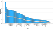
Figure 1 Personal finance course offering by state (N = 3,838) A bar graph comparing the personal finance course offering rates across different states. A bar graph compares the personal finance course offering rates across different states. The horizontal axis lists the states, and the vertical axis measures the offering rates, ranging from 0 to 60%. The bars are vertical and represent the offering rate for each state. Delaware has the highest offering rate of 57%, followed by Wyoming of 44%. Iowa has the lowest offering rate of 4%. The states are grouped into five categories based on their offering rates. The first group includes Delaware and Wyoming. The second group, with rates between 31% and 40%, includes 10 states and Washington D C. The third group, with rates between 21% and 30%, includes 10 states. The fourth group, with rates between 11% and 20%, includes 16 states. The fifth group, with rates between 0% and 10%, includes 12 states. The color scheme is uniform, with all bars in blue. More about this image found in Personal finance course offering by state (N = 3,838) A...
in Financial literacy education to college students in the U.S.
> International Journal of Bank Marketing
Published: 08 September 2026
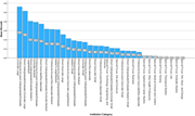
Figure 2 Personal finance course offering by institutional type (N = 3,838) A bar graph showing personal finance course offerings by institutional type. The bar graph compares personal finance course offerings across various institutional types. The x-axis lists different institution categories, while the y-axis represents the mean offering rate. There are 25 horizontal bars, each representing a different institution category. The bars are colored blue and vary in height, indicating different offering rates. The highest offering rate is for Professions-focused Undergraduate/Graduate-Doctorate Large institutions at approximately 56%, followed by Mixed Undergraduate/Graduate-Doctorate Large institutions at around 51%. Other notable categories include Mixed Undergraduate/Graduate-Master's Large/Medium, Professions-focused Undergraduate/Graduate-Doctorate Medium, and Mixed Associate/Baccalaureate. The graph shows a clear trend where larger and more comprehensive institutions tend to offer personal finance courses at higher rates. The data is based on the institutional types created by the Carnegie Mellon Foundation. More about this image found in Personal finance course offering by institutional type (N ...
Journal Articles
International Journal of Bank Marketing 1–24.
Published: 04 September 2026
in Phygital transformation and employer branding in banking: insights from a longitudinal narrative analysis of integrated reports
> International Journal of Bank Marketing
Published: 04 September 2026
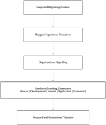
Figure 1 Theoretical framing of the study A flowchart illustrating the interconnected dynamics of integrated reporting context, phygital experience narratives, organizational signaling, employer branding dimensions, and temporal and institutional variation. The flowchart begins with the 'Integ... More about this image found in Theoretical framing of the study A flowchart illustrating the interconne...
in Phygital transformation and employer branding in banking: insights from a longitudinal narrative analysis of integrated reports
> International Journal of Bank Marketing
Published: 04 September 2026
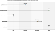
Figure 2 Distribution employer branding dimensions across interpretive levels A line graph showing the distribution of employer branding dimensions across interpretive levels. A line graph titled 'Distribution of employer branding dimensions across interpretive levels' presents data on five di... More about this image found in Distribution employer branding dimensions across interpretive levels A l...
in Phygital transformation and employer branding in banking: insights from a longitudinal narrative analysis of integrated reports
> International Journal of Bank Marketing
Published: 04 September 2026
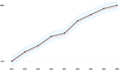
Figure 3 Phygital intensity trend A line graph showing the trend of phygital intensity from 2017 to 2025. A line graph showing the trend of phygital intensity from 2017 to 2025. The x-axis represents the years from 2017 to 2025, while the y-axis represents the intensity levels, ranging from lo... More about this image found in Phygital intensity trend A line graph showing the trend of phygital inte...
in Phygital transformation and employer branding in banking: insights from a longitudinal narrative analysis of integrated reports
> International Journal of Bank Marketing
Published: 04 September 2026
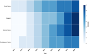
Figure 4 Heatmap of phygital intensity and employer branding dimensions by year A heat map showing phygital intensity and employer branding dimensions by year. A heat map representing the intensity of phygital orientation across different employer branding dimensions from 2017 to 2025. The hea... More about this image found in Heatmap of phygital intensity and employer branding dimensions by year A...
Journal Articles
International Journal of Bank Marketing 1–25.
Published: 03 September 2026
in Financial innovation and bank stability: evidence from 91 emerging markets
> International Journal of Bank Marketing
Published: 03 September 2026
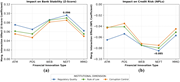
Figure 1 Marginal interaction effects of financial innovation and institutional quality dimensions and banking stability and credit risk. Source : Author's own work Two line graphs depict the impact of financial innovation types on bank stability and credit risk across different institutional ... More about this image found in Marginal interaction effects of financial innovation and institutional qual...
in Understanding the nature and effects of cognitive dissonance in demarketing contexts in the South African banking industry
> International Journal of Bank Marketing
Published: 03 September 2026
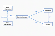
Figure 1 Conceptual model for this study. Source: Authors' own construct A conceptual model diagram illustrating the relationships between belief, inconsistency, action, cognitive dissonance, satisfaction, and loyalty. A conceptual model diagram illustrating the relationships between belief, i... More about this image found in Conceptual model for this study. Source: Authors' own construct A concep...
Journal Articles
International Journal of Bank Marketing 1–43.
Published: 03 September 2026
Journal Articles
International Journal of Bank Marketing 1–21.
Published: 28 August 2026
in FinTech adoption and financial inclusion: an integrated model for rural Thailand
> International Journal of Bank Marketing
Published: 28 August 2026
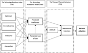
Figure 1 Conceptual framework. Source: Authors' own work, adopted from Parasuraman (2000) , Lee (2009) , Godoe and Johansen (2012) , Hasan et al. (2024) , and Goswami et al. (2022) A conceptual framework diagram illustrating the factors influencing FinTech adoption. A conceptual framework diagram illustrating the factors influencing FinTech adoption. The diagram is divided into three main sections: The Technology Readiness Index (TRI), The Technology Acceptance Model (TAM), and The Theory of Planned Behaviour (TPB). The TRI section includes four factors: Optimism, Innovativeness, Insecurity, and Discomfort. These factors influence Perceived Usefulness and Perceived Ease of Use in the TAM section. Perceived Usefulness and Perceived Ease of Use then affect Attitude in the TPB section. Attitude, along with Behavioural Intention, leads to FinTech Adoption. Arrows indicate the directional flow and relationships between these factors and sections. More about this image found in Conceptual framework. Source: Authors' own work, adopted from Parasuraman ...
in FinTech adoption and financial inclusion: an integrated model for rural Thailand
> International Journal of Bank Marketing
Published: 28 August 2026
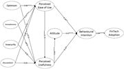
Figure 2 The SEM results of factors influencing FinTech adoption based on the TPB-TAM-TRI integration. Source: Authors' own work A diagram of factors influencing FinTech adoption based on the TPB-TAM-TRI integration. Optimism has a strong positive influence on Perceived Ease of Use, with a coe... More about this image found in The SEM results of factors influencing FinTech adoption based on the TPB-TA...
in Drivers of user engagement with FinTech: a cross-country analysis in digitally mature markets
> International Journal of Bank Marketing
Published: 27 August 2026
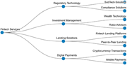
Figure 1 Key Fintech services. Source: Powered by Scopus AI, Wed Mar 26, 2025 A diagram of key fintech services and their subcategories. A diagram of key fintech services and their subcategories. The diagram starts with Fintech Services at the center and branches out into three main categories... More about this image found in Key Fintech services. Source: Powered by Scopus AI, Wed Mar 26, 2025 A d...
in Drivers of user engagement with FinTech: a cross-country analysis in digitally mature markets
> International Journal of Bank Marketing
Published: 27 August 2026
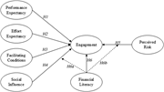
Figure 2 Conceptual model. Source: Authors’ own work A conceptual model diagram showing factors influencing engagement and financial literacy. The conceptual model diagram illustrates the relationships between various factors influencing engagement and financial literacy. The diagram features ... More about this image found in Conceptual model. Source: Authors’ own work A conceptual model diagram s...
in Drivers of user engagement with FinTech: a cross-country analysis in digitally mature markets
> International Journal of Bank Marketing
Published: 27 August 2026
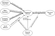
Figure 3 Model results. Source: Authors’ own work A diagram representing the relationships between various factors affecting engagement and perceived risk. A diagram representing the relationships between various factors affecting engagement and perceived risk. The diagram includes several lab... More about this image found in Model results. Source: Authors’ own work A diagram representing the rela...
Journal Articles
International Journal of Bank Marketing 1–28.
Published: 27 August 2026
Includes: Supplementary data

