
1-20 of 25706
Keywords: Fuzzy VIKOR
Close
Follow your search
Access your saved searches in your account
Would you like to receive an alert when new items match your search?
Journal

A unique blend of theoretical knowledge and managerial relevance International Journal of Quality & Reliability Management deals with aspects of business improvements and manufacturing services helping to raise standards in product and service quality.
in Exploring the relationships between successful implementation drivers of Quality 4.0: evidence from developing countries
> International Journal of Quality & Reliability Management
Published: 05 October 2026
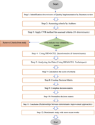
Figure 1 Research framework Flowchart detailing a research framework with steps and decision points. The flowchart starts with a 'Start' oval at the top. It proceeds through a series of rectangular boxes labeled as steps 1 to 12, detailing the research process. Step 1 involves identifying dete... More about this image found in Research framework Flowchart detailing a research framework with steps a...
in Exploring the relationships between successful implementation drivers of Quality 4.0: evidence from developing countries
> International Journal of Quality & Reliability Management
Published: 05 October 2026
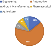
Figure 2 Expert-wise industries participated in the survey A pie chart showing the distribution of experts by industry. The pie chart illustrates the distribution of experts by industry who participated in the survey. The chart is divided into five segments, each representing a different indus... More about this image found in Expert-wise industries participated in the survey A pie chart showing th...
in Exploring the relationships between successful implementation drivers of Quality 4.0: evidence from developing countries
> International Journal of Quality & Reliability Management
Published: 05 October 2026
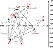
Figure 3 The digraph showing causal relations among these eight determinants A scatter plot with labeled data points and connecting lines. A scatter plot with labeled data points and connecting lines. The horizontal axis represents values ranging from 15.50 to 19.50, and the vertical axis repr... More about this image found in The digraph showing causal relations among these eight determinants A sc...
Journal Articles
International Journal of Quality & Reliability Management 1–28.
Published: 05 October 2026
Journal Articles
International Journal of Quality & Reliability Management 1–19.
Published: 02 October 2026
in Design of a prognostic alert system for coal power plants using FMEA and the proportional hazards model
> International Journal of Quality & Reliability Management
Published: 02 October 2026
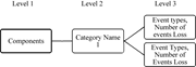
Figure 1 Hierarchical data classification for power plant failures A diagram showing a hierarchical classification system for power plant failures with three levels. The diagram illustrates a hierarchical classification system for power plant failures. Level 1 is labeled Components, leading to... More about this image found in Hierarchical data classification for power plant failures A diagram show...
in Design of a prognostic alert system for coal power plants using FMEA and the proportional hazards model
> International Journal of Quality & Reliability Management
Published: 02 October 2026
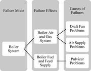
Figure 2 The components for FMEA analysis in a power plant A diagram showing the components for Failure Mode Effects and Analysis in a power plant boiler system. The diagram is divided into three main sections: Failure Mode, Failure Effects, and Causes of Failures. The Failure Mode section inc... More about this image found in The components for FMEA analysis in a power plant A diagram showing the ...
in Design of a prognostic alert system for coal power plants using FMEA and the proportional hazards model
> International Journal of Quality & Reliability Management
Published: 02 October 2026
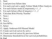
Figure 3 Pseudo code for the data processing and analysis of power plants A list of steps for implementing a prognostic framework, from loading data to determining survival probability thresholds. The steps include loading previous failure data, applying Failure Mode Effect Analysis, calculati... More about this image found in Pseudo code for the data processing and analysis of power plants A list ...
in Design of a prognostic alert system for coal power plants using FMEA and the proportional hazards model
> International Journal of Quality & Reliability Management
Published: 02 October 2026
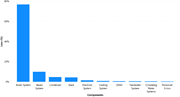
Figure 4 Total loss of each components of MR1 A bar graph comparing the total loss of each component of MR1, with the boiler system having the highest loss. The x-axis lists the components and the y-axis measures the loss percentage from 0 to 80. The boiler system shows the highest loss at 80 ... More about this image found in Total loss of each components of MR1 A bar graph comparing the total los...
in Design of a prognostic alert system for coal power plants using FMEA and the proportional hazards model
> International Journal of Quality & Reliability Management
Published: 02 October 2026
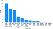
Figure 5 Events and their frequencies in boiler system A bar graph showing the frequency of various events in a boiler system, with Boiler Overhaul and Inspections being the most frequent. The x-axis lists different categories of events and the y-axis measures the percentage loss from 0 to 35.... More about this image found in Events and their frequencies in boiler system A bar graph showing the fr...
in Design of a prognostic alert system for coal power plants using FMEA and the proportional hazards model
> International Journal of Quality & Reliability Management
Published: 02 October 2026
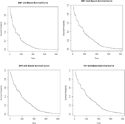
Figure 6 TC1 survival curve Four unit-based survival curves showing the decline in survival probability over time for AM1, MR1, SP2, and TC1 units. Four unit-based survival curves share a time x-axis from 0 to 800 and a survival probability y-axis from 0.0 to 1.0. AM1 Unit Based Survival Curve... More about this image found in TC1 survival curve Four unit-based survival curves showing the decline i...
in Design of a prognostic alert system for coal power plants using FMEA and the proportional hazards model
> International Journal of Quality & Reliability Management
Published: 02 October 2026
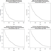
Figure 7 Survival curve of SP2 based on the previous failure Four survival curves showing the decline in survival probability over time for different event categories and types. Four survival curves share a time x-axis from 0 to 800 and a survival probability y-axis from 0.0 to 1.0. AM1: Fuel ... More about this image found in Survival curve of SP2 based on the previous failure Four survival curves...
in Design of a prognostic alert system for coal power plants using FMEA and the proportional hazards model
> International Journal of Quality & Reliability Management
Published: 02 October 2026
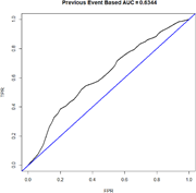
Figure 8 ROC for last failure-based model A line graph showing the ROC curve for a failure-based model with an AUC of 0.6344. The ROC curve shows the true positive rate (TPR) on the y-axis and the false positive rate (FPR) on the x-axis. The curve rises above the diagonal line, indicating some... More about this image found in ROC for last failure-based model A line graph showing the ROC curve for ...
in Design of a prognostic alert system for coal power plants using FMEA and the proportional hazards model
> International Journal of Quality & Reliability Management
Published: 02 October 2026
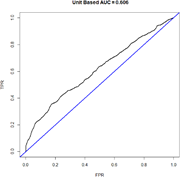
Figure 9 ROC for last failure-based model A line graph showing the ROC curve for a failure-based model with an AUC of 0.606. The ROC curve plots the true positive rate (TPR) against the false positive rate (FPR). The curve rises above the diagonal line, indicating some discriminative performan... More about this image found in ROC for last failure-based model A line graph showing the ROC curve for ...
Journal Articles
International Journal of Quality & Reliability Management (2026) 43 (9): 2367–2389.
Published: 01 October 2026
Includes: Supplementary data
Journal Articles
International Journal of Quality & Reliability Management 1–45.
Published: 29 September 2026
in Does greenwashing relate to higher ESG report readability? The boundary role of information quality
> International Journal of Quality & Reliability Management
Published: 29 September 2026
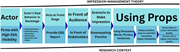
Figure 1 Theoretical framework. Source: Elaboration of research context and theory A diagram illustrating the impression management theory in the context of firms with high ESG visibility. The diagram outlines the impression management theory for firms with high ESG visibility. It starts with ... More about this image found in Theoretical framework. Source: Elaboration of research context and theory ...
in Does greenwashing relate to higher ESG report readability? The boundary role of information quality
> International Journal of Quality & Reliability Management
Published: 29 September 2026
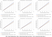
Figure 2 Simple slope. Source: Statistical output Six line graphs showing the relationship between greenwashing based on ESG risk or score and predicted readability at different levels of information quality. All values are approximated. More about this image found in Simple slope. Source: Statistical output Six line graphs showing the rel...
in A machine learning–driven framework for Quality 4.0 maturity assessment in service organizations: a socio-technical systems approach to digital quality transformation
> International Journal of Quality & Reliability Management
Published: 25 September 2026
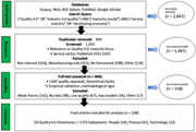
Figure 1 Data retrieval process using PRISMA protocol. Source: Authors' owns work A flowchart illustrating the systematic literature review process for developing a Quality 4.0 maturity assessment framework. A flowchart illustrating the systematic literature review process for developing a Qua... More about this image found in Data retrieval process using PRISMA protocol. Source: Authors' owns work ...

