
1-20 of 25672
Keywords: ORGANIZATIONAL CHANGE
Close
Follow your search
Access your saved searches in your account
Would you like to receive an alert when new items match your search?
Journal

A unique blend of theoretical knowledge and managerial relevance International Journal of Quality & Reliability Management deals with aspects of business improvements and manufacturing services helping to raise standards in product and service quality.
Journal Articles
International Journal of Quality & Reliability Management 1–40.
Published: 15 September 2026
Journal Articles
International Journal of Quality & Reliability Management 1–24.
Published: 15 September 2026
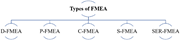
in Sustainability-oriented failure assessment of hybrid solar energy system using FMEA and fuzzy AHP
> International Journal of Quality & Reliability Management
Published: 15 September 2026
Figure 1 Types of FMEA A diagram showing different types of FMEA. A diagram representing the types of Failure Mode and Effects Analysis (FMEA) used in product or process development. The diagram is structured with a central node labeled 'Types of FMEA' branching out into five different types. ... More about this image found in Types of FMEA A diagram showing different types of FMEA. A diagram repr...
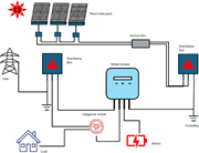
in Sustainability-oriented failure assessment of hybrid solar energy system using FMEA and fuzzy AHP
> International Journal of Quality & Reliability Management
Published: 15 September 2026
Figure 2 HSPW system A diagram of a hybrid solar photovoltaic system with various components. The diagram illustrates a hybrid solar photovoltaic (HSPW) system. At the top, three photovoltaic panels are connected to a junction box, which organizes terminals and connectors needed to link the PV... More about this image found in HSPW system A diagram of a hybrid solar photovoltaic system with various...
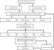
in Sustainability-oriented failure assessment of hybrid solar energy system using FMEA and fuzzy AHP
> International Journal of Quality & Reliability Management
Published: 15 September 2026
Figure 3 FMEA methodology chart A flowchart illustrating the steps of the FMEA methodology for identifying and analyzing failures in a system. The flowchart begins with the formation of the FMEA team. The team then analyzes the system and its subsystems. The next step involves determining fail... More about this image found in FMEA methodology chart A flowchart illustrating the steps of the FMEA me...
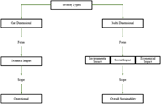
in Sustainability-oriented failure assessment of hybrid solar energy system using FMEA and fuzzy AHP
> International Journal of Quality & Reliability Management
Published: 15 September 2026
Figure 4 Severity types A flowchart illustrating the classification of severity types into one-dimensional and multi-dimensional categories. The flowchart begins with the classification of severity types into two main categories: One Dimensional and Multi Dimensional. For the One Dimensional c... More about this image found in Severity types A flowchart illustrating the classification of severity t...
in Sustainability-oriented failure assessment of hybrid solar energy system using FMEA and fuzzy AHP
> International Journal of Quality & Reliability Management
Published: 15 September 2026
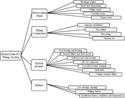
Figure 5 Nineteen relevant failure modes selected as criteria A diagram of a hybrid solar PV wiring system showing failure modes. A diagram of a hybrid solar PV wiring system illustrating nineteen relevant failure modes. The system is divided into four main components: Photovoltaic Panel, Wiri... More about this image found in Nineteen relevant failure modes selected as criteria A diagram of a hybr...
in Sustainability-oriented failure assessment of hybrid solar energy system using FMEA and fuzzy AHP
> International Journal of Quality & Reliability Management
Published: 15 September 2026
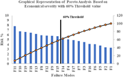
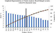
Figure 6 Pareto analysis for (O, SEc, D) A bar graph showing risk percentages for different failure modes with a 60 percent threshold line. A bar graph compares risk percentages for different failure modes. The horizontal axis lists failure modes labeled F 1 to F 19, and the vertical axis measures risk percentage ranging from 0 to 10 percent. The graph includes a 60 percent threshold line. The bars are vertical and ungrouped, with each bar representing a different failure mode. The risk percentages for the failure modes are as follows: The graph also includes a line plot with orange circles marking data points, showing a cumulative risk percentage on the right vertical axis ranging from 0 to 120 percent. More about this image found in Pareto analysis for (O, SEc, D) A bar graph showing risk perc...
in Sustainability-oriented failure assessment of hybrid solar energy system using FMEA and fuzzy AHP
> International Journal of Quality & Reliability Management
Published: 15 September 2026
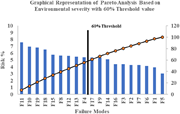
Figure 7 Pareto analysis for (O, SEn, D) A bar graph showing Pareto analysis of failure modes based on environmental severity with a 60% threshold value. The bar graph presents a Pareto analysis of failure modes based on environmental severity, with a 60% threshold value. The x-axis lists various failure modes labeled as F1 through F19, while the y-axis on the left indicates the risk percentage ranging from 0 to 10. The y-axis on the right shows cumulative risk percentage ranging from 0 to 120. Each failure mode is represented by a vertical blue bar indicating its risk percentage. A black line with orange circles represents the cumulative risk percentage, which increases as it moves from left to right. The 60% threshold is marked by a vertical black line intersecting the cumulative risk line. The graph shows that approximately 40% of the failure modes account for 60% of the cumulative risk percentage, highlighting the significant failure modes that require mitigation strategies. All values are approximated. More about this image found in Pareto analysis for (O, SEn, D) A bar graph showing Pareto an...
in Sustainability-oriented failure assessment of hybrid solar energy system using FMEA and fuzzy AHP
> International Journal of Quality & Reliability Management
Published: 15 September 2026
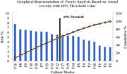
Figure 8 Pareto analysis for (O, SSo, D) A bar graph showing risk percentages for different failure modes with a cumulative percentage line. A bar graph compares risk percentages for different failure modes. The horizontal axis lists failure modes labeled F 1 to F 19, and the vertical axis measures risk percentage ranging from 0 to 10. The bars are vertical and ungrouped. A line graph overlays the bars, showing the cumulative percentage on the right vertical axis, ranging from 0 to 120 percent. A 60 percent threshold line is marked. The risk percentages for the failure modes are as follows: F 11 at 8 percent, F 8 at 7 percent, F 9 at 6 percent, F 10 at 6 percent, F 18 at 6 percent, F 7 at 5 percent, F 19 at 5 percent, F 13 at 5 percent, F 12 at 5 percent, F 17 at 4 percent, F 15 at 4 percent, F 14 at 4 percent, F 6 at 3 percent, F 4 at 3 percent, F 3 at 3 percent, F 16 at 2 percent, F 1 at 2 percent, F 2 at 2 percent, and F 5 at 1 percent. The cumulative percentage line increases steadily, crossing the 60 percent threshold between F 12 and F 17. More about this image found in Pareto analysis for (O, SSo, D) A bar graph showing risk perc...
in Sustainability-oriented failure assessment of hybrid solar energy system using FMEA and fuzzy AHP
> International Journal of Quality & Reliability Management
Published: 15 September 2026
Figure 9 Pareto analysis for (O, S, D) A bar graph showing Pareto analysis of failure modes with risk percentage and cumulative percentage. The bar graph presents a Pareto analysis of failure modes, illustrating the distribution of risk percentages and cumulative percentages. The x-axis lists ... More about this image found in Pareto analysis for (O, S, D) A bar graph showing Pareto analysis of fai...
in Sustainability-oriented failure assessment of hybrid solar energy system using FMEA and fuzzy AHP
> International Journal of Quality & Reliability Management
Published: 15 September 2026
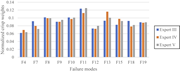
Figure 10 Fuzzy-AHP results A bar graph comparing normalized crisp weights for different failure modes by three experts. A bar graph compares normalized crisp weights for different failure modes by three experts. The horizontal axis lists failure modes labeled F 4, F 7, F 8, F 9, F 10, F 11, F... More about this image found in Fuzzy-AHP results A bar graph comparing normalized crisp weights for dif...
in Development of a model based on FMEA, AHP and 2-tuple fuzzy linguistic representation for supply risk assessment
> International Journal of Quality & Reliability Management
Published: 15 September 2026
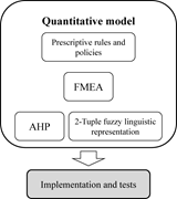
Figure 1 Main components of the quantitative model A diagram of the quantitative model's main components. The diagram illustrates the main components of a quantitative model. At the top, it features a box labeled 'Prescriptive rules and policies.' Below this, there is a box labeled 'FMEA,' whi... More about this image found in Main components of the quantitative model A diagram of the quantitative ...
in Development of a model based on FMEA, AHP and 2-tuple fuzzy linguistic representation for supply risk assessment
> International Journal of Quality & Reliability Management
Published: 15 September 2026
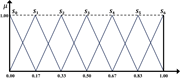
Figure 2 An example of a linguistic set with 7 terms compatible with 2-tuple A line graph showing a linguistic set with 7 terms compatible with 2-tuple. A line graph displays a linguistic set with 7 terms compatible with 2-tuple. The x-axis ranges from 0.00 to 1.00, marked at intervals of 0.17... More about this image found in An example of a linguistic set with 7 terms compatible with 2-tuple A li...
in Development of a model based on FMEA, AHP and 2-tuple fuzzy linguistic representation for supply risk assessment
> International Journal of Quality & Reliability Management
Published: 15 September 2026
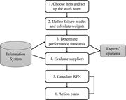
Figure 3 Outline of the proposed model for supplier risk management Flowchart of supplier risk management model. The flowchart illustrates a model for supplier risk management. The process begins with choosing an item and setting up a work team. Next, failure modes are defined, and weights are... More about this image found in Outline of the proposed model for supplier risk management Flowchart of ...
in Development of a model based on FMEA, AHP and 2-tuple fuzzy linguistic representation for supply risk assessment
> International Journal of Quality & Reliability Management
Published: 15 September 2026
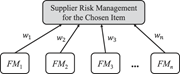
Figure 4 Single-level structure for failure modes A diagram representing a single-level structure for failure modes in supplier risk management. A diagram of a single-level structure for failure modes in supplier risk management. The diagram features a central box labeled 'Supplier Risk Manage... More about this image found in Single-level structure for failure modes A diagram representing a single...
in Development of a model based on FMEA, AHP and 2-tuple fuzzy linguistic representation for supply risk assessment
> International Journal of Quality & Reliability Management
Published: 15 September 2026
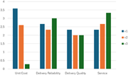
Figure 5 Comparison of partial RPN contributions per failure mode A bar graph compares partial RPN contributions per failure mode for three suppliers. The bar graph compares partial RPN contributions per failure mode for three suppliers, labeled as V 1, V 2, and V 3. The x-axis represents four... More about this image found in Comparison of partial RPN contributions per failure mode A bar graph com...
Journal Articles
International Journal of Quality & Reliability Management 1–27.
Published: 04 September 2026
... reflection and dialog, accidents and near misses remain isolated occurrences rather than triggers for broader organizational change (Hopkins, 2008 ; Carroll et al., 2002). The findings thus highlight a disconnection between managing the event and learning from the event, which weakens both...
Journal Articles
International Journal of Quality & Reliability Management 1–23.
Published: 04 September 2026
Includes: Supplementary data

