

1-20 of 564
Follow your search
Access your saved searches in your account
Would you like to receive an alert when new items match your search?
Journal

Aims to improve our understanding of logistics and trade practices between firms industries and countries in the global economy.
Journal Articles
Journal of International Logistics and Trade 1–23.
Published: 31 August 2026
Includes: Supplementary data
in Mitigation or adaptation? Unveiling the temporal scenario-based priorities of port climate resilience strategies using fuzzy Dombi-Bonferroni best-worst method
> Journal of International Logistics and Trade
Published: 31 August 2026
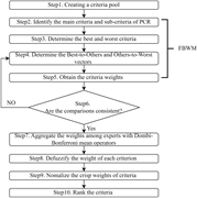
Figure 1 Procedure of FDB-BWM method. Source: Authors' work Flowchart detailing the steps of the FDB-BWM methodology. The flowchart outlines the steps of the FDB-BWM methodology. It starts with creating a criteria pool, followed by identifying the main criteria and sub-criteria of PCR. The nex... More about this image found in Procedure of FDB-BWM method. Source: Authors' work Flowchart detailing t...
in Mitigation or adaptation? Unveiling the temporal scenario-based priorities of port climate resilience strategies using fuzzy Dombi-Bonferroni best-worst method
> Journal of International Logistics and Trade
Published: 31 August 2026
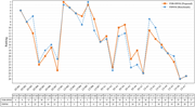
Figure 2 Criteria rankings of FDB-BWM vs. FBWM. Source: Authors' work A line graph comparing the rankings of FDB-BWM and FBWM across various criteria. The line graph compares the rankings of two methods, FDB-BWM and FBWM, across various criteria. The x-axis lists the criteria, including ST-M1 ... More about this image found in Criteria rankings of FDB-BWM vs. FBWM. Source: Authors' work A line grap...
in Mitigation or adaptation? Unveiling the temporal scenario-based priorities of port climate resilience strategies using fuzzy Dombi-Bonferroni best-worst method
> Journal of International Logistics and Trade
Published: 31 August 2026
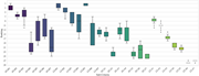
Figure 3 Box-plot distribution of criteria rankings across different scenarios. Source: Authors' work A box-and-whisker plot showing the ranking distributions of 28 sub-criteria across different scenarios. A horizontal box-and-whisker plot compares the ranking distributions of 28 sub-criteria ... More about this image found in Box-plot distribution of criteria rankings across different scenarios. Sour...
Journal Articles
Journal of International Logistics and Trade (2026) 24 (2): 110–126.
Published: 04 August 2026
in Measuring global supply chain resilience: entropy-based volatility analysis of container flows
> Journal of International Logistics and Trade
Published: 04 August 2026
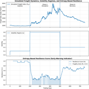
Figure 1 The visual results demonstrate a distinct inverse relationship between network resilience and freight rate instability Multiple graphs depict simulated freight dynamics, volatility regimes, and entropy-based resilience over trading days. The image contains three line graphs depicting ... More about this image found in The visual results demonstrate a distinct inverse relationship between netw...
in Measuring global supply chain resilience: entropy-based volatility analysis of container flows
> Journal of International Logistics and Trade
Published: 04 August 2026
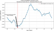
Figure 2 Cross-correlation function (CCF) of the resilience score R t calculated from the rolling Shannon entropy of returns and the absolute returns | r t | A line graph showing the correlation coefficient between the resilience score and absolute returns over a lag period ... More about this image found in Cross-correlation function (CCF) of the resilience score R t cal...
in Measuring global supply chain resilience: entropy-based volatility analysis of container flows
> Journal of International Logistics and Trade
Published: 04 August 2026
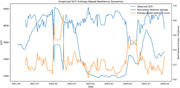
Figure 3 Empirical SCFI entropy-based resilience dynamics, 2021–2024 A line graph showing empirical SCFI entropy-based resilience dynamics from 2021 to 2024. The line graph illustrates empirical SCFI entropy-based resilience dynamics over the period from January 2021 to January 2025. The x-axi... More about this image found in Empirical SCFI entropy-based resilience dynamics, 2021–2024 A line graph...
in Measuring global supply chain resilience: entropy-based volatility analysis of container flows
> Journal of International Logistics and Trade
Published: 04 August 2026
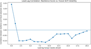
Figure 4 Lead-lag correlation between empirical resilience and future SCFI volatility A line graph showing the correlation between resilience score and future SCFI volatility over a lead-lag horizon of weeks ahead. A line graph titled Lead-Lag Correlation: Resilience Score vs. Future SCFI Vola... More about this image found in Lead-lag correlation between empirical resilience and future SCFI volatilit...
Journal Articles
Journal of International Logistics and Trade (2026) 24 (2): 161–181.
Published: 14 July 2026
Includes: Supplementary data
in The effect of liner shipping connectivity on green export performance: heterogeneous evidence from higher-income and lower-income exporters
> Journal of International Logistics and Trade
Published: 14 July 2026
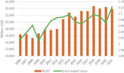
Figure 1 Green export value and bilateral liner shipping connectivity index across 150 countries, 2006–2021. Source: The author's calculation based on data from the BACI-CEPII and the UNCTAD databases A combination chart showing trends in bilateral liner shipping connectivity and green export v... More about this image found in Green export value and bilateral liner shipping connectivity index across 1...
Journal Articles
Journal of International Logistics and Trade 1–20.
Published: 01 July 2026
in Digitalisation of food supply chains: transformation factors for sustainable logistics in the digital era
> Journal of International Logistics and Trade
Published: 01 July 2026
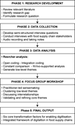
Figure 1 Research process of the study. The author's own elaboration A flowchart illustrating the research process of a study. The flowchart illustrates the research process of a study. It begins with Phase 1: Research Development, which involves reviewing relevant literature, identifying rese... More about this image found in Research process of the study. The author's own elaboration A flowchart ...
in Digitalisation of food supply chains: transformation factors for sustainable logistics in the digital era
> Journal of International Logistics and Trade
Published: 01 July 2026
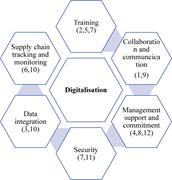
Figure 2 Core themes for enabling digitalisation in food supply chains. Source: Author's work A diagram of core themes for enabling digitalisation in food supply chains. A central hexagon labeled Digitalisation is surrounded by six hexagons. These hexagons are labeled Training, Collaboration a... More about this image found in Core themes for enabling digitalisation in food supply chains. Source: Auth...
Journal Articles
Journal of International Logistics and Trade 1–23.
Published: 15 June 2026
in Beyond the algorithms: behavioral determinants of sustainable last-mile delivery in MENA urban centers
> Journal of International Logistics and Trade
Published: 15 June 2026
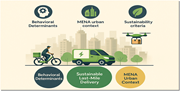
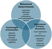
Figure 1 Hybrid framework for SLMD in developing centers More about this image found in Hybrid framework for SLMD in developing centers
in Beyond the algorithms: behavioral determinants of sustainable last-mile delivery in MENA urban centers
> Journal of International Logistics and Trade
Published: 15 June 2026
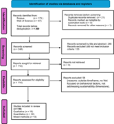
Figure 2 PRISMA 2020 flow diagram of the study selection process More about this image found in PRISMA 2020 flow diagram of the study selection process
in Beyond the algorithms: behavioral determinants of sustainable last-mile delivery in MENA urban centers
> Journal of International Logistics and Trade
Published: 15 June 2026
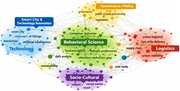
Figure 3 Bibliometric mapping of SLMD studies in MENA More about this image found in Bibliometric mapping of SLMD studies in MENA

