


Our study aims to focus on the application of knowledge mapping to provide pedagogically-structured learners' competences.
We conducted an experiment examined the associations between the pedagogical quality of students’ pedagogically-informed knowledge (PIK) maps, class assignment scores and perceptions of PIK mapping’s uses.
The results showed that higher assignment scores were significantly predicted by higher quality PIK maps, ratings for PIK mapping were significantly higher than other mappings, and the learners’ experience of PIK mapping led to a significant change of attitude towards mapping as a learning activity and to a positive opinion of the value of PIK mapping in particular. Interestingly, there was no significant relation between learners’ opinion ratings of the uses of PIK mapping in learning and their assignment scores.
Questions remain on the generalizability of the findings, and on the features of a PIK map which are particularly useful to a learner. This study investigated the value of PIK mapping in the context of a practical class on the building of simple DIY (do-it-yourself) holographic projectors; it may be thought that the applied nature of the topic was more suited to the PIK mapping of learner competences and intended learning outcomes than a more theoretic classroom topic on holography. A future study is planned to address this issue.
1. Introduction
Education confronts a number of challenging issues in the present day, including the implementation of new pedagogical expertise and stringent academic standards and goals. To increase the quality of education, a variety of ways and strategies are being used. One possible way is to use pedagogically-informed knowledge (PIK) mapping for learners and teachers. There are many types of mappings, for example, mind mapping, knowledge mapping, topic mapping and concept mapping. Each type suits a different use. Mind mapping, for example, is commonly used for representing thoughts and concepts in non-linear form, while other types introduce varying degrees of structure. Our research focuses on the use of knowledge mapping, in particular the structuring of PIK maps of learners’ competence in a given knowledge domain. A competence is considered as a capability with respect to some subject matter within a specified learning context at a specified level of performance that is linked to other competences which are prerequisite or dependent. A learnt competence may also be considered to be, in the terms of many current educational theories, a learning outcome within a learning context. In section 2, we describe the notion of knowledge mapping; survey different mappings used in education and organizations, and introduce our approach to the design of PIK maps for learning and teaching. We conducted an experiment, detailed in Section 3, to explore the relationships between the quality of learner PIK maps, assignment scores and opinions of the use of PIK mapping. Section 4 provides the results from the experiment. Section 5 concludes and reflects upon the results obtained, and Section 6 highlights the key points of our research and gives suggestions for further studies.
2. Knowledge mapping and classification
One description of knowledge mapping considers it a graphic assistance that indicates where and how to discover the most knowledgeable individuals or resources inside a group or organization (Wexler, 2001). By connecting sources with nodes containing extra information for a comprehensive overview of a concept, method or skill, the map depicts who or what resources possess the necessary knowledge and where to obtain it. With a certain topic as the main point, resources are distributed via connected nodes to illustrate the relationship between a topic and its authority (Grey, 1999). These connected resources, also known as a knowledge inventory, support organizational cooperation on areas of expertise and expansion of their understandings of a subject, technique or ability. Knowledge maps can function as a visual database that represents concepts and their associated resources (Vail, 1999).
Wexler (2001) classified knowledge mapping into three types. “Procedural knowledge mapping” refers to the documentation and communication of an organization’s procedures and processes. The organization can expedite knowledge transfer with the use of such mappings, allowing new employees to become engaged and productive more quickly. “Conceptual knowledge mapping” elaborates concepts, topics or subjects. By developing hierarchies and sub-topics, map creators may identify how various concepts connect to each other. MindManager is a popular graphic tool for collaborative conceptual mapping (Cameron and Voight, 2004). “Competency knowledge mapping” depicts behaviours, characteristically used by organizations to depict employee core competencies, leadership skills and training needs.
Nickols (2000) identified three types of knowledge. “Descriptive knowledge” (know-what), also known as declarative knowledge, describes an item, situation or set of facts or processes. “Procedural knowledge” (know-how) describes actions or manipulations, typically a procedure or behaviour. “Strategic knowledge” (know-why and know-when) describes a decision-making process.
2.1 Other types of mapping
Other types of mappings have been described for use within organizational and educational domains.
Mind mapping (or “idea” mapping) is a depiction of ideas and the interaction between them in a nonlinear visual network of interconnected ideas. It may aid memory retention and the organization of related concepts (Davies, 2011), or may facilitate the organization and creation of new ideas (Edwards and Cooper, 2010).
Concept mapping is similarly concerned with concepts and their connections but instead represents these elements as a structured hierarchy of nodes linked by lines or arrows (also called arcs) (Novak, 1990). The links may be labelled to illustrate the relationships between nodes (Davies, 2011). Concept maps may assist organizations in developing conceptual frameworks used for planning or assessment (Kim et al., 2003).
Argument mappings are box-and-line diagrams that represent the arguments and evidence for and against a claim or assertion (van Gelder, 2002), characteristically used in a legal context to identify claims, justifications and defences. It may help individuals and groups strengthen critical thinking in the preparation and delivery of arguments (Okada and Buckingham Shum, 2006).
Topic mappings describe the connections between knowledge domains and links to information resources (Yan et al., 2010), initially created as a mechanism to express back-of-the-book index structures (Hatzigaidas et al., 2004). They may assist in visualizing the flow of knowledge throughout an organization (Zhai et al., 2010). Whilst only topic mapping is an International Organization for Standardization (ISO) standard, concept mapping and mind mapping are comparable in intent.
2.2 PIK mapping
Knowledge mapping is distinct from simple information collection (Wexler, 2001). Knowledge may be considered to be the practical application of information, such that knowledge mapping assists the communication of the use of information. Our use of PIK mapping is to support learning and teaching by representing the prerequisite and dependency relationships between learning outcomes in a given educational context.
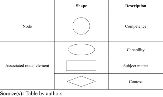
We consider a PIK map as a graphical structure of competences as may be relevant to a lesson, course or curriculum. The nodal element of a PIK map is a competence which comprises an item of subject matter with associated capability, and context (a complete PIK competence node would also include its associated level of performance, on the one hand as desired or intended and on the other as actually achieved, perhaps on a number of occasions. The remainder of this paper omits discussion or use of performance levels as may be found in portfolio, examination, training needs or certification systems). The relationship between each node on the PIK map is a prerequisite or dependency relationship, and the PIK map may be more formally said to be a directed acyclic graph.
We employ different shapes for representing PIK nodes and associated elements as shown in Table 1.
A PIK map may be presented in summary, comprising competence nodes only or in detail, comprising nodes and their associated elements. We illustrate a simple example PIK map for the topic “Construct a simple practical holographic image recording” with seven competences:
(1) (C) Explain holographic image recording for a simple practical example
(2) (C1) Describe illuminating light reflected from object
(3) (C2) Describe reference beam interfering with reflected light
(4) (C3) Describe photographic plate recording resulting interference pattern
(5) (C1a) Define coherent light source
(6) (C2a) Define beam splitter
(7) (C3a) Define transparent plate
Prerequisite relationships between the competence nodes are shown by an arrow leading to the parent node. The direction of the arrows provides a learning path that could be suggested to learners. The example summary PIK map for this topic is shown in Figure 1.
 The hierarchical path diagram consists of seven circle text labels arranged in a vertical hierarchy across three levels. At the top level is a single circle labeled “C”. Below it, a middle level contains three circles labeled “C 1”, “C 2”, and “C 3” from left to right. Three separate upward-pointing arrows connect these circles to the top center circle “C”. At the bottom level, there are three circles labeled “C 1 a”, “C 2 a”, and “C 3 a” arranged from left to right. A vertical upward-pointing arrow connects “C 1 a” to the bottom of “C 1”. A second vertical upward-pointing arrow connects “C 2 a” to the bottom of “C 2”. A third vertical upward-pointing arrow connects “C 3 a” to the bottom of “C 3”.
Summary PIK map for “construct a simple practical holographic image recording”
The hierarchical path diagram consists of seven circle text labels arranged in a vertical hierarchy across three levels. At the top level is a single circle labeled “C”. Below it, a middle level contains three circles labeled “C 1”, “C 2”, and “C 3” from left to right. Three separate upward-pointing arrows connect these circles to the top center circle “C”. At the bottom level, there are three circles labeled “C 1 a”, “C 2 a”, and “C 3 a” arranged from left to right. A vertical upward-pointing arrow connects “C 1 a” to the bottom of “C 1”. A second vertical upward-pointing arrow connects “C 2 a” to the bottom of “C 2”. A third vertical upward-pointing arrow connects “C 3 a” to the bottom of “C 3”.Summary PIK map for “construct a simple practical holographic image recording”
A detail PIK map provides the competence nodes along with their capability, subject matter and (optionally) context elements. The example detail PIK map is shown in Figure 2.
 The flowchart starts at the center, where a rectangle labeled “Holographic image recording” connects with an arrow that ends in a solid diamond mark to the central circle “C”. Above this, an oval labeled “Explain” connects downward to the path between the rectangle “Holographic image recording” and the circle “C”. From the right side, a diamond labeled “a simple practical example” connects with an empty diamond end to the same central circle “C”. Below the center, the diagram branches into three vertical paths. In the first branch on the left, a rectangle labeled “Illuminating light reflected from object” connects via a solid diamond arrow to a circle labeled “C 1”. An oval labeled “Describe” connects downward to the path between the rectangle “Illuminating light reflected from object” and the circle “C 1”. Below this, a rectangle labeled “Coherent light source” connects via a solid diamond arrow to a circle labeled “C 1 a”. An oval labeled “Define” connects upward to the path between the rectangle “Coherent light source” and the circle “C 1 a”. An arrow points upward from “C 1 a” to “C 1”, and “C 1” points upward to the central circle “C”. In the middle branch, a rectangle labeled “Reference beam interfering with reflected light” connects via a solid diamond arrow to a circle labeled “C 2”. An oval labeled “Describe” connects downward to the path between the rectangle “Reference beam interfering with reflected light” and the circle “C 2”. Below this, a rectangle labeled “Bean splitter” connects via a solid diamond arrow to a circle labeled “C 2 a”. An oval labeled “Define” connects upward to the path between the rectangle “Bean splitter” and the circle “C 2 a”. An arrow points upward from “C 2 a” to “C 2”, and “C 2” points upward to the central circle “C”. In the third branch on the right, a rectangle labeled “Photographic plate recording resulting interference pattern” connects via a solid diamond arrow to a circle labeled “C 3”. An oval labeled “Describe” connects downward to the path between the rectangle “Photographic plate recording resulting interference pattern” and the circle “C 3”. Below this, a rectangle labeled “Transparent plate” connects via a solid diamond arrow to a circle labeled “C 3 a”. An oval labeled “Define” connects upward to the path between the rectangle “Transparent plate” and the circle “C 3 a”. An arrow points upward from “C 3 a” to “C 3”, and “C 3” points upward to the central circle “C”.
Detail PIK map for “construct a simple practical holographic image recording”
The flowchart starts at the center, where a rectangle labeled “Holographic image recording” connects with an arrow that ends in a solid diamond mark to the central circle “C”. Above this, an oval labeled “Explain” connects downward to the path between the rectangle “Holographic image recording” and the circle “C”. From the right side, a diamond labeled “a simple practical example” connects with an empty diamond end to the same central circle “C”. Below the center, the diagram branches into three vertical paths. In the first branch on the left, a rectangle labeled “Illuminating light reflected from object” connects via a solid diamond arrow to a circle labeled “C 1”. An oval labeled “Describe” connects downward to the path between the rectangle “Illuminating light reflected from object” and the circle “C 1”. Below this, a rectangle labeled “Coherent light source” connects via a solid diamond arrow to a circle labeled “C 1 a”. An oval labeled “Define” connects upward to the path between the rectangle “Coherent light source” and the circle “C 1 a”. An arrow points upward from “C 1 a” to “C 1”, and “C 1” points upward to the central circle “C”. In the middle branch, a rectangle labeled “Reference beam interfering with reflected light” connects via a solid diamond arrow to a circle labeled “C 2”. An oval labeled “Describe” connects downward to the path between the rectangle “Reference beam interfering with reflected light” and the circle “C 2”. Below this, a rectangle labeled “Bean splitter” connects via a solid diamond arrow to a circle labeled “C 2 a”. An oval labeled “Define” connects upward to the path between the rectangle “Bean splitter” and the circle “C 2 a”. An arrow points upward from “C 2 a” to “C 2”, and “C 2” points upward to the central circle “C”. In the third branch on the right, a rectangle labeled “Photographic plate recording resulting interference pattern” connects via a solid diamond arrow to a circle labeled “C 3”. An oval labeled “Describe” connects downward to the path between the rectangle “Photographic plate recording resulting interference pattern” and the circle “C 3”. Below this, a rectangle labeled “Transparent plate” connects via a solid diamond arrow to a circle labeled “C 3 a”. An oval labeled “Define” connects upward to the path between the rectangle “Transparent plate” and the circle “C 3 a”. An arrow points upward from “C 3 a” to “C 3”, and “C 3” points upward to the central circle “C”.Detail PIK map for “construct a simple practical holographic image recording”
3. Experimental study using PIK mapping
The study explored the use of PIK mapping for two class assignments and its relation to learning achievement, investigating learners’ experiences with PIK mapping as a learning activity while undertaking the construction of DIY 3D holograms.
The learners were 20 students enrolled in the third-year undergraduate course “Digital Media II” at Prince of Songkhla University International College, Thailand. An a priori power analysis for the required sample size was carried out using GPower 3.1 (Faul et al., 2009). With regard to the study of the correlation between PIK mapping and learning achievement, a substantial correlation of r = 0.7 was set, representing the investigators’ interest in showing that at least 50% of the variance in learning achievement could be explained by PIK mapping. With regard to the study of the difference in opinion of PIK mapping from before to after the experiment, a substantial effect size of d = 1 was set, representing a change in opinion of a full Likert scale point, for example, from a “neutral” opinion of 3 to an “agree” opinion of 4 in conjunction with an expectation that the standard deviation of the opinion scores would be approximately 1.0. For both power analyses, a conventional Type I error rate of α = 0.05 was set with a deliberately small Type II error rate of β = 0.05. The desired power of 95% for the correlation study (bivariate normal) suggested N = 20, and for the difference in opinion study (matched pairs t-test) N = 16. The course met for 4 h each week. The study was carried out in the final 2 weeks of the course, 1 h per week. In the first week of the study, the learners provided demographic information, completed a survey of their opinions on the use of mapping in learning, received an introduction to the study and the main ideas of PIK mapping*, and then sketched a PIK map of the topic for the first assignment. In the second week, the learners sketched a PIK map for the second assignment, completed a survey of their opinion on the use of PIK mappings in learning, and were given the opportunity to discuss the study and ask any questions about it. A few weeks later the learners received a Uniform Resource Locator (URL) to the study findings and were able to see how their data was used. (* PIK mapping was presented and described to the learners as “knowledge mapping”, using the concepts outlined in Section 2.3 above.)
The study was granted ethical approval by the University’s Ethics Institutional Review Board under reference Prince of Songkla University (PSU) Institutional review board (IRB) 2023-LL-Nic-003 (Internal). The questionnaires and mapping scores criteria were reviewed by 2 independent experts to confirm their understandability and face validity and were found to be clear and relevant measures. The experts included one from an external organization who had a research background similar to the investigator, and another was the head of curriculum, which was responsible for curriculum development and management.
The research questions were:
What is the relation between the quality of the learners’ PIK mappings and their performance in the class assignments?
The quality of a submitted PIK map was given by a comparison with the “ideal” PIK map for the topic as constructed by the class instructor to incorporate PIK map elements which were considered necessary and sufficient for the topic as taught. Scores were given for competences relevant to the topic, linked and labelled, and capability verbs, subject matter, and contexts which were consistent with the given competences. These six attributes were scored on a four-point scale 0..3, where 0 = absent/incorrect, 1 = poor, 2 = good and 3 = excellent, and weighted 0..4 according to the number of competences in the map, where weight = 0 if absent, = 1 for1 competence, = 2 for 2 or 3 competences, = 3 for 4, 5 or 6, and = 4 for 7 or more. For example, a PIK map might have 5 capability verbs which were collectively rated “good”, resulting in a score of 3 * 3 = 9 for this component. An “ideal” PIK map for the topic was considered to comprise at least 7 ILOs where the 6 attributes were all rated excellent, so that it would score a total of 72, and a given PIK map was given a quality score as a percentage of the “ideal”. The learner’s performance in the class assignments was the mark given to their assignment by the instructor. The relation between the quality of the learners’ PIK mappings and their performance in the class assignments was explored by regression analysis, where performance in the assignment was predicted by the PIK map quality score.
What is the relation between the quality of the learners’ PIK maps and their opinion of the use of PIK mapping in learning the topic?
Each learner PIK map was given a total quality score as explained for RQ1. Learner opinion ratings were given by a survey at the end of the experiment, where the learners were asked to rate 10 statements of the use of PIK maps (presented as “knowledge mappings”) on a 5-point Likert scale, 1 = Strongly disagree, 2 = Disagree, 3 = Neither agree nor disagree, 4 = Agree and 5 = Strongly agree: “Making knowledge mappings was easy”, “Knowledge mapping made my tasks easier”, “Knowledge mapping helped me identify gaps in my understanding”, “Knowledge mapping helped me express my tasks”, “I felt satisfied with my overall experience of knowledge mapping”, “My experience with knowledge mapping was better than I expected”, “Using knowledge mapping improved the quality of my tasks”, “Using knowledge mapping enhanced my effectiveness in completing my tasks”, “I felt motivated when using knowledge mapping”, and “I enjoyed using knowledge mapping”. The relation between the quality of the learners’ mappings and their opinion ratings was explored by regression analysis, where average quality score of their two PIK mappings was predicted by the 10 opinion ratings.
(a) Are learner opinion ratings of mapping, both prior to and then following the experiment, better than “neutral”? (b) Do learner opinion ratings of mapping show a change between their general prior experiences on mappings expressed at the start of week 1 and their experience of PIK mapping expressed at the end of week 2?
Opinion ratings of mapping in general (presented as “mind mapping”, “concept mapping”, and “knowledge mapping” without further elaboration) were taken at the start of week 1, where the learners were asked to rate 10 statements of mapping use on a 5-point Likert scale, 1 = Strongly disagree, 2 = Disagree, 3 = Neither agree nor disagree, 4 = Agree and 5 = Strongly agree: “Making mappings was easy”, “Mapping made my tasks easier”, “Mapping helped me identify gaps in my understanding”, “Mapping helped me express my tasks”, “I felt satisfied with my overall experience of Mapping”, “My experience with mapping was better than I expected”, “Using mapping improved the quality of my tasks”, “Using mapping enhanced my effectiveness in completing my tasks”, “I felt motivated when using mapping” and “I enjoyed using mapping”. Opinion ratings of the use of PIK mapping in learning were taken at the end of week 2 as described for RQ2.
All research instruments (including PIK map quality scoring and opinion survey questions) were reviewed by two experts. There were four criteria for evaluating each quality score or opinion question: relevance to the research problem; relevance of the data analysis to answering the research question; redundancy of score or question; and simplicity of understanding. A 5-point Likert scale was used to evaluate each criterion. For two criteria (relevance to the research problem and relevance of the data analysis to answering the research question), the rubric scores were 1 (not at all relevant), 2 (slightly relevant), 3 (moderately relevant), 4 (very relevant) and 5 (completely relevant). For the criterion “redundancy of score or question,” the rubric scores were 1 (completely redundant), 2 (very redundant), 3 (moderately redundant), 4 (slightly redundant), and 5 (not at all redundant). For the criterion “simplicity of understanding,” the rubric scores were 1 (completely difficult), 2 (very difficult), 3 (neutral), 4 (easy) and 5 (very easy). The average review ratings, for each opinion survey or quality scoring, ranged from 4.5 to 5. In particular, the average rating of “Relevance to Research Question” for PIK map quality scoring for each expert was 5 (standard deviation [SD] = 0) as illustrated in Figure 3. The other ratings showed similar agreement.
 The line graph shows the relevance to a research question across six different categories. The horizontal axis is labeled with categories “s k m 1”, “s k m 2”, “s k m 3”, “s k m 4”, “s k m 5”, and “s k m 6”. The vertical axis ranges from 0 to 6 in increments of 1 unit. The graph shows two lines. The legend identifies the two lines as “E 1” and “E 2”. Both lines are perfectly horizontal across all categories. The “E 1” line is positioned at the value of 4.9 on the vertical axis. The “E 2” line is positioned slightly higher at the value of 5.1 on the vertical axis. Note: All data numerical values are approximated.
Graph illustrating expert rating agreement of relevance to research question of the 6 PIK map quality scores
The line graph shows the relevance to a research question across six different categories. The horizontal axis is labeled with categories “s k m 1”, “s k m 2”, “s k m 3”, “s k m 4”, “s k m 5”, and “s k m 6”. The vertical axis ranges from 0 to 6 in increments of 1 unit. The graph shows two lines. The legend identifies the two lines as “E 1” and “E 2”. Both lines are perfectly horizontal across all categories. The “E 1” line is positioned at the value of 4.9 on the vertical axis. The “E 2” line is positioned slightly higher at the value of 5.1 on the vertical axis. Note: All data numerical values are approximated.Graph illustrating expert rating agreement of relevance to research question of the 6 PIK map quality scores
4. Experimental results
Data analyses were conducted using IBM (International Business Machines Corporation) SPSS (Statistical Package for Social Sciences) version 29.
4.1 Demographic variables
Demographic variables were collected from the learners:
(1) Gender
(2) Grade point average (GPA)
(3) Number of personal computers (PCs) used at home (Npc)
An overall measure of the quality of the PIK maps produced by the learners was given by the average of their PIK map quality scores from weeks 1 and 2 (MapAvg). These 3 demographic variables and 1 outcome variables showed insignificant correlations with each other, apart from a significant correlation between GPA and overall map quality (Table 2). As might be expected, learners with higher GPA produced maps with significantly higher overall quality.
4.2 Relation between the quality of the learners’ mappings and their performance in the class assignments
The research question RQ1 is whether the learners’ average assignment mark can be predicted from their average mapping score, their prior opinion on mapping in general, their current opinion on PIK mapping, and/or their GPA. The question was answered by a linear regression, setting the average assignment mark (AssAvg) as the dependent variable and the average mapping quality score (MapAvg), opinion on mapping in general (Mavg), opinion on PIK mapping (Kavg) and GPA as independent predictor variables. From Table 3, average assignment mark was significantly predicted by the four predictors taken together, adjusted R2 = 0.77, p < 0.001.
Linear regression of average assignment marks against opinion on mapping in general, opinion on PIK mapping, average mapping score and GPA
| Model | R | R square | Adjusted R square | Std. Error of the estimate | Change statistics | ||||
|---|---|---|---|---|---|---|---|---|---|
| R square change | F change | df1 | df2 | p (F change) | |||||
| 1 | 0.90a | 0.81 | 0.77 | 3.18 | 0.81 | 16.45 | 4 | 15 | <0.001 |
Note(s): a. Predictors: (constant), MapAvg, Kavg, Mavg, GPA
Source(s): Table by authors
Considered separately (as shown in Table 4); however, only the average mapping score was a significant individual predictor, beta = 0.74, p < 0.001. GPA approached significance, p = 0.08. We can conclude that the average assignment mark was significantly predicted by the learner’s average mapping score – the higher the mapping score, the higher the assignment mark.
Coefficient tables of linear regression of GPA, Mavg, Kavg and MapAvg against AssAvg
| Model | Unstandardized coefficients | Standardized coefficients | t | p | 95.0% confidence interval for B | Correlations | |||||
|---|---|---|---|---|---|---|---|---|---|---|---|
| B | Std. Error | Beta | Lower bound | Upper bound | Zero-order | Partial | Part | ||||
| 1 | (Constant) | 75.67 | 12.97 | 5.84 | <0.001 | 48.03 | 103.32 | ||||
| GPA | 2.54 | 1.36 | 0.26 | 1.87 | 0.08 | −0.36 | 5.44 | 0.66 | 0.44 | 0.21 | |
| Mavg | 0.46 | 2.16 | 0.03 | 0.21 | 0.84 | −4.14 | 5.05 | 0.13 | 0.06 | 0.02 | |
| Kavg | −2.47 | 2.27 | −0.12 | −1.09 | 0.29 | −7.31 | 2.37 | 0.04 | −0.27 | −0.12 | |
| MapAvg | 0.42 | 0.08 | 0.74 | 5.17 | <0.001 | 0.25 | 0.59 | 0.87 | 0.80 | 0.58 | |
Note(s): a. Dependent variable: AssAvg
Source(s): Table by authors
Additionally, a linear regression tested whether the learners’ marks for the assignments taken separately could be predicted from their relevant mapping quality score. Assignment week 1 mark was significantly predicted by the week 1 mapping score, adjusted R2 = 0.81, p < 0.001 (Table 5) and assignment week 2 mark was significantly predicted by the week 2 mapping score, adjusted R2 = 0.60, p < 0.001 (Table 6).
Linear regression of week 1 assignment marks against week 1 mapping quality scores
| Model | R | R square | Adjusted R square | Std. Error of the estimate | Change statistics | ||||
|---|---|---|---|---|---|---|---|---|---|
| R square change | F change | df1 | df2 | p (F change) | |||||
| 1 | 0.90a | 0.82 | 0.81 | 3.31 | 0.82 | 79.91 | 1 | 18 | <0.001 |
Note(s): a. Predictors: (constant), Totalw1
Source(s): Table by authors
Linear regression of week 2 assignment marks with week 2 mapping quality scores
| Model | R | R square | Adjusted R square | Std. Error of the estimate | Change statistics | ||||
|---|---|---|---|---|---|---|---|---|---|
| R square change | F change | df1 | df2 | p (F change) | |||||
| 1 | 0.79a | 0.62 | 0.60 | 3.97 | 0.62 | 29.84 | 1 | 18 | <0.001 |
Note(s): a. Predictors: (constant), Totalw2
Source(s): Table by authors
The scattergram of the class average assignment mark versus the average PIK map quality score and its associated regression line is shown in Figure 4.
 The two-dimensional scatter plot titled “Regression of Assignment Mark Against P I K Map Quality Score”. The horizontal axis is labeled “Average P I K Mapping Quality Score (percent)” and ranges from 0 to 80 in increments of 10 units. The vertical axis is labeled “Average Assignment Mark (percent)” and ranges from 70 to 105 in increments of 5 units. The graph shows one line, and the cluster points are provided around the line. The line begins at an “X” marker at (0, 72) and ends at an “X” marker at (80, 100). The data points are distributed along the diagonal line. These points start at (12, 73) and (16, 72), rising to a cluster between 15 and 35 on the horizontal axis with values ranging from 74 to 88 on the vertical axis. Further points are located at (46, 82), (54, 91), (56, 92), (65, 92), and (67, 96). Note: All data numerical values are approximated.
Scattergram and regression line of average assign mark against average PIK mapping quality score
The two-dimensional scatter plot titled “Regression of Assignment Mark Against P I K Map Quality Score”. The horizontal axis is labeled “Average P I K Mapping Quality Score (percent)” and ranges from 0 to 80 in increments of 10 units. The vertical axis is labeled “Average Assignment Mark (percent)” and ranges from 70 to 105 in increments of 5 units. The graph shows one line, and the cluster points are provided around the line. The line begins at an “X” marker at (0, 72) and ends at an “X” marker at (80, 100). The data points are distributed along the diagonal line. These points start at (12, 73) and (16, 72), rising to a cluster between 15 and 35 on the horizontal axis with values ranging from 74 to 88 on the vertical axis. Further points are located at (46, 82), (54, 91), (56, 92), (65, 92), and (67, 96). Note: All data numerical values are approximated.Scattergram and regression line of average assign mark against average PIK mapping quality score
The correlation between the average assignment mark and the average PIK map quality score was r = 0.87, p < 0.001, 95% confidence interval [CI] 0.68–0.94 (CI estimation based on Fisher’s r-to-z transformation with bias adjustment).
4.3 Relation between PIK map quality and opinion ratings of mapping in learning the topic
The research question is whether the learners’ average PIK map quality score can be predicted from their opinions on PIK mapping. A linear regression of the average PIK map quality score against 10 opinion ratings of PIK mapping in learning showed that the average PIK map quality score was not significantly predicted by opinion ratings of PIK mapping, adjusted R2 = negligible, p = 0.69 (Table 7).
Linear regression of PIK mapping quality scores against learners’ opinions of PIK mapping
| Model summary | |||||||||
|---|---|---|---|---|---|---|---|---|---|
| Model | R | R square | Adjusted R square | Std. Error of the estimate | Change statistics | ||||
| R square change | F change | df1 | df2 | p (F change) | |||||
| 1 | 0.67a | 0.45 | −0.17 | 25.38 | 0.45 | 0.72 | 10 | 9 | 0.69 |
Note(s): a. Predictors: (constant), KMeu, KMum, KMqt, KMte, KMec, KMme, KMbe, KMgu, KMet, KMse
Source(s): Table by authors
4.4 Learner opinion ratings of mapping
Research question RQ3 asks (a) whether learner opinion ratings of mapping, both prior to and then following the experiment, were better than “neutral”; (b) whether learner opinion ratings of mapping showed a change between their general prior experience of mapping expressed at the start of week 1 and their experience of PIK mapping expressed at the end of week 2. The opinion statements were as follows at the start of week 1 and, with the word “knowledge” inserted before “maps” or “mapping”, at the end of week 2.
(1) Me – Making maps was easy
(2) Te – Mapping made my tasks easier
(3) Gu – Mapping helped me identify gaps in my understanding
(4) Et – Mapping helped me express my tasks
(5) Se – I felt satisfied with my overall experience of mapping
(6) Be – My experience with mapping was better than I expected
(7) Qt – Using mapping improved the quality of my tasks
(8) Ec – Using mapping enhanced my effectiveness in completing my tasks
(9) Um – I felt motivated when using mapping
(10) Eu – I enjoyed using mapping
Question RQ3(a) may be answered qualitatively by consideration of the profile graph of mean opinion ratings (as shown in Figure 5). Prior opinions of mapping (week 1) were generally “neutral” with average ratings around 3 within a confidence interval of 2 standard errors, apart from opinions regarding “Mapping helped me identify gaps in my understanding” and “Mapping helped me express my tasks”, which showed average ratings of positive agreement around 4. Following the experiment (week 2), all opinions of PIK mapping were generally positive with average ratings around 4.5, in the region between “Agree” and “Strongly agree”.
 The line graph shows the estimated marginal means of rating based on different opinions over two weeks. The horizontal scale is labeled “opinion” and ranges from 1 to 10 in increments of 1 unit. The vertical scale is labeled “Estimated Marginal Means” and ranges from 0 to 5 in increments of 1 unit. The graph shows two lines. The legend identifies the two lines as “week 1” and “week 2”. The “week 1” line begins at (1, 3.1), drops to (2, 2.6), rises sharply to (3, 4.1), and then fluctuates through (4, 4.0), (5, 3.4), (6, 2.9), (7, 3.2), (8, 3.4), (9, 3.1), and ends at (10, 3.5). The “week 2” line remains consistently higher, beginning at (1, 4.4), reaching (5, 4.6), and ending at (10, 4.8). Each data point on both lines includes vertical error bars labeled “Error bars: plus slash minus 1 S E”. Note: All data numerical values are approximated.
Profile plots of mean ratings of mapping in general (week 1) and PIK mapping (week 2)
The line graph shows the estimated marginal means of rating based on different opinions over two weeks. The horizontal scale is labeled “opinion” and ranges from 1 to 10 in increments of 1 unit. The vertical scale is labeled “Estimated Marginal Means” and ranges from 0 to 5 in increments of 1 unit. The graph shows two lines. The legend identifies the two lines as “week 1” and “week 2”. The “week 1” line begins at (1, 3.1), drops to (2, 2.6), rises sharply to (3, 4.1), and then fluctuates through (4, 4.0), (5, 3.4), (6, 2.9), (7, 3.2), (8, 3.4), (9, 3.1), and ends at (10, 3.5). The “week 2” line remains consistently higher, beginning at (1, 4.4), reaching (5, 4.6), and ending at (10, 4.8). Each data point on both lines includes vertical error bars labeled “Error bars: plus slash minus 1 S E”. Note: All data numerical values are approximated.Profile plots of mean ratings of mapping in general (week 1) and PIK mapping (week 2)
Question RQ3(b) was answered by a two-way repeated measures analysis of variance (ANOVA) which considered the differences in opinion ratings between week 1 and week 2, and between the 10 opinions. The test of sphericity was not significant (Table 8), hence the ANOVA significance tests of within-subjects effects were conducted assuming sphericity. The week * opinion interaction effect was significant (Table 9) and required an analysis of simple main effects and associated pairwise comparisons.
Mauchly’s test of sphericity of ANOVA effects of opinion and week * opinion
| Effect | Mauchly’s W | Approx. Chi-square | df | p | Epsilon | ||
|---|---|---|---|---|---|---|---|
| Greenhouse-geisser | Huynh-feldt | Lower-bound | |||||
| opinion | 0.07 | 43.25 | 44 | 0.54 | 0.68 | 1.00 | 0.11 |
| week * opinion | 0.07 | 42.22 | 44 | 0.58 | 0.66 | 1.00 | 0.11 |
Source(s): Table by authors
ANOVA tests of effects of week, opinion and week * opinion
| Source | Type III sum of squares | df | Mean square | F | p |
|---|---|---|---|---|---|
| Week | 136.9 | 1 | 136.89 | 124.39 | <0.001 |
| Error (week) | 20.9 | 19 | 1.10 | ||
| Opinion | 21.3 | 9 | 2.36 | 6.72 | <0.001 |
| Error (opinion) | 60.1 | 171 | 0.35 | ||
| Week * opinion | 21.4 | 9 | 2.38 | 6.38 | <0.001 |
| Error (week*opinion) | 63.8 | 171 | 0.37 |
Source(s): Table by authors
The descriptive statistics and pairwise comparisons (Tables 10 and 11) showed that average opinion ratings following the experiment in week 2 were significantly higher than those prior to the experiment in week 1, except for the opinions regarding “Mapping helped me identify gaps in my understanding” and “Mapping helped me express my tasks”, which were not significantly different. The comparisons supported the earlier qualitative inspection of the profile graph (Figure 5).
Descriptive statistics of opinion ratings
| Week | Opinion | Mean | Std. Error |
|---|---|---|---|
| 1 | me | 3.05 | 0.14 |
| te | 2.60 | 0.23 | |
| gu | 4.05 | 0.14 | |
| et | 4.00 | 0.15 | |
| se | 3.40 | 0.15 | |
| be | 2.85 | 0.15 | |
| qt | 3.20 | 0.14 | |
| ec | 3.40 | 0.13 | |
| um | 3.05 | 0.15 | |
| eu | 3.45 | 0.15 | |
| 2 | me | 4.40 | 0.13 |
| te | 4.45 | 0.15 | |
| gu | 4.40 | 0.15 | |
| et | 4.30 | 0.18 | |
| se | 4.60 | 0.13 | |
| be | 4.35 | 0.15 | |
| qt | 4.60 | 0.11 | |
| ec | 4.50 | 0.14 | |
| um | 4.35 | 0.17 | |
| eu | 4.80 | 0.09 |
Source(s): Table by authors
Pairwise comparisons of week 1 and week 2 opinion mean ratings
| Opinion | Mean difference | Std. Error | p1 |
|---|---|---|---|
| me | 1.35 | 0.21 | <0.001 |
| te | 1.85 | 0.31 | <0.001 |
| gu | 0.35 | 0.21 | 0.11 |
| et | 0.30 | 0.22 | 0.19 |
| se | 1.20 | 0.17 | <0.001 |
| be | 1.50 | 0.20 | <0.001 |
| qt | 1.40 | 0.21 | <0.001 |
| ec | 1.10 | 0.14 | <0.001 |
| um | 1.30 | 0.19 | <0.001 |
| eu | 1.35 | 0.21 | <0.001 |
Note(s): 1. Sidak adjustment
Source(s): Table by authors
5. Discussion
A key feature of this study was the use of a group of learners as their own control. A “gold standard” study would have involved the randomized allocation of participants to either a control or an experimental group, where in preparation for a relatively high-stakes assessment the experimental group would have employed PIK mapping, and the control group would not. Despite its superiority for identifying cause and effect, such an arrangement for a class of students studying for their degree would, entirely properly, not pass ethical scrutiny. Instead, the study sought to relate assessment performance to the extent to which a learner produced a good quality PIK map. Here, a significant correlation would provide evidence for an experimental effect just as well as a significant t-test following a randomized control trial.
5.1 Quality of learners’ PIK mappings and performance in class assignments
For RQ1, we investigated the relation between the quality of the learners’ PIK mappings and their performance in the class assignments. The results showed that the assignment marks were significantly predicted by the learner’s PIK mapping quality scores the higher the mapping score, the higher the assignment mark for the assignments and mappings considered both together and separately in week 1 and week2. In the case of the average assignment mark, the average PIK mapping quality score was a significantly better predictor than the learner’s GPA. This suggests that a good quality visualization of the intended learning outcomes, their component elements and their prerequisite relationships is an effective tool to help learners understand the lesson topic and demonstrate their competence in its application.
There is a question concerning the necessary or inevitable relationship between the quality score given to a learner’s PIK map based upon an “ideal” PIK map of the topic, such as that of DIY holographic projectors, and the mark given to a learner’s constructed artefact based upon the demonstration of the required components, such as that of the specified projector. There is properly a close alignment (Biggs and Tang, 2011) between an “ideal” PIK map of a DIY holograph projector identified at the start of a practical session and the required components of such a projector built and presented at the end. It is clear that if a built projector matches the “ideal” PIK map it will and should be given the highest marks; and this is entirely the point of constructing a good quality PIK map, to identify the competences to be demonstrated in achieving a good assignment.
5.2 Quality of learners’ PIK mappings and opinion of mapping in learning
For RQ2, we investigated the relation between PIK mapping quality scores and opinion ratings of using PIK mappings in learning the topic. The results showed that the average mapping quality score was not significantly predicted by opinion ratings of the use of PIK mapping in learning. Interestingly, we cannot conclude that when the learners make good quality PIK mappings they give higher opinion ratings of the uses of PIK mapping in learning. This suggests that a positive effect on learning performance may be given by PIK mapping activity regardless of the learner’s positive or negative opinion or expectation of such activity.
5.3 Learner opinion ratings of mapping
For RQ3, we investigated (a) whether learner opinion ratings of mapping, both prior to and then following the experiment, were better than “neutral” and (b) whether learner opinion ratings of mapping showed a change between their general prior experience of mappings expressed at the start of week 1 and their experience of PIK mapping expressed at the end of week 2. The results showed that prior opinions of mapping in general (week 1) were “neutral” with an average rating around 3, apart from a positive view that mapping helped the identification of gaps in understanding, and that mapping helped the expression of (learning) tasks. Following the experiment (week 2), all opinions on PIK mapping were generally positive, with average ratings around 4.5, in the region between “Agree” and “Strongly Agree” and were significantly higher than those prior to the experiment in week 1. We conclude that the learners’ experience of PIK mapping led to a significant change of attitude towards mapping as a learning activity, and to a positive opinion of the value of PIK mapping in particular.
6. Summary and future studies
Mapping techniques include mind mapping as a nonlinear structure of ideas, concept mapping as a connected network of ideas, argument mapping as a box-and-line diagram representing arguments and evidence, and topic mapping as a hierarchical structure of information. Knowledge mapping is a particular variety of visualization describing knowledge and its relationships. There are many definitions of knowledge mapping as used within organizations and education which have been classified as procedural (referring to an organization’s process), conceptual (referring to concepts or subjects) or competency-based (referring to a person’s skills). Our approach introduces PIK mapping to support a pedagogical purpose, being a directed acyclic graph of competences, comprising subject matter with corresponding capabilities and contexts, with prerequisite and dependency relationships.
The reported case study showed a high and significant correlation between the quality score of learners’ PIK maps and their subsequent assignment marks. The results showed that the assignment marks were significantly predicted by the learner’s PIK mapping quality scores; the higher the mapping score, the higher the assignment mark. The study also showed significant and positive opinion ratings of PIK mapping at its conclusion. Interestingly, there was no significant relation between learners’ opinion ratings of the uses of PIK mapping in learning and the demonstrated strong relationship between good quality PIK maps and assignment marks.
Questions remain on the generalizability of the findings, and on the features of a PIK map which are particularly useful to a learner. This study investigated the value of PIK mapping in the context of a practical class on the building of simple DIY holographic projectors; it may be thought that the applied nature of the topic was more suited to the PIK mapping of learner competences and intended learning outcomes than a more theoretic classroom topic on holography. A future study is planned to address this issue.
When scoring the learner PIK maps for quality, it became clear that very few maps included relevant contextual elements, that most maps were well annotated with subject matter but less well annotated with capability verbs, and that the depiction of prerequisite and dependent relationships was somewhat haphazard. Future studies would usefully explore the learning benefits, if any, associated with better articulation of the contextual and capability elements of a competence, and with more careful representation of their prerequisites and dependencies.

