1-20 of 6203
Keywords: ORGANIZATIONAL CHANGE
Close
Follow your search
Access your saved searches in your account
Would you like to receive an alert when new items match your search?
Journal

Aims to publish research in the field of service management that makes a
theoretical contribution to the service research literature.
Journal Articles
Journal of Service Theory and Practice 1–20.
Published: 21 July 2026
Includes: Supplementary data
in Effect of word-of-mouth acquisition methods on consumer purchase regret following service failure
> Journal of Service Theory and Practice
Published: 21 July 2026
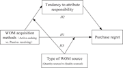
Figure 1 Research model. Source: Authors’ own work A diagram illustrating the relationship between word-of-mouth acquisition methods, tendency to attribute responsibility, type of word-of-mouth source, and purchase regret. A diagram representing a research model. The diagram includes four main... More about this image found in Research model. Source: Authors’ own work A diagram illustrating the rel...
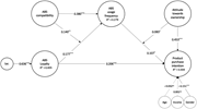
in Effect of word-of-mouth acquisition methods on consumer purchase regret following service failure
> Journal of Service Theory and Practice
Published: 21 July 2026
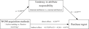
Figure 2 Influence path of WOM acquisition methods affecting purchase regret. Note: a b is the coefficient of the mediating effect of the tendency to attribute responsibility, where *** represents p < 0.001. Source: Authors’ own work A diagram showing the influence path of WOM acquisition methods on purchase regret. The diagram illustrates the influence path of word-of-mouth (WOM) acquisition methods on purchase regret. It includes three main components: WOM acquisition methods, tendency to attribute responsibility, and purchase regret. WOM acquisition methods are categorized as active-seeking versus passive-receiving. The tendency to attribute responsibility is divided into internal attribution versus external attribution. Arrows indicate the flow from WOM acquisition methods to the tendency to attribute responsibility, and from the tendency to attribute responsibility to purchase regret. The coefficients a and b represent the mediating effect of the tendency to attribute responsibility, with a value of 0.58 and -0.29 respectively, both significant at p < 0.001. The direct effect of WOM acquisition methods on purchase regret is -0.36, also significant at p < 0.001. The indirect effect is -0.17 with a 95% confidence interval of -0.261 to -0.073. More about this image found in Influence path of WOM acquisition methods affecting purchase regret. Note: ...
in Effect of word-of-mouth acquisition methods on consumer purchase regret following service failure
> Journal of Service Theory and Practice
Published: 21 July 2026
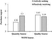
Figure 3 The moderating effect of WOM source on purchase regret. Source: Authors’ own work A bar graph comparing purchase regret based on WOM source and whether the information is actively sought or passively received. A bar graph compares purchase regret based on WOM source and whether the in... More about this image found in The moderating effect of WOM source on purchase regret. Source: Authors’ ow...
in Effect of word-of-mouth acquisition methods on consumer purchase regret following service failure
> Journal of Service Theory and Practice
Published: 21 July 2026
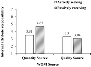
Figure 4 The moderating effect of WOM source on internal attribution. Source: Authors’ own work A bar graph showing the moderating effect of W O M source on internal attribution. The bar graph compares internal attribute responsibility for quantity source and quality source, with two data seri... More about this image found in The moderating effect of WOM source on internal attribution. Source: Author...
Journal Articles
Journal of Service Theory and Practice 1–20.
Published: 21 July 2026
in Resilience in service innovation ecosystems: adaptive capacities, co-creation and institutional agility amid external shocks
> Journal of Service Theory and Practice
Published: 21 July 2026
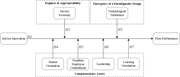
Figure 1 Layered, recursive framework of resilience in SIEs A diagram representing the resilience of service innovation ecosystems through a layered, recursive framework. A diagram of the layered, recursive framework of resilience in service innovation ecosystems. The diagram features a circul... More about this image found in Layered, recursive framework of resilience in SIEs A diagram representin...
Journal Articles
Journal of Service Theory and Practice (2026) 36 (7): 99–125.
Published: 07 July 2026
Includes: Supplementary data
in When access leads to ownership: Explaining ownership rebound in access-based services
> Journal of Service Theory and Practice
Published: 07 July 2026
Figure 1 Conceptual model showing constructs and hypothesized relationship. Source: The above figure was created by the authors A conceptual model showing constructs and hypothesized relationships. A conceptual model diagram illustrating the relationships between different constructs. The diag... More about this image found in Conceptual model showing constructs and hypothesized relationship. Source: ...
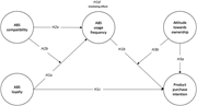
in When access leads to ownership: Explaining ownership rebound in access-based services
> Journal of Service Theory and Practice
Published: 07 July 2026
Figure 2 Path estimates and statistical significance. Note: ***p < 0.001; **p < 0.01; *p < 0.05 (two-tailed); the dotted paths illustrate non-statistically significant relationships. Source: The above figure was created by the authors A diagram showing relationships between ABS compatibility, ABS usage frequency, ABS loyalty, attitude towards ownership, and product purchase intention. The diagram illustrates the relationships between ABS compatibility, ABS usage frequency, ABS loyalty, attitude towards ownership, and product purchase intention. ABS compatibility influences ABS usage frequency and ABS loyalty. ABS usage frequency affects product purchase intention. ABS loyalty impacts product purchase intention directly and indirectly through attitude towards ownership. Attitude towards ownership affects usage frequency and purchase intention. The diagram includes statistical significance indicators for the relationships, with solid lines representing significant relationships and dotted lines representing non-significant relationships. More about this image found in Path estimates and statistical significance. Note: ***p &l...
Calls For Submissions
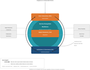
in Beyond reputation and status in hotel management: Social activities as strategic service resources
> Journal of Service Theory and Practice
Published: 25 June 2026
Figure 1 The conceptual model of this study A conceptual model diagram illustrating the relationship between social evaluations, social activities, and performance. A conceptual model diagram illustrating the relationship between social evaluations, social activities, and performance. The diag... More about this image found in The conceptual model of this study A conceptual model diagram illustrati...
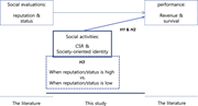
in Beyond reputation and status in hotel management: Social activities as strategic service resources
> Journal of Service Theory and Practice
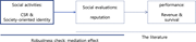
Published: 25 June 2026
Figure 2 Robustness check: a mediation model A diagram of a mediation model. A diagram illustrating a mediation model with three main components. The first component, labeled 'Social activities', includes 'CSR and Society-oriented identity'. An arrow points from this component to the second, l... More about this image found in Robustness check: a mediation model A diagram of a mediation model. A d...
in Beyond reputation and status in hotel management: Social activities as strategic service resources
> Journal of Service Theory and Practice
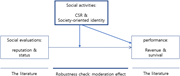
Published: 25 June 2026
Figure 3 Robustness check: a moderation model A diagram of a moderation model. The diagram illustrates a moderation model with three main components. At the top, a box labeled 'Social activities: CSR and Society-oriented identity' points to two separate boxes below. The left box is labeled 'So... More about this image found in Robustness check: a moderation model A diagram of a moderation model. T...
in Beyond reputation and status in hotel management: Social activities as strategic service resources
> Journal of Service Theory and Practice
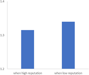
Published: 25 June 2026
Figure 4 The effects of CSR and society-oriented identity on performance in the case of high vs. low reputation A bar graph comparing performance when reputation is high versus low. A bar graph compares performance when reputation is high versus low. The horizontal axis is labeled with two cat... More about this image found in The effects of CSR and society-oriented identity on performance in the case...
in Beyond reputation and status in hotel management: Social activities as strategic service resources
> Journal of Service Theory and Practice
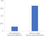
Published: 25 June 2026
Figure 5 The effects of CSR and society-oriented identity on performance in the case of high vs. low status (business group affiliation) A bar graph comparing the effects of status on performance. A bar graph compares the effects of status on performance. The horizontal axis is labeled with tw... More about this image found in The effects of CSR and society-oriented identity on performance in the case...
Journal Articles
Journal of Service Theory and Practice 1–23.
Published: 25 June 2026
Journal Articles
Journal of Service Theory and Practice (2026) 36 (4): 537–548.
Published: 22 June 2026
in A meta-analytic study on the relationship between service innovation and firm performance
> Journal of Service Theory and Practice
Published: 16 June 2026
Figure 1 Conceptual model. This figure is created by the authors, and the authors have permission to use it A conceptual model diagram showing relationships between service innovation and firm performance. The diagram illustrates a conceptual model with service innovation at the left and firm ... More about this image found in Conceptual model. This figure is created by the authors, and the authors ha...
